 Brand: Basil Hayden
Manufacturer: Beam Suntory
Agency: Design Bridge and Partners
“The world of bourbon comes across as pretty dark and intimidating, and stereotypically masculine. It’s almost an endurance test—like, can you take it?” For many whiskey novices, this description by Alice Clapp, Associate Strategy Director at Design Bridge and Partners, feels utterly on-point.
There aren’t many luxe whiskey brands who shy away from perceptions of intensity and elitism, but Basil Hayden—a small-batch bourbon owned by Beam Suntory—is one of them. While most premium whiskeys project a dark, almost-abrasive, “cowboy-with-his-mouth-on-fire” (as Clapp puts it) taste profile, Basil Hayden stands out for its delightful drinkability. The Kentucky-based bourbon manages to be welcoming without tasting watered-down.
"The world of bourbon comes across as pretty dark and intimidating, and stereotypically masculine. It’s almost an endurance test—like, can you take it?"
Apparently, this sense of approachability was precisely the aim of Frederick “Booker” Noe, the sixth-generation master distiller who created Basil Hayden in 1992. Reportedly, he once quipped: “If you don’t like bourbon, try Basil Hayden.”
Bourbons with more-approachable tastes have been trending with consumers in recent years—an observation supported by Basil Hayden’s own growing sales in the late 2010s. While the product itself was on-point and the packaging looked distinctive, the design lacked a certain air of sophistication. It also possessed some practical drawbacks; for example, the paper “bib” would rip or become saturated with liquid when harried bartenders poured from the bottle.
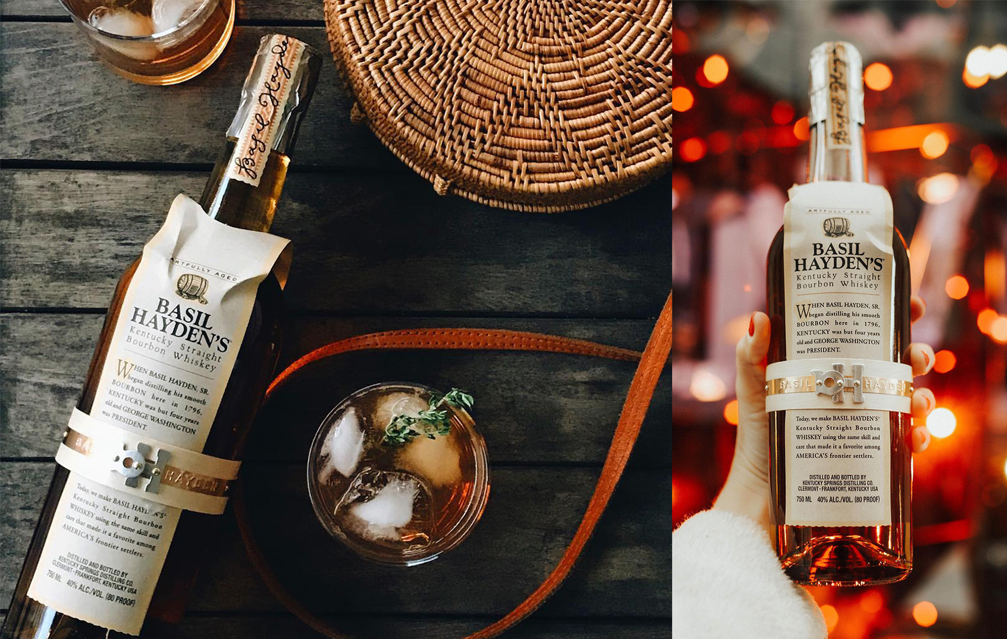 While distinctive, the "bib" on Basil Hayden's prior packaging possessed some practical drawbacks—a tendency to tear, crinkle, and become saturated with liquid among them.
Having decided that a redesign was in order, the brand brought on Design Bridge and Partners, a New York-based branding agency, to lead the charge in April 2020. From there, some difficult foundational discussions ensued. Should the bottle’s signature “bib” be retained? How about the lengthy narrative gracing the front of the bib?
As it happens, one of the most important turning points in the project was less about design and more about the brand’s foundational strategy. After many conversations, this is the directive that emerged: “Your story is about Booker Noe creating a liquid and a brand that shone a light on the best of what bourbon can be, and that brought people into the category. That's your story—nothing else matters.”
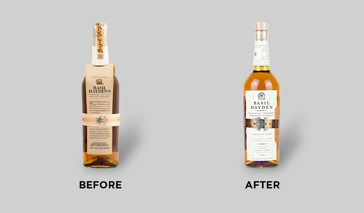
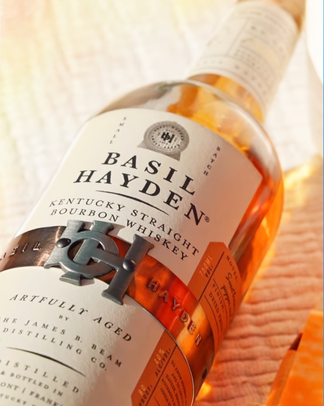
So the bib with its weathered coloring and fusty narrative set in 1796 had to go—a much-debated decision, given the distinctiveness of that particular design element. The new, modernized label simply explains that the bourbon within was “artfully aged by The James B. Beam Distilling Co.” in elegant, tracked-out lettering.
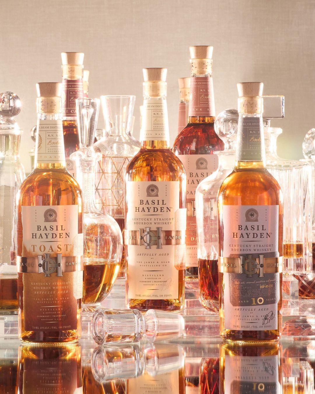
While Basil Hayden’s bib didn’t survive the reoutfitting, its characteristic and utterly-charming “belt” emerged bigger and better than before. It’s now a burnished, rich copper with an upsized monogram “buckle.” This distinctive element has the added benefit of creating cohesion across the brand’s portfolio. “It literally ties everything together,” remarked Clapp.
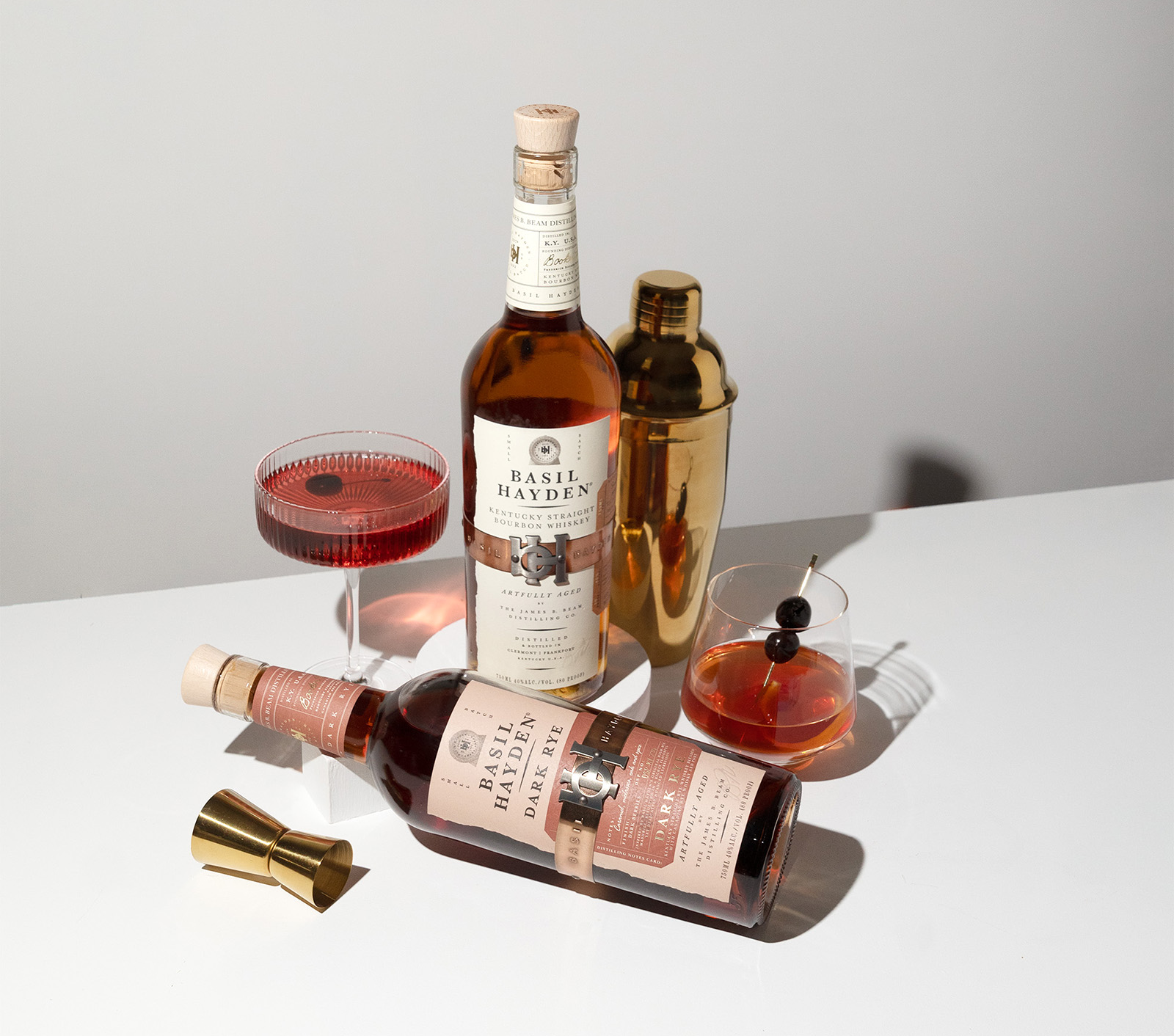
What’s more, the belt isn’t just a jaunty accessory. It’s meant to evoke the metal hoops on bourbon barrels—a nod to the care and craftsmanship that goes into creating the product itself.
“The barrel is central. From a physical perspective, you can see it in the belt, as well as in the oak closure that resembles a barrel bung. Those are nice nuances, but it’s also about communicating the defining qualities of the liquid inside the barrel in the best possible way,” explained Gregor Johnstone, Creative Director at Design Bridge and Partners.
In August 2021, Basil Hayden’s new design hit store shelves—with enthusiastic approval from retail partners. The new look helped close distribution gaps and improved the rate of sale at retailers who were already carrying the brand, which then increased the sales team’s ability to sell in multiple facings and incremental display.
Consumers were similarly delighted. During the six months following the launch, Basil Hayden’s sales grew 15% compared to the same period during the prior year, despite modest declines in the whiskey category overall. Basil Hayden’s market share also increased by 15%.
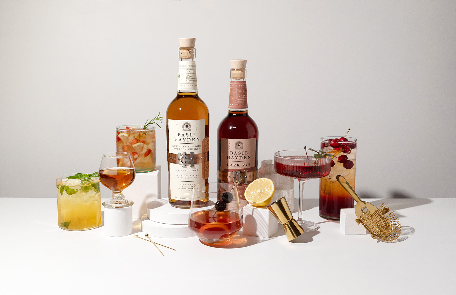
Consumer research by Designalytics affirms these outcomes: When whiskey buyers were asked which design they’d prefer to purchase—old or new—71% chose the new design.
During the six months following the launch, Basil Hayden’s sales grew 15% compared to the same period during the prior year.
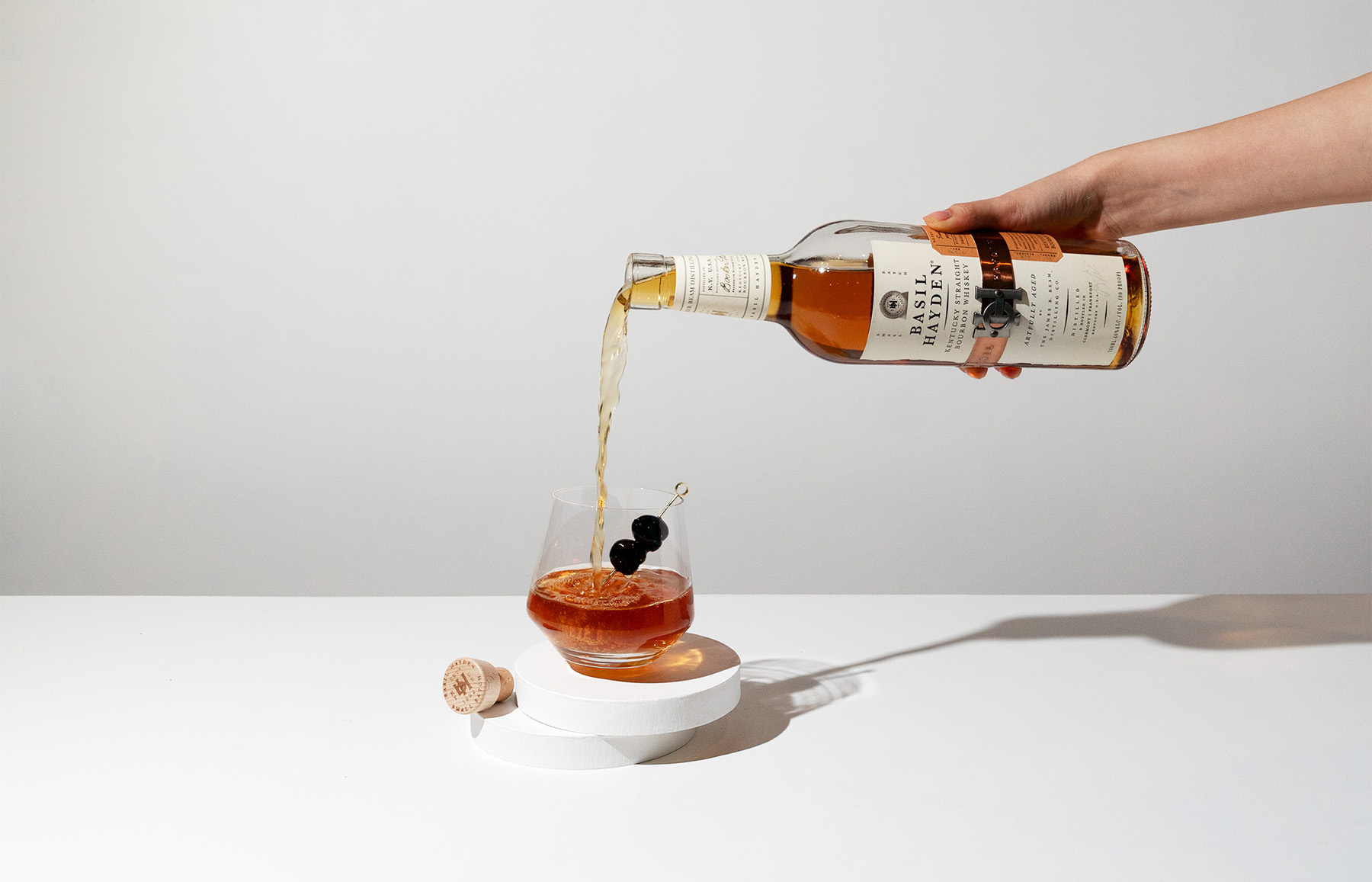
When asked to reflect on what made this initiative so successful, the team emphasized a willingness to take strategic risks and Beam Suntory’s broader organizational belief in the power of design to drive brand growth—which Basil Hayden’s triumph has only reinforced.
In developing a new, more-approachable design beloved by consumers, Basil Hayden has continued to realize Noe’s original vision: Sharing his love of bourbon with more people.
We’ll drink to that.

