 Brand: Bloom
Manufacturer: Bloom Nutrition
Agency: Riser
After hitting rock bottom mentally and physically, Mari Llewellyn bounced back by taking ownership of her health—and was inspired to help others do the same. Realizing there was an unmet need for nutritious and delicious supplements in the market, she founded Bloom in 2019 with the help of her husband, Greg LaVecchia. Since then, Bloom has experienced dramatic growth.
Consumers flocked to follow Llewellyn on popular apps and, when she started the company known for its greens, collagen, pre-workout products and more, they followed her there, too. After just a couple of years with a direct-to-consumer-only model, the brand was already looking to expand its product line and make its first foray into retail outlets like Target and Walmart. Knowing that its products would be seen by new consumers and in a different context—not to mention alongside bigger, more recognizable brands—Bloom wanted to ensure it was set up for success with a new package design.
The brand had unique challenges as it embarked on the project with Riser, its branding and design agency. To start, Bloom would need to broaden its appeal to other category consumers without alienating the fans it had found online. “In general, the design needed to be approachable and healthful but also flavor-forward and fun,” said Paul Marcucilli, co-founder of Riser. “Bloom is definitely not a ‘gym rat’ or ‘health fanatic’ type of brand, and they didn't want to come across as too much of a niche product.”
There were areas in which the brand knew it could improve, including appetite appeal, and it was essential to create a design architecture that could work across its new (and future) product lines. Since Bloom was in a very distinctive stage of its business—enough of a following to be successful, but still unknown to a great number of category buyers—there were a myriad of directions the redesign could go. Riser took the opportunity to explore. “I think we definitely went broad with our initial exploration, and it was helpful to get the client's reaction to that range of options,” said Marcucilli.
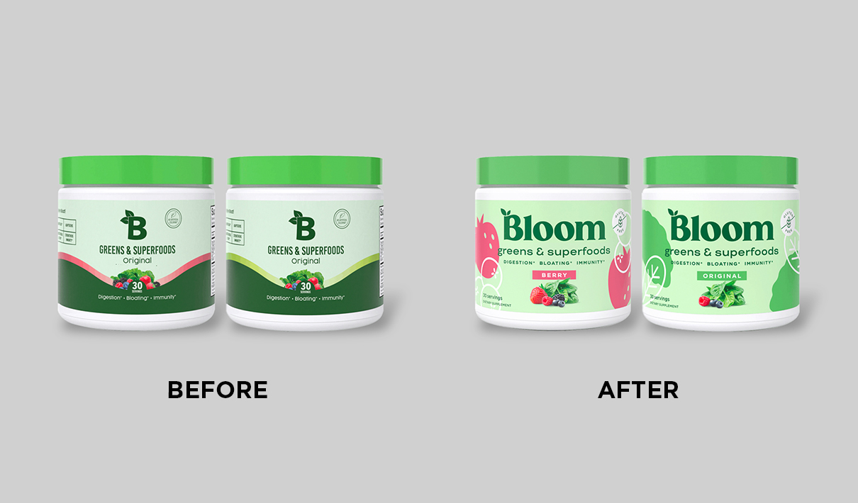
One area of exploration involved the brand’s logo: initially, a green “B” with two leaves popping out of the top. Bloom and the agency had differing points of view regarding its evolution. While Bloom felt its consumers were accustomed to the B, Riser advocated for a bolder look that included the entire Bloom name. “The brand was hesitant about that change, but from our perspective it was necessary for where they wanted to go,” noted Marcucilli. “It felt like a big area of potential improvement.”
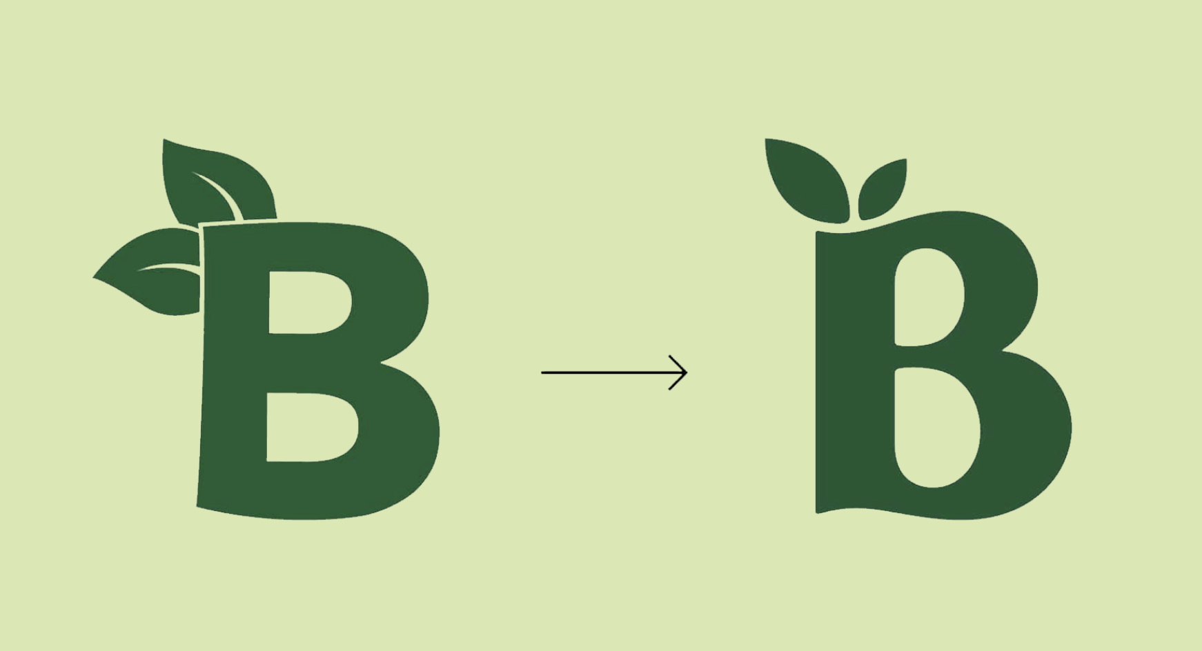
Ultimately, Bloom was swayed to make the change—in part by Riser, and in part by seeing that the current logo might not be serving the brand well. There was a disconnect for some consumers between the “B” logo and Bloom Nutrition. “People were googling ‘the B brand,’ and referring to us as ‘the B brand’ on social media. We knew we needed to make a change to ensure people were identifying us correctly,” commented Nareh Vartanian, head of creative marketing at Bloom Nutrition.
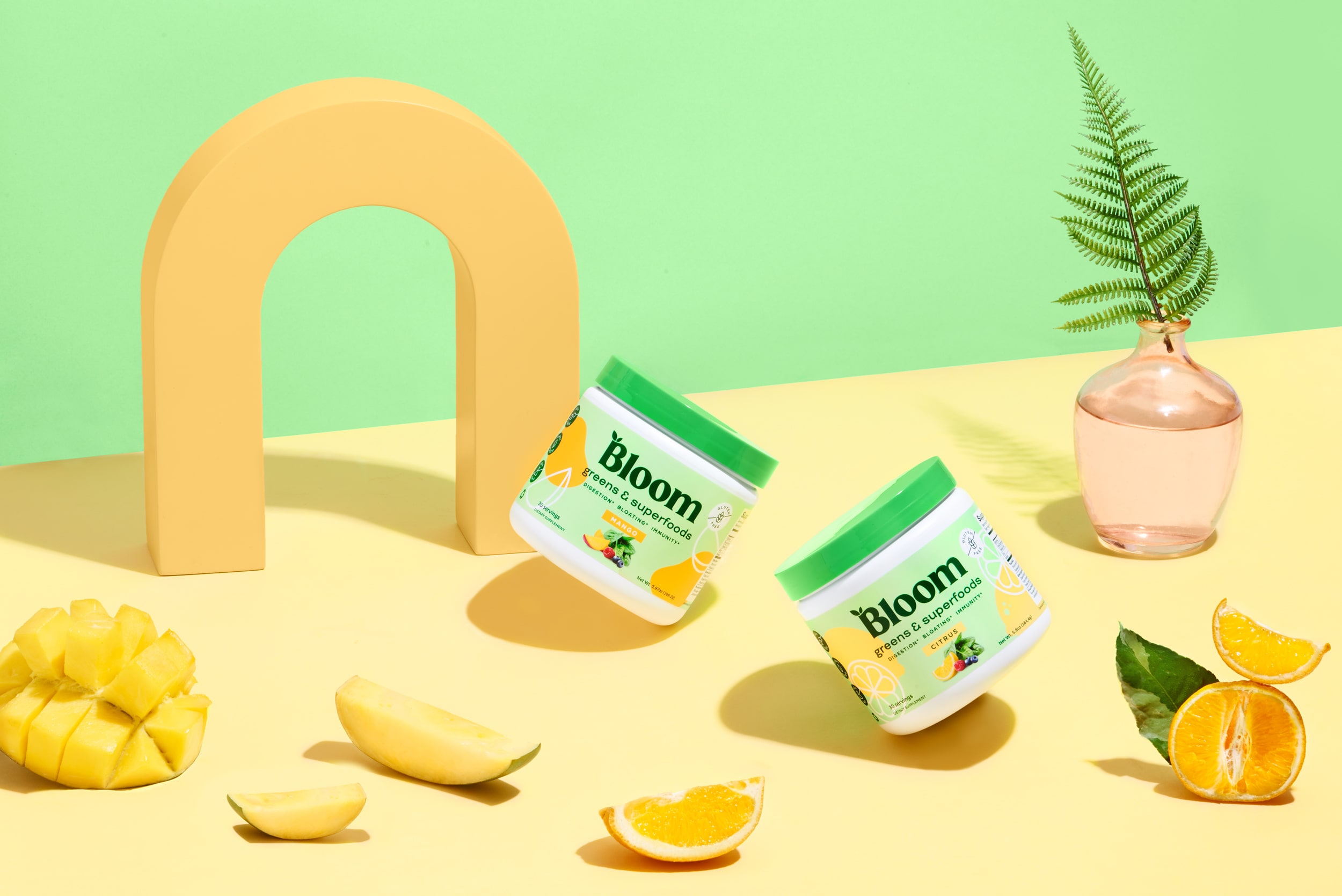
A few adjustments were made to enhance communication; the listing of benefits related to digestion, bloating, and immunity were made larger and placed higher on the pack, for example. Throughout the design development process, though, Riser avoided veering too far from the core of the Bloom brand. On the new logo, for instance, the two leaves sprouting from the original B were retained—a strategic choice made to connect the two looks. “We just rendered it slightly differently, a little more modern and stylized,” remarked Marcucilli. “Essentially, what we did throughout was to look at the previous packaging and ask ourselves: How can we take what is already here and make it Bloom 2.0?”
"Essentially, what we did throughout was to look at the previous packaging and ask ourselves: How can we take what is already here and make it Bloom 2.0?"
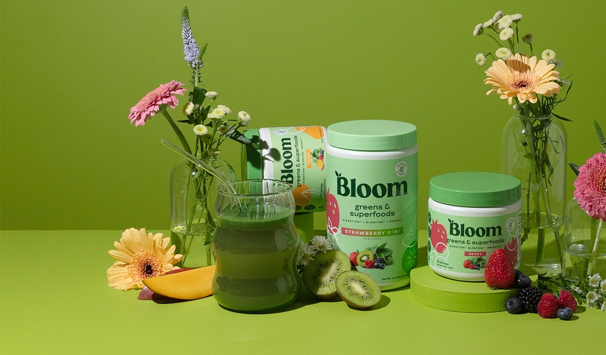
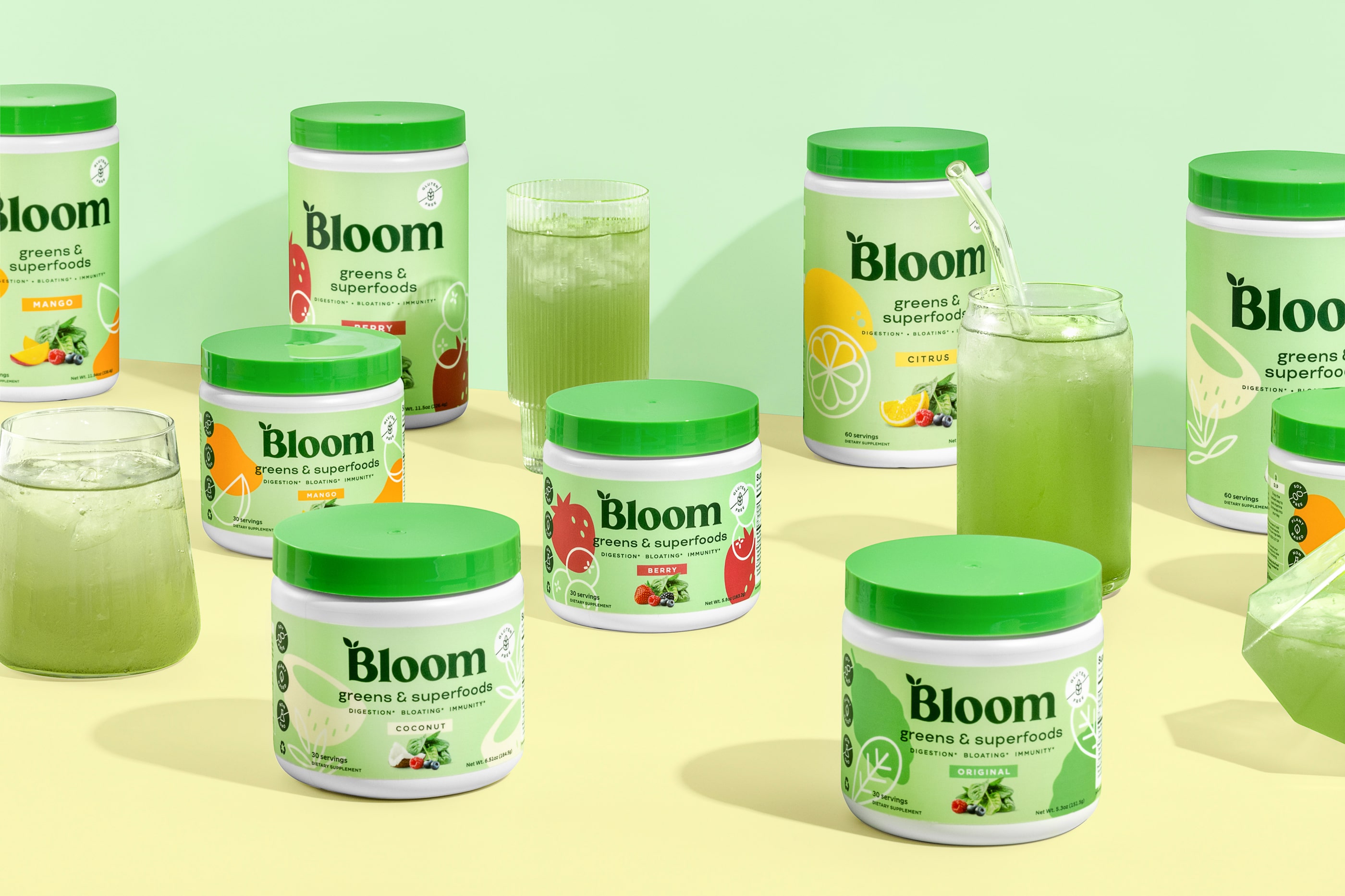
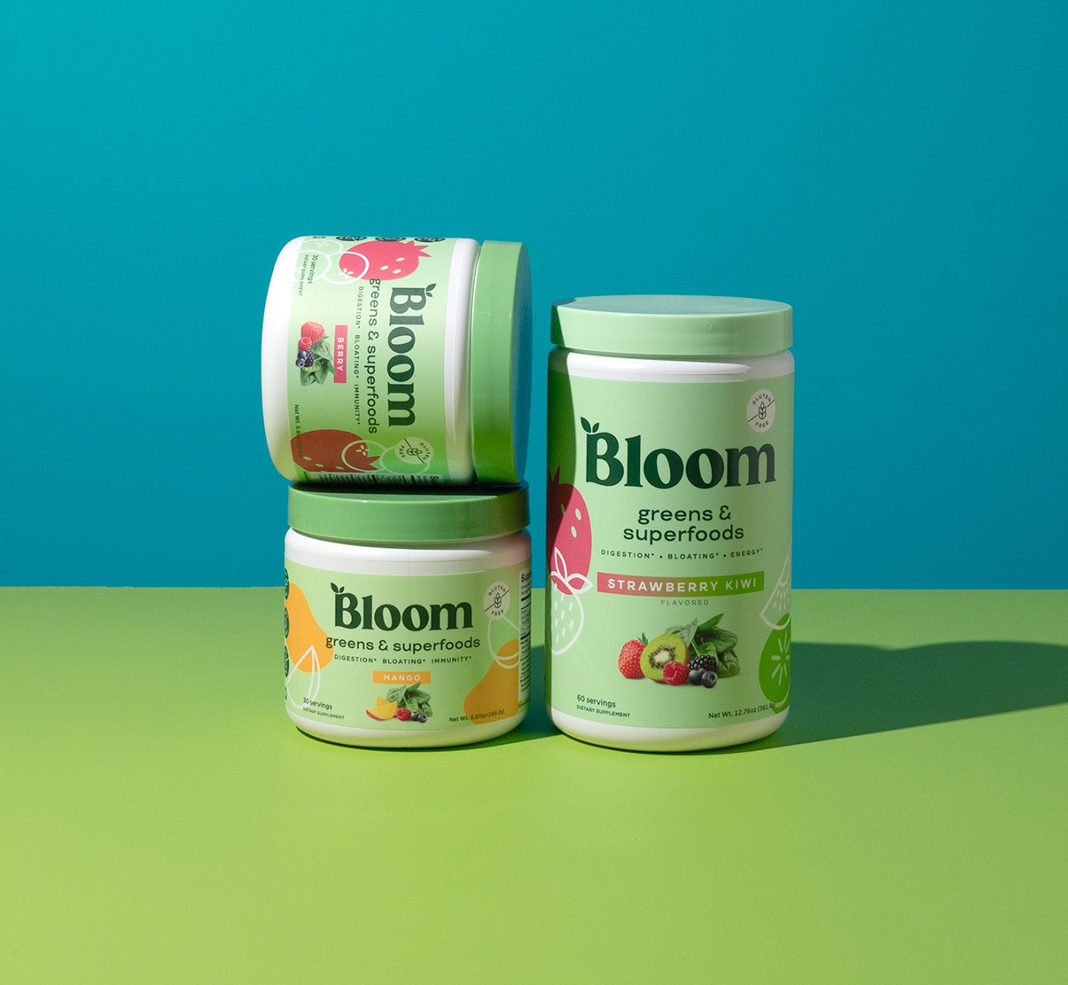
Part of that next-stage evolution was making the brand stand out on shelves, whether that entailed increasing font sizes across the board or ensuring the texture of fruits and vegetables could be seen clearly in the taste imagery. The latter was meant to convey flavor more effectively, which was one of Bloom’s biggest goals. “We did a pretty big exploration around how to show flavor,” Marcucilli recalled. “Flat or abstract illustration styles, floating photography, side or top view… we looked at many different approaches.” In the end, the brand chose to move forward with the larger photography as well as two kinds of illustrations—simple white ones and flat, colorful ones that aligned with each flavor.
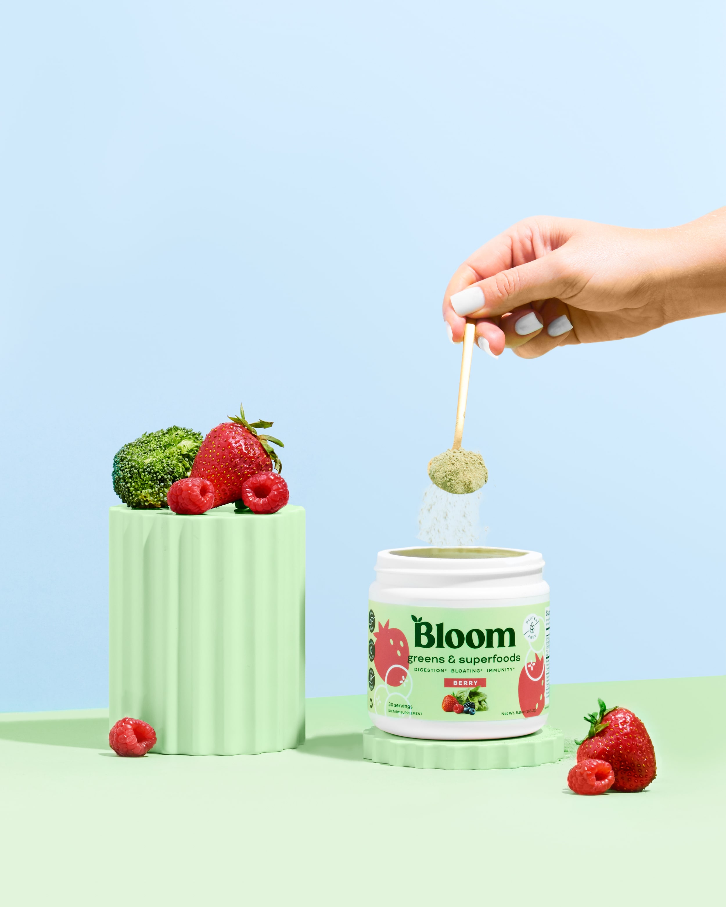
The illustrations were designed to pique the interest (and tempt the palate) of consumers in a fun and unmistakable way. “The fruit-forward illustrations are playful and unique, making the flavor easily identifiable. And yet there is a good balance between illustrations, photography, and other brand elements,” said Vartanian.
In June 2022, Bloom rolled out its new packaging, and it quickly struck a chord with consumers. During the six months following the new design's launch, sales averaged an impressive 288% growth rate over the same period during the previous year. This aligns with Designalytics’ analysis: A whopping 84% of consumers preferred the new design over the old. For obvious reasons, the brand was very happy with these results—and can already see opportunities to utilize its newly-minted design assets elsewhere to help move the brand forward.
During the six months following the new design's launch, sales averaged an impressive 288% growth rate over the same period during the previous year.
“The new design has really shaped the trajectory of how our brand look-and-feel is evolving,” said Erica Tam, vice president of brand at Bloom Nutrition. “The fruit illustrations, for example, don’t just live on the pack. We've started to bring them out into our digital assets. These unique elements on the package design are now a part of our overall visual representation as a brand.”
For Marcucilli, it was a lot of fun to collaborate with a young, exciting brand in a vibrant, evolving category. It also reminded him that true collaboration sometimes requires challenging his clients, as he did with Bloom on its logo. “In the end, the client is looking for results. So it’s okay to push them to make a change that may feel a little uncomfortable initially, because ultimately it’s about giving them the results they are looking for.”