 Brand: Funky Buddha
Manufacturer: Funky Buddha Brewing
Agency: Moxie Sozo
When Ryan Sentz started Funky Buddha Brewing in 2010, craft beer was at the start of a precipitous ascent in the United States. According to the National Brewers Association, the number of breweries started steadily increasing around 2007. By 2015, there were more than 4,800 craft breweries in the U.S., and by 2022, that number had essentially doubled.
Funky Buddha was certainly buoyed by this popularity over the years, and the brand had developed a strong identity while serving beer-lovers at its lounge on the Atlantic coast of Florida. A few years later, the brand decided a redesign was in order and now had the resources and expertise to make it a great one. But it would require a delicate balance: Funky Buddha wanted to maintain its fun, Florida feel while building a design architecture that would create a more cohesive feel across its portfolio. Essentially, the brand wanted to mature—but not too much.
“We wanted to create a strong master brand as well as increase brand awareness on the shelf,” said Andres Rios, senior designer at Funky Buddha. “At the same time, we didn't want to lose our personality.” The brand hired Moxie Sozo, a Boulder-based design and branding agency which works primarily with food and beverage brands, to help them achieve these goals.
More than anything else, Funky Buddha’s identity was rooted in the state of the brand’s birth: Florida. The agency believed there was a real opportunity to eventually make the brand synonymous with the Sunshine State. “In our internal discussions, we said ‘If Coors is immediately connected with Colorado, then Funky Buddha can have that same association with Florida,’” said Charles Bloom, creative director at Moxie Sozo.
As the brief was developed, the agency discussed how Funky Buddha might represent its homeland. “We knew we’d have to avoid cliches or anything that could feel like any other brand in the state,” Bloom recalled. “It needed to feel unique to Florida, but not replicable for another brand.”
First things first, though: Consistency. The agency knew that there needed to be a design system where the master brand was at the forefront. “At the start, the brand told us that loyal consumers would buy, say, the Floridian wheat beer, but would not necessarily know it was a Funky Buddha product,” said Mike Bowman, account director at Moxie Sozo. “So strengthening the brand identity was a focal point.”
Yet each variety of beer would also need real estate to convey its individual personality. “The Funky Buddha team had some really cool background stories of how they came up with some of these different beers like Hop Gun and Floridian, so we wanted to create space to express that,” Bowman remarked.
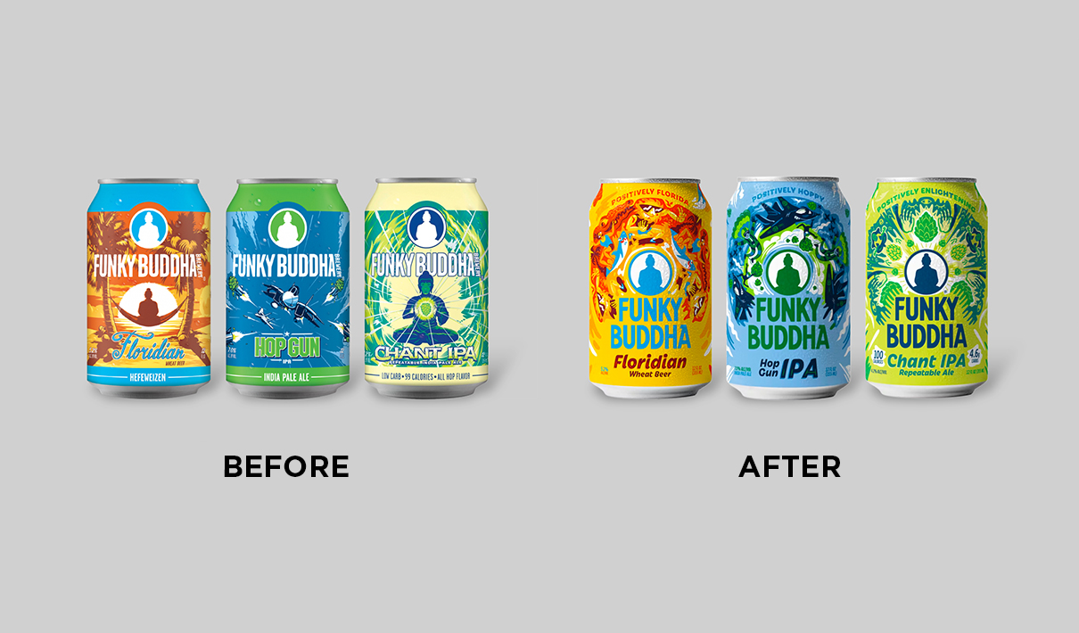
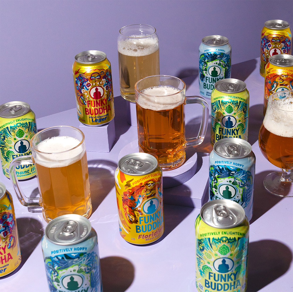
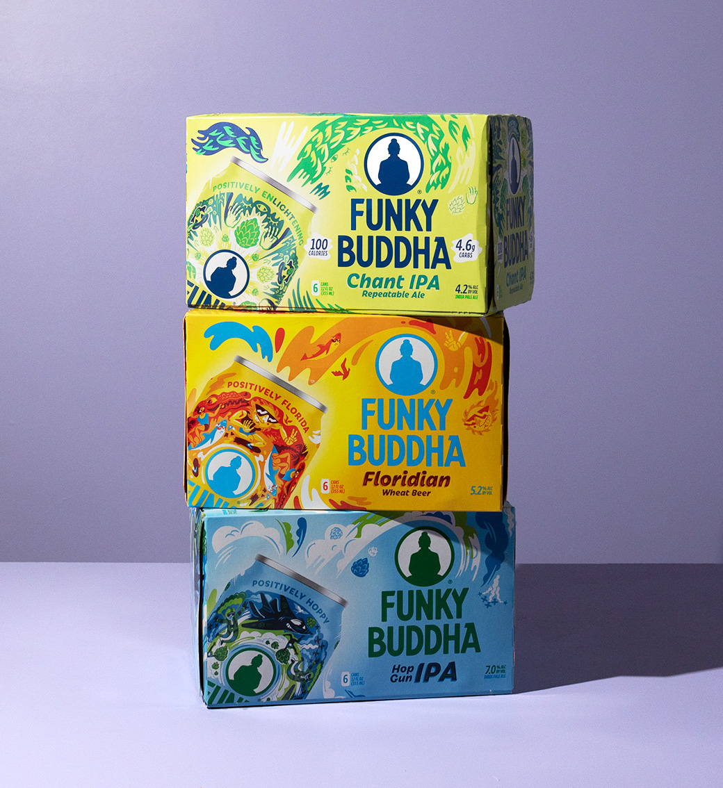
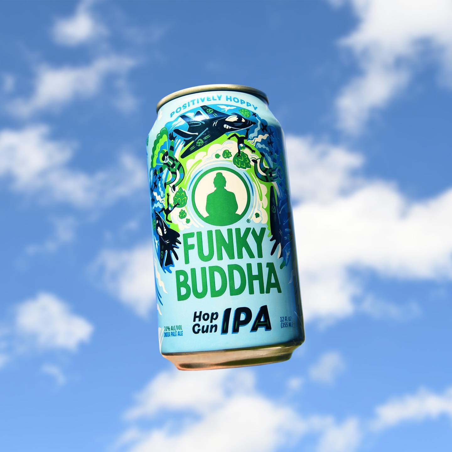
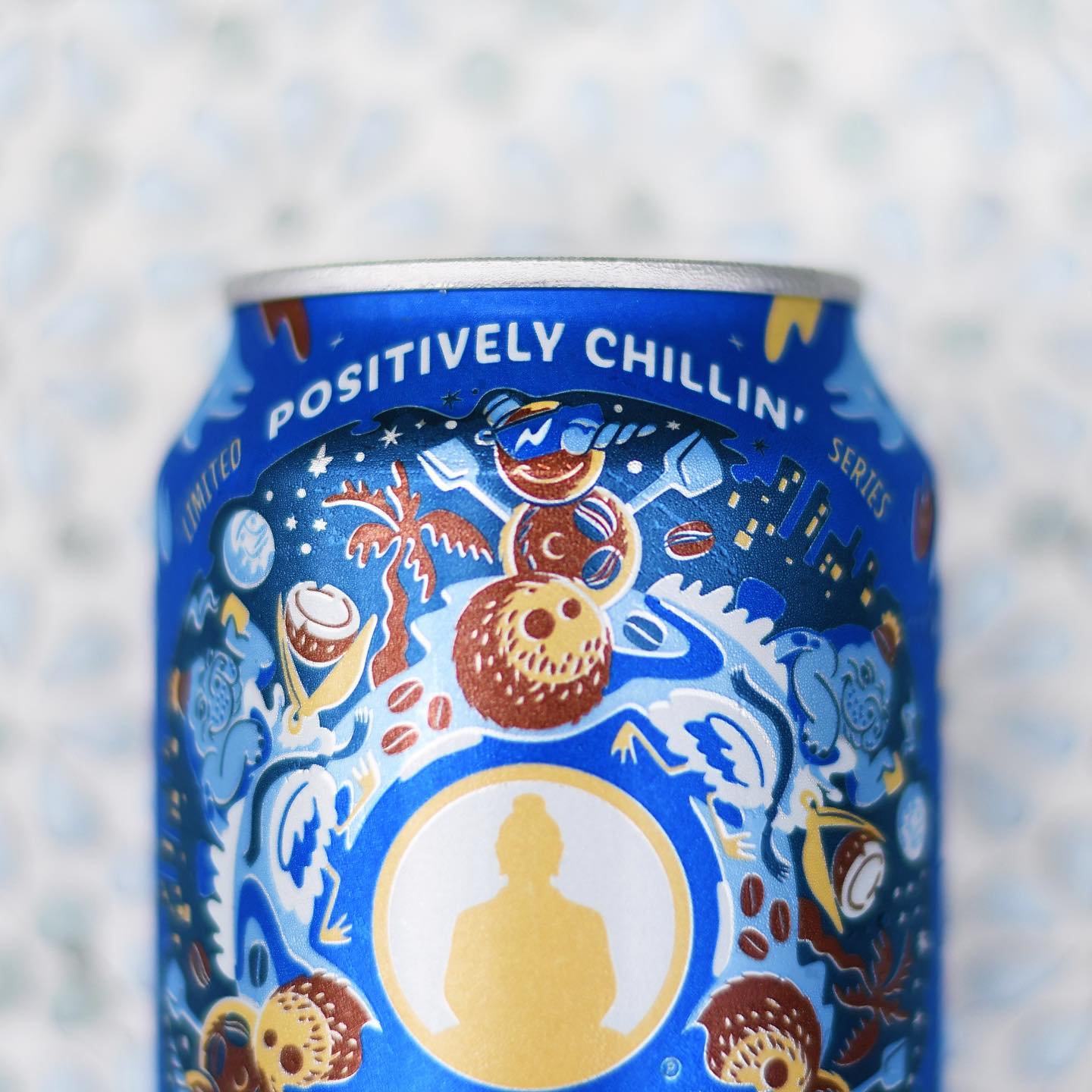
Moxie Sozo expanded and centered the logo on all beers—both the silhouette of the Enlightened One and the Funky Buddha name itself, which was now stacked—and made its color vary from variety to variety. The Floridian wheat beer, for example, has a bright blue logo, while Vibin’ Groovable Lager features a red one. This helps create an anchor for the design system. There remained, however, the previously noted individuality—the “funky” to balance out the Buddha.
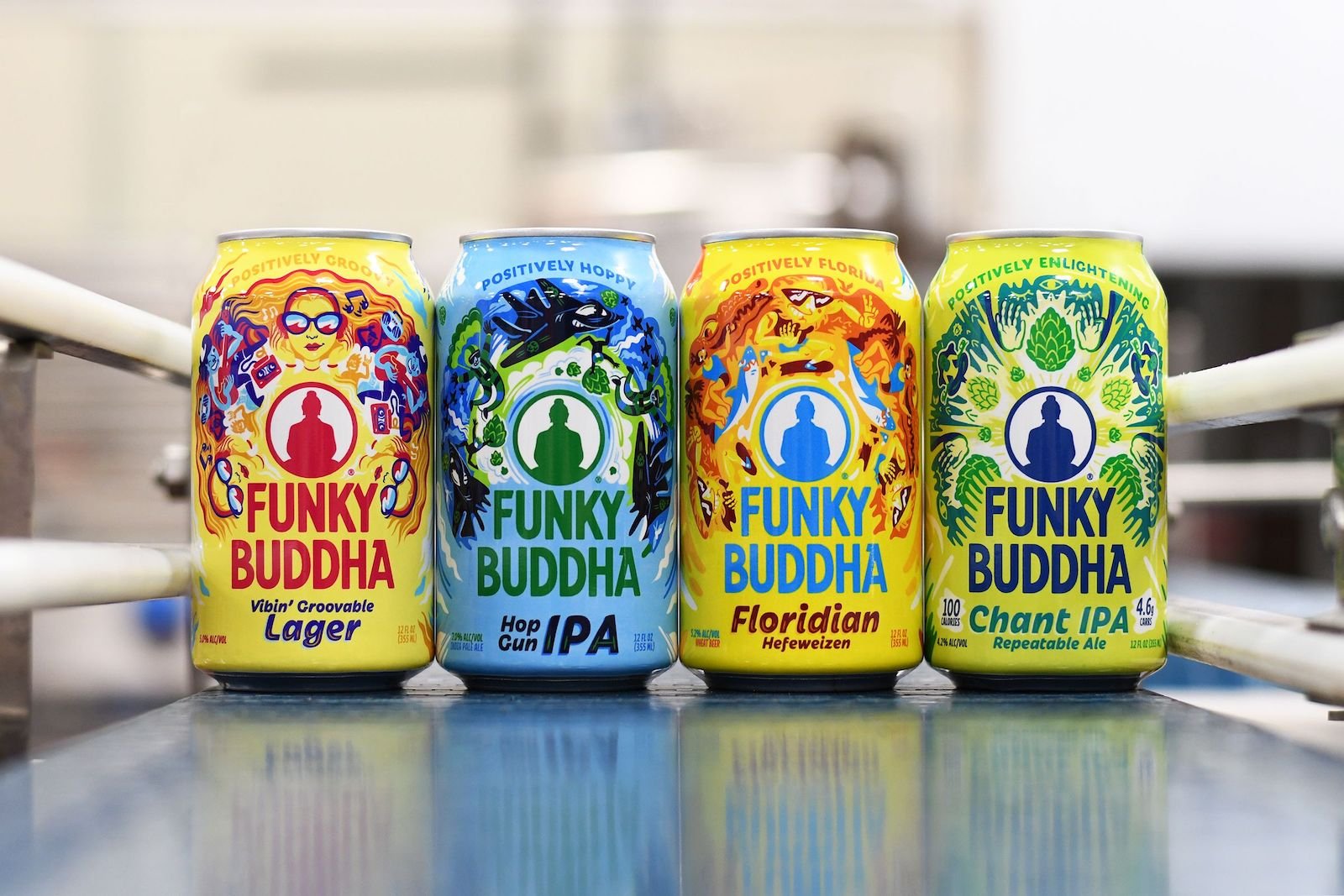
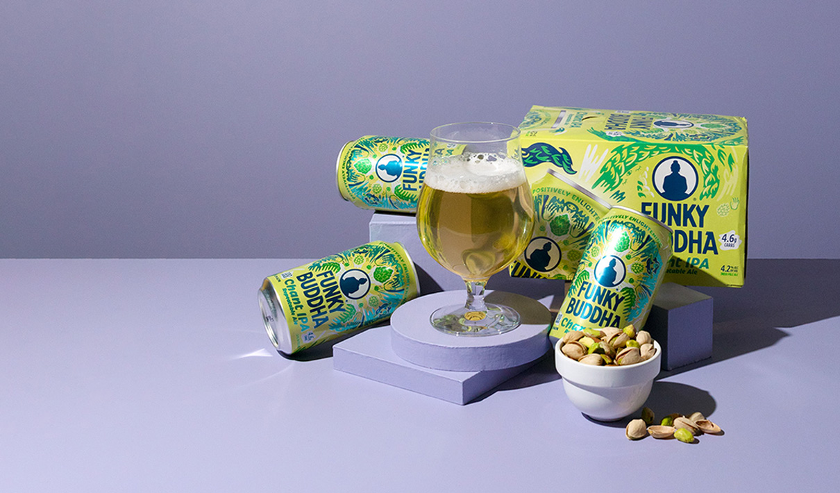
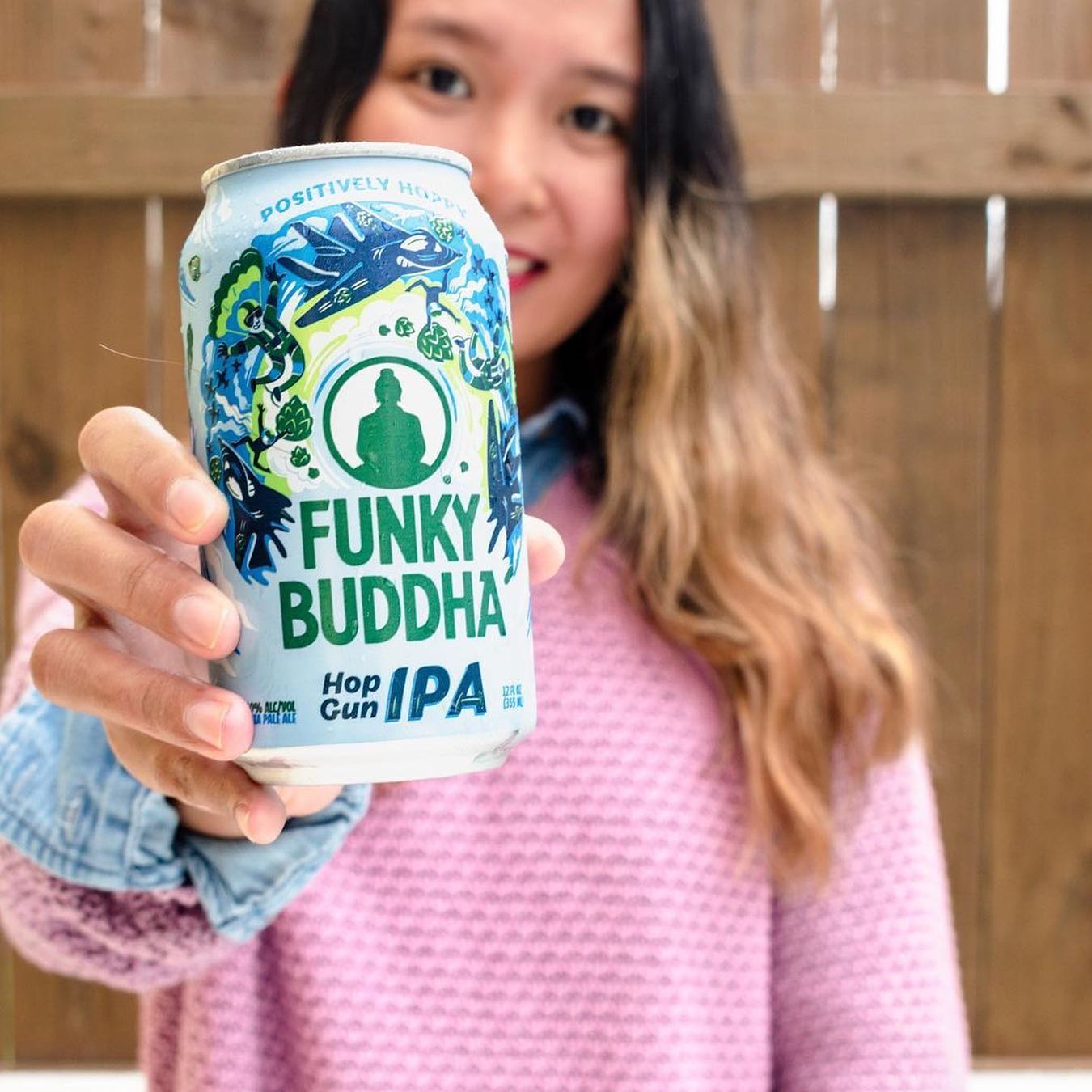
For this, the agency employed what was termed a “radiating mandala”—a nod to the artistic, and often kaleidoscopic, creations in Buddhist and Hindu traditions. Whereas typical mandalas were more geometric, the new cans feature fun, colorful illustrations aligned with the beer’s name. On the brand’s flagship (Floridian), for example, the mandala features a sun-faced character skateboarding while being chased by a shark—a quirky, surreal scene that supports the brand’s no-worries vibe and Florida bonafides. “For each beer, the mandala would surround the Buddha and have similar visual aspects, but the characters and colors would change,” noted Rios.
“We didn’t want the allusions to Buddhism to be too overt,” noted Bloom. “It did help inspire the visuals overall, but it was more about bringing the funkiness forward.” Another element the agency borrowed from more traditional mandalas was the complexity—each can had a number of characters, colors, and other visuals, and yet each maintained a continuity. “Everything needed to flow into the next object naturally,” Bloom commented, recalling the process of creating the illustrations.
There were practical modifications made to the design as well, especially as it pertained to typefaces. With the previous design, each beer featured a different typeface: Floridian had a cursive style, for example, while the Hop Gun IPA’s font was block-style lettering (reminiscent of the Top Gun movie title font, most likely). Now, the individual beers share the same typeface, even as their respective mandalas demonstrate individuality and their colors add a dash of fun. “Everything now seemed more like a family, rather than just a collection of different beers,” remarked Rios.
Adding to the familial feel is a standardized tagline, found at the top-front of the can, starting with “Positively” and including a word that encapsulates that particular beer. For example, atop the Tropical Floridian (a fruitier take on the flagship beer) it says “Positively Paradise,” while the Chant IPA is crowned with “Positively Enlightening.” The “Positively ____” tagline formula seemed like an ideal summarization of the brand’s ethos. “We had tried it during one of our explorations, and we just said: ‘Wow, this is perfect. It’s affirmative and uplifting, and that’s really the whole vibe at Funky Buddha,’” said Bloom.
During the six months following the launch of the redesign, the brand's sales grew by 6.7% relative to the same period during the previous year—significantly outperforming a category which actually saw a decrease of 8.5% during that same period.
As it happens, consumers were loving the vibe, too. During the six months following the launch of the redesign, the brand's sales grew by 6.7% relative to the same period during the previous year—significantly outperforming a category which actually saw a decrease of 8.5% during that same period.
It looks like the positive vibes will be continuing for many years to come.