 Brand: Häagen-Dazs
Manufacturer: Froneri International
Agency: Chase Design Group
The name Häagen-Dazs is synonymous with indulgence—a distinctive and delectable treat worthy of its unique name. It makes one wonder: What does that exotic name mean? The answer: nothing.
The name, coined by Polish-immigrant founders Reuben & Rose Mattus, is a made-up word. The couple wanted the ice cream they created in 1960 to appeal to higher-income consumers, whom they felt would be drawn to a name that sounded European. They chose words related to the Danish language as a tribute to Denmark’s efforts to help Jews during the Holocaust, but the words themselves are gibberish. “Häagen-Dazs doesn’t mean anything,” Reuben Mattus once said. “We created a meaning for it. It means ‘the best.’”
There are a lot of consumers who would agree with that definition. Over the decades, Häagen-Dazs has become one of the most beloved ice cream brands in the world. And yet, with the advent of low-calorie and plant-based varieties of ice cream, not to mention myriad new flavors and types of treats, the freezer aisle looks very different from what Rose and Reuben knew. And Häagen-Dazs needed to evolve.
“The previous package just wasn’t effectively conveying who Häagen-Dazs is to the modern consumer,” said Rachel Jaiven, marketing director at Froneri, which runs Häagen-Dazs in the United States. “We wanted to remind them that this is a brand for today, rather than just for their parents’ or grandparents’ generations. So we approached Chase basically saying, ‘Help us go from a brand that is widely recognized to one that's loved.’”
Jaiven was referring to Chase Design Group, the award-winning agency tasked with the redesign. “The brief evolved as we were working together,” recalled Jon Arriaza, senior design director at Chase. “We discovered a number of opportunities to remain this very recognizable brand, but still feel fresh, modern, and desirable. We explored and had fun with it throughout the process, and came up with some really creative solutions.”
Of course, creative solutions were necessary—the Bronx-born brand has been a favorite of consumers for decades, so any change would need walking the tightrope of honoring its past while also making it more shoppable, appetizing, and relevant amongst its competitive set. “We’re an established and beloved brand, but we needed to really sell the yumminess of our ice cream. Our previous design wasn’t doing that well…. It was a clean design, but it didn’t pull you in,” Jaiven remarked.
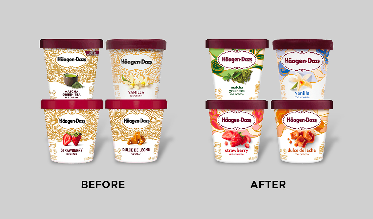
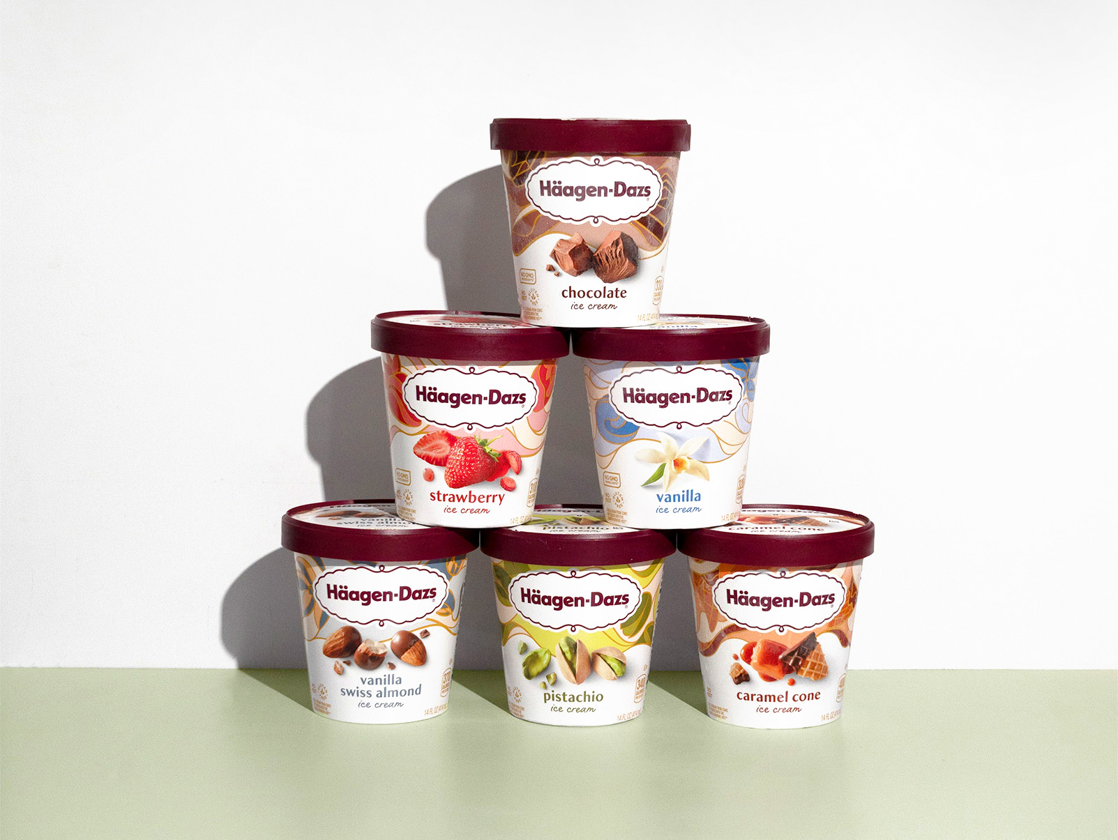
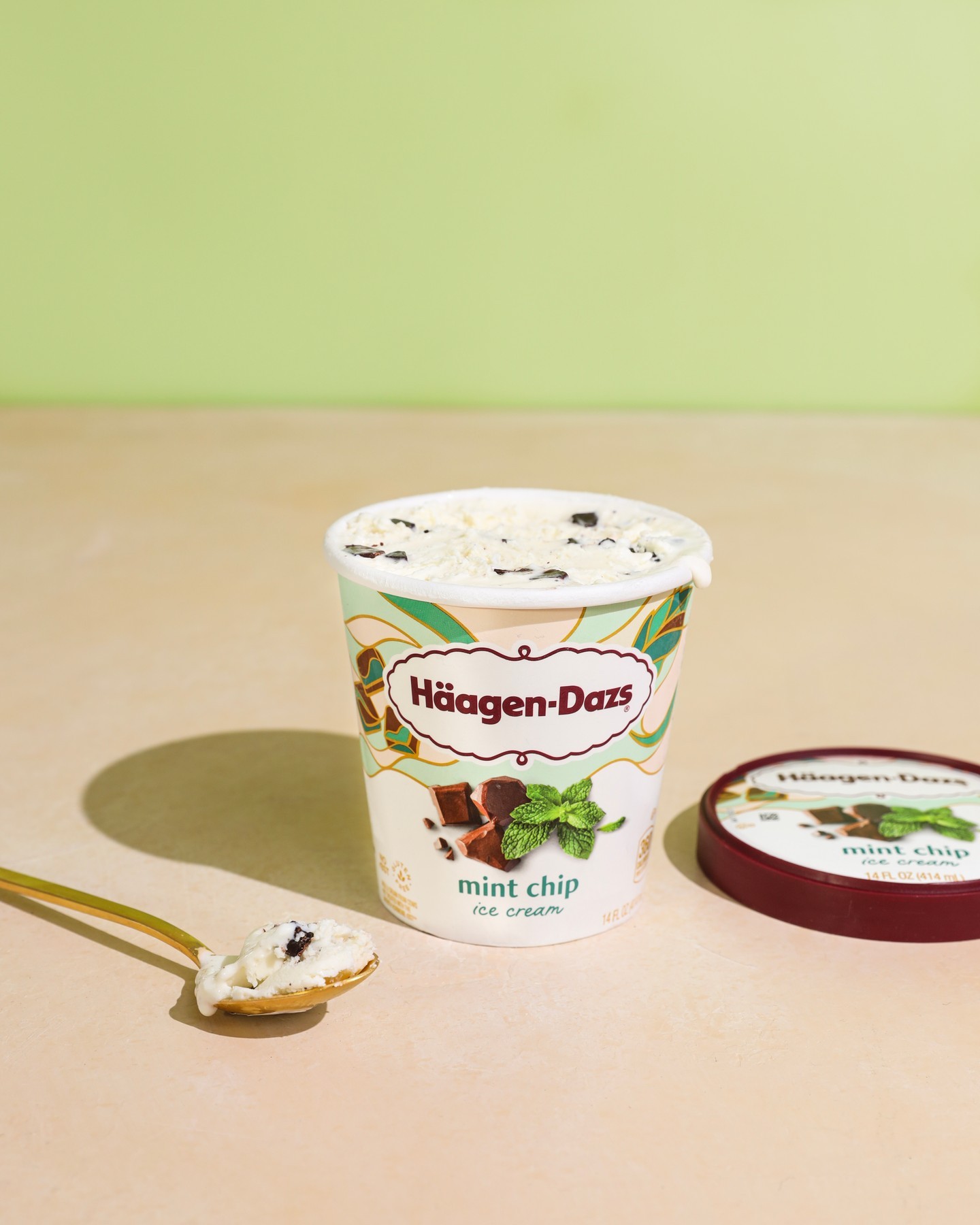
For this recognizable-yet-renewed look, Häagen-Dazs would need to change what Jaiven called the “tapestry”—a wrap-around feature of the package design that has existed in some form since the 1960s. Chase Design Group took the feature in an entirely new direction: replacing the previous dense, gold weave with a relaxed, colorful flourish that evokes flavor. “In the spirit of modernizing the design, we felt we needed to loosen it up,” commented Arriaza.
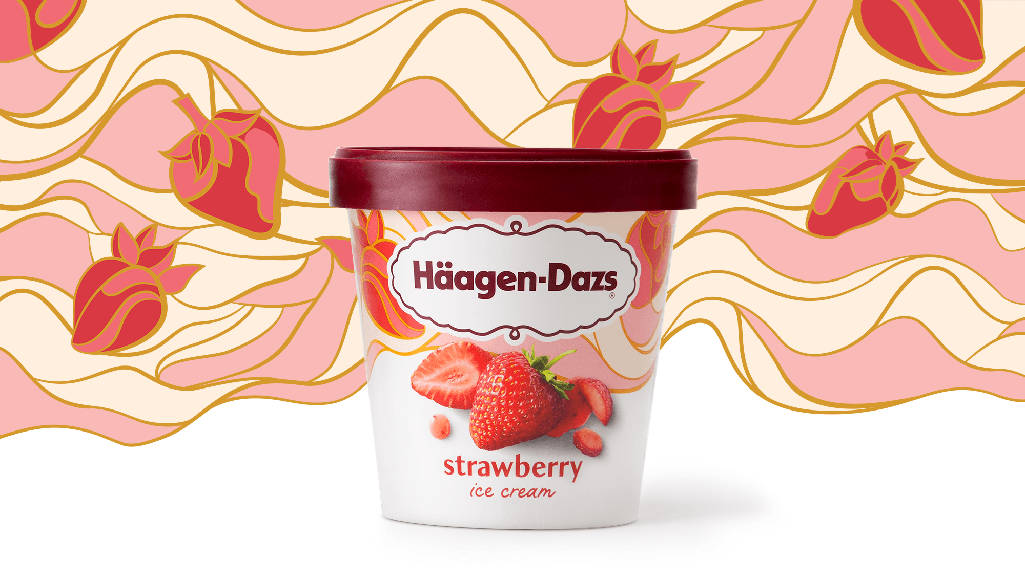
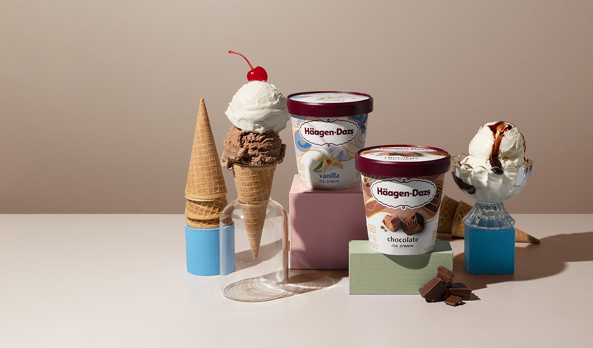
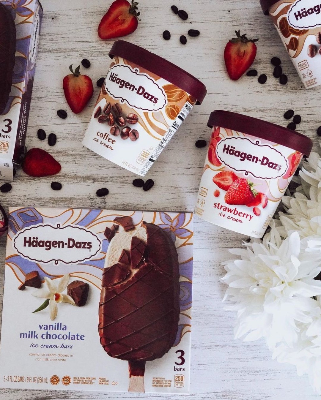
Each flavor has its own distinctive tapestry, with unique shapes and colors that complement the flavor imagery. In some cases, a closer look reveals that seemingly-abstract cells of color actually create the shape of an ingredient, such as a strawberry or pineapple—a subtle, clever complement to the flavor story each package tells. “Our intention was for consumers to recognize the brand and the flavor right away, as soon as they looked at the package,” Arriaza noted.
He pointed out that the ingredient imagery not only takes up more space with its central position on the package, but the photos are also more real. The pieces are cut in differing sizes; sauces might include an errant drip that implies relaxed enjoyment, rather than rigid flawlessness. “The ingredients are beautifully shot, but they're not too idealized,” Arriaza said. “It gives it a sort of perfectly-imperfect feel. A beautiful mess.”
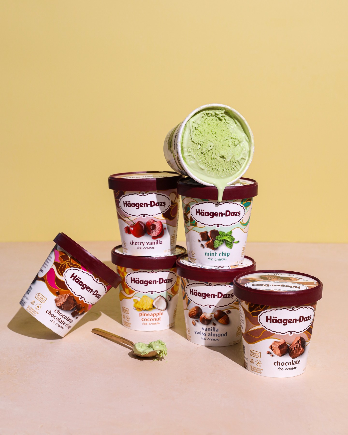
The package does not feature the ice cream itself, which Jaiven points out has always been the case. “We’ve never had imagery of ice cream on the front of our package,” she noted. “Häagen-Dazs has always been about showcasing the highest-quality ingredients, rather than a scoop or a bowl. So we looked at options with the ice cream, but we agreed it just wasn’t in our brand’s DNA. It didn’t feel right.”
Even though Häagen-Dazs had strong equities within their design, the brand team was open to change throughout the process. For example, at the start of the project, the brandmark—which was a different color in the United States than it was in Europe—was deemed untouchable. In the end, the brand decided to unify the two, matching the U.S. version to its across-the-pond cousin. “We went from black to burgundy because we realized it was the right thing to do,” said Jaiven. “So what was once a ‘sacred cow’ ended up being updated after all.”
Based on Designalytics’ consumer evaluation and the brand’s sales performance, it’s clear that shoppers are eating up the new look. After it was rolled out around March 2021, Häagen-Dazs’ sales increased by more than 6% during the six months following, compared to the same period in 2020—representing an annualized sales increase of nearly $57 million and share surge of 1.6 points. And that’s in spite of the fact that the category as a whole saw an 11% dip in sales (the latter a likely return-to-earth after the pandemic, when ice cream sales skyrocketed). “In the channels we measure, we became the number one ice cream brand in the United States in terms of total dollars after this redesign was launched,” noted Jaiven. “I feel so proud of that.”
Häagen-Dazs’ sales increased by more than 6% during the six months following, compared to the same period in 2020—representing an annualized sales increase of nearly $57 million and share surge of 1.6 points.
Jaiven believes the updated look brings the best of both worlds—it’s Häagen-Dazs at heart, but with a vibrant and eye-catching new expression of the brand’s personality. “What’s so lovely about this design is that there are a lot of little features that show an intense attention to detail, so it was complicated in that way,” she noted. “But it's actually a very simple design, and the flavors really pop. It’s sort of what we envisioned when we started—something consumers will see in the freezer aisle and say, ‘Wow, look at Häagen-Dazs!’ Because it is so different, but also so familiar.”

Arriaza is proud of leading a talented team that created a redesign worthy of Häagen-Dazs heritage, and credits a disciplined approach. “With every decision we made, there needed to be a good reason for it. We weren't making random choices that didn't make sense. Everything had a strategic component to it. And I think it shows.”