 Brand: Laird Superfood
Manufacturer: Laird Superfood
Agency: Stone Strategy & Design

If you’re at all familiar with surfing (and even if you’re not), there’s a good chance you know the name Laird Hamilton. Much like Tony Hawk for skateboarding or Shaun White for snowboarding, Hamilton is a singular legend in the sport of big-wave surfing.
Like many world-class athletes, Hamilton always wanted to get the most out of his food. So he started experimenting with adding healthy plant-based fats and other real-food ingredients to his morning coffee several years ago. It energized and sustained him so well throughout the day that he shared it with his fellow surfers. “One of his friends said ‘Hey, this is amazing! You need to share this with the world.’ And that’s how our company began,” said Martha Opela, VP of marketing at Laird Superfood.
Hamilton started Laird Superfood with his wife Gabrielle Reece, a professional volleyball player and model turned wellness expert, and the “superfood creamer” that had impressed his friends was their first product. Since the company’s launch in 2015, it has grown dramatically (even embarking on an IPO in 2020) and expanded its real-food offerings to include drink mixes, snacks, supplements, and more.

While Hamilton and Reece drew a devoted following of athletes and fitness enthusiasts to Laird Superfood, the brand’s mission was to bring the benefits of simple, natural, plant-based foods to a larger audience, according to Sharee Rodriguez, associate creative director at Laird. “You don’t have to be a big-wave surfer or professional volleyball player like Gabby to benefit from Superfood. We needed a package design that could welcome a broader group of consumers,” she said.
Broadening the company's reach would require more retail distribution, which brought specific challenges. “The big imperative as we expanded into new retail spaces was awareness, differentiation, and shoppability,” noted Opela. “We realized that the brand was looking a lot like other brands on the shelf, when in fact we’re completely unique.”
Increasing taste appeal was also essential, as was creating a unified system that would work for categories beyond coffee creamer. Finally, the brand needed to do all of this without losing the brand’s essence—namely, the story of its two founders. It was, in the parlance of surfing, a gnarly challenge, but one the team and its agency, Stone Strategy & Design, was keen to tackle.

“Our process at Stone is to step, stretch, leap,” said Emily Wolf, co-founder and creative director at Stone Strategy & Design. “That's how we think about it strategically. So throughout the process, we explored all sorts of different ways that Laird could show up in the world, from the founder’s larger-than-life feats to the art and science of nutrition.” Ultimately, they landed on the concept of “big-wave mentality.” It wasn’t limited to surfing, the agency noted; it was a never-back-down, always-be-improving ethos that is inspiring and energizing no matter what you want to conquer in life. “There was an intersection between Laird’s story, his personality, and the real-food solutions he’s created,” Wolf said.
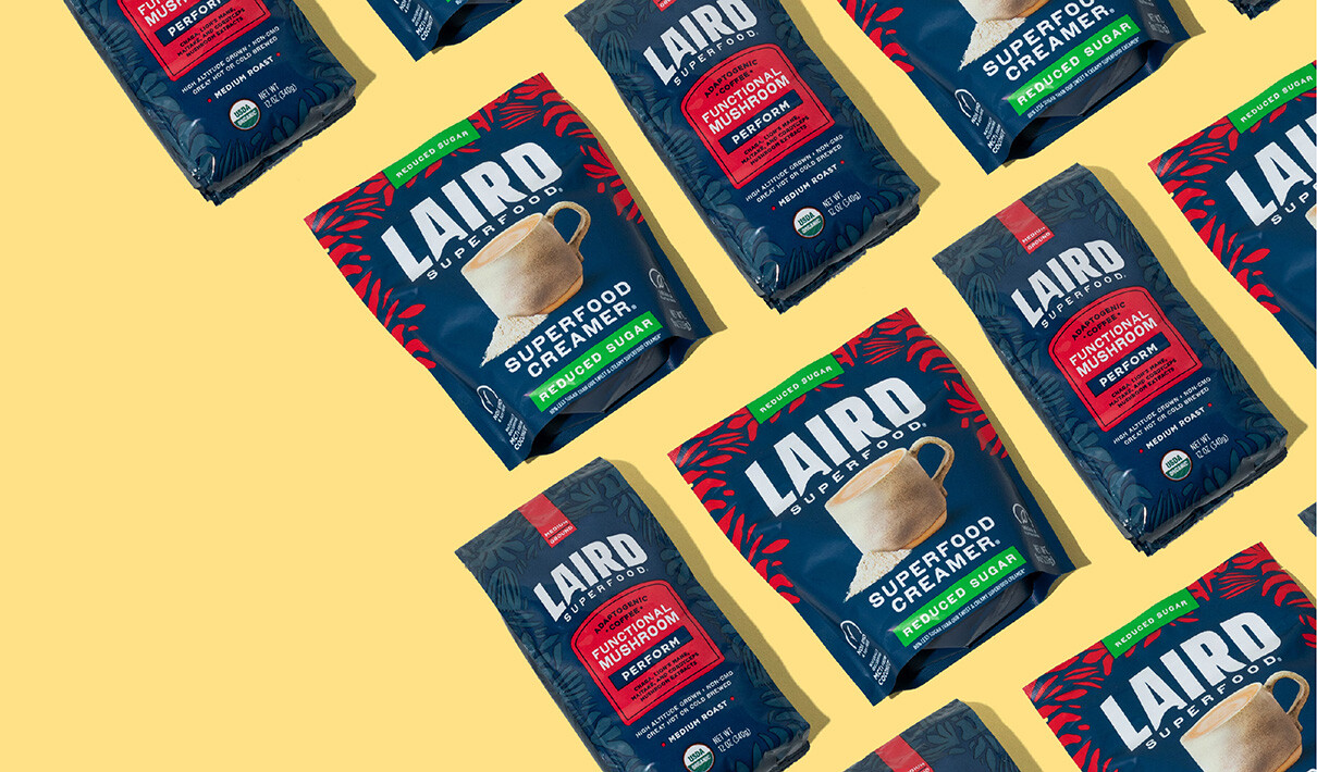
As Hamilton had once revolutionized big-wave surfing, the teams at Stone Strategy & Design and Laird Superfood did the same for the brand’s package design. The new look is almost completely bathed in a deep-blue color that evokes the ocean. It replaced the chromatic patchwork and photography of the original design, which featured a bright-orange swath above a medley of photos.

“There’s a simplicity and naturalness to that deep blue that aligns well with the Laird Superfood brand, and it creates a really nice canvas for other colors to pop,” commented Kelley Cobb, senior brand leader at Stone Strategy & Design. Wolf added that the blue also served as an excellent differentiator across the entire portfolio. “We always try to make the system as unified as possible, as different as necessary,” she said. “Within each of the aisles where a Laird product sits, we realized this blue could be a disruptor.”
As Hamilton had once revolutionized big-wave surfing, the teams at Stone Strategy & Design and Laird Superfood did the same for the brand’s package design.

Laird Superfood had its genesis in Hawaii (Hamilton created the recipe in his kitchen in Kauai), so there is also a nod to the 50th state on the package as well. The red palm-leaf aesthetic provides a perfect complement to the deep-blue background, adding texture and personality that aligns with the brand’s birthplace, which also happens to be the state Laird and Gabby call home.
These creative choices were part of an overarching aesthetic—nature—that Stone Strategy & Design wanted to carry through the entire design. “The intention was to point back to nature as much as we could,” Cobb said. “We wanted the mug to feel earthy, ceramic, and handmade. We wanted the ingredient cues to be really natural, not super-stylized. The ingredients were to be hand-broken and hand-crushed. And the leaf pattern is another way to drive home that natural feel.”
A surfing theme dominated the old design, and while the sport was clearly central to the brand’s genesis, the team at Laird Superfood was open to a change. “We had a robust discussion about having an image of Laird on the front of the pack, but realized it was taking away from other elements such as taste appeal,” recalled Opela.

In the six months following the launch of the new look, the brand’s superfood creamer saw a nearly 6% boost in sales compared to the same period a year earlier.
Hamilton would still be featured throughout the brand world (and the back of the packaging), and Cobb said they would honor the founder by taking a cue from the man himself. “It was less about putting Laird's face on the front and more about capturing the essence of his confidence,” she said. “It takes some guts to ride a hundred-foot wave, and we needed to capture that, not to mention give more attention to this delicious creamer he created.” Another way to capture that audacity was to make Laird's logo extra large with a subtle wave shape within the ‘A.’ “So the boldness of the brandmark really fits the brand, helps build awareness, and it allows the brand to be bigger than just him or just Gabby,” Cobb added.
At the time of the launch, traditional marketing was taking a backseat at Laird as the brand repositioned itself for growth, so the updated design was a big part of the company’s new focus. “It was really about getting this amazing packaging out there,” recalled Opela. “The idea was: when in doubt, let the packaging shine. As long as we had this new design and we were telling the stories of our founders in its assets, we knew it was going to work.”

The packaging did indeed shine, and Laird Superfood is riding high after seeing the sales results. In the six months following the launch of the new look, the brand’s superfood creamer saw a nearly 6% boost in sales compared to the same period a year earlier. This aligns with Designalytics’ analysis: 65% of category buyers preferred to purchase the new design over the previous version.
Making such a sharp departure from the original design was bold, and Opela believes that was integral to the success of the design. “We purposefully leaned into Laird's gutsiness and the reasons he started the business in the first place. We tried something bold, leaned into his personality and what’s authentic about the brand, and I think that's what made it so successful.”


