 Brand: Malk
Manufacturer: Malk Organics
Agency: Riser
Malk has steadily built a devoted fan base since its launch in 2015. The dairy-alternative brand, which prides itself on using limited, organic ingredients, has achieved national distribution in Whole Foods in addition to some regional retail outlets. That popularity has not occurred in a vacuum, though: the plant-based-milk space overall has grown immensely and there has been a corresponding boom in competition. Stagnancy in such an environment can seriously curdle a brand’s growth, and Malk needed to adapt.
“I was brought into the business in October 2020 to find a way to accelerate the brand,” said Jason Bronstad, CEO of Malk. “We evaluated our packaging as part of that process, and realized that we weren't communicating who we were as effectively as we wanted to.”
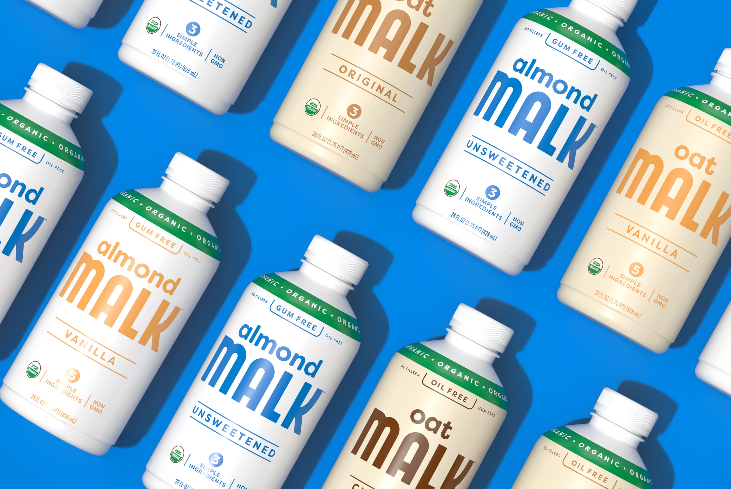
Bronstad noted that Malk occupies a differentiated position in this space—it wasn’t necessarily about what the brand had, but what it didn’t have. “We offer the cleanest plant-based products you can buy. We have competitors that call the ingredient side of the packaging ‘the boring side.’ We actually encourage consumers to turn our bottle around. We want people to see everything we leave out of our product.”
Bronstad and his team engaged the design agency Riser to help tell its story more effectively. Riser’s co-founder, Paul Marcucilli, recalled that there were clear challenges to address at the outset of this project. “The current design felt a little generic and it was a bit challenging to shop,” he said. “We also wanted to be able to speak to the entire household, not just a certain age group. In other words: The package needed to be cool enough to be Instagrammable, but approachable enough for the everyday shopper.”
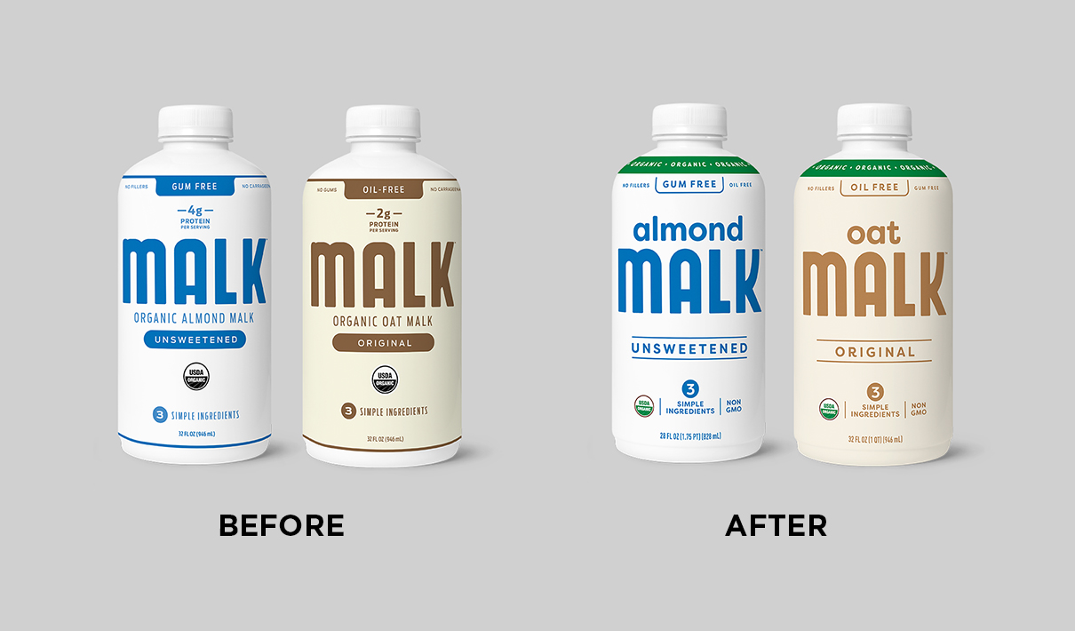
It was important to respect the fairly large base of consumers who were familiar with the brand, but improvements needed to be made in order to remove potential confusion at the point of purchase. For example: The Malk logo was prominent on the old design, but the variety (e.g., oat, almond, etc.) was harder to see—and given that consumers often have a preferred plant-based milk, that was potentially reducing the design’s effectiveness. Plus, even though the brand prides itself on being organic, that wasn’t always clear to consumers. “We had found in our research that it wasn't always obvious that we were organic, so we needed this redesign to address that issue,” noted Bronstad.
After aligning with Malk on the creative brief, Riser created several concepts—some of which strayed far from the original packaging. “I think it’s helpful for the client to see what might be outside of their comfort zone in order to gauge where the creative should ultimately go,” Marcucilli stated. “Sometimes the more revolutionary options help everyone realize which evolution feels right.” Bronstad concurred: “People learn from discomfort. By providing options that pushed the boundaries, Riser helped us cement where we wanted to be.”
There was a healthy back-and-forth between the brand and the agency as they worked to hone the design, which was all the more impressive because Paul and his partner at Riser, Camila Drozd, were traveling throughout the project. “We've kind of been a bit nomadic since we started the company,” Paul said. “On this project, we lived and worked in Italy, Hungary, the Dominican Republic, and New Mexico. It's definitely a different approach to work, but we’ve found that it inspires us. And some might think we would be less responsive, but it’s actually been the opposite.”
Bronstad found the process more productive because of Riser’s wayfaring worklife, and it lent an air of flexibility to the project as a whole. “We did a lot of fixing the plane while we were flying it,” he recalled. “And as they kept changing their environment, it seemed to make them ever more present in the project.”
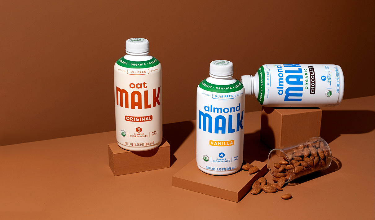
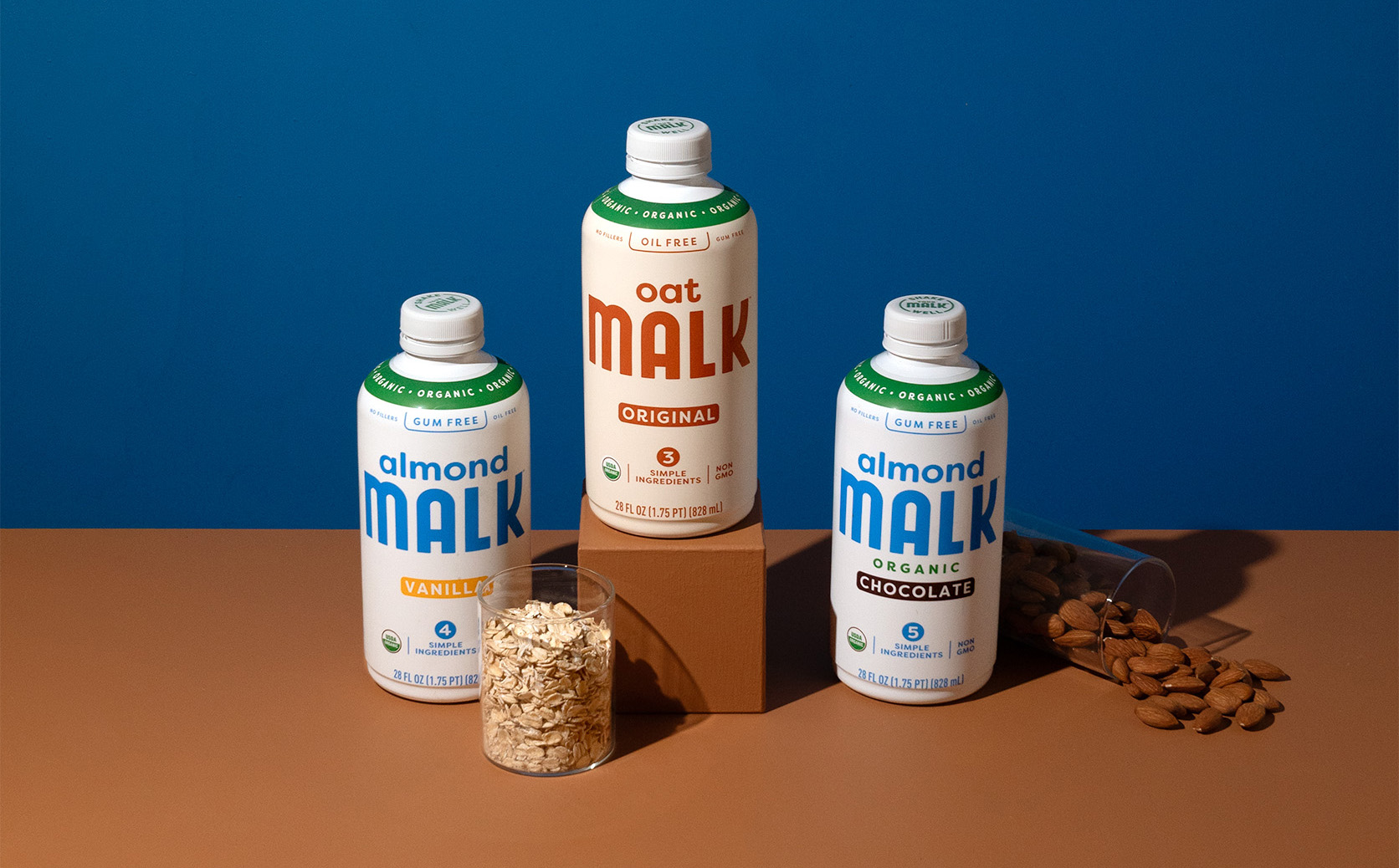
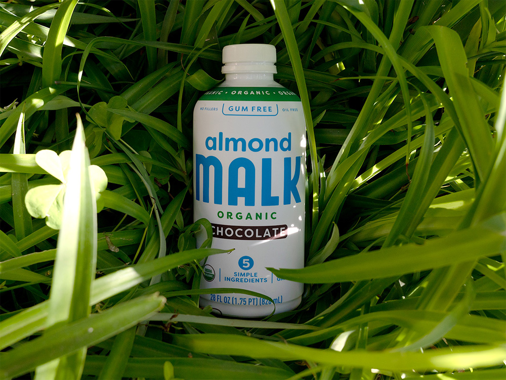
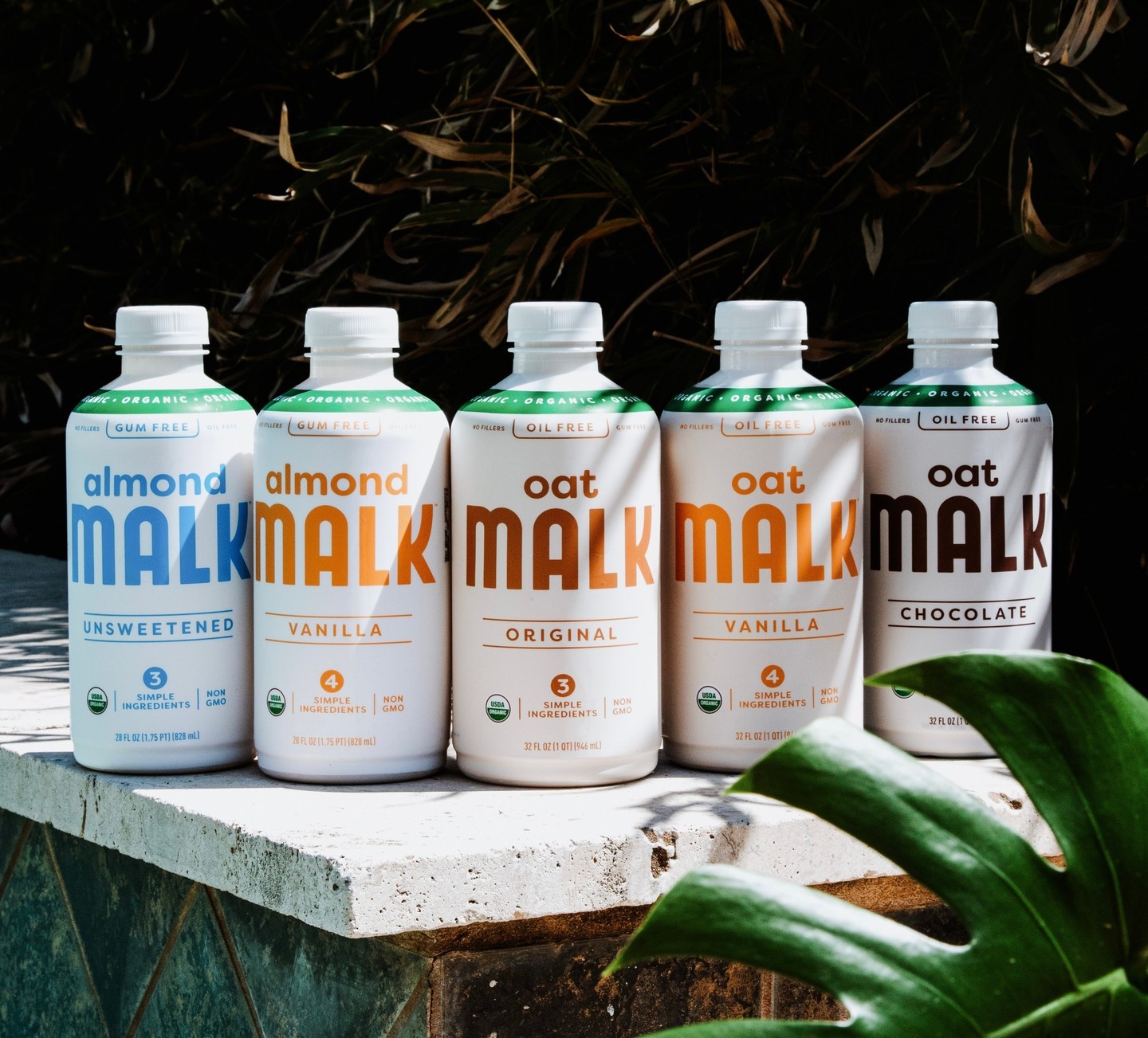
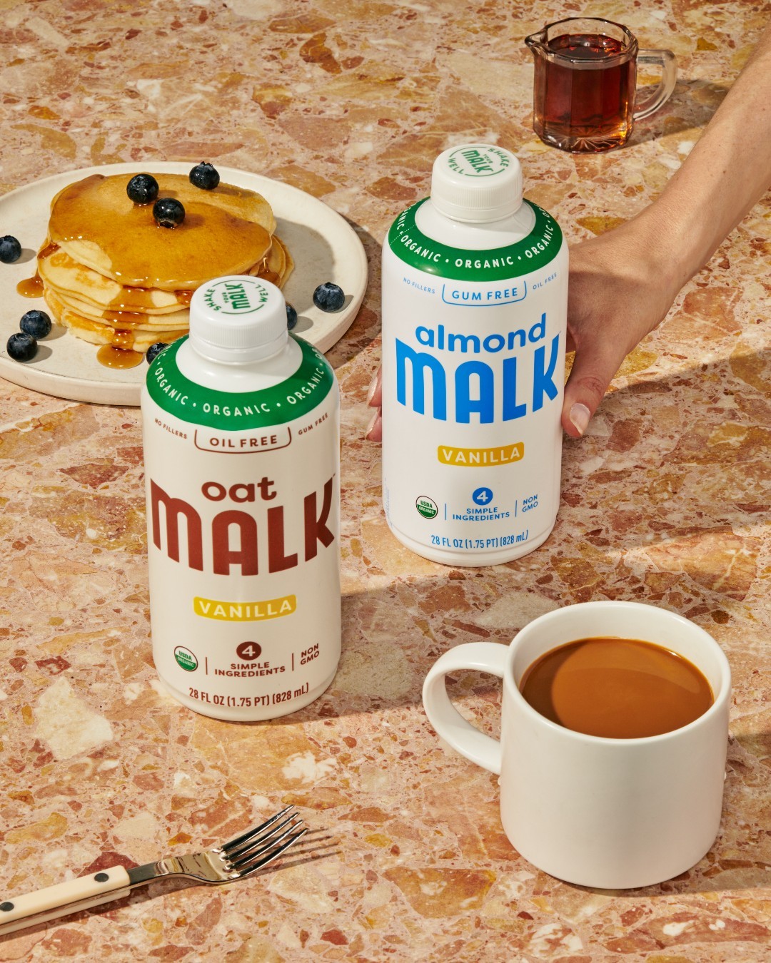
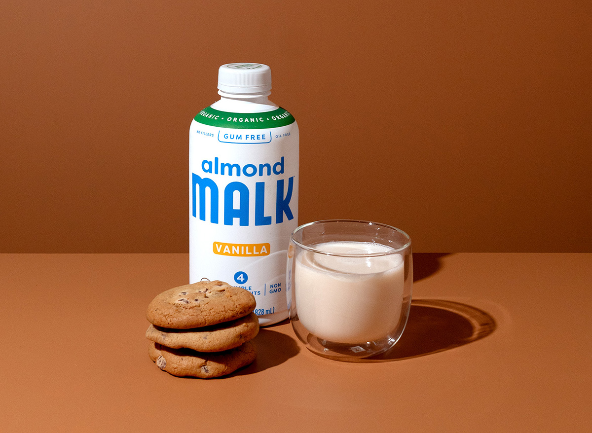
The final design stayed fairly similar to the old, but with some clear enhancements. For one, the bottle features a green band around the neck that says “organic” in order to highlight this important differentiator. In addition, each variety of the milk—almond and oat, for example—was easily seen and placed alongside the wordmark so consumers could quickly identify it.
Riser also relegated or removed other design elements—the “USDA Organic” was moved down, for example, and the protein call-out was dropped from the front of the package altogether. “The protein wasn’t a big selling point for consumers, and we wanted to keep the package clean,” said Marcucilli.
The cleanliness of the package was, in part, meant to mirror the product itself. Each of Malk’s products is made without the additives found in other plant-based milks, so conveying the simplicity of ingredients was paramount. “Almond milks generally have a lot of gums, and oat milks typically have a lot of oils,” commented Bronstad. “We have none of that. Riser did a phenomenal job of making sure that ‘no gums, no oils’ message really pops on the package.”
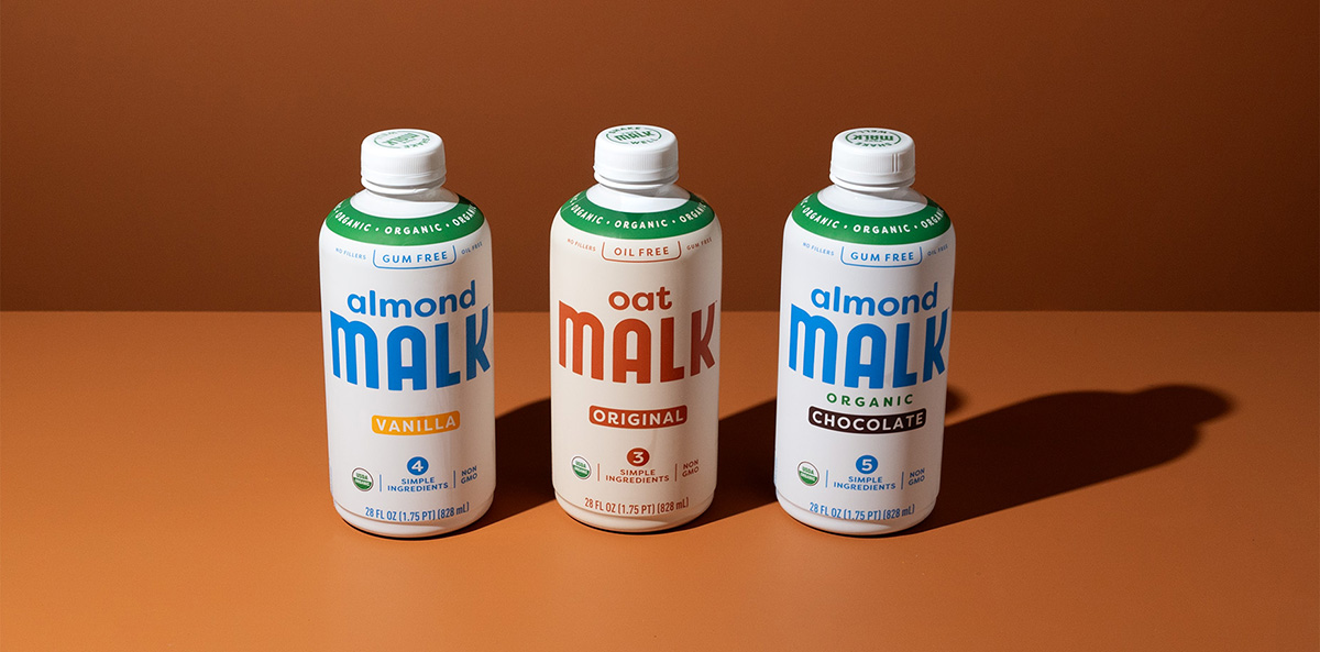
It was also important to convey that the products are with minimal ingredients (5 or less, depending on the variety), a message that is now stacked directly below the brand name. Bronstad appreciated Riser’s attention to detail on this design element specifically, because the agency took into account the wide variety of shelves upon which the product would be placed. “Not all shelves are created the same, and there are often price tags and other barriers that can obscure the lower part of your package. And yet, I would say that in 85-90% of stores in America, the ‘simple ingredients’ call-out now sits above any barriers on the shelf. That’s huge.”
When the new design arrived in stores, there was an immediate positive response, including from Malk’s top retailers. “As soon as it started hitting shelves, it was clear that it was sparking interest,” recalled Bronstad.
Consumers agreed: According to Designalytics analysis of the old and new designs, 78% of consumers preferred to purchase the latter. Ultimately, the sales numbers confirmed that the redesign was a success—the brand saw an impressive 56% increase in sales over the same period the previous year, pummeling the category growth rate of 8%.
The brand saw an impressive 56% increase in sales over the same period the previous year, pummeling the category growth rate of 8%.
For Bronstad, the success of the new design unleashed a world of possibilities for the brand. “Our new marketing strategy started with this redesign,” he said. “Once we had this great new package that clearly highlighted who we are, we leaned in on marketing for the first time in a long time.”
Marcucilli believes that staying focused on what works for a design—rather than solely focusing on aesthetics—was key to the success of the redesign. “You have to think: What's going to resonate with the consumer? If a design looks good, but doesn’t have an impact for the client, then it isn’t doing its job. I think the challenge lies in creating something that's visually compelling but is also going to bring results.”
“You have to think: What's going to resonate with the consumer? If a design looks good, but doesn’t have an impact for the client, then it isn’t doing its job. I think the challenge lies in creating something that's visually compelling but is also going to bring results.”