 Brand: Mr. Clean Clean Freak
Manufacturer: P&G
Agency: Chase Design Group

In the pantheon of characters that adorn CPG packaging, there are few who are as well-known as Mr. Clean. Since his creation in 1958, the bald, muscular man with the golden earring has become synonymous with home hygiene and has helped make the brand he represents among the most successful in the industry. So, reducing the famed character’s prominence on the Mr. Clean Clean Freak package was probably not top of mind for the brand. That is, until it became clear through consumer research that another element of the design warranted a bit more attention.
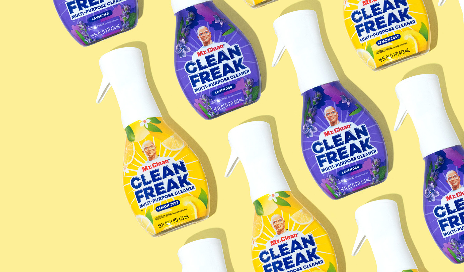
First, some background: Clean Freak was launched in 2018 as a next-level cleaning product in the esteemed brand’s portfolio. The cleaning solution was its most effective product yet, so the original packaging understandably highlighted its strength and efficacy. It was labeled a “deep cleaning mist,” and the shine-burst on the package (along with the gleaming brawn of Mr. Clean) was meant to signal the highest standard of cleanliness.
Once the product was in the market for a few years, the brand conducted interviews with Clean Freak users to understand how they were using the product. The results were eye-opening; while consumers loved the product, some saw the term “deep cleaning” as a cue that it should be used only on the most challenging messes. “At that point, we knew we needed to reinforce that this product is great for cleaning all messes, not just the toughest ones,” said Jen O’Quinn, senior design director for home care brands at Procter & Gamble (P&G), which owns Mr. Clean.

In addition to some misperceptions about the product’s everyday utility, there were other helpful insights —including one that really stood out. “The research showed that we had an opportunity to amplify an element consumers loved: the scent,” O’Quinn noted. “In the original design, highlighting scent was a lower priority than our iconic character, but we saw the potential in flipping that balance.”
This realization coincided with a trend the Mr. Clean team and its agency, Chase Design Group, had seen in recent years. The all-purpose cleaner category had grown, and scent-driven products were becoming more prevalent and popular. The good news was that Clean Freak had a strong fragrance story to tell. “Scent is something that people crave as a part of their cleaning routine; it’s one signal of a job well done,” said Meredith Morten, associate creative director at Chase Design Group. “We already had scents that people love—lemon and lavender—and scents that you cannot get in any other spray, like Gain and Unstoppables.”
The primary goal was to emphasize the aromatic qualities of Clean Freak, but the brand also wanted to educate consumers about the product’s value in everyday use and to clearly show which surfaces it works best on, like greasy kitchen messes, bathroom soap scum, and countertops. “The brief was incredibly focused—it was the type of brief that gives you the opportunity to think about many solutions to the problem,” said Morten.

Chase Design Group wanted to ensure the Mr. Clean team a broad range of design options to consider. The agency ended up presenting five concepts (“ranging from mild to wild,” quipped Morten) and the chosen design ended up one of the more expressive options.
The new look was reminiscent of the previous one but refreshed—and undoubtedly reflected the redolence of the product within. Whereas the previous design alluded to scent primarily through color cues (with small depictions of the fragrance at the bottom of the package), the updated packaging leans heavily on sensory illustrations. Large lemons or lavender blooms, for example, dominate the design, not only because they evoke a particular aroma but because they convey a sense of clean. “Consumers love the intensity of our fragrances and view it as a signal of cleanliness,” said Morten. “We wanted to lean into this key delighter and dial up the scent visually.”

Since the scent illustrations required ample space on the packaging, the usual star of the show—the legendary Mr. Clean himself—had to become a little smaller. “To give us more room to play, we made some strategic choices, one of which was reducing his scale. He is still central to the pack, but now he is surrounded by scent graphics. We also kept the graphic burst and the name ‘Clean Freak’ to maintain that link to efficacy,” Morten explained.
“Consumers love the intensity of our fragrances and view it as a signal of cleanliness. We wanted to lean into this key delighter and dial up the scent visually.”

Speaking of efficacy, the brand aimed to communicate the potency of its formula even more clearly. For example, “cuts through grease and grime” is one of the top purchase drivers in the category, and the updated sticker on the package’s nozzle hits on this directly. The brand used those words exactly (adding “on contact”), replacing the less-specific “3X cleaning power” messaging and icons. It worked well—in fact, Mr. Clean outperforms the entire category in conveying that message, according to Designalytics’ analysis.
To ensure consumers knew the product’s value in everyday use, the Mr. Clean team changed the product description from “deep cleaning mist” to “multi-purpose cleaner.” “The ‘deep cleaning’ message wasn’t aligning with how current Clean Freak fans were utilizing the product. They were using it more regularly for the delightful scent and shine,” Morten commented. “We looked at several statements of identity to pivot away from ‘deep cleaning,’ and consumers preferred straight-forward language which communicated versatility and daily mess cleaning, like wiping down countertops after dinner.”

During the 26 weeks following the new design's launch, sales sparked double-digit growth compared to the same period during the prior year.
Once it hit the market, it became clear that the new design was a winner. During the 26 weeks following the new design's launch, sales sparked double-digit growth compared to the same period during the prior year. Designalytics’ research aligned with that result: 66% of category buyers preferred to purchase the new design over the previous version.
Anecdotal response to the design from retailers, salespeople and consumers has also been very positive, which has further solidified the redesign’s role in the marketing of the product. “Clean Freak’s new and thoughtful design is pulled through in various other ways, including on in-store retailer displays and in advertising online and on TV,” said Rick Mason, senior communications leader at P&G.
According to Morten, the brand and agency teams’ trust in each other—and in consumer feedback—help guide the project’s success. “What is great about working with the Mr. Clean team at P&G is that we challenged each other as a group to push the boundaries on design,” she said. “We changed the design based on the deep knowledge of the consumer and category. Everything we did was rooted in data, and it felt good to see that pay off.”


