 Brand: Partake Brewing
Manufacturer: Partake Brewing
Agency: Designsake Studio

Partake Brewing had an undeniably auspicious beginning. Founded in 2017 by Ted Fleming, the Calgary-based brand was featured on Dragon’s Den (Canada’s version of the popular U.S. show Shark Tank) the following year, where it secured funding and invaluable exposure. This television notoriety, dovetailing perfectly with burgeoning consumer interest in craft, non-alcoholic (NA) brews, helped establish Partake as a category leader in the Great White North.
With an excellent product and a base of loyal consumers, Partake was poised for growth and ready to enter the U.S. market in retailers like Target and Costco. Yet the same demand that had buoyed the brand had invited a veritable cavalcade of competitors. “The commoditization of the category seemed to happen overnight,” recalled Sara Ross, VP of marketing at Partake. “All of the players were trading on the same functional benefits, and very quickly we saw the shelf set look completely different.”

In order to contend with this rapid transformation of the category, Partake understood it would need to revisit its packaging, which hadn’t changed since it first launched. They elicited the help of Designsake, a San Francisco-based branding and packaging agency, to create a flexible new design system that would position Partake for growth in the years to come.
As the folks at Designsake were developing the brief, they immediately realized there was a huge opportunity in the space. While the category was growing, many NA craft-brew brands had appealed to niche targets, and the market hadn’t matured to the point where one NA beer could appeal to a broad, diverse audience of alcohol-avoidant consumers.
For example, the most popular player in the non-alcoholic craft beer space, Athletic Brewing, had largely tied itself to active consumers simply by virtue of its name. “Partake has a totally different appeal,” Ross asserted. “It's more for a Renaissance person, someone who has a lot of interests and hobbies and doesn’t want to be pigeon-holed. You can be an athlete and drink Partake, but you can also build model cars, be really into gardening, or any number of other things.”

Like others in the space, Partake had entered the market wanting to represent the benefits of the category—good-tasting beer without the booze—but now it wanted to stake its unique claim. “Previously, the appeal for consumers was participating in beer, enjoying it while pursuing your passions, but without the alcohol,” said Danielle McWaters, founder & creative director at Designsake. “Now, we needed to stand for the value our consumers were looking for, no matter what their passions. And the visual expression of the concert on the old design limited us in that regard.”
The concert imagery McWaters referenced was a dominant feature of the previous package, and it was among the first things addressed by the teams at Partake and Designsake. The image had worked at their start—it suggested fun, conviviality, and reclaiming moments often associated with alcohol—but the brand’s shift to focus on its unique differentiators called for a fresh approach. “Strategically, that was no longer what we wanted as a brand, so it made sense to step aside from that design element.”

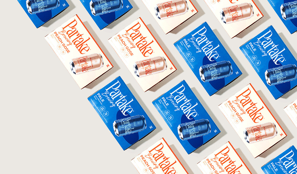
So what would replace it? In large part, the teams decided on color—a full palette of bright, bold colors that have been linked with different styles of beer (blue for pale ale, green for IPA, etc.). In addition to creating a powerful brand-blocking effect on shelf, it evoked visual cues long associated with traditional beer. “There is really a sense of nostalgia with certain colors as it relates to beer; those cues have existed for a long time,” McWaters stated. “And while others were focused on trendy visuals happening in the space, we wanted to lean into those bold, confident colors that also spark nostalgia.”
Confidence, the brand understood, wouldn’t come just from the colors themselves. It would come from embracing unapologetic simplicity, and the design still needed to deliver on the functional benefits consumers want. Ross put it this way: “The idea was: if people spend seven seconds or less with our can, we want them to know the name, the brew variety, and the calorie count. Everything else is icing on the cake.”
“If people spend seven seconds or less with our can, we want them to know the name, the brew variety, and the calorie count. Everything else is icing on the cake.”

The calorie count is a clear differentiator for the brand (for example, Partake’s IPA has 10 calories, while Athletic’s Run Wild IPA has 65), so it is featured in a circle at the top-center of the can—understated but unmissable. Below that, “non-alcoholic” is prominently displayed above the variety (blonde, pilsner, pale, etc.).
Finally, the logo was transformed: The previous design’s brush-stroke script in small block lettering was replaced with a large, confident, serif font for Partake, along with a charming script for the word “brewing.” It is proud, centered, and insistent. “The typeface is more consolidated, has a taller X height, and is a better use of the real estate on the can. Having a good sense of the shelf set, we designed it so that consumers could very quickly see and understand what they’re looking at in that shopping environment,” said McWaters.

The brand's sales grew by an impressive 29%... This represents a complete change in trajectory, as the brand’s sales were flat during the year before the redesign.
Though it was a considerable departure, the brand’s new look also maintains a connection to Partake’s past. “We wanted to honor where the brand had been,” Ross said. “So even though we have overhauled the look and feel of the brand, you can see echoes of the previous design—we generally stuck with the colors, we maintained the horizontal presentation of the logo, and a script font is even included as a homage to the former packaging.”
The good times certainly seem to be rolling for Partake after this redesign. During the six months following the launch, the brand's sales grew by an impressive 29% relative to the same period during the previous year. This represents a complete change in trajectory, as the brand’s sales were flat during the year before the redesign.

A groundswell of post-redesign enthusiasm among retailers has likely helped garner additional distribution—the brand recently gained distribution in Whole Foods across the U.S., for example—which undoubtedly contributed to those sales gains. “I think the design may be opening doors for us that weren’t before,” Ross stated. “This confident, modernized presentation of the brand has been very exciting, and I think it’s helped us gain significant traction in what we’re trying to achieve.”


