 Brand: Suave Kids
Manufacturer: Yellow Wood Partners
Agency: 1HQ
Suave is one of the most recognizable brands in America—the company claims its products can be found in one out of every two households. Such ubiquity is a testament to the power of Suave’s brand, which makes changing any of its package designs an even more noteworthy and fraught undertaking.
Suave (which was owned by Unilever before its acquisition by Yellow Wood Partners earlier this year) launched the Suave Kids brand in the 1980s, and has seen widespread success ever since. Times (and the category) have changed in recent years, and even established brands like Suave Kids have understood the need to revamp packaging. The brand reviewed its portfolio—which includes body washes, hair care products, and even bath bombs—and recognized plenty of areas that needed improvement.
Suave asked 1HQ, a global branding and design agency, to pitch a new design vision for its kid-based brand. The agency established from the outset that, despite Suave Kids’ status as a category leader, the redesign would require a new way of thinking. “One of our team members actually brought her nine-year-old niece to the original pitch meeting with Suave,” recalled Kate Rascoe, creative director at 1HQ, with a smile. “She contributed to our creative strategy and thought starters.”
The pitch obviously made an impression, as 1HQ was tasked with redesigning the Suave Kids portfolio. As the brief was developed, one of the first questions that needed to be answered was fundamental: Who would be the primary audience, kids or caregivers? “We started our strategy looking at a spectrum: Should we focus more on the product proposition to the mom or decision-maker, or should we do something more kid-focused?” said Rascoe. “We saw competitors who were speaking to both sides. In the end, we decided to firmly plant ourselves on the ‘kid’ side of the spectrum, really leaning into fun.”
"We saw competitors who were speaking to both [kids and parents]. In the end, we decided to firmly plant ourselves on the ‘kid’ side of the spectrum, really leaning into fun."
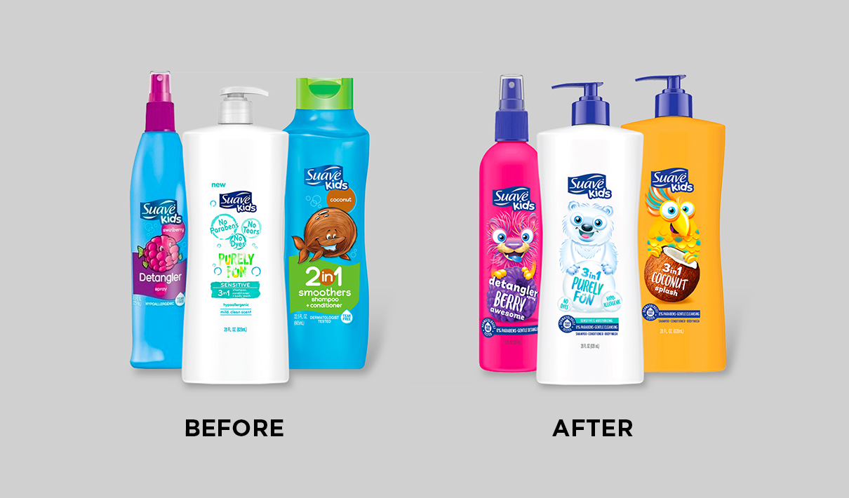
That frivolity would have to correspond with consistency, however. The brand needed to ensure there was cohesiveness across a portfolio that had grown somewhat disparate from a design perspective in recent years. “There were varied iterations of designs—different collections that weren't all really living in a consistent world,” noted Rascoe.
Another goal was to clarify and standardize some claims. “We needed to create coherent communication to make the brand easier to shop,” explained David Macari, 1HQ’s senior director of client strategy and partnerships. “For each of the products, we needed to convey the primary function and benefit in a consistent way, so it was easier for consumers to understand at a glance.”
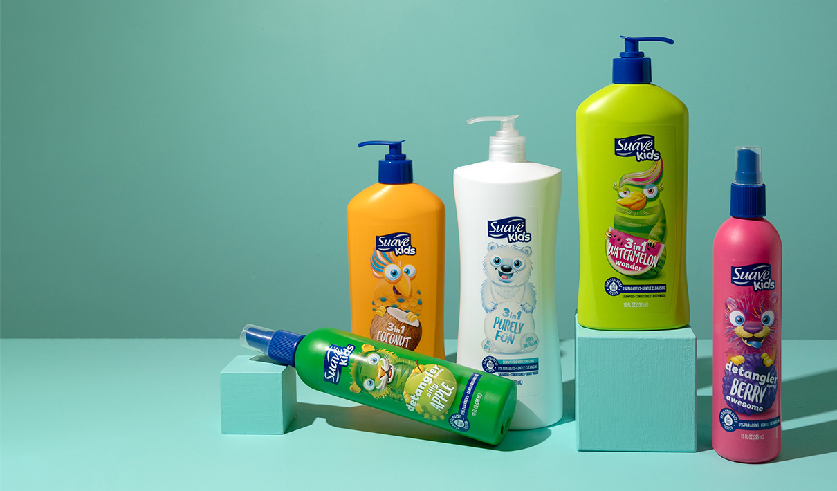
Character illustrations, however, would be the true stars of this redesign. They had been rendered in different styles on the previous packages, and came across as dated. The team agreed that new illustrations and ownable personalities should be a vital element of this design, especially since the packages in this category often feature a number of recognizable properties from animated shows and movies (including some Suave Kids’ products that feature Paw Patrol and Frozen, for example).
To create the initial concepts for the characters, 1HQ engaged a children’s book and product illustrator named Russell Benfanti. “We worked with Russell for some of the character designs to create a look and feel that would be engaging, three-dimensional, and competitive with licensed properties,” Rascoe commented.
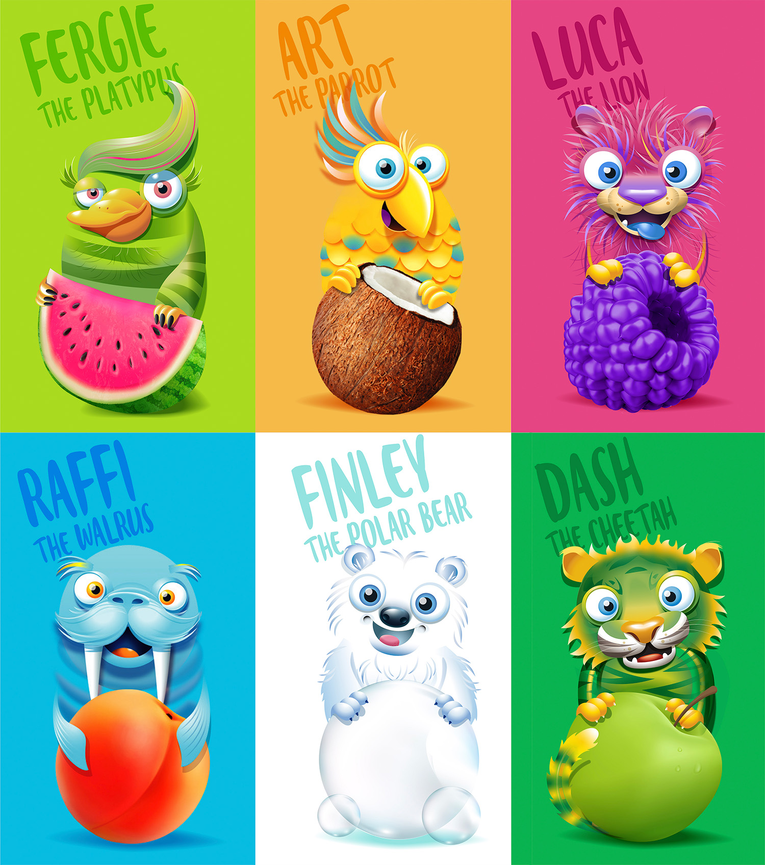
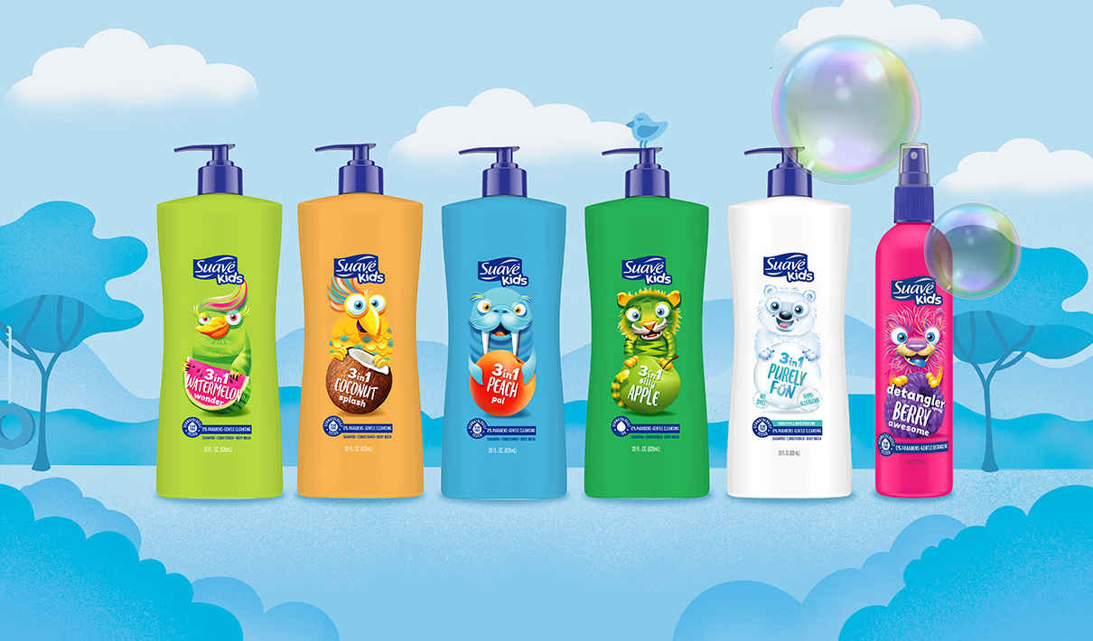
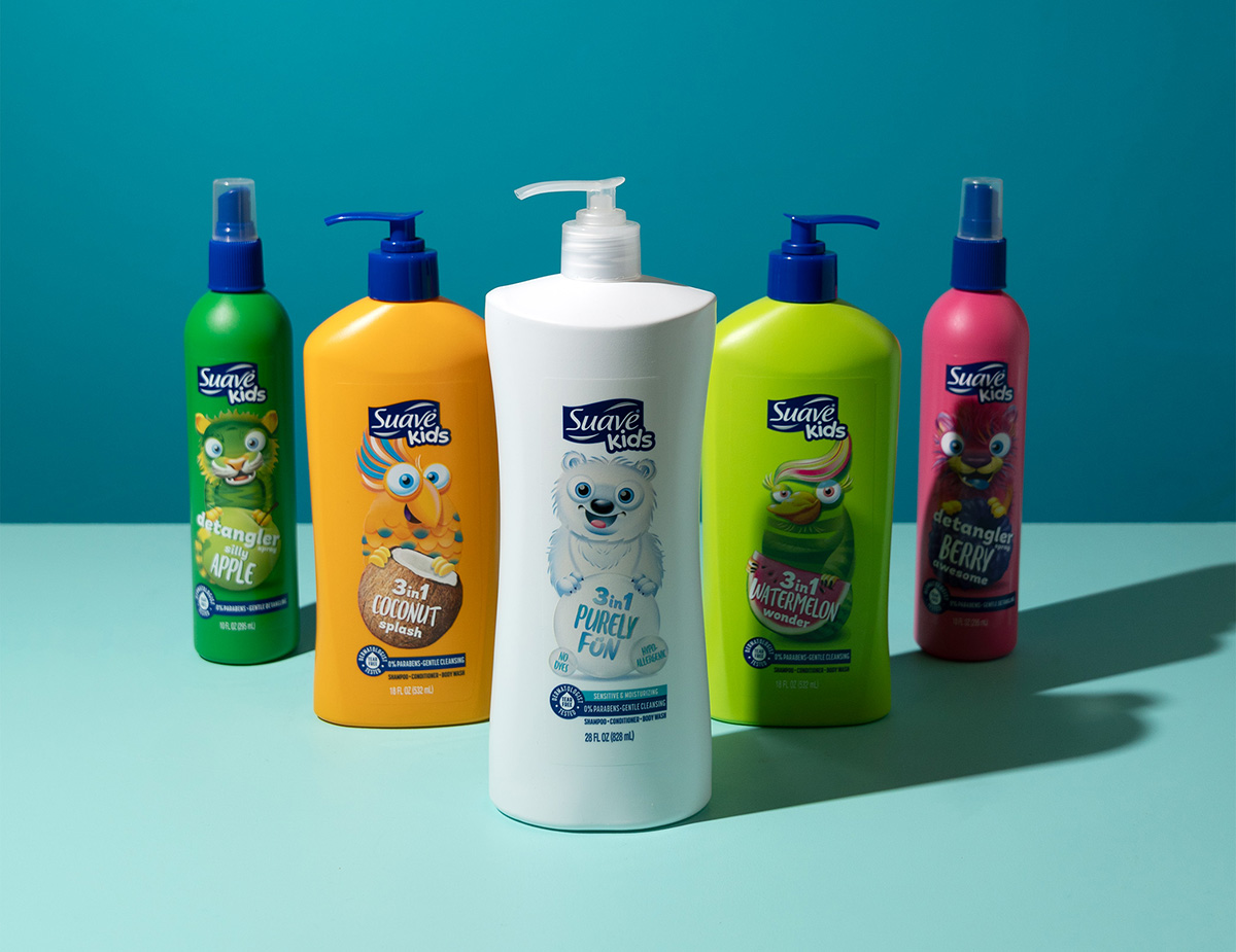
The agency then developed these illustration concepts into a lineup of wide-eyed, colorful animal characters with quirky names like Raffi the Walrus, Dash the Cheetah, and Luca the Lion, among others. Each is designed to represent a different personality, but they also form a bathtime menagerie of sorts—Suave Kids calls them the Sunshine Bay Crew. “The packages almost become collectibles, really. The parent buys one, but kids enjoy variety and may want to try another one. I know my nieces and nephews are like that,” Macari commented.
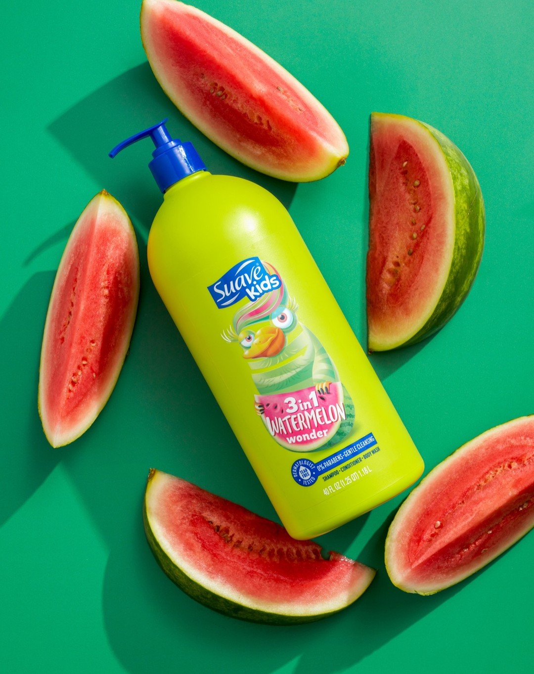
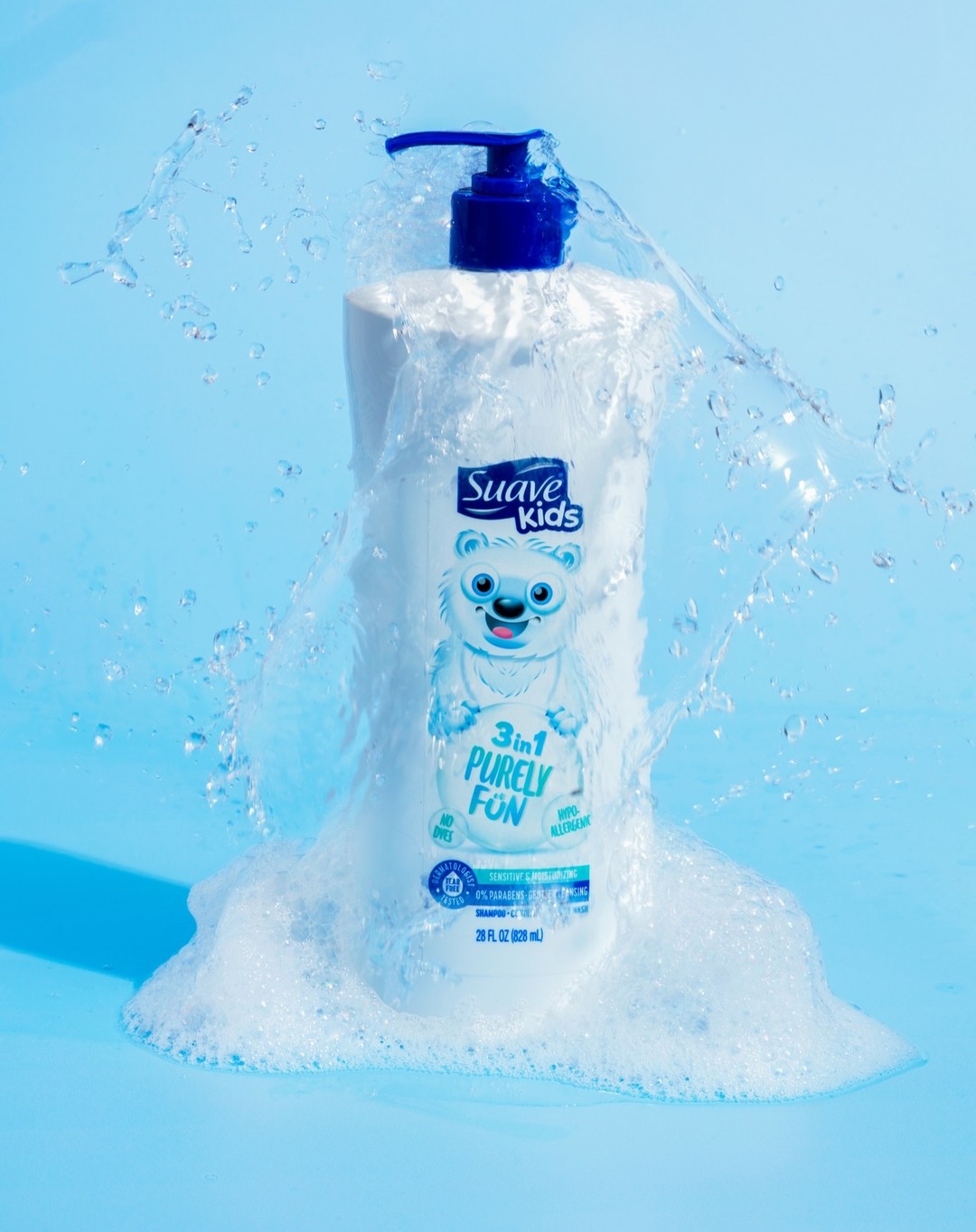
To create a sense of playful cohesion across the portfolio, the brand chose a multicolor approach that would align with the flavor-focused scents and these new characters. Raffi the Walrus, for example, is light blue on a blue bottle, and he’s hugging a peach. “We wanted to build something that was captivating and even inspiring to kids, where each color has a unique fit with the character and the scent,” Rascoe noted.
The characters, colors, and the corresponding fruit imagery communicated a lot, but the brand understood that parents would need more information. Thus, each of the new designs contains clear messaging—in consistent places on the package—about the products’ ingredients and efficacy. “We sought to establish the architecture of communications and make messages like ‘dermatologically tested’ or ‘0% parabens’ prominent because we knew this was important to primary purchasers like moms,” said Macari.
One element that did not change appreciably was the Suave Kids logo, despite the fact that it is relatively small. Together with 1HQ, however, the brand decided that Suave’s standing in the market afforded it a rare opportunity to dedicate more space to its story, rather than its logo. “It was a trade-off we were willing to make in order to create engaging characters and let them lead,” Roscoe remarked.
The idea was to create a connection with the kids and get consumers to engage with the product—and then let Suave’s reputation close the deal. “Once you pick it up and see that it’s made by Suave, then it’s like ‘Well, yeah, why wouldn’t I buy this?’ It was really just about optimizing the real estate on the package.”
The brand also made functional changes to some of the packages, increasing the amount in each bottle and opting for a pump rather than its traditional capped top.
Once it was launched, Suave Kids’ new look cleaned up. Sales grew by 11% compared to the same period during the prior year. Designalytics’ consumer research affirms this impressive performance: When category buyers were asked which design they’d prefer to purchase, a vast majority (69%) selected the new over the old.
Sales grew by 11% compared to the same period during the prior year.
The new look clearly resonated with consumers and has paid dividends for Suave Kids. When reflecting on the success of the redesign, Rascoe credited the wide array of talented people that worked on the project and talked about the power of stories in branding. “I’d recommend using stories to anybody working on a project like this. Maybe it’s not characters like it was for Suave Kids, maybe it’s more subtle, but telling the right story can really help you connect to consumers, and stay connected.”
Macari agreed, while acknowledging that it may require some brands to embrace some risk. “In the world we live in, it's very easy to take no chances with design—so don't be afraid to take chances, especially in this world of minimalism and debranding and flattening of assets. Don't be afraid to create new assets and new stories.”
"In the world we live in, it's very easy to take no chances with design—so don't be afraid to take chances, especially in this world of minimalism and debranding and flattening of assets. Don't be afraid to create new assets and new stories."