 Brand: Vermont Creamery
Manufacturer: Land O' Lakes
Agency: Pulp+Wire

Founded in 1984, Vermont Creamery was built on the idea of “consciously crafting” high-quality milks, butters, and cheeses using sustainable farming practices. This has been an abiding mission for the brand—in fact, it became a certified B Corp in 2014, meeting the rigorous standards that demonstrate the company’s commitment to their workers, suppliers, customers, communities, and the environment.
The brand has built a loyal consumer base that has grown steadily over the years. After its acquisition by Land O’ Lakes in 2017, it continued to grow, thanks to increased distribution. Despite this success, Vermont Creamery realized the package design for its cultured butter products wasn’t breaking through enough on dairy shelves. The brand reached out to the Portland, Maine-based design and branding agency Pulp+Wire for help.

The challenge was clear: Its loyal consumers loved the brand’s butter and deeply-held mission, but the brand needed to draw (and keep) consumer attention beyond its most devoted fans. “Certain key aspects of the product weren’t as visible at the shelf, and the brand needed to be more successful in breaking through with consumers,” said Naomi Davidowitz, managing director and partner at Pulp+Wire.
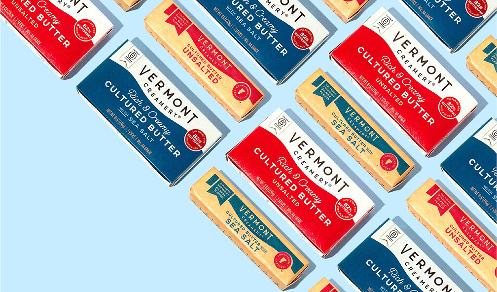
The previous packaging was a testament to simple, wholesome Vermont life. A belly band wrapped around a craft box, with line art depicting an idyllic farm scene, a tasteful logo centered at the top, the signature “consciously crafted” badge at the bottom right, and a narrow swath of color at the bottom with some product information. Pulp+Wire noticed immediately that valuable real estate on the package was being underutilized. “We wanted to maximize our overall space to increase the brand impression on shelf,” said Sara Rosario-Gray, design director at Pulp+Wire.
Simplifying on-pack messaging was another important goal, which wasn’t easy considering the product’s quality and the brand’s natural-foods bonafides. “The inclination is to want to promote everything about the brand and the product,” explained Rosario-Gray. “But we have a limited amount of space on the pack, and we needed to make sure there was breathing room so we could have that ‘billboard effect’ on the shelf.”

The agency explored a number of options for creating that effect, including watercolor and photography, but ended up opting for a billowing, color-blocked “wave” aesthetic. Vermont Creamery had taken such an approach with its cheese packaging in the past, but Pulp+Wire saw the wave as an opportunity to take this approach to the next level. “We wanted to create an element of movement in order to bring the design to life a little more,” recalled Rosario-Gray.
Communicating quality and taste was paramount, so the agency also added an “82% butterfat” callout as well as prominent “rich and creamy” script above the name of the product. “Other premium butters highlight butter fat content, so we wanted to include it to compete among the shelf set,” Davidowitz noted. “The ‘rich and creamy’ and ‘cultured’ add flavor cues that align with the premium ingredient messaging.” The new design also includes a “Certified B Corp” badge to remind consumers of Vermont Creamery’s stellar social responsibility credentials.

To incorporate these elements, the agency knew they’d have to pare down what was on the current design. The “consciously crafted” badge with the outline of Vermont, for example, was moved to the back of the pack, and the farm-scene drawing was removed entirely. “That line-drawing illustration style was very cute and whimsical, but it was taking up valuable real estate in order for us to maximize an impressionable brand block,” noted Rosario-Gray. “Plus, the delicate nature of it was contributing to some of the difficulties in standout, due to the receding nature of the linework and colors. So we didn't feel like we were losing too much by omitting it from this pack in particular.”
That said, Pulp+Wire found ways to nod to the brand’s pastoral New England roots. The agency increased the scale of the company’s logo—an emphatic reminder of the butter’s provenance—and used a clever visual pattern to generate a Green Mountain State vibe. “We intentionally brought in some elements to pay homage to Vermont. The undulating swaths of color, for example, are reminiscent of the rolling hills of the state,” Rosario-Gray said.
“The inclination is to want to promote everything about the brand and the product. But we needed to make sure there was breathing room so we could have that ‘billboard effect’ on the shelf.”

The new look certainly helped churn out additional sales. During the six months prior to the packaging change for Vermont Creamery’s cultured butter, dollar sales had actually declined slightly (-1%) compared to the same period the year before. And in the six months after? A whopping 29% increase over the same period from the previous year. Results from Designalytics’ consumer evaluation confirm these results: butter buyers preferred the new design to the old design by a wide margin (67% to 33%).

During the six months prior to the redesign, dollar sales had actually declined slightly (-1%) compared to the same period the year before. And in the six months after? A whopping 29% increase.
When asked why this design was so successful, Davidowitz said it was a cumulative effect of good design by Pulp+Wire and smart choices by Vermont Creamery. “I think it’s the sum of all the parts. In particular, some of the ways we used subtle design language cues to signal the value of the product,” she stated. “The colors, the typography choices, the choices in call-outs—it all added up to that show-stopping effect the brand was looking for.”


