 Brand: Yasso
Manufacturer: Unilever
Agency: Stone Strategy & Design
The Yasso story began in an appropriate place: with two good friends at ice cream camp. (That’s right. There’s such a thing as ice cream camp.)
Yasso’s founders, Amanda Klane and Drew Harrington, had noticed there were very few better-for-you options in the ice cream aisle. As friends since kindergarten, they knew they’d make excellent partners in a frozen-treat enterprise, but they needed an education—thus, the aforementioned camp (officially, Ice Cream University) that led to the creation of Yasso.
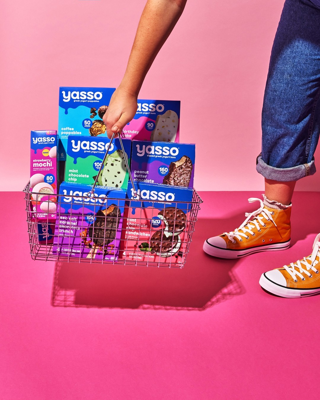
In 2011, Klane and Harrington became the first to bring frozen Greek yogurt bars to market in the United States, and sales quickly skyrocketed. In the ensuing years, the brand’s portfolio expanded to include dipped bars, Greek yogurt sandwiches, mochi, and beyond. Then, the whole category got an unexpected boost from the pandemic: Year-over-year sales for dessert bars, for example, grew 22% from 2020 to 2021.1 “We had crazy successes during that time—everyone was at home craving frozen treats,” said Selina Morse, creative director at Yasso. “So it was a good category to be in.”
Riding high, Boulder-based Yasso was in a solid position to take the next step in its evolution. In order to continue growing, its packaging would need to stand out more on the shelf and be more ownable amidst a growing and increasingly-fragmented space. The brand engaged another Colorado company, Stone Strategy & Design (based in Golden), to improve the package design while staying true to Yasso’s established, one-word ethos: joy. “Our personality was light and jovial, and everything we did needed to ladder up to the idea of joy,” said Morse. “We believed our brand should feel like you’re being invited to a fun party.”
“We believed our brand should feel like you’re being invited to a fun party.”
As the project got underway, one question arose: How far could the brand go with the new look? “We asked our CMO at the time if we needed to stay close to the design we had,” said Morse. “And he gave us the go-ahead to push it. He said ‘Tell me what you think would make it better.’ And I remember thinking ‘We really have permission to take off the lid of this thing and see what it can be.’”
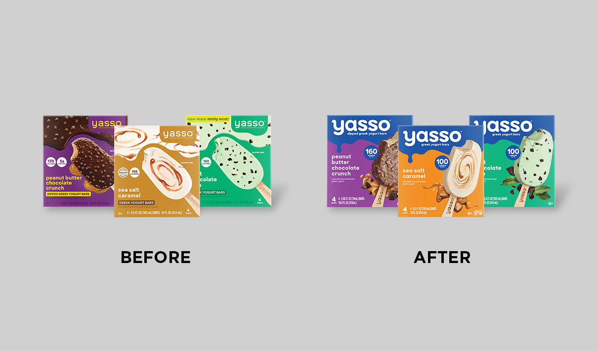
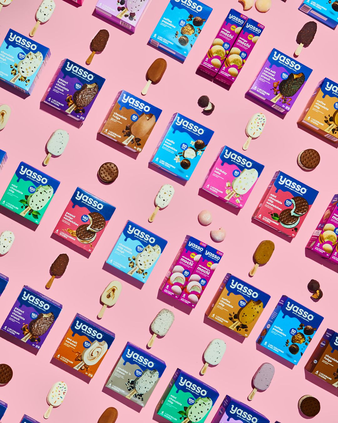
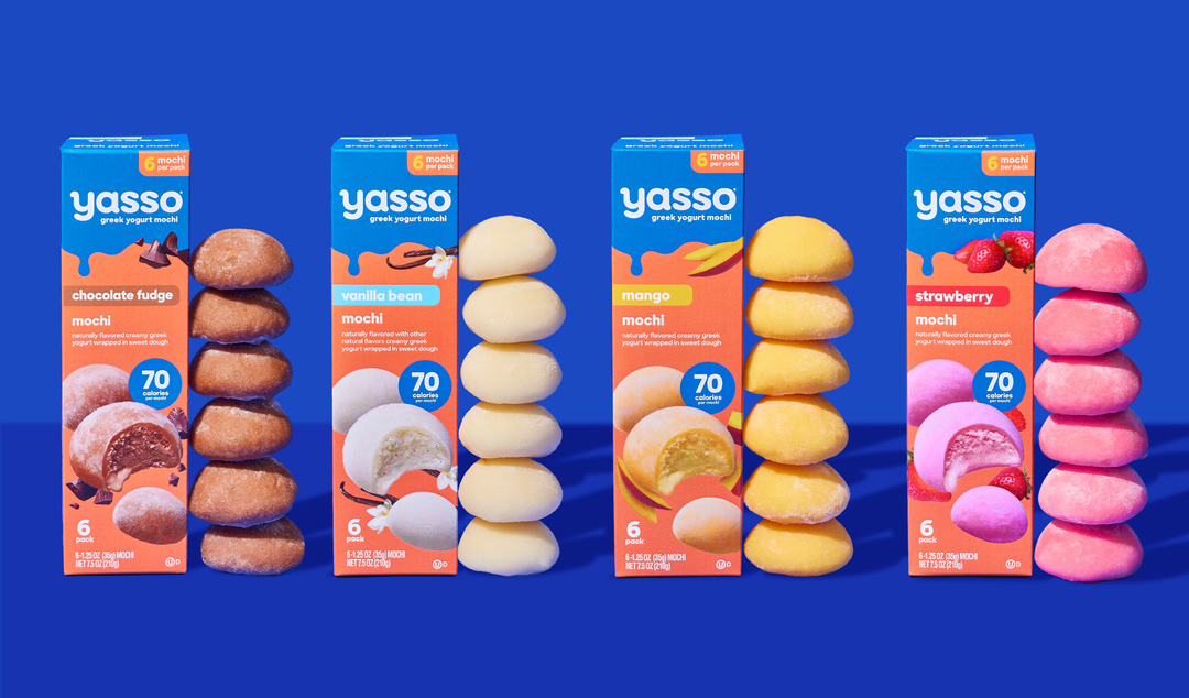
With such strong support for a creative approach to the redesign, it was only a matter of where to begin. The first challenge, according to Morse, was color. With the old design, the backdrop color for the logo would change for each flavor, which was proving to be problematic. “Consumers would buy a particular flavor of Yasso and love it. Then, they’d go back to the store to try another flavor, and have trouble finding us,” said Morse.
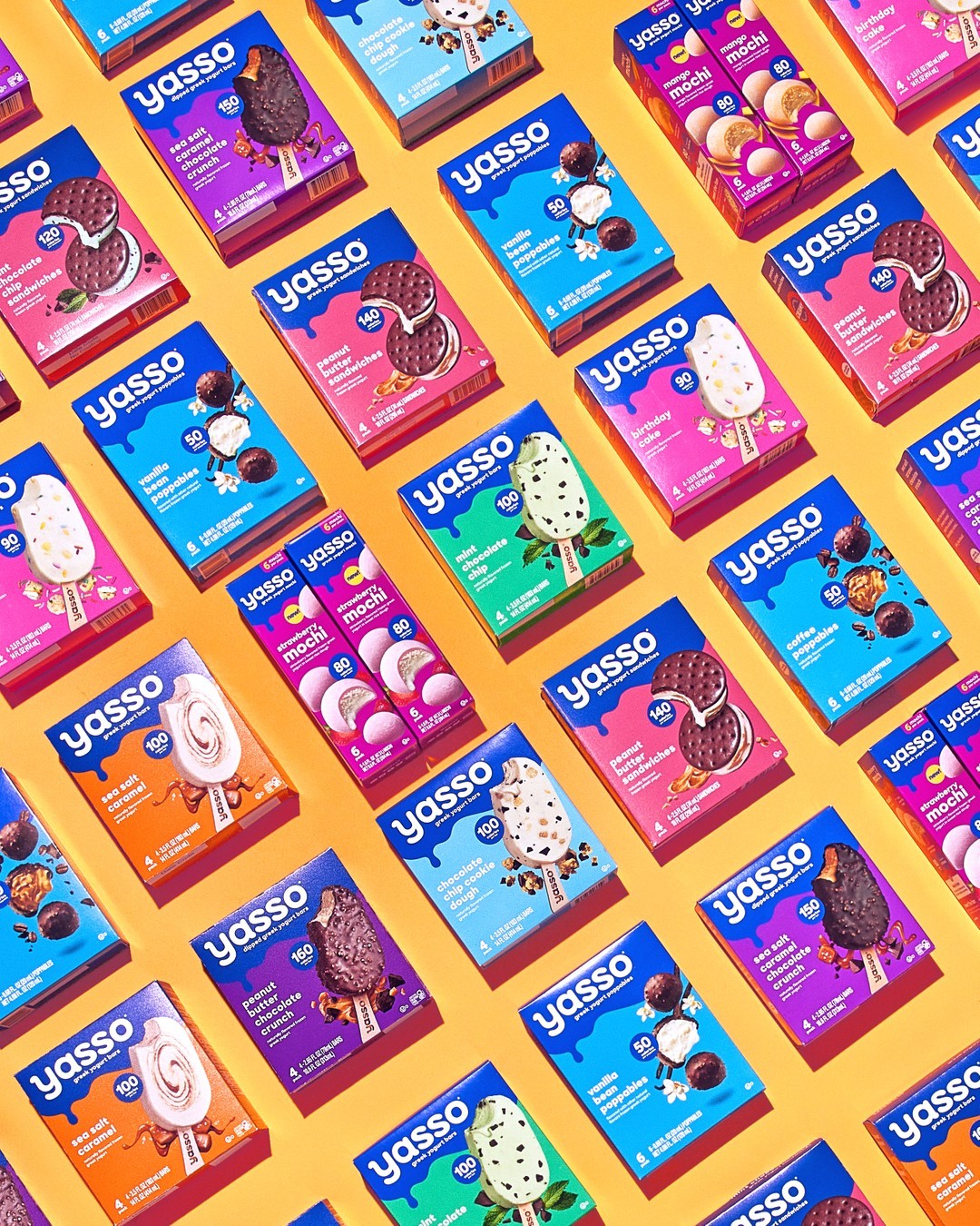
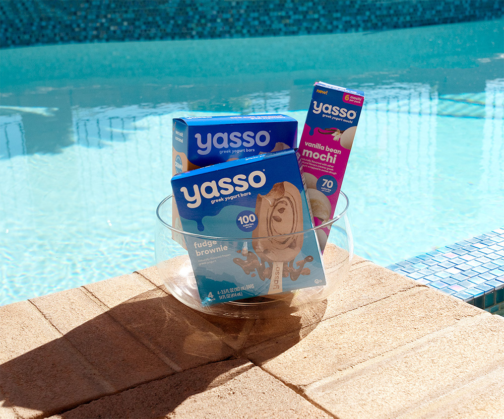
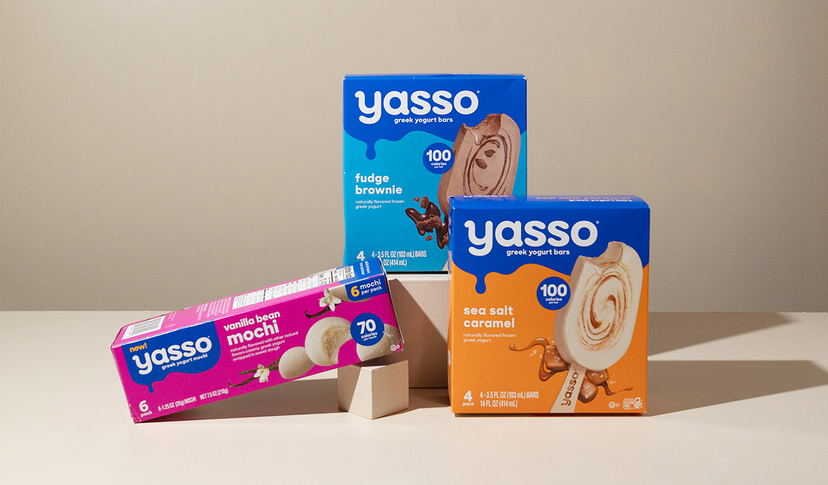
So the brand chose one unifying color to apply across its portfolio—a rich, royal blue. There are tactical benefits to this change: It contrasts nicely with the white Yasso logo, making the brand name pop; it complements the coloring used to indicate specific variants; and it creates an eye-grabbing brand block on store shelves. To add another ownable element, the brand added a drip to the blue colorblock that graces every package, regardless of the flavor or product type.
In furtherance of the brand’s goal of boosting awareness, the revamped design also features an upsized logo—with a slightly chunkier typeface and small details to add more personality (e.g., an additional curve at the top of the “y”).
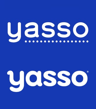
“We wanted to create a bolder, more ownable logotype that would be more memorable for consumers,” said Mia Huang, senior brand design lead at Stone Design. “The letterforms were crafted with an ice cream party in mind, and we wanted to make the letters feel as fun, delicious and creamy as Yasso's products.”
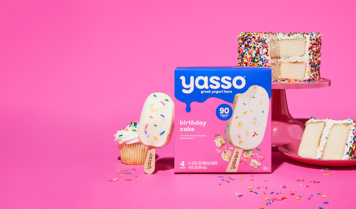
Understanding the importance of a taste appeal, Yasso upgraded its imagery as well. “The illustrated food on the old package just wasn’t very appetizing,” noted Morse. “We wanted to do everything we could to bring real food and appetite appeal across through the photography.”
Stone delighted in this opportunity to really drive home the yumminess of the product with photography. “There are few other categories more ready to dare someone to eat with your eyes than ice cream,” said Emily Wolf, partner and creative director at Stone Design. “Our internal brief was to make someone want to lick the art and we really wanted to celebrate all the delicious inclusions.”
“Our internal brief was to make someone want to lick the art and we really wanted to celebrate all the delicious inclusions.”
The new, punched-up images have more depth and realism, plus supplementary visuals to signal flavor and ingredients (e.g., mint leaves, strawberries, vanilla flowers, etc.). The photography also features what is now a calling card for the brand: a tantalizing drip from the bar itself, which wasn’t easy to perfect. “There were definitely challenges in getting the drip just right,” recalled Huang. “We thought: Should it be one drip or two? And when does the drip start to feel messy? A lot of ideas in the initial exploration guided the creative to what you see on shelves today—a refined drip that feels appetizing, with just the right amount of movement without feeling sticky or gross.”
The new design streamlines the claims displayed on the prior design, removing copy related to protein content and the “gluten-free” call-out. In exchange, the low-calorie count—a major benefit for consumers seeking better-for-you frozen treats—is now more prominent. “That was also part of our exploration,” Morse commented. “How do we have a big, bold calorie claim that draws your eye but doesn't distract from everything else on the package?”
When the new design hit shelves in 2022, consumers responded emphatically. In the six months following, sales increased by 44% compared to the same period in the prior year—significantly outpacing the category growth rate of 15%. The results of a consumer evaluation by Designalytics support this outcome: 68% of category buyers preferred to purchase the new design over the old one.
In the six months following, sales increased by 44% compared to the same period in the prior year—significantly outpacing the category growth rate of 15%.
That was big news for the brand, and it was followed by some even bigger news: In July of 2023, Unilever agreed to purchase Yasso as part of its efforts to create a premium portfolio in the ice cream space. Morse believes the success of the redesign contributed to solidifying this deal. “The redesign was crucial in having us look the part of a big brand,” she said. “We already had a strong sales and shelf presence, and this made us look even better.”
Wolf believes that the project proved that, with the right approach, you can deliver a design that is both functional and fun. “This project was a strong reminder that powerful brand strategy and a clear reason to believe can live next to a celebration of brand personality in order to drive brand affinity, trial, and lift,” she noted.
For Morse, the achievement goes beyond the brand’s bottom line and burgeoning profile. From an idea born at ice cream camp and nurtured through its growing pains, Yasso is now among the big players in the freezer aisle—and has a package design that positions it for further success. “It feels really incredible for our whole team when we go to our own grocery stores, and you can just witness the big, blue, brand block. And to know we got that done nimbly, with a small team and a relatively modest budget. It’s a massive point of pride.”