When it comes to package design, communication is clutch.
In fact, we’ve found that communicating important product attributes on your package—and doing it well—contributes heavily to sales performance, with a nearly 90% correlation to directional in-market outcomes.
Discerning brands recognize this and are continually assessing, through research: a) what is actually important to target consumers, and b) how to prioritize and maximize messaging to convey these attributes to that audience.
In our analysis of hundreds of redesigns, we’ve come across quite a few brands that added, altered, or amplified claims to make their designs considerably more effective. Here are seven recent ones that stand out:
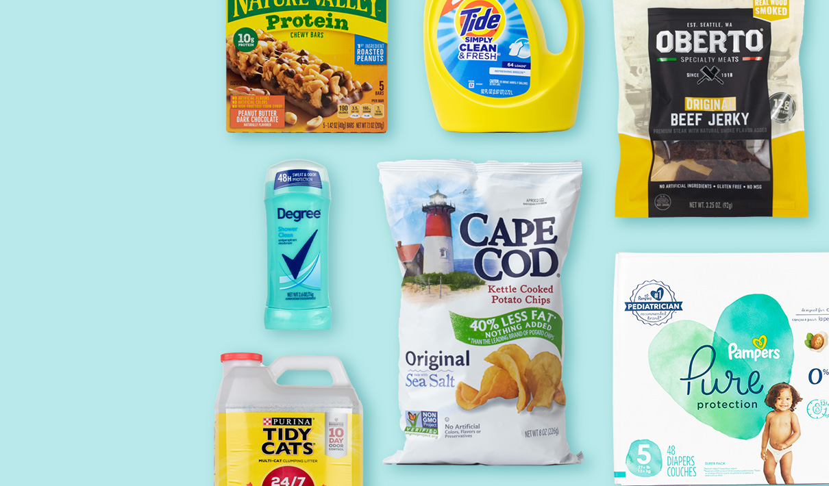
Degree Dry Protection
The number one purchase-driving attribute for women’s deodorant is “long lasting,” and yet Degree Dry Protection’s previous design offered no clear indication of its effectiveness over time.
On the new design, however, a sticker was added to the cap, boldly claiming: “48h Sweat & Odor Protection.” In our Redesign Response Report, 74% of consumers said that the new design communicated “long lasting” better than its predecessor, and 73% said they’d prefer to purchase the new design. Is the fact that these two numbers are nearly identical coincidence? Not likely.
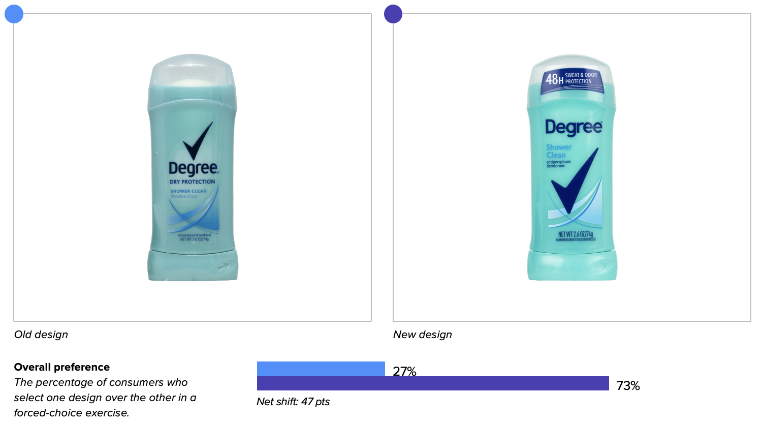
Nature Valley Protein Chewy Bars
The second and third most important attributes in a nutritional snack bar, according to consumers, are “nutritious” and “made with real ingredients” respectively (first, as with most foods, is “tastes great”). Nature Valley added two claim-based assets to its new design: the blue “1st ingredient: roasted peanuts” and the orange listing of ingredients it lacked (“no artificial flavors, no artificial ingredients, and no high fructose corn syrup”). This change paid off—the new design outperformed its predecessor by 26 points in “nutritious” and by 22 points in “made with real ingredients.” Overall, consumers preferred to purchase the new design over the old by a 20-point margin, 60% to 40%.
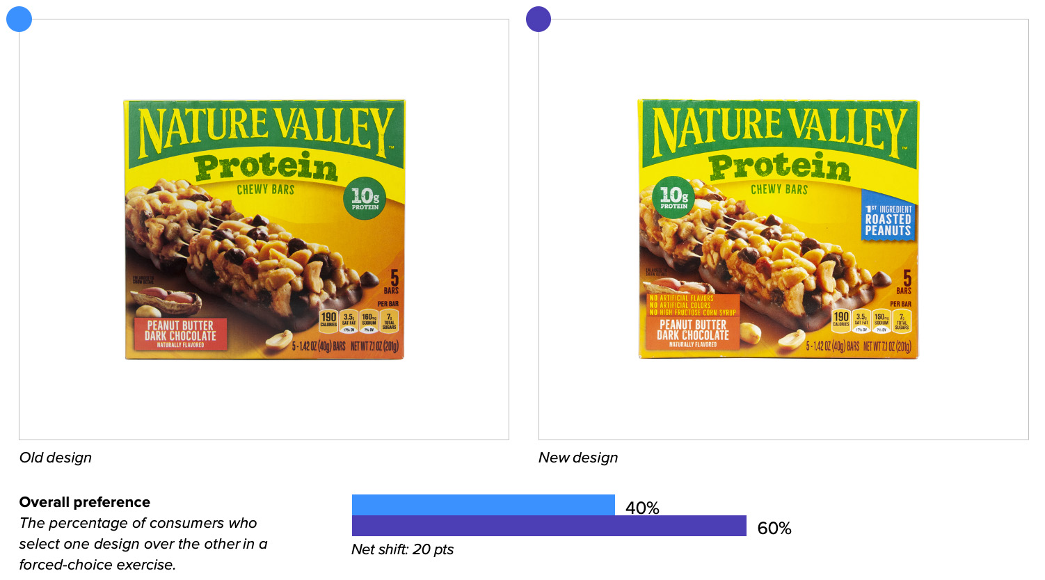
Oberto Original Beef Jerky
In this matchup of old and new designs, consumers were drawn to the single significant difference between the two: the “real wood smoked” claim in the upper right corner of the latter. It made an impression, with dozens of consumers commenting positively on this addition. One consumer said “Seeing the words ‘Real wood smoked’ makes it seem like it is new and different from other brands,” while another noted “real smoke has a different flavor than liquid smoke.” Given the choice of which they’d prefer to buy, 68% of consumers chose the new design (vs. 32% for the old design).
Purina Tidy Cats
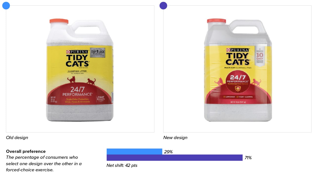
While the new design featured a few alterations, the undeniable star was the “10-day odor protection” claim in the upper right corner. Consumers noted this claim far more than any other in their open-ended responses, saying things like “10 day odor control is easier to understand than what the other says,” “the 10 day caught my attention,” and “it says how many days it lasts.” Not surprisingly, the new design was the pick of this litter, outperforming the old in overall preference, 71% vs. 29%.
Cape Cod Kettle Cooked Potato Chips
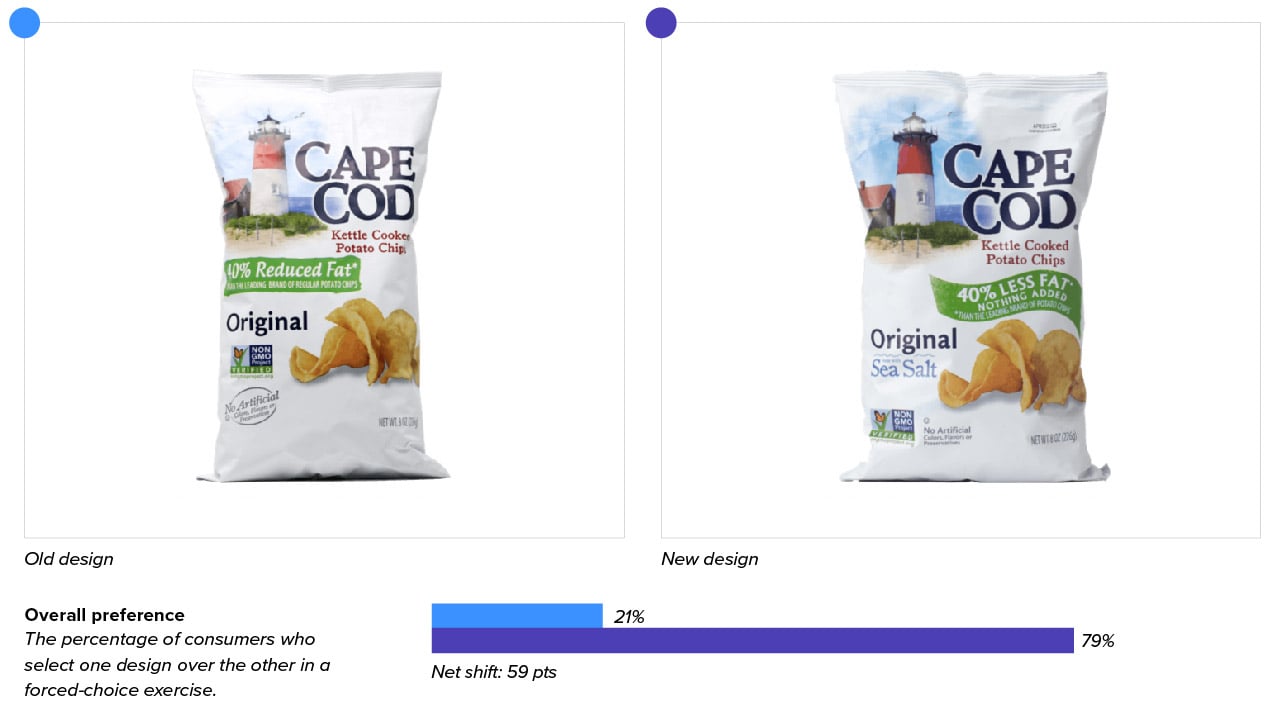
This redesign showcased just how important it can be to add and clarify important information to connect with your target audience. Consumers clearly preferred the new design (79% vs. 21% for the old), due mostly to a few seemingly minor wording changes.
They generally focused on: a) the addition of “sea salt” to the package (“really shows what the flavor will be like,” said one consumer) b) the change from “reduced” to “less” on the fat claim (“I prefer the wording 40% less fat, instead of reduced,” noted a respondent); and c) the “nothing added” claim on the ribbon (“It's important to say that nothing was added when the fat was reduced in this product”).
Tide Simply Clean & Fresh Detergent
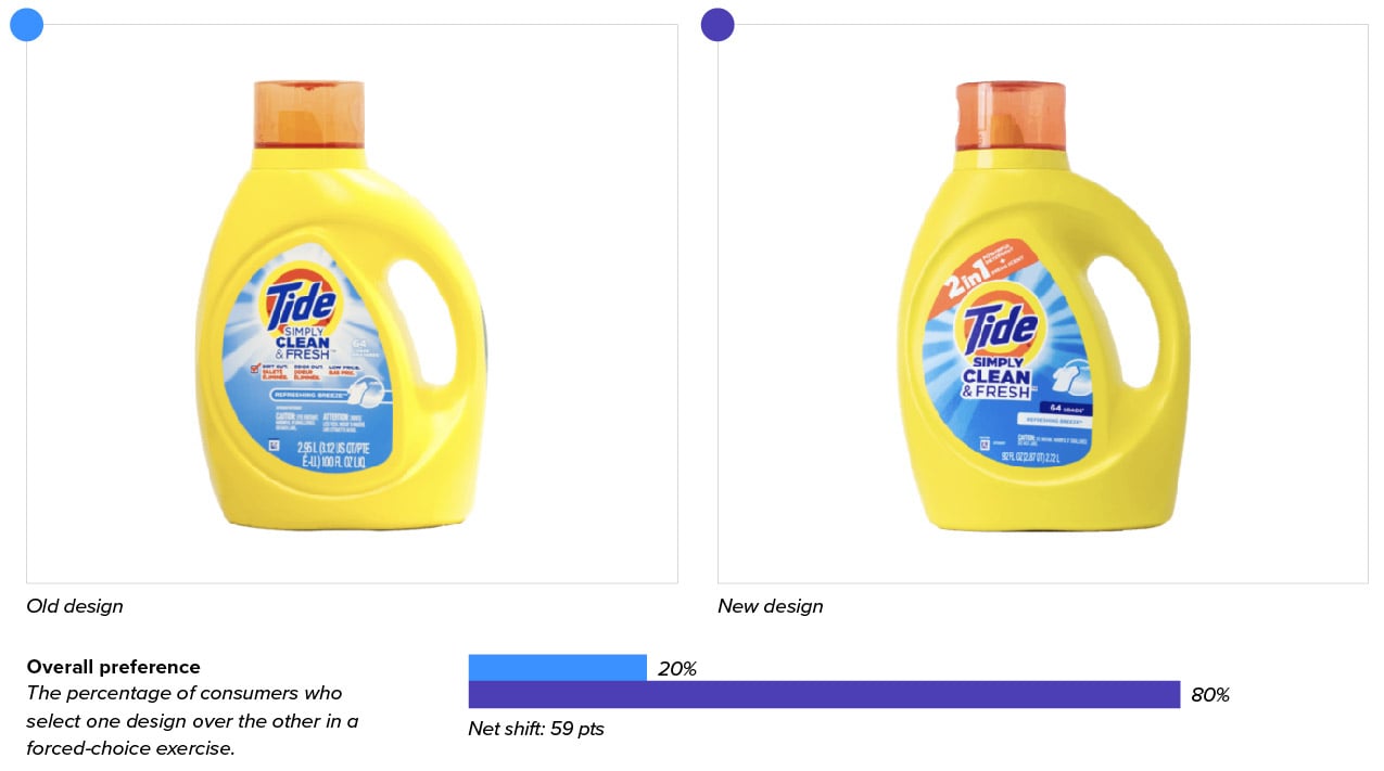
Tide made a few adjustments in this redesign, including increasing the size of the logo and product name. Most notable, though, was the removal of “Dirt out, odor out, low price” claims” and the addition of a bright orange banner at the top of the label stating “2 in 1 - Powerful Detergent & Fresh Scent.”
Consumers took note, including one who said “The 2 in 1 label made it appealing and also it explained what it had that maybe other detergents don't.” Many others concurred, and one in particular pointed out how this new approach may have driven home the concept of value better than the low-price claim: “Label states 2-in-1, which makes me feel I'm getting more for my money.” Overall, the new design cleaned up, enjoying an 80% to 20% advantage in overall preference over the old.
Pampers Pure Protection
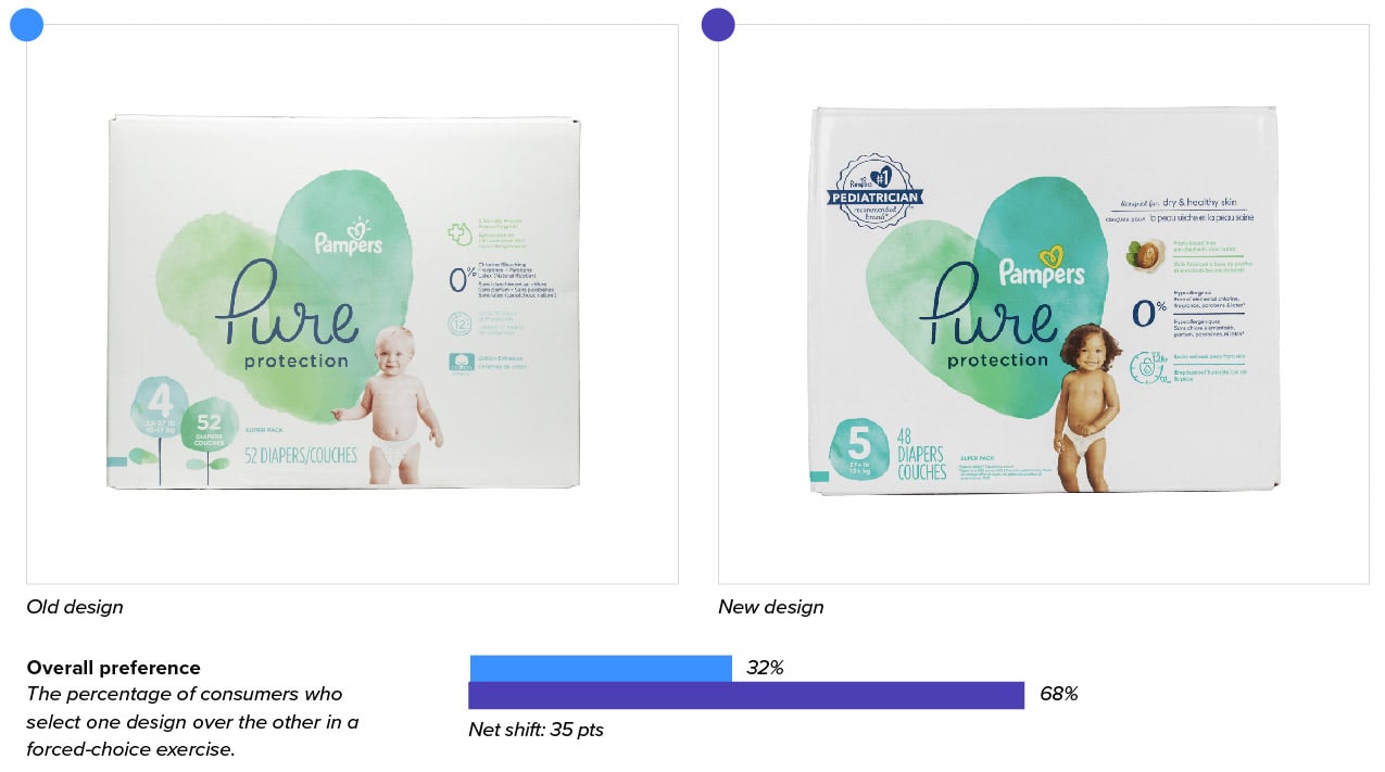
There is one fewer claim and a brand new baby on the new packaging, but neither seemed to be the reason consumers chose it over the old design. It was overwhelmingly the “#1 pediatrician recommended brand” badge that seemed to push the new design to a massive advantage over the old (68% vs. 32%) in overall purchase preference. “The main difference was the pediatrician endorsement,” stated one of many consumers who pointed this out, while another liked that it is “easy to see it’s pediatrician recommended.”


