
In the consumer-packaged-goods (CPG) world, planograms have been widely used for measuring the effectiveness of a package design in a retail environment. This idealized depiction of store shelves is meant to showcase a brand’s packaging “in context”—purportedly reflecting what consumers see in stores and, thus, providing insights into their behavior.
It’s clearer than ever that the status quo isn’t serving CPG brands well when it comes to planogram-based design testing. And while some progressive manufacturers have questioned its fundamental validity, others have yet to reexamine its relevance or reliability in today’s retail market. The truth is that there’s evidence that redesigns have been successful in spite of planograms, not because of them.
A difficult problem
Let’s start by addressing an unavoidable issue: Standout research is notoriously difficult, and no approach to it is perfect. Additionally, there is an understandable incentive to use an accepted legacy system of validation—after all, the shared “That’s how we have always done it” mentality combined with an aversion to rocking the proverbial boat can create strong headwinds against a more modern approach.
There’s a central paradox with planogram testing that’s immediately apparent, though: It is supposed to be “representative” of all retail environments, when it clearly only mimics one. By placing a design in a single “context,” you are inviting all of the specifics of that context—a particular competitive set, unique shelf placements, discrete adjacencies, and more—to influence the outcome of your design testing.
In truth, there is overwhelming variability across store formats, retailers, and classes of trade, not to mention the recent mass migration to online shopping. No single planogram stimulus can qualify as representative of more than one retail environment. It’s not that there’s no utility at all to planograms, it’s just that it is extremely limited and it doesn’t reflect retail realities. It’s not an accurate way to measure design effectiveness, and it never really was.
Three common-sense challenges created by planograms
Planogram testing is based on a simple premise: You manufacture an interaction with a sampling of consumers, in hopes of evoking a measurable difference in response to the stimulus. Assuming the stimulus and the consumer sample is representative of the marketplace, then you can infer a difference in design performance and make a better-informed, crucial decision.
That’s the goal—reliably projectable data for more successful decisions. And in order to have confidence in the data, you need to have confidence in the representation.
Important questions arise: Is the exercise representative of the dynamics being assessed? Is the stimulus representative of the marketplace? Is the respondent sample representative of consumers in your category? Given the importance of planograms in traditional design testing, it’s helpful to take a fresh look at some of the challenges with the paradigm itself.
Challenge #1: Which planogram should you use?
“Preparing a representative planogram.” It sounds simple enough, but anyone who has done it can disabuse you of that notion. Ideally, you’d choose a planogram that reflects your biggest customer, right? Say that’s Walmart. Okay, we’ve got it!
Not so fast. Now you have to select which Walmart planogram you want to use. Which store format? Which region of the country? Which market density (A, B, C, or D)? You’d likely choose the planogram that represents the most stores, but it’s now apparent: It reflects only a minority share of Walmart stores overall.
The challenges continue to accumulate. In order to engender shopper loyalty, chain stores offer a distinct assortment of products: exclusive sizes, variants, challenger-brand alliances, and a swath of prime shelf space for their own brands. Even retailers with similar brand offerings will have wildly divergent shelf configurations, with products in varying positions on the shelf, distinct left/right adjacencies, and invasive merchandising.
In the end, you choose a planogram. But it clearly would not be representative beyond a minuscule segment of stores.
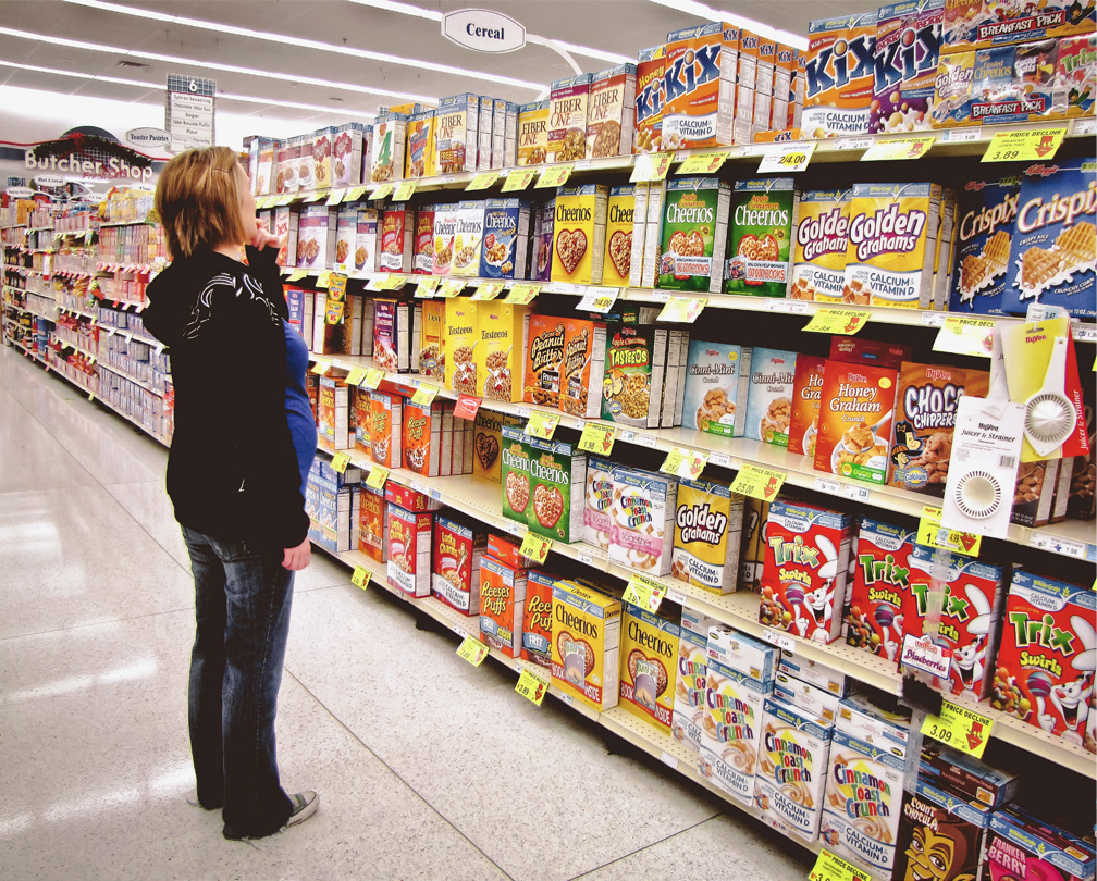
Most store aisles are no wider than 6 feet, with consumers tending to stand approximately 3 feet away.
Challenge #2: Planograms are the Shangri-La of shelves. (That is: Pretty, but they don’t reflect reality.)
Have you ever seen a store shelf that looks anything like a testing planogram? Probably not (and that’s before Covid wreaked havoc on our supply chains).
They’re meticulously crafted, comprehensive, and unintentionally flawless... which is not really the way consumers experience them. In addition, planograms don’t—can’t, really—account for out-of-stock items (more common given said supply-chain issues), store merchandising, obstructive price stickers, and more.
Moreover, the typical planogram stimulus represents a panoramic section of shelving that inadvertently simulates a viewing distance of 12+ feet. A vast majority of store aisles are 5-6 feet wide, so unless you are blessed with a category that fits on a very narrow shelf section (looking at you, shoe polish and condoms), the testing paradigm falls short of reality.
In truth, a person’s visual field from a mid-aisle stance is very limited. And our task-driven consumer brains are not overly concerned with physically surveying the four corners of the category.

When viewing store shelves, the focused field of vision (maroon circle) is no larger than 3 feet in diameter. We can see approximately twice this distance (purple circle) with less clarity, and our peripheral vision beyond is quite blurred. For example, in the cereal aisle, consumers can take in only a handful of brands without shifting their gazes—but consider the number of brands which are not seen. In standard grocery stores, cereal spans one or both sides of an entire aisle. In real life, consumers only see a fraction of the brands included in a planogram at one time.
Challenge #3: The e-commerce conundrum
The ascendancy of online shopping has brought planograms’ increasing obsolescence into sharp relief. In the first quarter of 2021, online sales were up 39% over last year, and grocery shopping saw an intriguing shift as well. A recent Nielsen study found that nearly 60 percent of Americans had shopped online for groceries in the past year and, importantly, virtually the same percentage planned to shop online as frequently or even more frequently in the future.
E-commerce is the great democratizer—each brand gets one “facing,” the order of products is unpredictable, and there is no physical limit to the number of products offered. Planograms heavily weight factors that are irrelevant in the online marketplace (i.e., the number of facings) or over which brands have no control (where they appear on the website or app, which brands they’re next to, etc.). Testing standout with a brick-and-mortar planogram completely ignores this massive and exploding segment of the retail space.

E-commerce environments eliminate factors that are core to planograms, such as brand blocking, shelf positioning, and product adjacencies.
What are you actually measuring with a planogram?
According to our syndicated design effectiveness data, more than 50% of package redesigns fail to increase purchase preference compared to their predecessors. The brands that undertake these redesigns are not small or undisciplined, either; these redesigns very likely used standard, end-of-process validation tools and met established action standards. Nevertheless, when re-measuring redesigns that likely made it through these formal processes, the failure rate—as measured through consumer preference and actual sales performance—is incredibly high.
The root issue with planogram-based testing is that it doesn’t measure design in a reliable and predictive way. It isn’t the only reason for the failure rate above, but it is an important factor—because how can brands make sound design decisions based on something that doesn’t accurately measure design?
The brands that brought these redesigns to market weren’t wrong or reckless; They were simply trusting the standard design-testing paradigm, which happens to be ill-suited to measuring design’s impact—in large part because most of the success criteria is dependent on single-planogram-based exercises (including standout, findability, and purchase from shelf). If the stimulus is not representative, the measured response is not projectable.
We understand this revelation can be a bit jarring, especially given all the decisions made over the years based on faith in this legacy approach (and our role as a vehement detractor of planograms might explain why we’re not often invited to parties).
The upshot, though, is this: No matter how confident a brand may be in this approach, it has very low reliability in actually measuring design effectiveness. And it’s continued hegemony is hiding something of remarkable value to CPG brands: the considerable power of design to drive reliable, significant sales growth.
As a data-obsessed company, however, we decided to put our assertions to the test with an experiment that, incidentally, can be repeated by any brand that would like to see for themselves.
A simple planogram experiment
Following are two planograms for the coffee category: one replicates a major-market Walmart shelf, and the other mimics a Target in the same major market. Both are big-box mass merchandisers, and include many of the same top category brands.
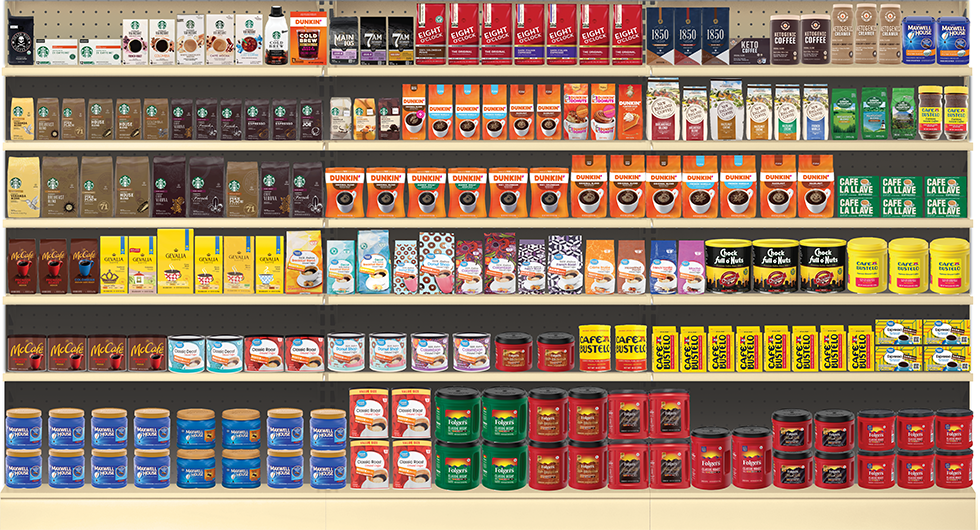
Planogram replicating actual shelf configurations at Walmart for the bagged coffee category.
Planogram replicating actual shelf configurations at Target for the bagged coffee category.
This is an extremely typical stimulus used in multiple legacy design-testing exercises, and upon which critical decisions are made. The package designs for the products are identical in both planograms. The relative heights for each package image were meticulously checked, and are the same between planograms. (If you’ve built a planogram before, you know how tedious the process can be.)
The objective of the experiment was to establish how “representative” the measures from the typically-tested Walmart planogram are in light of a second planogram-based test. We focused on standout measurement using the latest eye-tracking technology with large, balanced samples (n=100+) of category buyers.
The standout measures in the chart below are the observed percent of consumers noting the design in the first four seconds of exposure for each of the common brands between the two retailer’s offerings. (The blue dots represent values for the Walmart planogram, and the maroon for Target.) The vertical arms extending from each dot are the statistical-error ranges of those mean observations based on a 95% confidence interval. If the Walmart planogram provided “representative retail context” for big-box retailers, the data for each brand would overlap. For six of eight coffee brands measured, this was not the case.
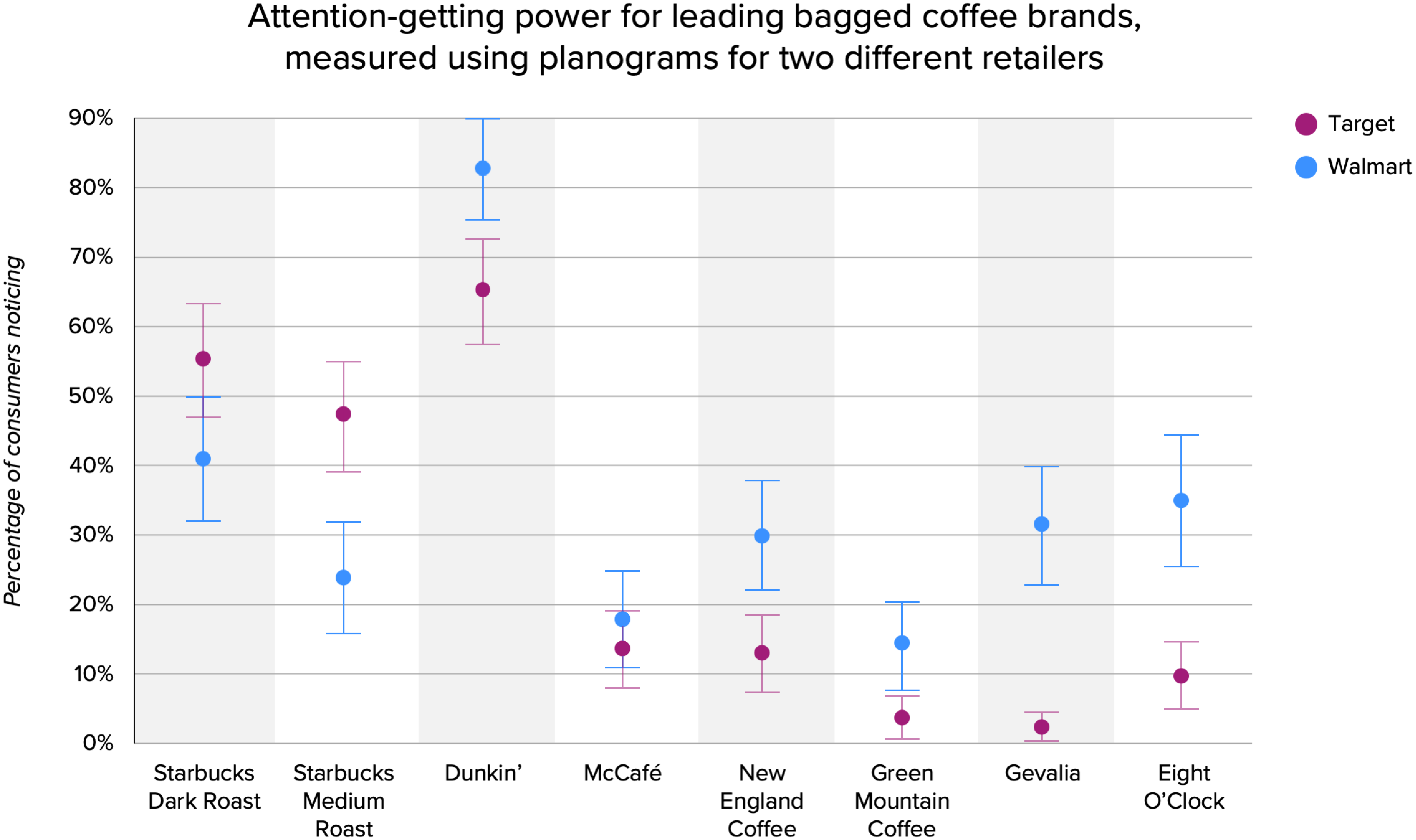
Attention-getting power for leading bagged coffee brands, using planograms for two different retailers.
As you can see, the data is wildly divergent between the two planogram-based test cells for each brand, despite there being no variation in each brand’s design. The differential from one to the other was staggering in some cases: 24 points for Starbucks Medium Roast; 25 points for Eight O’Clock, and a whopping 29 points for Gevalia.
Now consider that standout scores are believed by many to be a design performance measure. This experiment demonstrates that, in fact, the measure is heavily influenced by the specific context in which it appears.
If the Walmart planogram results are not representative of even the nearest alternative retailer, how can it be representative of the dynamics in food, drug, or convenience stores? And what bearing does it have on any e-commerce purchases?
Because other action-standard reliant measures are also based on the same single planogram stimulus, the strength or weakness of the brand’s standout will likewise influence the measured performance of findability and “shop-from-shelf” purchase preference.
Here, it’s important to recognize a fundamental reality: While a brand has absolute control over its design, it has virtually no control over the context (or variability of the context) in which it is seen: the number of facings, shelf placement, competitive set, and product adjacencies. So why are critical design decisions being made with measures that are heavily influenced by non-representative factors outside of a brand’s control?
Just to be thorough (see: data-obsessed, above), we repeated the same test design with another category: chocolate.
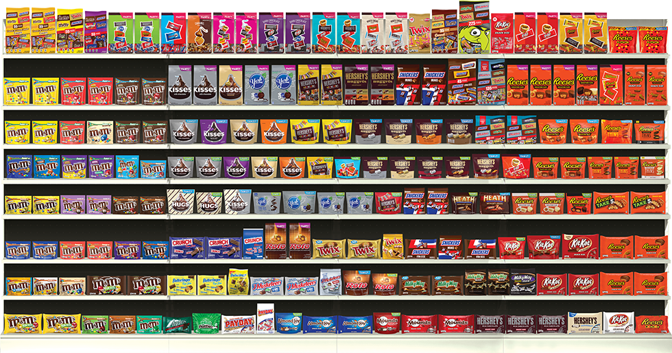
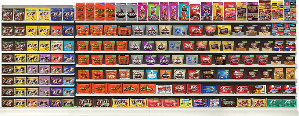
Planograms replicating actual shelf configurations at Walmart (top) and Target (bottom) for the
chocolate category.
The results, seen below, were even more stark. The differentials between the two planograms ranged from six points to 50 for each brand, with an average of 27 points. This isn’t a minor discrepancy—it’s a statistical chasm. If you worked for one of these brands and were relying on these results to validate your design strategy and inform key decisions, would you trust these numbers?
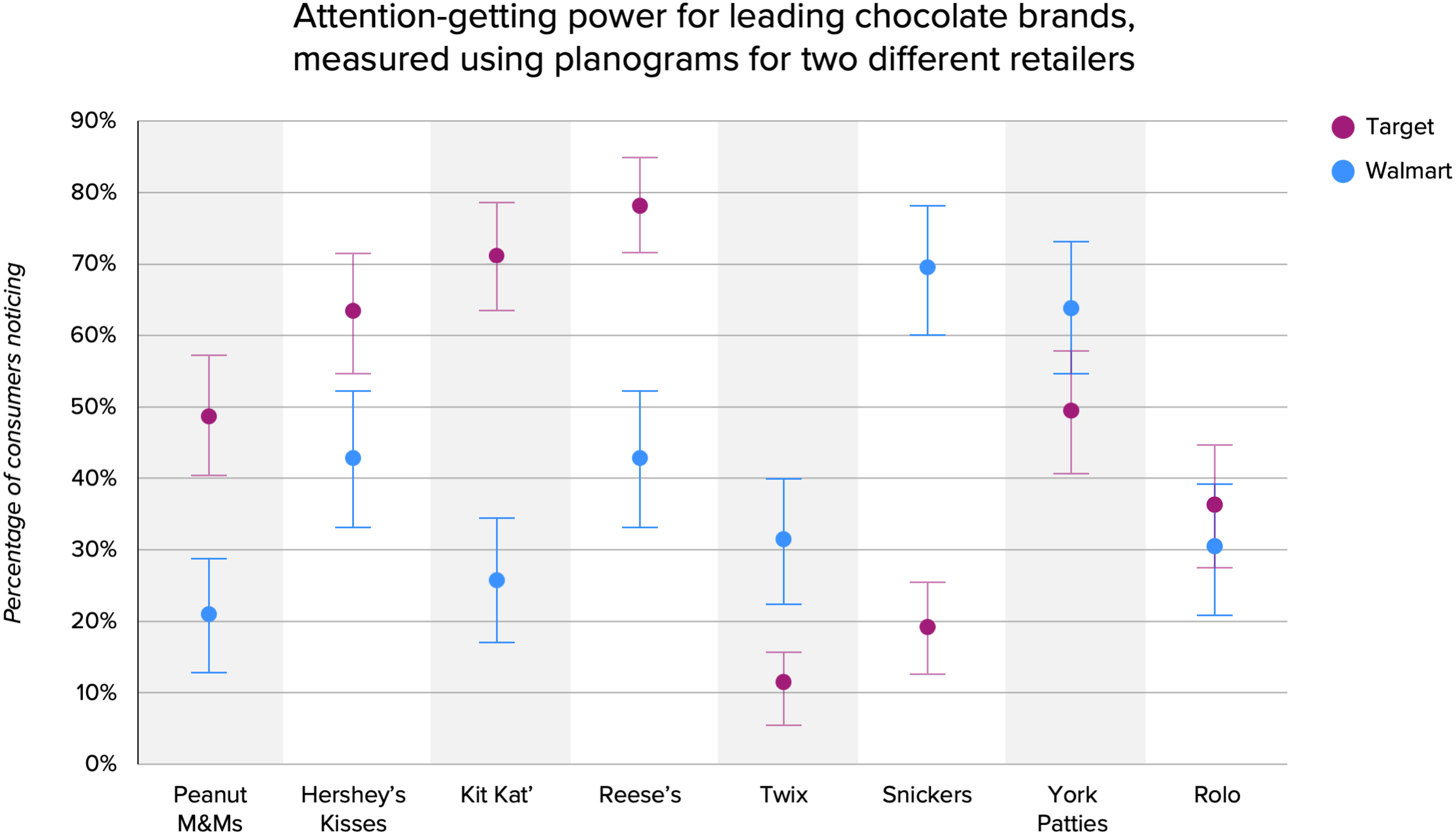
Attention-getting power for leading chocolate brands, using planograms for two different retailers.
Why does this happen?
At its core, planogram testing is about consumer response to stimulus. If you present a stimulus to a consumer—in this case, a visual of a store shelf—they are responding to that particular stimulus. Any variation is very likely to skew the results.
As you can see from the photos of the planograms, they have completely different numbers of facings, starkly divergent placements, varying competitive sets, and contrasting adjacencies... and that’s before you take into account many of the other common-sense issues mentioned previously. As noted above, the issue stems from what you think you’re measuring versus what you actually are.
You believe you’re measuring how effectively a design grabs attention, but you’re really measuring the standout power of that design under very specific shelf arrangements (facings, position, and adjacencies) and competitive-set compositions—factors which vary considerably by store and which you can’t control. Basically, you’re measuring a number of powerful confounding variables, not the inherent efficacy of your design across infinitely variable retail contexts.
Why hasn’t this issue been called out before?
Testing two different planograms is extremely rare in the CPG world, likely because of misplaced faith in the idea of a “representative planogram” combined with the considerable extra effort and cost of preparing a second planogram stimulus.
This includes endless discussions about which configuration of brands is “representative”—not to mention the work involved to assemble the visual stimuli—and tens of thousands of research dollars per planogram. Plus, why invest in something like that when the whole industry has been in alignment on planogram-based testing since the Reagan administration? If there was an issue with it, surely it would have been discovered already. Right?
Inertia is a powerful thing, and sometimes issues can be hidden in plain sight. For years, action standards have been built around planogram-based design testing, and the results have sometimes been good. Instead of questioning the way design was measured, most brands have guessed that design simply didn’t have that much of an impact on sales performance. More often than not, it was thought of as a risk to be managed rather than an opportunity to be seized.
Designalytics has been able to prove that design has always had an impact—it was just the measurement that was lacking. Our cutting-edge system of design measurement has been able to predict whether a redesign will increase sales with more than 90% certainty.
We realize this is new information for much of the industry, so don’t take our word for it. Try an experiment like the one above for yourself. The next time you test a design, simply do so with two planograms rather than one. See how the results compare, and then ask yourself whether you’ve really been maximizing your package design, or if there might be a better way.
How Designalytics does things differently
At Designalytics, we offer unprecedented data quality thanks to our massive sample sizes, advanced exercise design, and multi-view standout evaluation. We don’t just test one planogram; We test dozens of different retail configurations and arrangements, and assiduously account for different adjacencies and positioning to filter out their distortive influence in the data.
In addition to classic performance indicators, we’ve pioneered entirely new-to-industry metrics like distance recognition, memory structures, and distinctive assets, and we’re also the only provider to ensure “first-view” data quality where each critical online activity utilizes a new set
of consumers.
The result is a better and more comprehensive view upon which to base important design decisions. How do we know? Because we empirically validate our metrics with real business outcomes with astoundingly high predictive correlations on several of our key measures.
Download a free copy of this white paper here.
Want to learn more?


