In the United States, the bourbon space has seen an unprecedented boom in recent years. Basil Hayden, a super-premium Kentucky bourbon, intended to capitalize on this boom, with the added ambition of expanding its footprint in Asia. While the distinctive paper bib and barrel-inspired wooden belt had a charming, handmade feel in the United States, they failed to translate as super-premium in Asia.
Beam Suntory (which owns Basil Hayden) engaged Design Bridge and Partners to undertake a refresh of the entire Basil Hayden portfolio to punch up its appeal globally. “When we first met Basil Hayden, there was a wide gap between how it showed up on the outside—shrouded in the dark shadows and heaviness of the bourbon category—and how it truly expressed itself on the inside: layered, nuanced, deeply inviting,” said Gregor Johnstone, creative director at Design Bridge and Partners.
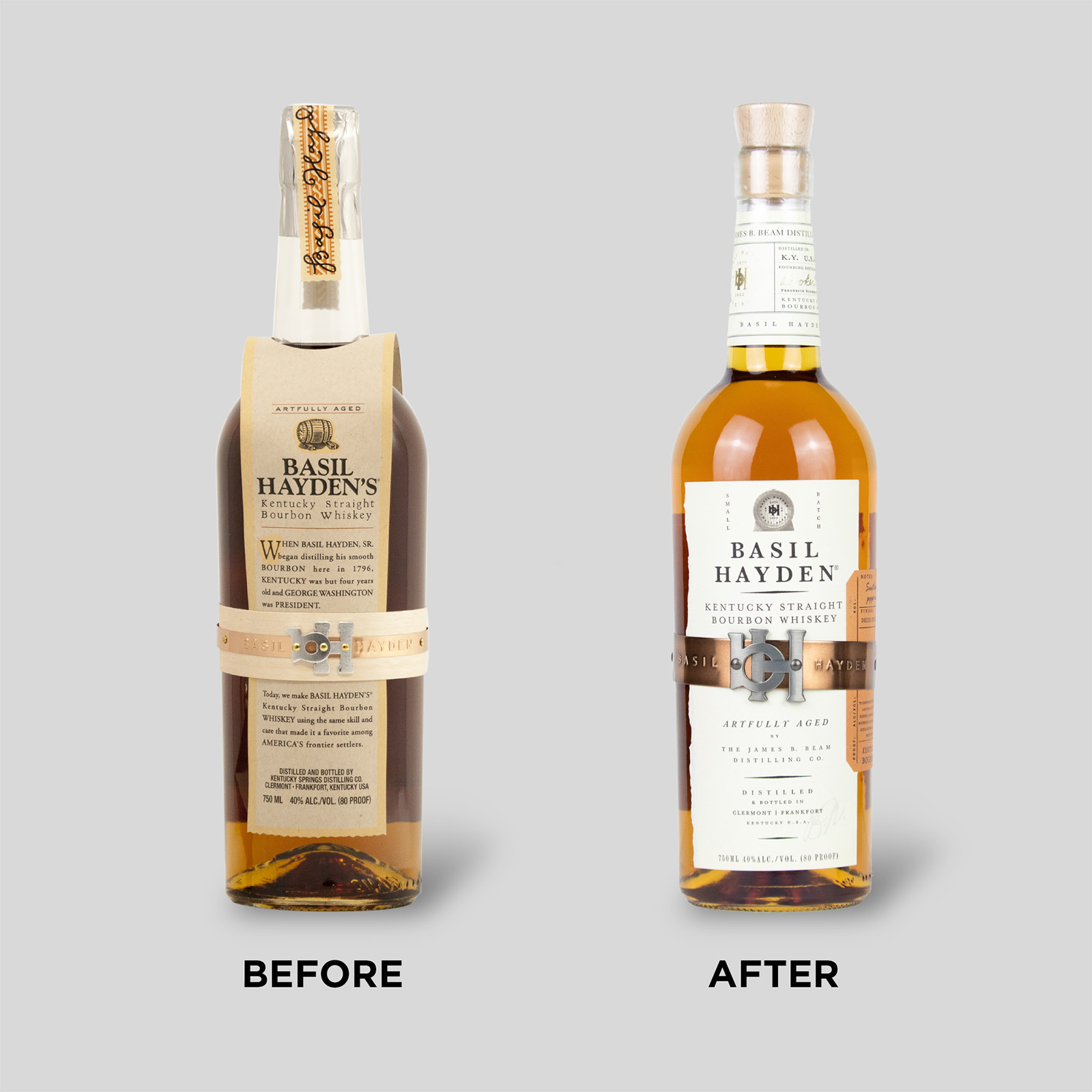
The new design ditches Basil Hayden’s signature paper “apron” and replaces it with a more traditional label. Gone is the old-world feel—the weathered paper, the quaint cask illustration, and the long-winded history of the brand. Instead, the new design features a high-contrast, white label with streamlined copy, a tidier cask illustration (stamped with “bH”), and a modernized brand mark.
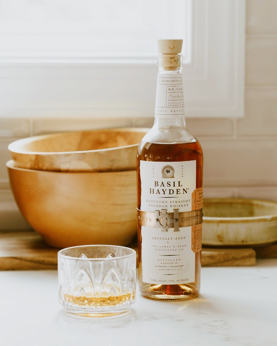
The packaging’s most distinctive asset—the monogrammed metal “belt” in the center of the bottle—receives an upgrade in the new design; it’s a burnished, rich copper with an upsized “bH” buckle, a feature that’s meant to evoke the metal hoops on bourbon barrels.
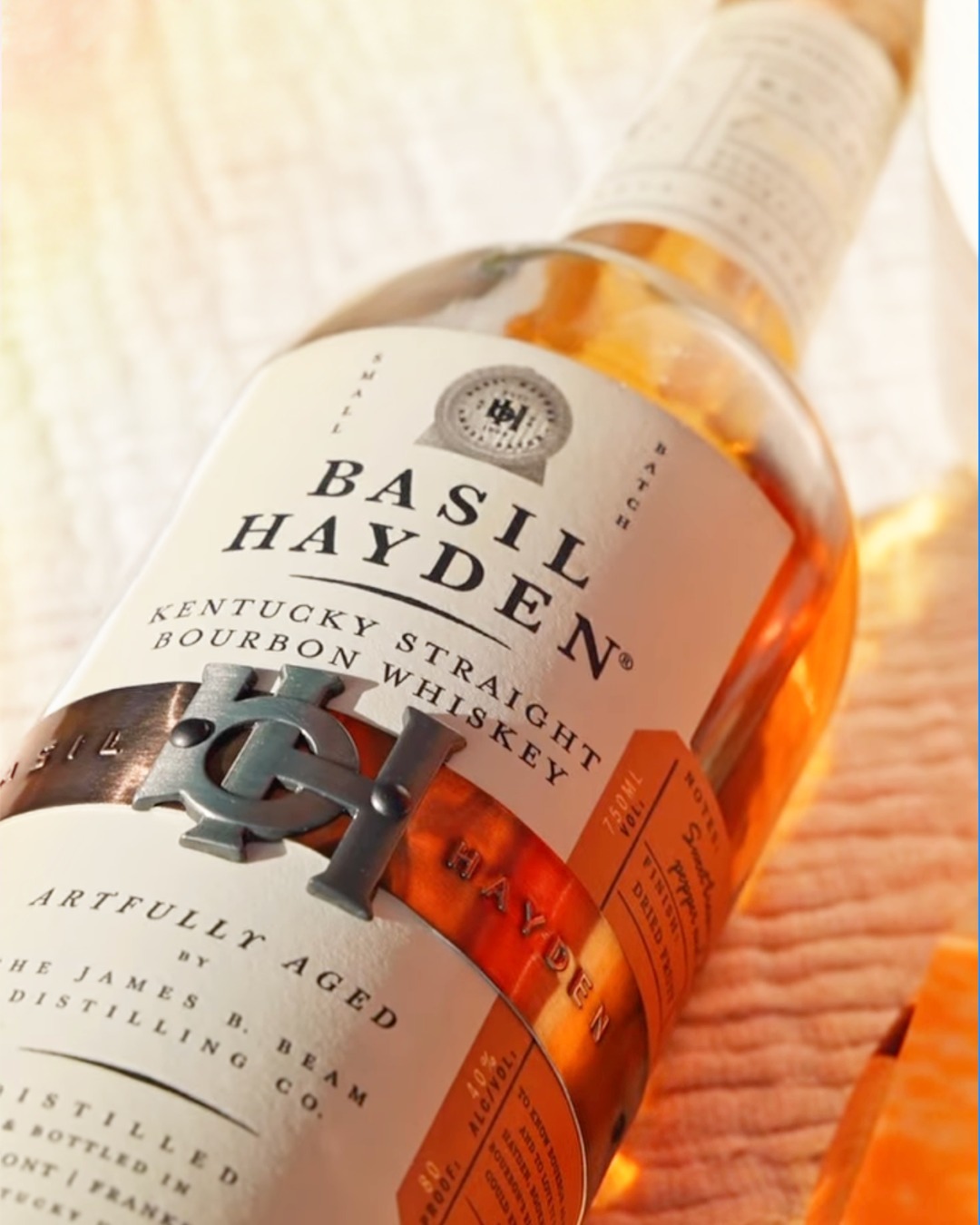
In fact, every element on the package now references the home of the bourbon-making craft: the barrel. From the tactile oak closure that reflects the barrel bung, to the copper monogram belt—every detail reflects the care and exquisite craft Basil Hayden puts into creating the whiskey itself. Combined, the elements set up Basil Hayden to express its true craft everywhere it shows up—at home and abroad.
"The father of small-batch bourbon, Booker Noe, crafted Basil Hayden to show bourbon in a new light, so everyone could experience it the way he did. Every aspect of our repositioning, packaging redesign, and brand-world refresh is in service of showing bourbon in its best light—taking cues from the barrel itself and reimagining Basil’s key brand assets to reintroduce the world to what bourbon can be," said Johnstone.
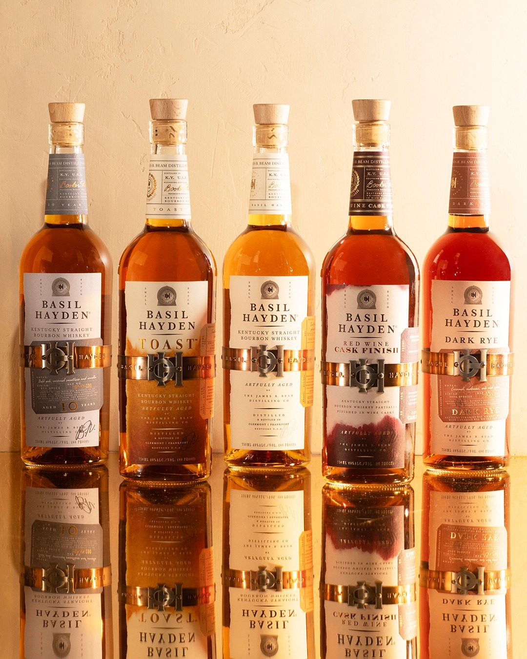
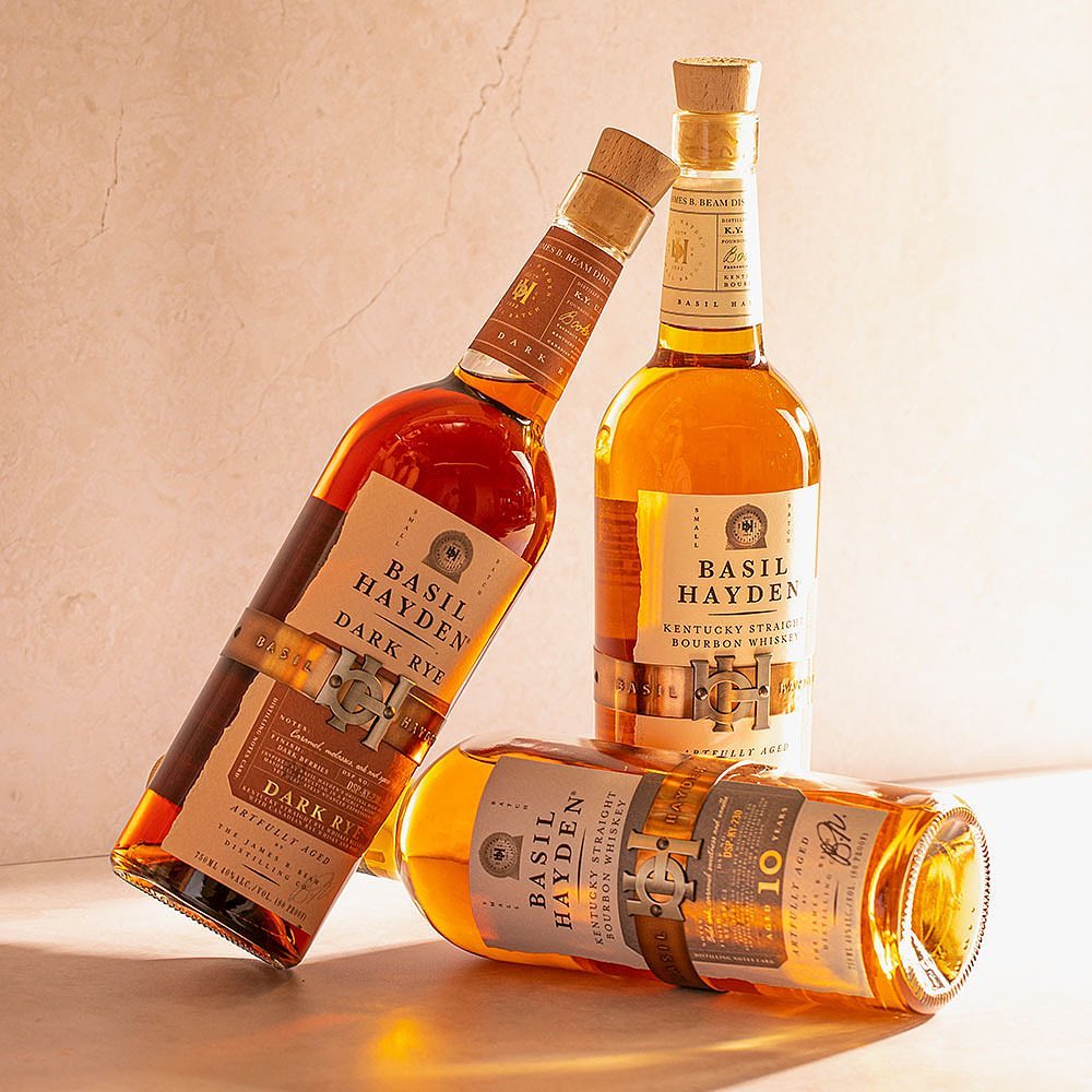
In the United States, the new packaging has proven a smashing success. In the six months following the redesign, Basil Hayden’s sales grew 15% compared to the same period during the prior year, despite modest declines in the overall whiskey category. Basil Hayden’s market share also increased by 15%.
In the six months following the redesign, Basil Hayden’s sales grew 15% compared to the same period during the prior year.
Consumer research by Designalytics affirms these outcomes: When whiskey buyers were asked which design they’d prefer to purchase—old or new—71% chose the new design.
We’ll drink to that. Congratulations, Basil Hayden!

