There was a time when national brands ruled the roost. They had the name recognition, the distinct packaging, and the longevity to stay at the top of consumers’ minds and shopping lists. And for a time—a long time—it was enough.
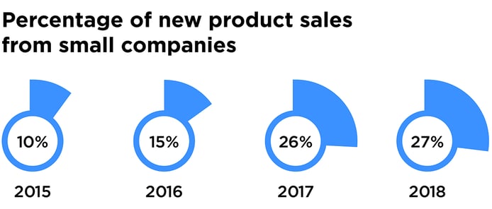
In recent years, smaller brands have been giving category heavyweights a run for their money. From 2015 to 2018, the share of new product sales generated by smaller manufacturers has nearly tripled, growing from 10% to 27%.
The success of smaller players can be attributed to multiple factors; agile innovation practices, new distribution channels, and consumer health trends are commonly cited contributors. The role of disruptive design has received far less attention, but is no less important for many challenger brands. Consider a brand like EOS lip balm, whose rapid rise in popularity can be largely attributed to its unusual egg-shaped design, which makes it easier for consumers to find in their handbags.
For smaller brands without sizable media budgets, packaging is an incredibly effective and affordable marketing channel; it drives stand-out for brands with low awareness, communicates unique benefits, and reaches 100% of in-store category shoppers.
So what does great packaging look like? Based on Designalytics’ evaluations, which collect data from thousands of consumers about top-selling and fast-growing brands across consumer-packaged-goods categories, we’ve identified five challenger brands that are leveraging packaging to great effect. We pored over data related to key design performance factors—including stand-out, communication, distinctive assets, mental availability, and resonance—to select these disruptive designs.
1. White Claw Hard Seltzer
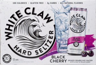
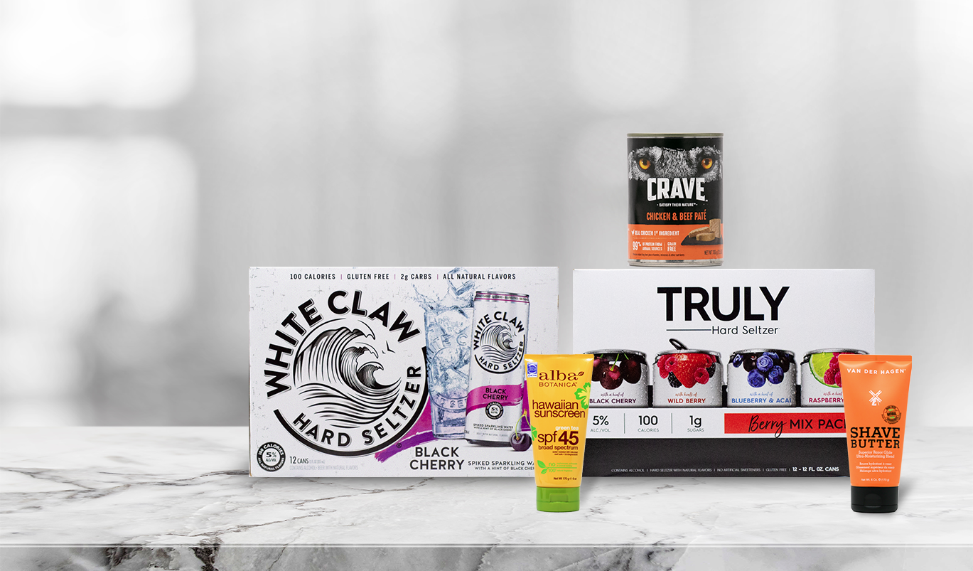
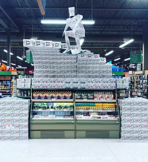
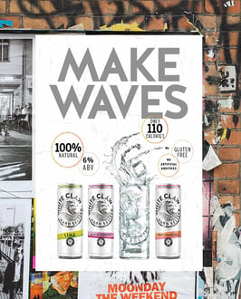
When White Claw entered the scene in 2016, it didn’t tiptoe up to consumers—it made waves. Just three years after its introduction, 73% of category buyers claim that they’re familiar with the brand. Consumers view the wave illustration embedded in the brand’s logo as highly unique to White Claw and incredibly likable. This doesn’t seem to be a surprise to the brand, who has begun to employ this asset in other marketing channels—including elaborate in-store wave displays built from White Claw boxes and POS posters depicting waves in a glass.
![]()
2. Alba Botanica Sunscreen
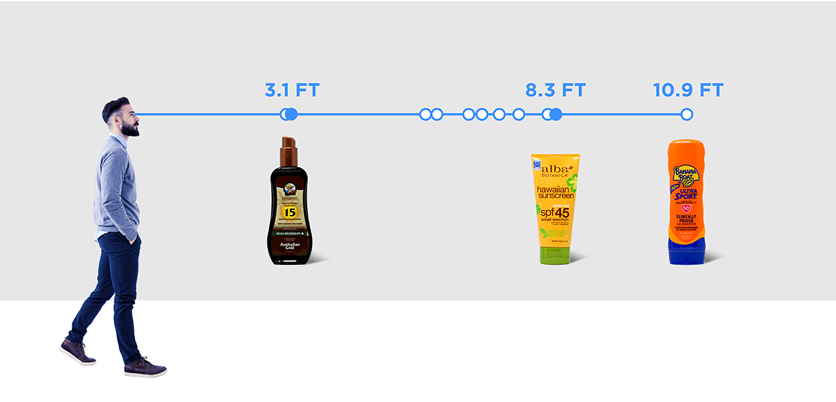
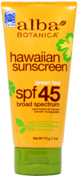 Alba Botanica isn’t a new entrant, but it certainly has solid footing for a smaller brand amongst category giants like Banana Boat, Coppertone, and Neutrogena. While Banana Boat is the most easily recognizable brand from a distance—10.9 feet on average—Alba Botanica ranks second among tested brands, with a recognition distance of 8.3 feet. The brand’s vivid yellow-orange bottle, green cap, and bright flower illustrations undoubtedly contribute to this outcome.
3. Crave Wet Dog Food
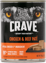 Crave, a dog food launched in 2017, also performs above-average on distance recognition. Consumers identify the animal's eyes as a brand asset that's unique to Crave—one which makes the product easier to find when one is actively searching for it. (Strong findability is critical for retention in a world where consumers are only willing to spend a limited amount of time scanning store shelves before selecting a different option.) The predatory eyes may also contribute to Crave's ability to communicate "has real meat" much more effectively than other top-selling brands in the category—an impressive feat for a challenger brand.
4. Van Der Hagen Shave Butter
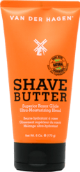 Men’s skincare products have been growing in popularity, and Van Der Hagen Shave Butter is a prime example. According to consumers, this product ranks number one for communicating attributes such as “leaves skin smooth” and “leaves skin moisturized”—far outpacing Gillette's family of shave prep products. The "Shave Butter" nomenclature certainly contributes to this, and the packaging enhances this communication shortcut by prioritizing it in the design hierarchy; the words are much larger and higher-contrast than the brand name. What’s more, the bright orange bottle claims the greatest share of attention among the competitive set in eye-tracking evaluations.
5. Truly Hard Seltzer
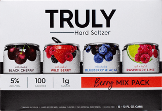 The flavored malt beverage category is truly having a moment—thanks in no small part to Truly. This hard seltzer brand adopts healthier positioning with low-calorie and low-sugar claims. Despite its newcomer status, consumers view it as “healthier than other options” by a wide margin—no doubt driven by its refreshing, realistic fruit imagery. In Designalytics' evaluation, consumers commented that the fruit "looks fresh" and "makes it appear better in flavor and quality.” In fact, the fruit was the most-liked graphical element on the package.
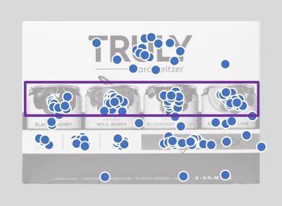
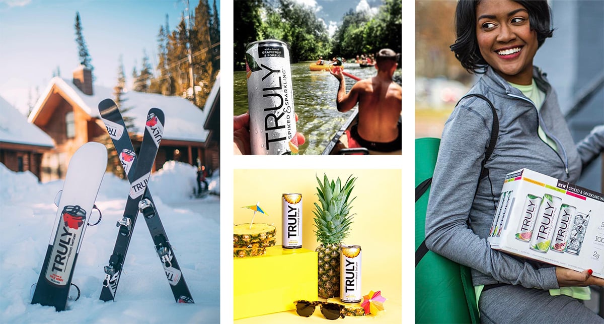
The brand is leaning into this healthier positioning, with social media posts depicting fruity goodness and active lifestyles.
