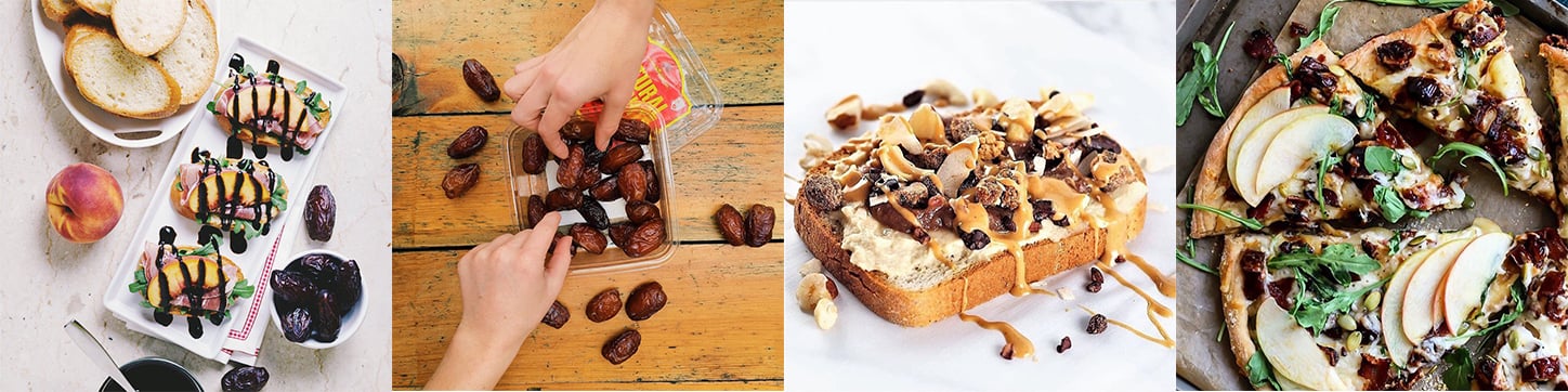
 Until a few years ago, dates were considered a passé produce item in America—suited for grandma’s holiday fruitcake, but little else. Today, Medjool dates have become the literal glue of the healthy snack food world, lending a natural sweetness—and stickiness—to mainstream energy bars, smoothies, vegan brownies, and healthy cereals. These flavorsome fruits can be dressed up or down: stuffed with cheese and encased in bacon at trendy restaurants, or eaten straight from the box during a Netflix binge. So how did a “dated” baking commodity become a star superfruit?
In the early 2010s, a brand called Natural Delights, the top-seller of Medjool dates in America, realized that it was running on borrowed time. “The primary customer was dying—literally. They were at the top end of the age spectrum and, if we didn't do something to appeal to a broader range of consumers, the brand was going to be in trouble,” said Bradley Fitzhenry, Director of Strategic Brand Planning at MJR Creative Group, a California-based agency who led the redesign initiative.
The team recognized that communicating a broader range of usage occasions would be integral to winning over a younger demographic. Moreover, dates have some inherent virtues that were being under-leveraged; they’re a natural alternative to refined sugar, high in fiber, and packed with antioxidants—just to name a few. In fact, countless online articles have touted benefits ranging from increasing skin elasticity to curing hangovers to promoting naturally-induced labor in pregnant women. A quick Google search will leave the reader asking, “Really, what can’t dates do?”
“We worked over a period of five or six years to reposition the product as a healthy snack that supports a healthy lifestyle. Yes, you can use it for baking—we invested a lot in recipes—but we moved away from your typical date bar or date bread. We positioned it in a more contemporary context, as a food in its own right,” said Fitzhenry.
This repositioning effort began without the aid of a new design. Instead, the team focused on different marketing channels, investing more in digital and less in print. They also worked with influencers who had clout with Millennial consumers. The brand made great strides, but eventually hit a wall. “There was a disconnect. We would sit in focus groups and receive feedback that the packaging was very loud or just not appealing. And we saw with our own eyes that the packaging wasn’t connecting with the new positioning that we were trying to communicate to our audience,” said Erin Hanagan-Muths, Director of Marketing for Natural Delights at the time.
Then, in 2017, the Bard Valley Date Growers Association—the cooperative of farmers that sells under the Natural Delights brand—notified the marketing team that there would be a dramatic increase in product volume within the next two years. This is because, as the brand began to grow in the early 2010s, the farmers continued to expand their acreage; however, it takes several years before Medjool Date Palm Trees begin to bear fruit. By 2017, the countdown was nearing its end.
“We told the growers, ‘We feel like we’ve done everything we can do in terms of messaging and activating new consumer channels. If you want us to create that kind of demand, we need to redesign the packaging,’” said Fitzhenry.
"We told the growers, ‘We feel like we’ve done everything we can do in terms of messaging and activating new consumer channels. If you want us to create that kind of demand, we need to redesign the packaging.'"
As with many redesigns, the stakeholders were hesitant to change something that they felt had played a role in their current success. “There was a personal connection there for the growers, too. That's very difficult. It’s important for us, as marketers, to constantly check ourselves and ask, ‘Is this just my preference? Am I thinking like my customer?’” said Hanagan-Muths.
Early-stage research played a critical role in making the growers comfortable with a big design leap. “We realized that we needed third-party validation of our advice if we wanted them to really believe in what we were trying to do, and be willing to make that investment,” said Fitzhenry.
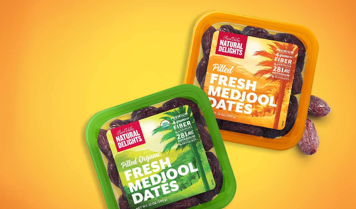
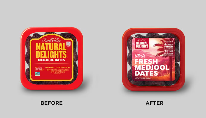
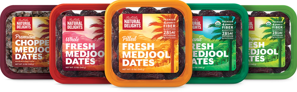
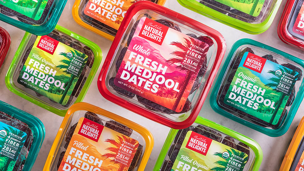
With buy-in secured, the agency began to evaluate the brand’s existing design assets. Which should be preserved, and which could be changed? “We determined that the color red was something we needed to keep. We created a lockup around ‘Bart Valley Natural Delights’ for the logo that remains red regardless of the product variety. That became the primary connection to the brand heritage,” said Fitzhenry. While the predominant package color varies across products, the team also ensured that the top-selling variety—whole dates—was assigned red.
The team wanted to design a more modern, likeable package that would appeal to younger consumers—but, perhaps more than with other redesign initiatives, precise communication was the primary consideration; the brand needed to challenge consumers’ fundamental perceptions of the product and its usage occasions.
“We found we had an identity problem around what a Medjool date is and what the experience is like. We conducted some research that indicated ‘fresh’ was a key attribute we needed to communicate. Dried fruits are often considered unhealthy—basically condensed sugar-bombs—and that’s not what we’re offering,” said Fitzhenry. Accordingly, the agency reconfigured the hierarchy of communication, emphasizing the product name over the brand name and adding the word “fresh” before “Medjool dates” in large text.
Imagery also played a role in communicating that dates are a fresh produce item, able to compete with stacks of scrumptious stone fruits and plump berries. “You’re in the produce department, around all these beautiful fresh fruits and vegetables. We're asking you to buy something in a package versus a lovely orange that you can pick up and smell and experience tactilely. Our package had to be as appealing as the most appealing fresh item because our competition isn't other date brands—it’s other fresh fruit choices," said Fitzhenry.
"Our package had to be as appealing as the most appealing fresh item because our competition isn't other date brands—it’s other fresh fruit choices."
The team considered different graphical approaches before landing on a scenic, tropical illustration of a Medjool Date Palm Tree. An image of a date could have been considered redundant, given the clear plastic box that allows consumers to view the product directly. “Should we show dates on top of dates? Do we need that? How about a recipe preparation? But then we ran the risk of limiting how consumers think about consuming dates. To sell millions of additional pounds of product, we needed more than incremental purchases; we needed a significant increase in the number of consumers purchasing dates,” explained Fitzhenry. And that would require remaining open to a wide range of usage occasions.
Some of the growers felt strongly about picturing the product on the packaging—a debate that quantitative research helped to settle. “We said, ‘If you want to use a picture of stuffed Medjool dates because that’s the way you’ve always consumed them, let’s put it in front of consumers. Maybe you’re right.’ We tried to be really respectful of the growers’ ideas and give them due consideration. Research gave us a platform to help make those decisions more objectively and equitably,” said Fitzhenry.
In the end, MJR Creative Group presented ten design concepts to the growers to demonstrate a range of possibilities for the new design. This original set was narrowed down to five, and then tested quantitatively with consumers. The image of the palm tree resonated strongly, supporting associations related to “fresh” and “tropical”—a finding also supported by Designalytics’ post-launch consumer evaluation. In fact, when asked whether the old or new design best communicates “fresh,” two-thirds of consumers selected the new design. Taste attributes—which are always of high importance in food categories—also benefited, with the new design showing considerable gains of descriptors like “looks delicious,” “tastes great,” and “made with real ingredients.”1
Consumer research also helped to inform more aspects of the design’s communication, particularly the claims that were featured on the front of the package. In keeping with the current “clean label” trend, claims such as “no pesticides” and “no additives” ranked highly with younger consumers. Perhaps not surprisingly, an endorsement by the American Heart Association proved to be less important to Millennials than to older consumers. Key claims were placed more prominently on the new package, set apart in an easy-to-parse block in the top-right corner of the label.
Finally, two versions of the design were tested in a head-to-head quantitative study with consumers to determine a final winner. The new design was launched to market in January 2019, shaking up a previously uninspired category.
“There's always a huge amount of drama associated when a brand redesigns its packaging in terms of worrying how retailers will respond. There’s this incredible fear of change. But I think something like this totally energizes the sales team—their conversations with buyers take on a completely new tone. The design change really contributed to retailers sitting up and suddenly paying attention to a category that had been very sleepy before,” reflected Fitzhenry.
“Retailers like when products and packaging are reflective not just of their consumers, but also of their own brand images. We had become a better fit for stores such as Whole Foods and Sprouts Farmers Market. For example, at Sprouts, we had permanent display cases—not just part of a shelf, but an entire wire rack—for at least six months. Those are the types of opportunities that were increased by the packaging change,” said Hanagan-Muths.
During the 26 weeks before the packaging change, sales for Natural Delights had remained flat compared to the same period in 2018. During the 26 weeks following the new design's launch, year-over-year sales reflected a growth rate of 4%—representing an annualized increase of nearly $2 million.2 Designalytics’ consumer evaluation supports these sales results, with two-thirds of consumers indicating that they would purchase the new design over the old one.3
During the 26 weeks following the new design's launch, year-over-year sales reflected a growth rate of 4%—representing an annualized increase of nearly $2 million.
Isolating the impact of package design can sometimes be difficult, as a brand will often increase its marketing spend to promote the new look.4 In Natural Delights’ case, the marketing spend remained the same after the new design’s launch, providing further evidence that the revised packaging was the primary growth driver.
“The investment in the design research was significant, and we knew we were going to be held to a certain ROI based on that. We chose to spend on research and creative instead of marketing because we had to be confident that the design would bring new users into the franchise. Our packaging is the billboard—the first or primary touchpoint—that consumers are going to experience. We consider it a form of marketing in itself,” said Hanagan-Muths.
“I believe strongly that if you’re going to do something like this, you should engage as many means as possible to validate your decisions before going to market. Having our process be data-driven as well as creatively-driven was very important for us. You may feel in your gut that something is the right thing to do, but having validation from multiple sources—and continuously validating as you iterate on the design—that allows you to say, ‘There’s absolutely no reason this shouldn’t be successful,’” she added.
"You may feel in your gut that something is the right thing to do, but having validation from multiple sources—and continuously validating as you iterate on the design—that allows you to say, ‘There’s absolutely no reason this shouldn’t be successful.'"
The business results confirm that Hanagan-Muths’ assertion was right; combining top-tier creative talent with a rigorous, objective process for making design decisions paid dividends for the Natural Delights brand. No longer just a supporting ingredient, Medjool dates have assuredly become a superfruit with swagger.
Download the report with interviews from all the Designalytics Effectiveness Award winners.
1,3 Designalytics Redesign Response Report for Natural Delights, May 2020 (n=400).
2 IRI, total U.S., multi-outlet, latest 26 weeks ending 01/01/2019 (pre-redesign) and 07/02/2019 (post-redesign) vs. the same periods in 2018.
3 Increased marketing spend certainly correlates with better sales performance, which can make it challenging to isolate the financial impact of design. That said, all marketing activities—from social media to print advertising—leverage key elements of the new design. For this reason, ROI from these other marketing activities increases because of good design; the two are inextricably linked.


