In late 2017, Utz Quality Foods acquired Boulder Canyon, a Colorado-based manufacturer of salty snacks. Founded in 1994, the brand had been an early entrant in the better-for-you potato chips category—and, more than 20 years later, was still adopting a design aesthetic better suited to the 1990s. Moreover, as Boulder Canyon added new flavors and product lines, the retail experience became confusing for consumers; the brand lacked a sense of uniformity, and it was difficult for consumers to navigate within the brand’s portfolio. “We just weren’t carving out our space well and setting the brand apart collectively, so each bag looked like a different soldier. They could’ve been part of different teams,” said Mark Schreiber, Chief Customer Officer and Executive Vice President, Sales and Marketing at Utz Quality Foods.
Adding to Boulder Canyon’s branding challenges was an influx of flavor-centric new entrants—plus thriving incumbents, such as Kettle Brand and Cape Cod potato chips. Perhaps not surprisingly, Boulder Canyon’s sales had begun to slip; in October 2017, sales had declined by 29% compared to the same period in 2016.8 Like many smaller players who attract big-league benefactors, it was time for Boulder Canyon to grow up—starting with a significant makeover.
“What's cool about packaging is that it’s the only form of competitive design. For example, Coke still has to sit right next to Pepsi. And they have to sit next to the challenger brand. Even smaller players can disrupt someone's purchasing behavior at that critical moment with strategic design,” said Fred Hart, Creative Director at Interact Boulder, a Colorado-based branding agency that was engaged to lead the redesign effort.

Following an intensive, pre-brief strategy session with the agency in April 2018, the teams aligned on three overarching goals: overtake Kettle Brand, entice the East, and dominate the West. But what did that mean in design terms?
Through competitive audits and a deep-dive assessment of Boulder Canyon’s existing positioning, it was determined that the new design needed to leverage its local heritage more effectively to attract consumers who identify with the active, adventurous Boulder lifestyle. “Boulder Canyon is a specific place with a specific persona—we tried to make sure that we could export that to appeal to outdoor-oriented consumers around the country,” said Hart.
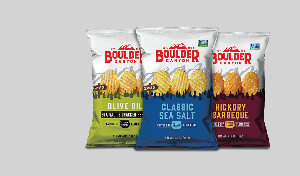
To play up the power of place, the agency transformed the silhouette of the Boulder mountains, known as the Flatirons, from the original logo into an abstract background element within a larger landscape. This had the added benefit of rendering the logo more clean, modern, and flexible; it became a single color, and the surrounding and constraining square was removed.

By using relatively simple visual elements—a block of color, uniform tree silhouettes, and depth cues such as scale, layering, and shadowing—the agency was able to create a mountain scene that truly evokes the great outdoors as a visual metaphor for the natural taste and texture of the chip. In fact, in Designalytics’ consumer evaluation, category buyers were more likely to associate words like “mountains,” “Colorado,” “Boulder,” and “outdoors” with the new design than the old design.9 Additionally, the outsize chips and basic illustration style ensured that the design conveyed “approachable” as well as “adventurous.”
“When I saw the new design, I thought, ‘Wow, this is like Jeep or REI or other role model brands that tap into consumers’ emotions,’” remarked Bill Blubaugh, Senior Vice President of Marketing and Communications at UTZ Quality Foods. “People often aren’t making rational decisions at the shelf, so the more you can get them to nod their heads and say, ‘Yeah, that’s me, or that’s someone I want to be,’ the better,” he added.

"People often aren’t making rational decisions at the shelf, so the more you can get them to nod their heads and say, ‘Yeah, that’s me, or that’s someone I want to be,’ the better."
Incorporating the chip imagery in such a creative and distinctive way accomplished two key objectives; it heightened taste appeal by providing a more detailed view of the product, and it infused a sense of personality into the scene, allowing Boulder Canyon to “own” this stylistic element in a way that could be echoed across other designs and marketing materials.
”In food and beverage, taste is the number one benefit, and you can't lose sight of that. There are cues that help to drive taste appeal—like, for chocolate products, there might be a pour or pool of chocolate. If you know that works, now how do you make it ownable or unique to your brand? In this case, having the chips stand on their sides was one way to create the crave—and do it in a very branded way,” explained Blubaugh.
This “less is more” approach to food imagery also served to differentiate Boulder Canyon from competitors. “When we looked at the category, everyone had a pile of chips on their packaging. Who doesn’t know what a bowl of potato chips looks like?

Why not go for a quality-over-quantity approach with more personality and taste appeal?” said Hart. “As an agency, one of our core principles is to challenge the category, not the consumer. It's really easy to be different for the sake of being different; it’s a lot harder to be different in a more strategic, meaningful way,” he added.
When the team considered other points of competitive differentiation, Boulder Canyon’s use of healthy oils rose to the top of the list. “No one needed another classic sea salt chip. Oh, but a chip made with avocado oil? That’s good for the trade and interesting to the consumer,” said Hart. Accordingly, Interact Boulder restructured the hierarchy of communication on the package to prioritize the type of oil used—which was emblazoned in large text with the flavor signifier below in smaller text. For products that didn’t incorporate unique oils, the agency gave flavor top billing to compete more effectively with rivals who were doing the same.
"One of our core principles is to challenge the category, not the consumer. It's really easy to be different for the sake of being different; it’s a lot harder to be different in a more strategic, meaningful way."
The red of the Boulder Canyon logo—carried over from the previous design—and the white background on the upper portion of the bag remained consistent, regardless of the oil or flavor. Additionally, the color-blocking on the bottom of the package helped to improve visibility and shopability at the shelf. Impressively, the new branding enabled consumers to locate Boulder Canyon more quickly in a competitive context, reducing find-time from 6.1 seconds to 4.9 seconds.10

The brand team selected the final design from among five distinct design directions initially created by Interact Boulder, which ranged from close-in to more dramatic. “When you’re working on a redesign of a product that’s existed for a long time, you're always trying to feel out the guardrails. Like, how far can we stretch this thing? We did a lot of experimentation with the execution and placement of different visual elements, as well as the hierarchy of communication,” said Hart.
"When you’re working on a redesign of a product that’s existed for a long time, you're always trying to feel out the guardrails. Like, how far can we stretch this thing?"
To help inform the decision, Interact Boulder also assessed the design concepts in a competitive context. “We present concepts mocked-up in a ‘worst-case-scenario’ digital shelf environment. So, if there’s a large block of Kettle Brand chips on the left, and a large block of Cape Cod chips on the right, and 365 Whole Foods chips below, what does that look like? We want to make sure that our flavor and product line distinctions don’t accidentally recede when presented in a competitive context,” explained Avery Henderson, Account Manager at Interact Boulder.
In March 2019, Boulder Canyon rolled out its new packaging, quickly winning over consumers. During the 26 weeks prior to the packaging change, dollar sales for Boulder Canyon chips had declined by 38% compared to the same period in 2018. During the 26 weeks following the new design's launch, year-over-year sales reflected an impressive growth rate of 17%, completely reversing the decline and skyrocketing sales.11 Results from Designalytics’ consumer evaluation confirm these results; chip buyers preferred the new design to the old design by a ratio of two-to-one.12
During the 26 weeks following the new design's launch, year-over-year sales reflected an impressive growth rate of 17%—completely reversing the decline and skyrocketing sales.

Consumers weren’t the only ones wow-ed by Boulder Canyon’s new look; it also caused retailers to sit up and take notice. “Previously, a senior executive at a national retail chain told us that our brand had lost its way over the years. When we presented the new design, it really opened up the doors—and the shelf space—for us. We played big at that retailer,” recalled Schreiber. It doesn’t look like Boulder Canyon will be cashing in its chips anytime soon, either. Thanks to the design overhaul, Boulder Canyon’s distribution increased modestly and the brand was given priority placement at many retailers.
"Honestly, if you have a strong design that’s working hard at the shelf, you may not even need advertising. At the very least, good design is making your other marketing activities that much more effective."
“I’m a huge believer in package design. I've seen it transform brands— especially smaller brands that don't have big marketing budgets. Honestly, if you have a strong design that’s working hard at the shelf, you may not even need advertising. At the very least, good design is making your other marketing activities that much more effective,” said Blubaugh.
Download the report with interviews from all the Designalytics Effectiveness Award winners.
8 IRI, total U.S., multi-outlet, latest 4 weeks ending 10/29/2017 vs. the same period in 2016.
9, 10, 12 Designalytics Redesign Response Report for Boulder Canyon, May 2020 (n=400).
11 IRI, total U.S., multi-outlet, latest 26 weeks ending 3/24/2019 (pre-redesign) and 9/22/2019 (post-redesign) vs. the same periods in 2018.


