 Protein bars, once favored exclusively by fitness and health-food fanatics, have slowly become a grab-and-go staple for mainstream consumers. Supermarkets now devote significant shelf space to these tasty little snacks—with options ranging from protein-rich peanut-butter wafers to keto-friendly venison bars.
Despite the incredible range of choices today, times were simpler in the 1990s when the category was first beginning to gain momentum; there were far fewer competitors clamoring for consumers’ attention. In 1999, a brand called thinkThin launched, targeting health-focused shoppers. As an early mover, thinkThin amassed a large following over the years, and enjoyed steady growth—until a torrent of new challenger brands entered the scene.
Over the past decade, many established consumer-packaged-goods (CPG) brands have found themselves in the same predicament, asking: how can we update our image to appeal to today’s consumer? Many of these brands have also adopted the same strategy that thinkThin did—a dramatic rebrand—to reverse their fortunes, but few have experienced such marked success.
“There's a revolution going on where upstart brands aren’t playing by traditional CPG rules. They're using a lot of color, and they're using very gutsy, big, and bold names. It’s getting harder for legacy brands to restage themselves and retain their relevance,” said Ross Patrick, Executive Creative Director at DDW, the California-based design agency that led thinkThin’s rebranding effort.
ThinkThin’s signature beige coloring had initially been an element that helped the brand to stand out at the shelf. “Several years ago, there were a lot of flashy, colorful brands screaming at consumers—and we were a very neutral, natural, soothing center brand block. We were an oasis in a rainbow of confusion,” said Melissa Astete, Senior Brand Manager at think!.
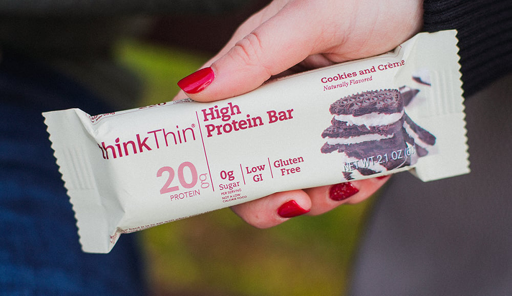
However, as time passed, some competitors began to take inspiration from thinkThin’s muted coloring; the brand became much harder for consumers to spot on store shelves. New consumer trends also created weaknesses in thinkThin’s packaging—notably, America’s obsession with protein-packed foods. The craze was widespread by the mid 2010s, with little sign of slowing down; in 2019, products with protein claims were growing at 9% per year—three times faster than total U.S. grocery sales, according to IRI.1
“We discovered that we weren’t getting credit for our high protein content, while some other brands with only half the protein were connecting with consumers on that dimension because they had more prominent claims, stronger personalities, and more distinctive designs,” said Astete.
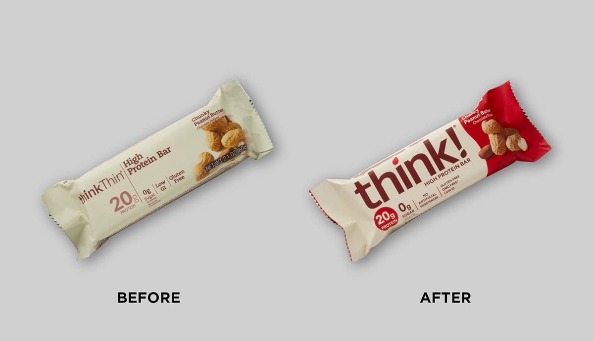
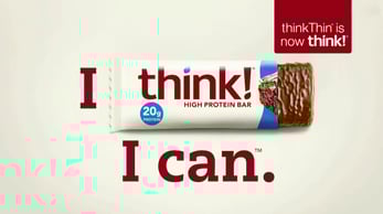
In September 2018, thinkThin engaged DDW to lead its rebranding effort. Prior to the kick-off, the brand had made the decision to shed the word “Thin” from its name—and all the baggage that comes with it. The agency updated the existing logo, but retained the same color and typography as the original version. “It’s all about health, nutrition, and body positivity now. When you look back at the thinkThin name, you go, ‘Wait a minute—how was it called that?’ But that was years ago, and a lot has changed,” said Mike Goefft, Managing Director at DDW.
“It’s all about health, nutrition, and body positivity now. When you look back at the thinkThin name, you go, ‘Wait a minute—how was it called that?’ But that was years ago, and a lot has changed.”
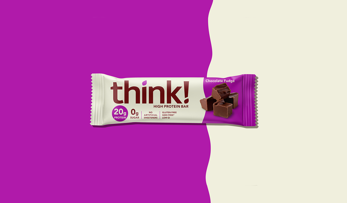
Following an intensive workshop session to flesh out the creative brief, the agency developed several distinct package design concepts based on the new think! positioning. Ultimately, the brand team chose the design that would pop on shelf and communicate the right things—healthy, tasty, and high in protein—while preserving the current design’s key distinctive assets.
Shortening the brand name meant that the logo could be enlarged on the package, which had a profound impact on the brand’s findability. When consumers were tasked with locating the old and new designs from a competitive line-up, they could identify the new design nearly six seconds faster with higher accuracy scores, according to Designalytics’ consumer evaluation.2
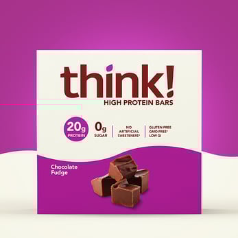
Having captured consumers’ attention, the next priority was to make the protein claim pop. DDW placed a colorful, high-contrast circle behind the “20 grams” call-out, making it impossible for consumers to miss.
Amplifying the protein count and downplaying diet associations had the added benefit of attracting more male consumers. “From our research, we knew that 40% of thinkThin users were male, and we couldn’t ignore the guys in the room any longer. Dropping the ‘Thin’ from our brand name and emphasizing the protein call-out has definitely expanded our user base,” said Astete.
Based on consumer feedback collected earlier in the process, the team knew which of its existing brand assets were distinctive and important to preserve: “The logo needed to remain burgundy, and that ‘blonde’ canvas needed to be retained in some form. Additionally, we were doing something that many brands in the category don’t do—including food imagery on the pack—which we felt was important in driving taste appeal. These became our guardrails,” said Nora Witt, Marketing Director at think!.
DDW kept the brand’s signature beige coloring for think!’s core product line but added bold splashes of color to boost its visibility on retail shelves. This approach translated well to other channels, including advertising and social media. “The modern shelf set includes Instagram, and we presented our initial designs in that context in addition to the traditional retail environment," said Patrick. "Consumers might be seeing the product for the first time on Instagram, and they might be making their purchase decisions there. We needed to be a confident, vibrant, bold brand in that space,” he added.
This color-forward approach also emphasized the product photography, which remained the same across old and new designs. As a result, the product’s superior taste credentials came through more clearly. In Designalytics’ consumer assessment, consumers were nearly four times more likely to report that the new design better conveys “tastes great.”3
In Designalytics’ consumer assessment, consumers were nearly four times more likely to report that the new design better conveys “tastes great."
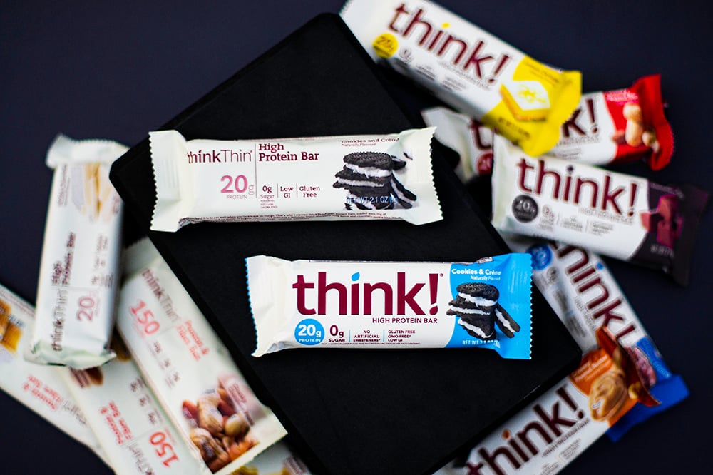
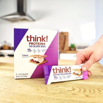
Color also played a key role in making the brand’s different flavor varieties and product lines easier for consumers to navigate. “Even retailers were confusing our product lines—they’d put 10-gram protein bars in the slots for 20-gram bars. We needed a better way to differentiate them,” said Astete. The team determined that beige would be used to denote the core, high-protein line, while white would be used exclusively for Protein+ 150 Calorie bars. Additionally, the core line made use of a distinctive, wavy color-block, while the secondary line stuck to bold diagonals.
In April 2019, think! launched its new brand to market—receiving overwhelmingly positive feedback from consumers and retailers alike. The bars began to receive priority placement at more stores. “A lot of retailers are looking at think! as a new brand. It’s been around for 20 years, but it just feels new, you know?” remarked Bill Larsen, Director of Client Services at DDW.
“A lot of retailers are looking at think! as a new brand. It’s been around for 20 years, but it just feels new, you know?”
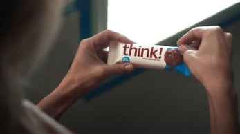
Soon after the launch, think! developed a TV spot to promote the brand—in which the new package design played a pivotal role. “From testing, we learned that the first version of the spot didn’t leverage the packaging as much as it should’ve. Some consumers weren’t sure what the ad was for until the end. We went back to add footage where the packaging was really prominent, like a consumer taking a bite out of the bar, and we consciously made the decision to begin and end the spot on a package shot,” said Witt.
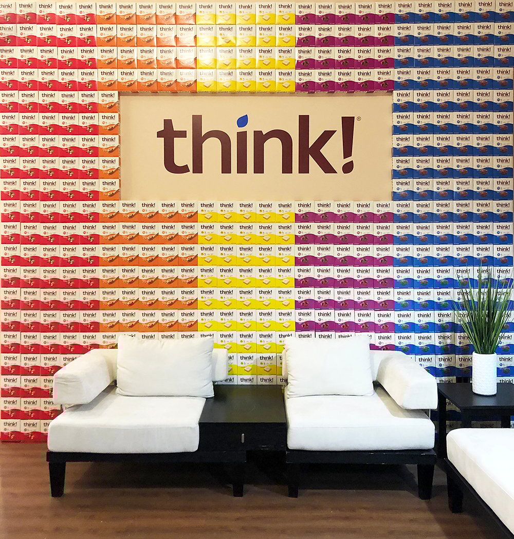
Think!’s other marketing efforts heavily leveraged the new design, including social media, digital advertising, trade shows, and in-store promotions. “The wave became a powerful asset because it created a strong block of color and a strong shelf presence. This really came through in their Expo West booth, creating a cool visual effect at such a large scale,” said Janice Healy, Account Director at DDW.
During the 26 weeks before the packaging change, sales for thinkThin bars had declined by 7% compared to the same period in 2018. During the 26 weeks following the new design's launch, year-over-year sales increased by 6%.
The redesign had a profound impact on think!’s sales, halting a decline, and returning the brand to growth. During the 26 weeks before the packaging change, sales for thinkThin bars had declined by 7% compared to the same period in 2018. During the 26 weeks following the new design's launch, year-over-year sales increased by 6%.4 Truly, nothing tastes sweeter than winning over consumers.
Download the report with interviews from all the Designalytics Effectiveness Award winners.
1 Food Business News, “Protein remains a powerful force in food and beverage innovation,” June 2019.
2,3 Designalytics Redesign Response Report for think!, May 2020 (n=400).
4 IRI, total U.S., multi-outlet, latest 52 weeks ending 12/29/2019. Data for Think! High Protein and Protein+ 150 Calorie Bars, including both single bars and multi-packs.


