
This blog post was updated in June 2026 to reflect the most recent information, data, and insights available at the time of publication.
Consumers have a lot going on. They’ve got jobs, maybe a few kids, a demanding cat, a house to clean—all of which take up space in their brains. That doesn't leave much room for brands, especially given the vast number of them competing for attention on television, social media, bus shelters—pretty much any available space in the digital and physical realms.
Brands that find their way into consumers' minds are more likely to be short-listed when shoppers are hurriedly scanning store shelves for the products they'll purchase. This concept of "mental availability," which refers to the propensity for a particular brand to be noticed or thought about in buying situations, achieved mainstream popularity in 2010 with the publication of Byron Sharp's bestseller, How Brands Grow.
Why should brands care about mental availability?
Package design is arguably the most important marketing "channel" for mental availability; it reaches 100% of in-store buyers at the time when they're actively making purchase decisions. Advertising plays an important role in driving brand awareness when consumers aren't shopping, but advertising that doesn't connect to the package design ultimately has little impact on purchase behavior.1 Packaging is the last link in the chain. (Sometimes it's the first, too—but it's always the last.)
Advertising plays an important role in driving brand awareness when consumers aren't shopping, but advertising that doesn't connect to the package design ultimately has little impact on purchase behavior.
Historically, no formal measurement system existed to gauge the mental availability of a brand. As a result, some brands today aren't even aware that they have low mental availability—or, if they are, they may not feel like they have the depth of information required to address the problem.
How can brands assess their mental availability?
Distance recognition
In physical stores, highly recognizable brands tend to act as “anchor points” as consumers approach a particular aisle. These brands are more likely to make it into consumers’ transactional
consideration sets—and, ultimately, more likely to get purchased. Strong distance recognition can be driven by brand familiarity, larger package sizes, highly prominent and legible branding, and the presence of distinctive assets.

Frozen appetizers and snacks provide an interesting example. Bagel Bites and Totino’s pizza rolls are familiar to almost all category consumers, but based on Designalytics' consumer evaluation, Bagel Bites is recognizable from a significantly greater distance—20.9 feet, versus 14.6 feet for Totino’s.
Both packages feature distinctive logos and appetizing product imagery, and consumers responded to those elements nearly equally. However, several factors may be contributing to Bagel Bites’ superior distance recognition. While red and yellow are common colors in the category, Bagel Bites’ particular combination of colors and taste imagery appears to be more effective. The brand’s box format may also play a role in providing a larger, flatter surface to display these design elements than Totino’s flexible bag.
Memory structures
If mental availability is a house, memory structures are the bricks that make up that house. Memory structures are associations tied to a specific brand, such as the brand name, the product's appearance, the brand's personality, the context in which the product is used, and so on. These "bricks" can be added over time to increase the size of the house (i.e., the brand's mental availability). Marketing activities that consistently tap into memory structures strengthen the "house."
In categories where multiple brands employ the same color, unique combinations of color or brand assets can provide an additional line of defense against confusion. The water enhancers category, for example, showcases multiple different types of design-driven memory structures, including color. Liquid I.V. utilizes blue, along with multiple graphic elements, including flavor imagery and several product claims. Gatorade also uses the color blue for one of its flavors, but the product's brand equity—specifically the “G” and lightning bolt so often associated with the brand—helps to set it apart from Liquid I.V.
Mio doesn’t have the advantages that a massive brand like Gatorade does, or those of an established category leader like Liquid I.V. So it has to create its own distinctive structures—like shape. Mio’s egg-shaped format is a memorable attribute—so much so that consumers associate the word “teardrop” and “drop” with the brand (“egg” was also mentioned, which may be worth noting for the brand.

It's worth noting that for memory structures to be effective, they must link to a specific brand, not just to the category in general. For example, in the dog food category, images of adorable canines are practically ubiquitous, and many brands vary the dogs they feature across their different product varieties and sub-brands. Generally, consumers don't connect these images with one brand in particular. However, dog food brands that consistently use the same canine celebrity on their packaging may succeed in developing brand-specific memory structures.
Distinctive assets
Distinctive assets are colors, typefaces, symbols, shapes, characters, or other graphical elements that are linked to a particular brand. They facilitate brand recognition, help to differentiate between competitors and sub-brands, add extra "umph" to marketing efforts, and enable more flexible creative by relying less on a brand's logo.
Cholula offers a strong example in multiple categories. La Chila—the iconic woman on the brand’s packaging—is a highly distinctive brand asset. In fact, taco seasoning category buyers in 2025 indicate that she is the product's most distinctive element, outperforming even the Cholula logo, colors, and product imagery.

Maintaining resonance over time without sacrificing brand equity can be a balancing act for heritage brands expanding into new categories or refreshing their designs.
Cholula has carried its top distinctive asset across its portfolio, from its original hot sauce to newer products like seasonings and salsas. And La Chila's equity seems to endure. A Designalytics 2023 study of the hot sauce category found her just as distinctive on the original hot sauce packaging as the 2025 taco seasoning design.
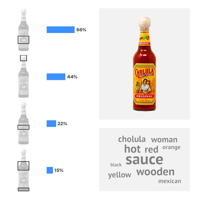
Consumers also identify La Chila as the original hot sauce design's most distinctive asset—represented through the distribution of clicks across the package and consumers' open-ended responses when asked which assets are uniquely associated with this brand. (Source: Designalytics Annual Category Report for Hot Sauce, September 2023)
Design is the bedrock of strong mental availability, which links all marketing efforts to the moment of purchase. Brands, both small and large, should constantly be striving to cement and increase their mental availability through consistent, strategic use of their visual brand assets. Of course, it's always helpful to begin with the consumer view when asking questions like, "Which assets are viewed as truly unique to the brand? Which assets are not yet distinctive, but appealing and worthy of greater emphasis? Which distinctive assets would be more likable if rendered differently?"
If you'd like to learn more about how Designalytics measures mental availability or see how brands in your category perform on mental availability metrics, drop us a line.
1 Byron Sharp, How Brands Grow, 2010.


