
These days, many brands are taking a fresh look at their packaging and deciding on a simplified approach. This trend towards addition-by-subtraction has other brands, understandably, wondering if it makes sense to follow suit.
The shift to more minimalist designs is understandable, in part because of the deluge of information consumers are facing. Consider this: In the 1970s, it was estimated that the average American was exposed to 500 or more advertising messages daily. By 2007, that number had skyrocketed to around 5,000. Since then, it's estimated to have increased to as many as 10,000 messages per day. Our brains are bombarded, and our shopping experiences are among the most informationally intense of all.
That’s just one reason this current shift makes sense. The answer to the question “should my brand simplify its packaging?” may not be as simple as you might think, however.
The case for minimalism in packaging
The organizing principle behind this movement appears to be “less”: decreased copy, fewer (and more neutral) colors, reduced textural elements, flatter logos, and simpler imagery. In addition to helping brands keep up with modern design trends, this approach addresses an inevitable (and sometimes unfortunate) accretion of design assets.
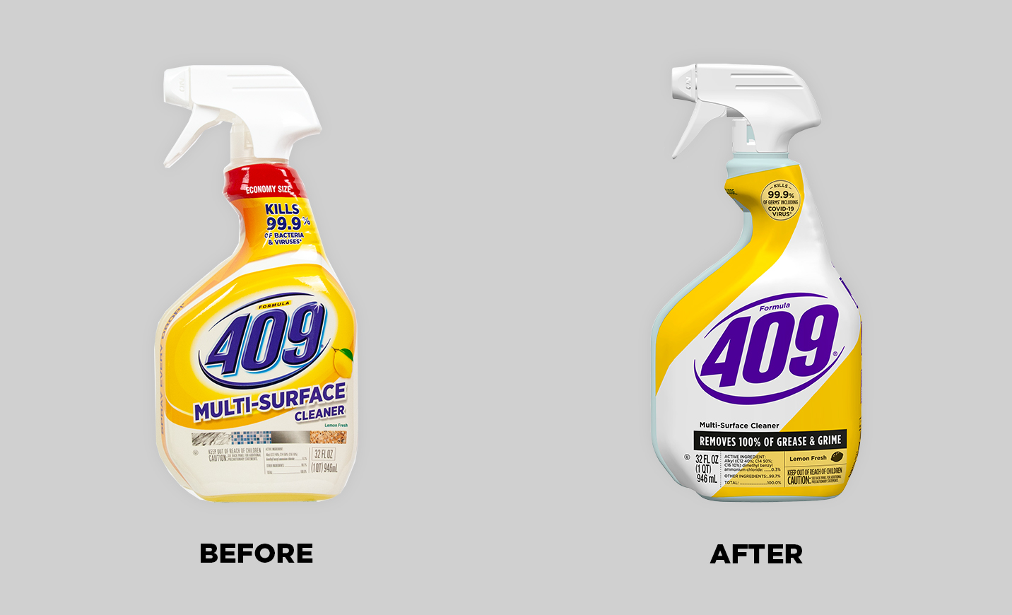
Some brands, like Formula 409, opt for a redesign that finds ways to simplify their logo.
Over time, designs tend to get cluttered; one iteration builds on another as the market evolves and your brand battles its competition on the (actual and virtual) shelves. Making claims that align with where the market is shifting makes good sense, but over time they can build up. Consider all the claims that have become popular in recent years, from the “free” family (BPA-free, fat-free, cruelty-free, gluten-free, etc. ) to the celebration of organic, sustainability-minded, and plant-based products within any given package.
Morningstar Farms, a Designalytics Effectiveness Award winner, struggled with this very issue. “Over the years, we had started to ‘NASCAR’ the pack—over-claiming it and putting too many banners and call-outs, which was impacting shopability,” said Neil Cowan, brand design director at Kellogg’s. Streamlining the content and refining the hierarchy of communication helped create an award-winning redesign.
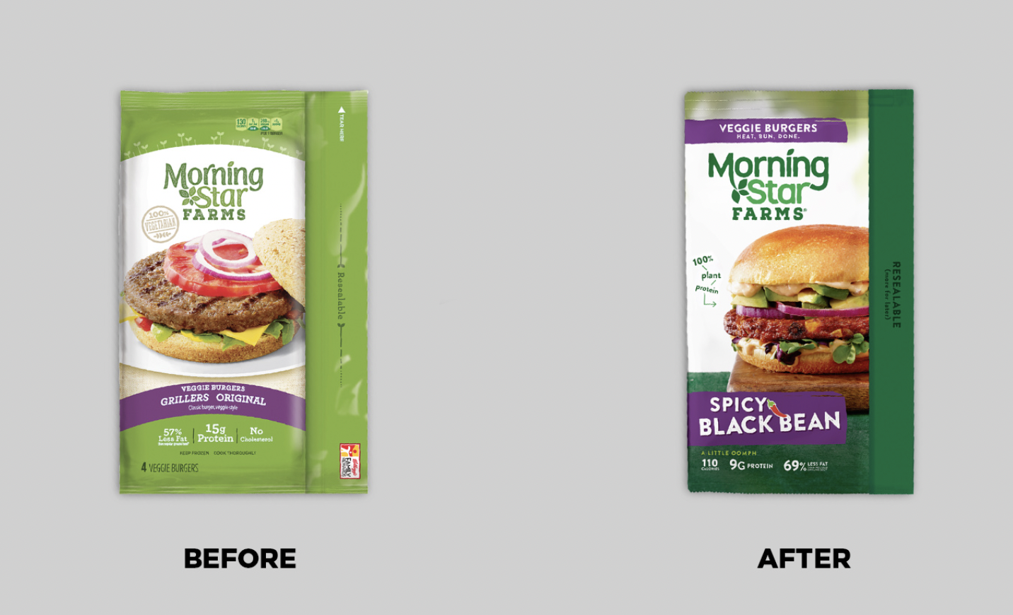
“De-NASCAR-ing” their design proved effective for MorningStar Farms.
Cutting back on design elements can have a “spring cleaning” effect, making your design more modern and aesthetically appealing. On a practical level, it can also help a product stand out amidst the colorful cacophony of competing brands, and bucking category norms can capture consumers' attention.
So, there are very clear benefits to embracing this style. As with most things, though, it’s not just a matter of either-or, but of degrees and discernment.
The testing problem
When a brand embarks on a design initiative, its objectives may range from tactical considerations (e.g., “improve standout at shelf”) to branding and aesthetic improvements (e.g., “look more modern”). Sometimes, a redesign concept can gain ground in one area, but lose in another. In the case of minimalist designs, the areas where they may fall behind can be among the most important: communication, and traditional design testing is ill-equipped to illuminate the issue for several reasons, most notably that it generally takes place at the end of the creative process.
At that stage, it’s too late to inform a strategic creative brief or make significant changes. Testing earlier in the process not only gives brands the opportunity to test multiple designs, it allows for data-driven feedback (rather than subjective opinion) to help refine one that’s chosen. When it comes to creating a “minimalist” design, it allows you to define and refine what that means for your brand.
After all, there is a spectrum of simplification—it isn’t only a matter of whether you’ll streamline your design, but how you’ll do it. Does your design lack key efficacy claims? Is your food imagery not conveying “tastes great” as effectively as it could? Is your color scheme occluding your brand’s “natural” positioning? Testing designs earlier helps to crystallize what’s most important as you move through the creative process, particularly in the area of communication.
Are you hitting “mute” on your design?
At Designalytics, we’ve found a nearly 90% correlation between improved communication and better sales. In other words, if you improve on this metric, there’s an excellent chance you’ll improve business outcomes.
When it comes to communication, there can be an advantage to removing some elements of your design. (Note: We’re talking not only about written claims here, but relevant visuals, package shape, and overall design—each can communicate in its own way).
By “saying” fewer things, your brand can draw consumers’ attention to what remains, and reducing the noise allows increased focus on essential elements. The question is: Do you really know what’s essential to your design? And are you sure of how clearly and effectively you are communicating vital messages? If not, you may be eliminating the most important parts of your design.
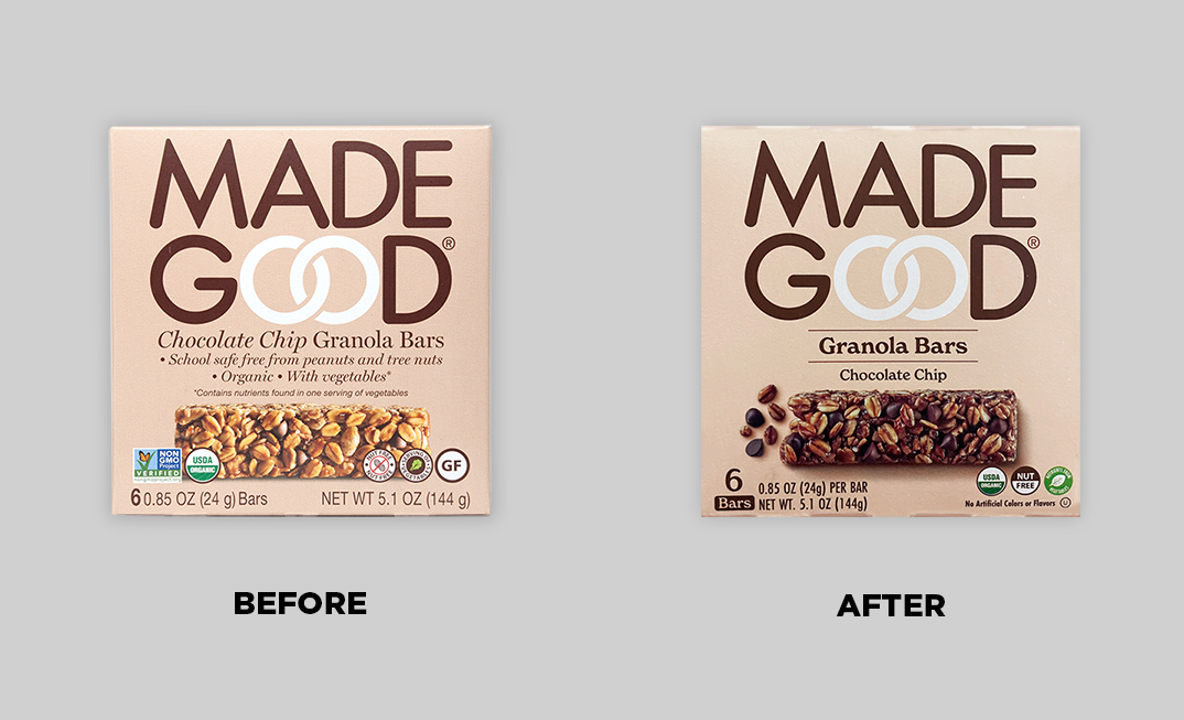
Made Good reduced their messaging considerably in their design, including removing text claims and winnowing the number of seals, in order to focus more on appetite appeal.
There’s a quote from advertising legend David Ogilvy that’s illustrative in this case: “The more you tell, the more you sell.” Sometimes, in service to the minimalist ideal, brands end up “telling” much less—they remove some of what communicates the product’s value best. If the packaging isn’t saying much, it leaves an opening for other brands to fill. (There’s a reason good salespeople are rarely shy.)
It’s important to remember that consumers will buy a product primarily because they believe it will deliver what they want better than the alternatives. That means that communicating the right messages to consumers (and doing it well) is of paramount importance. And if you don’t have objective measurement, how can you be sure you’re hitting the right notes in a way that’s resonating with consumers?
Weighing simplified packaging for your brand
A minimalist approach can have a negative impact, then, but that doesn’t necessarily mean it’s a bad idea. Just as important as the choice to take this path is how you execute it. Before you declutter your design, you should first ask: what is actually clutter and what is communicating something important?
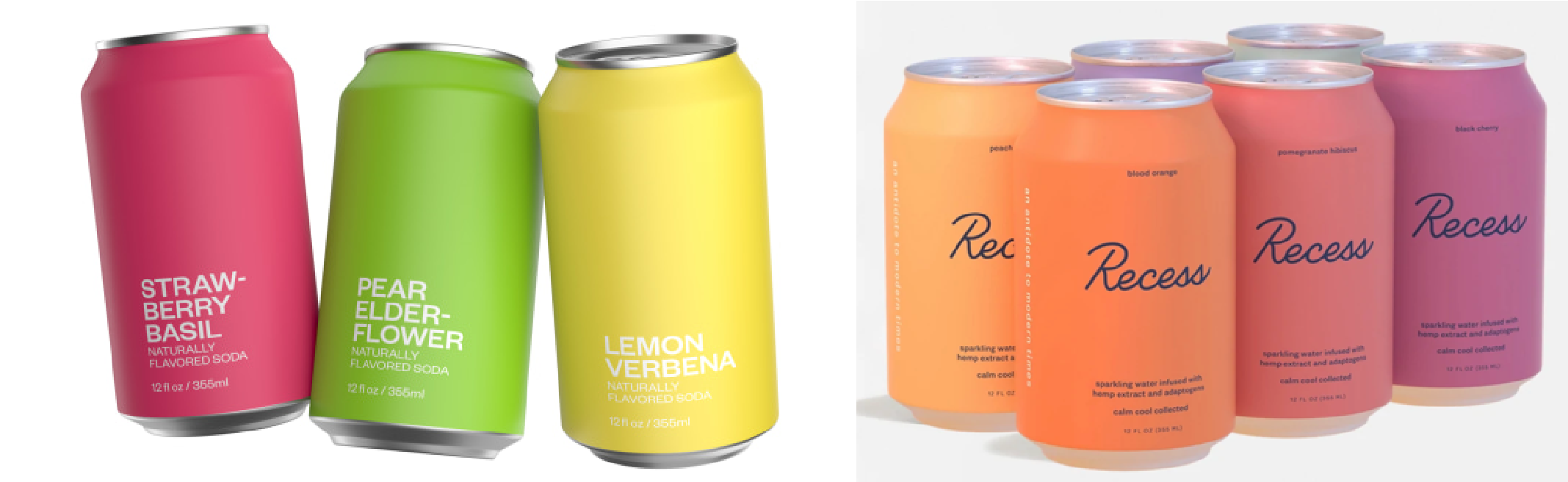
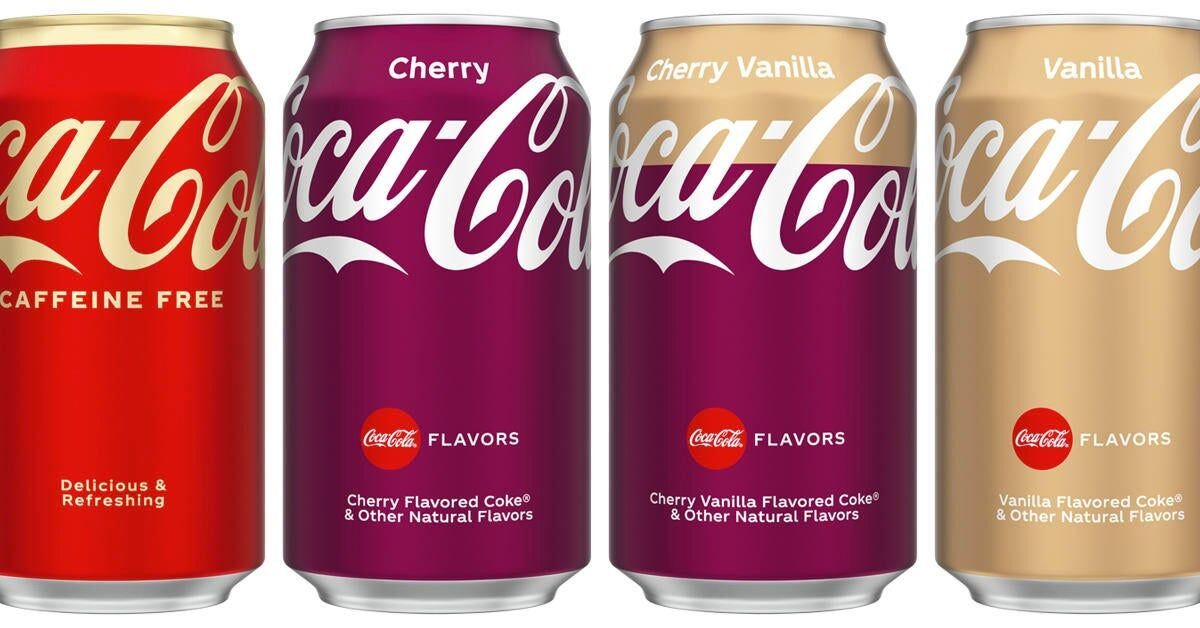
More brands are experimenting with simplifying designs, from challengers to icons.
Here’s a great way to explore this question: Test a range of design options on a spectrum from your current design to an extremely minimalist version—ensuring that you take into account standout as well as other essential factors like communication and purchase preference (which, our validation work has shown, both have a high correlation with in-market performance). If you’ve done this earlier in the process, it will allow you to refine your design to maximize impact—and the results will likely give a clear indication of which evolution of your design is likely to modernize your design and drive in-market sales.
Out of 20 recent redesigns that Designalytics has measured, eight improved purchase preference (a measure with 95% predictive reliability), three performed roughly the same, and nine actually reduced consumer interest in purchasing the product.
Brands that simplify their design can be successful, but not simply because they set out to be minimalistic. It’s much more likely that they’ve created a design that cuts through the noise to communicate what consumers actually want to know… without overwhelming them with what they don’t.


