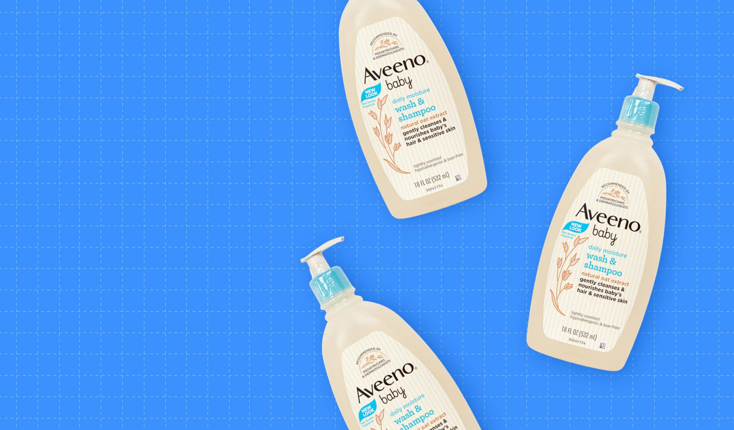
Brand: Aveeno Baby Wash
Category: Baby Bath Care
Parent brand: Johnson & Johnson
Agency: Unknown
Welcome to our Redesign of the Month series—where we spotlight one deserving brand harnessing the power of design to make an impact, tell a story, and outshine its previous packaging.
Hundreds of current category consumers evaluate the old and new designs across a wide range of performance areas, including purchase preference, communication, mental availability, and design-element resonance. Notably, Designalytics’ testing outcomes align with actual sales performance more than 90% of the time, which bodes well for this month’s winner: Aveeno Baby Wash & Shampoo.
Background
Parents and caretakers obviously pay close attention to anything that touches their baby’s skin, especially when it comes to bathtime. While the effectiveness of bath products is important, it doesn’t top the list of consumers’ concerns. Attributes like “safe for my baby,” “does not irritate skin,” “good for sensitive skin,” and “does not cause tears” rank higher in importance.
Gentleness may be paramount for the product, but that doesn’t mean the category competition is gentle. Other contenders include iconic brands like Dove, Burt’s Bees, Honest, and Cetaphil—so succeeding in this space isn’t exactly child’s play.
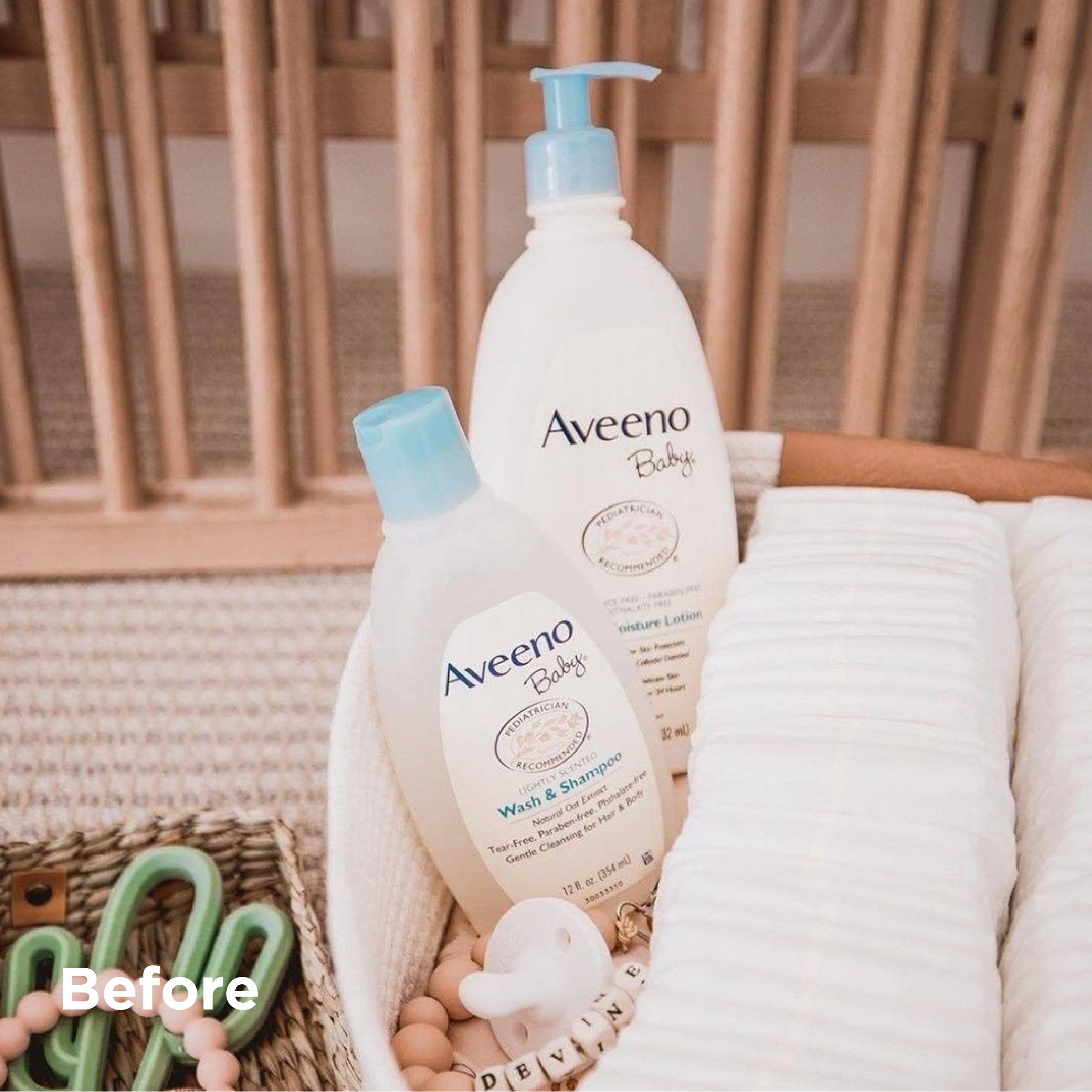
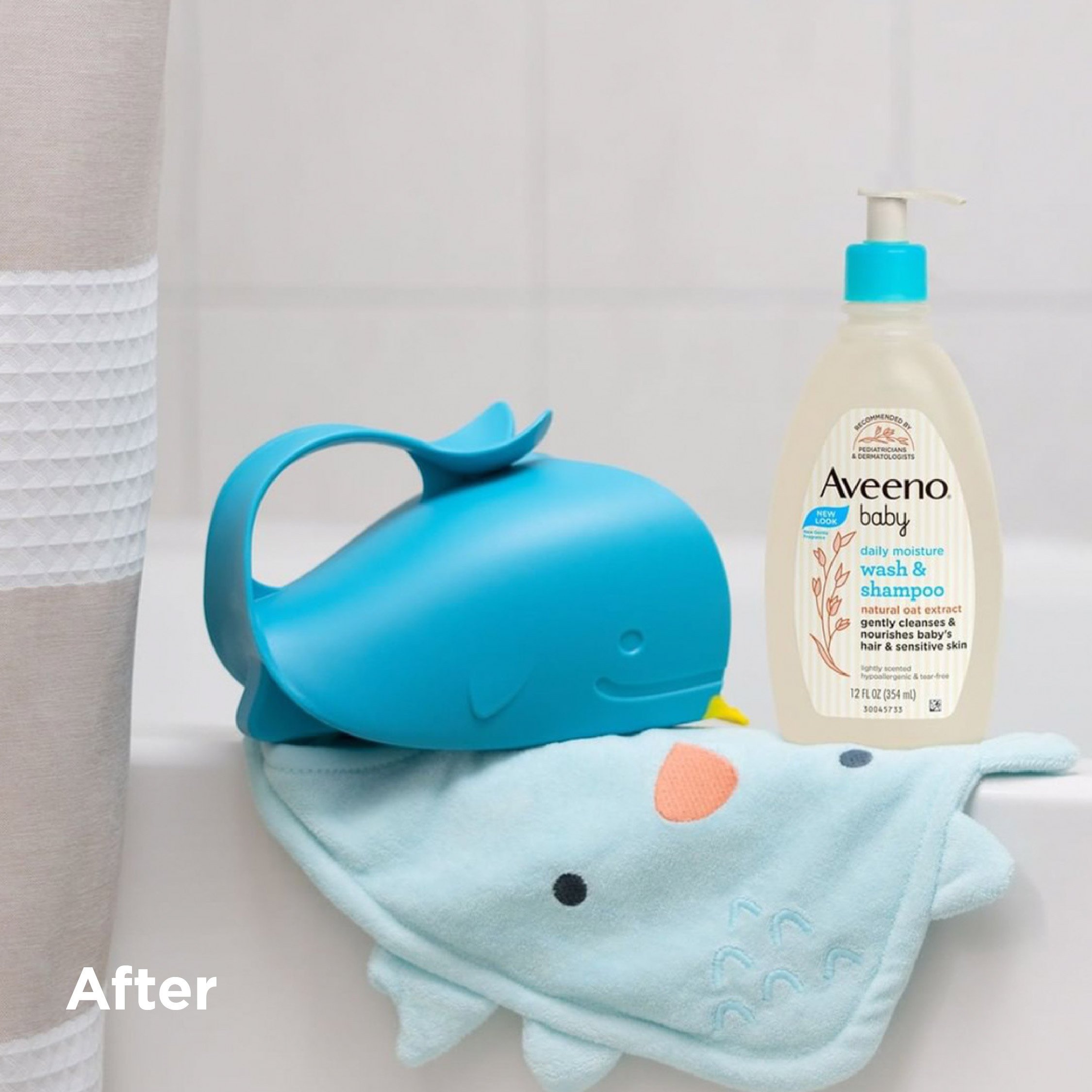
That’s likely why Aveeno, in spite of already having a well-performing design, decided to refresh its packaging. And, oh baby, did its new design deliver positive results.
Key creative changes
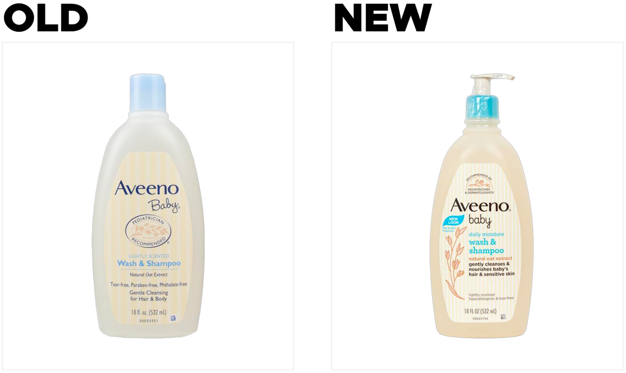
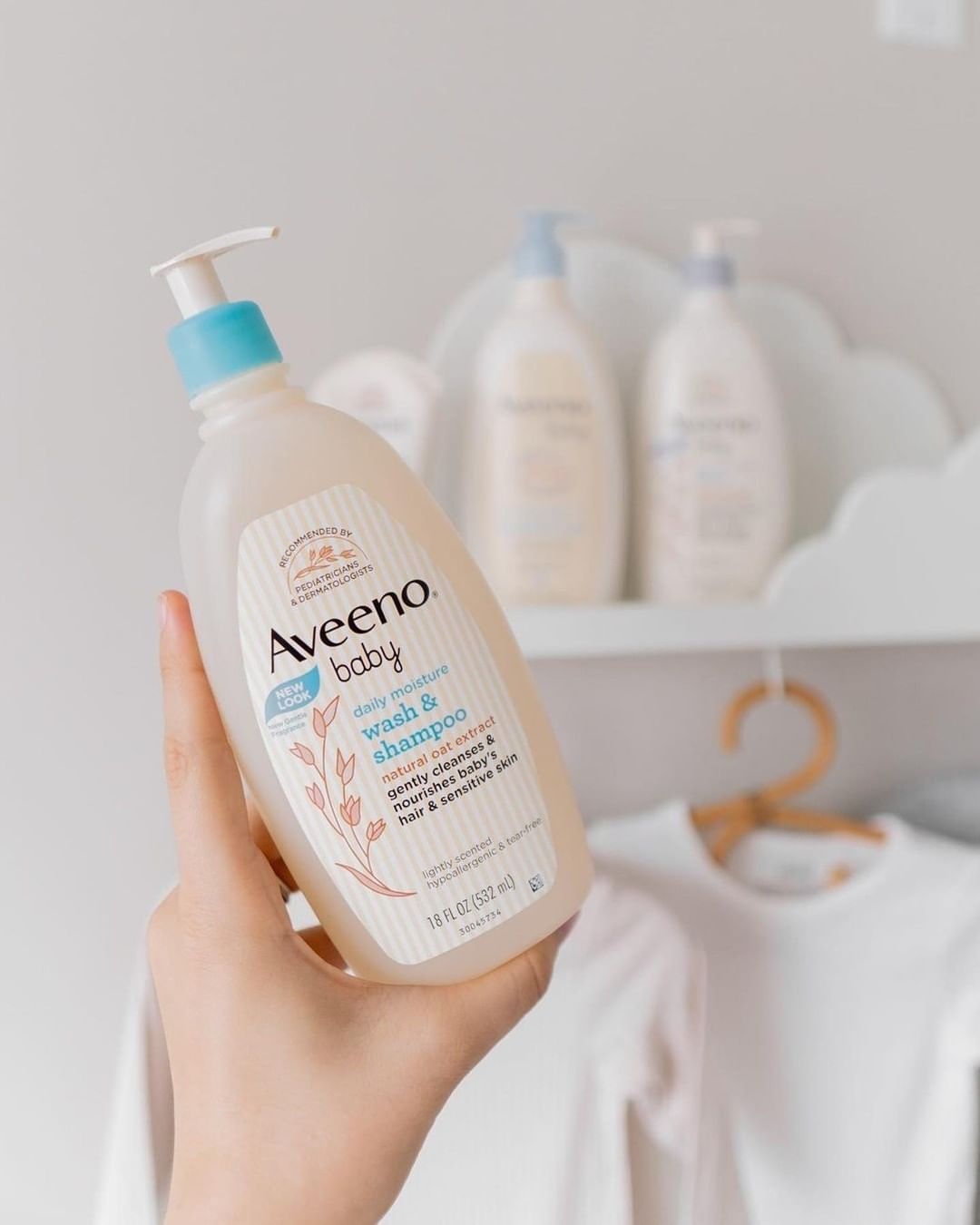
There were quite a few modifications–including the addition of a pump spout–but this redesign primarily seemed to coalesce around a specific idea: highlighting what the product is and what it does, and placing less priority—but not necessarily removing—what it isn’t (tear-free, paraben-free, etc.).
This category’s consumers are driven by what’s good for their baby, so the importance of communication—a crucial component of package design effectiveness in any category—is even more pronounced. Products can only say so much without overwhelming the consumer, so a carefully-calibrated approach is called for.
The approval of medical experts can boost a product’s credibility, and that’s certainly the case in the baby bath care category. “Pediatrician recommended” was listed on the old design, but on the new design, the brand not only gave it priority placement at the top of the label, they also added another M.D. to the mix: “Recommended by pediatricians and dermatologists.”
There were other changes to messages as well. On the old design, “lightly scented” was used to describe “wash & shampoo.” As it turns out, scent isn’t even listed in the top 12 attributes for baby bath care, but “leaves skin moisturized” is. So the brand chose “daily moisture” to highlight this quality.
The new design also offered new language to summarize what the product actually does—“Gently cleanses & nourishes baby’s hair & sensitive skin”—as well as a reference to “natural oat extract,” an ingredient known to contribute to healthy skin (which also appeared on the old design, but less prominently). Importantly, each of these modifications to the package’s communication was buttressed by an overarching effort to make the text more readable: the brand chose larger, bolder fonts with contrasting colors that stood out more.
The bottom line
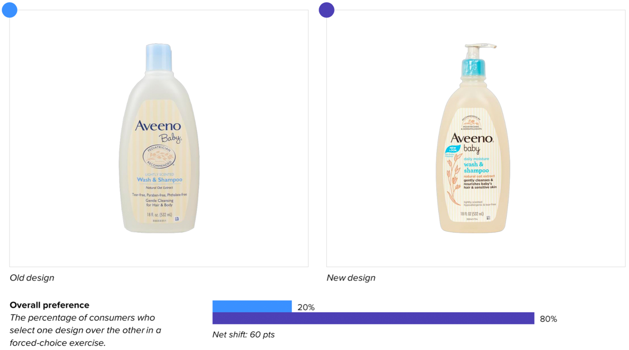
As far as consumers are concerned, Aveeno’s new design is as smooth as a baby’s… well, you know. It bested the old look in purchase preference by a stunning four to one–80% to 20%.
Wins and opportunities
This redesign is a testament to how targeted changes in communication can make a marked difference in the effectiveness of a design.
In some variables, there was little change in performance across designs: they were roughly equal in both findability and distance recognition, for example. Yet the brand clearly understood what was important to their customers. How do we know?
Designalytics objectively determines the top purchase-driving attributes in a given product category through research with hundreds of consumers. Then we then utilize a forced-choice exercise to ascertain which designs are communicating each attribute most effectively.
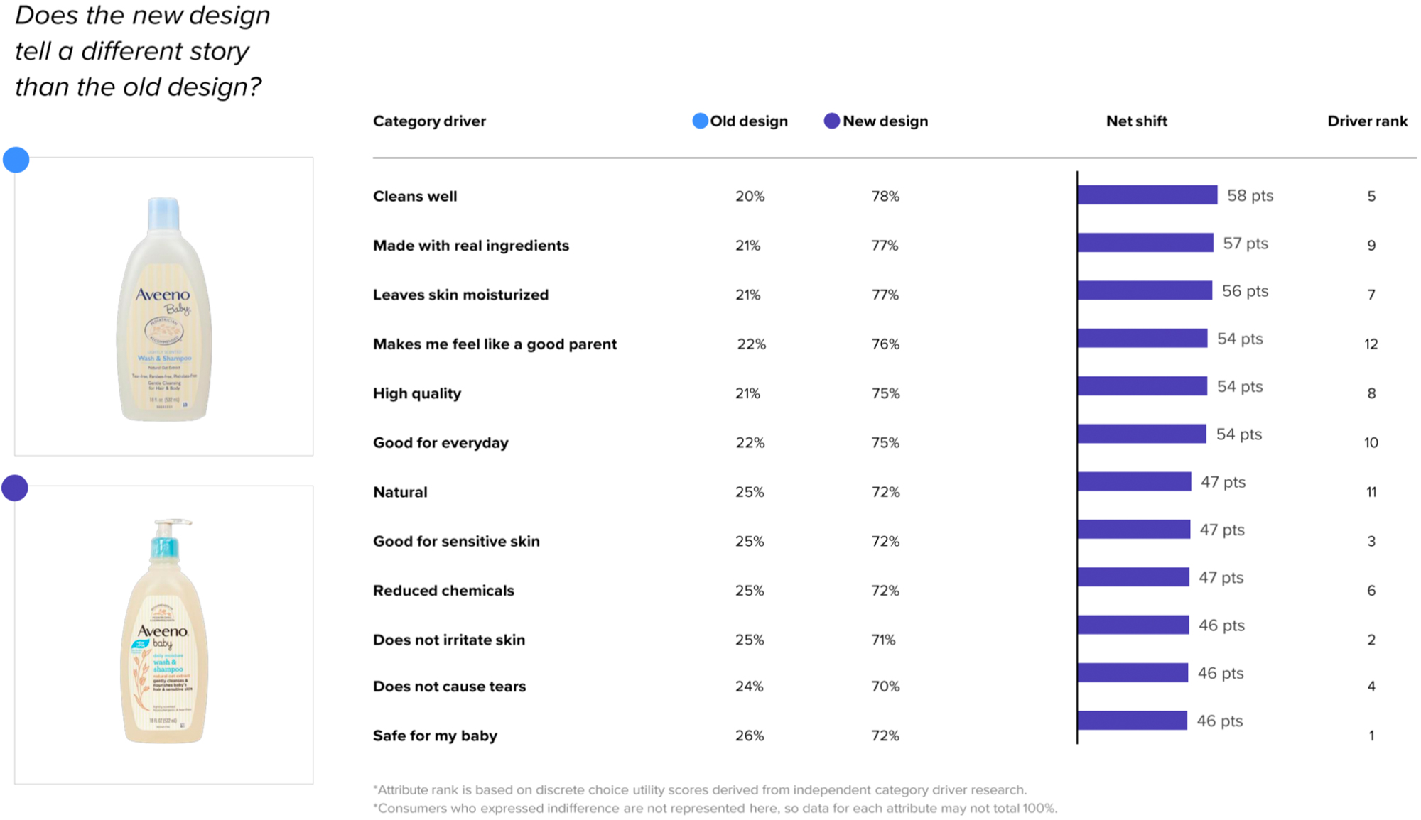
In the case of Aveeno’s new design, it not only improved in addressing each of the top 12 most important attributes, it dominated the older iteration.
The economy of words was notable. For example, the phrase “daily moisture” on the bottle hits on attributes related to everyday use and moisturizing skin. The call out of an oat extract ingredient alludes to “natural” as well as moisturizing qualities (oat extract is known for contributing to healthy skin). “This is beyond [the] bath,” wrote one consumer, “It moisturizes the baby’s skin.”
And the central message on the bottle communicates exactly what the product does—“Gently cleanses & nourishes baby’s hair & sensitive skin”—in a way that addresses several of the most important attributes (e.g., safe for my baby, does not irritate skin, good for sensitive skin, cleans well). Consumers said as much, including one who commented “[This] tells me what this product is good for,” while another said “[I] like the features and benefits—this is the information I need to know.”
In measurements of resonance, consumers will generally “like” elements of a design more than they will “dislike.” Usually, it’s a matter of degrees–how much does the new design resonate relative to the old version?
The old design had a like-to-dislike ratio of 4.7, which is good. The new design, however, had a ratio of 10.3 – more than doubling the old and the category average of 4.2 (which, incidentally, is higher than the average for most other categories).
Last but certainly not least, there is the functional modification that had consumers gushing: The pump. Parents and caretakers can have their hands full at bathtime, so the new feature–which allows for dispensing with one hand–was very much appreciated by consumers. One went so far as to say: “The pump is the best thing.”
Wins
- The new design beat the old in every single attribute of communication and by massive margins in each—between a 45- and 56-point differential for each.
- Overall, the like-to-dislike ratio (a measure of resonance) for elements of the new design was far above that of the old (and most other products in our cross-category database): 10.3 vs. 4.7.
- Both the colors and the sizes of the fonts on the new design made a difference; Multiple consumers noted that they liked how easy to read the new package was vs. one consumer who wrote of the old: “The pale yellow and white colors don't really show up that well, and make everything look really washed out.”
Opportunities
- There really wasn’t much to cry about with this redesign, but there are opportunities to improve the mental availability of the design. The new design fared no better on distance recognition (a measure of mental availability), for example, and dropped slightly on distinctive asset scores. The brand could work on developing and reinforcing more distinctive assets, both on its packaging and across marketing channels.
Consumer highlight
“It makes me feel good about how I care for my child.”
About our data
Our goal behind highlighting impactful redesigns is to help brands understand market reactions to design changes and make intentional design decisions. We create a full report of these insightful case studies for every brand redesign in our cross-category database. These value-add tools are created automatically for our clients who subscribe to syndicated category data. For more information on this redesign report or others, contact us.


