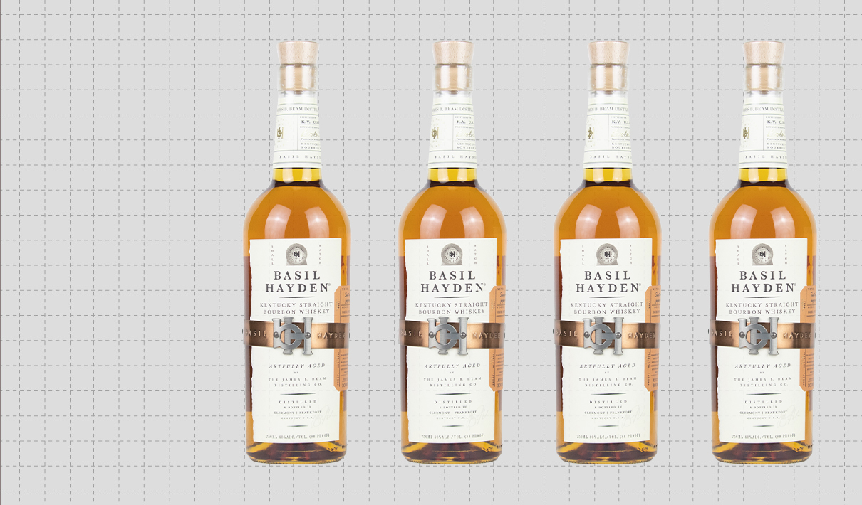
Brand: Basil Hayden Bourbon
Category: Whiskey ($25+)
Parent brand: Beam Suntory
Agency: Design Bridge
Welcome to our Redesign of the Month series—where we spotlight one deserving brand harnessing the power of design to make an impact, tell a story, and outshine its previous packaging.
Hundreds of current category consumers evaluate the old and new designs across a wide range of performance areas, including purchase preference, communication, mental availability, and design-element resonance. Notably, Designalytics’ testing outcomes align with actual sales performance more than 90% of the time, which bodes well for this month’s winner: Basil Hayden Bourbon.
Background
The bourbon space has seen an unprecedented boom in recent years. As this trend has continued, the number of distilleries has grown along with it, increasing the level of competition and pushing more established brands to ensure they’re positioned to succeed.
Basil Hayden remains a strong brand, regularly among the top 10 best-selling bourbons in the US. Created in 1992 by Booker Noe, the brand is named for Meredith Basil Hayden, Sr., a farmer-turned-bourbon pioneer who settled in Kentucky in the late 18th century. (Incidentally, Hayden’s grandson would eventually create his own bourbon, which features Basil Hayden’s face: Old Grand Dad.)
While the brand still enjoys a devoted following, the increase in competition and the ever-present battle for market share likely prompted this redesign.
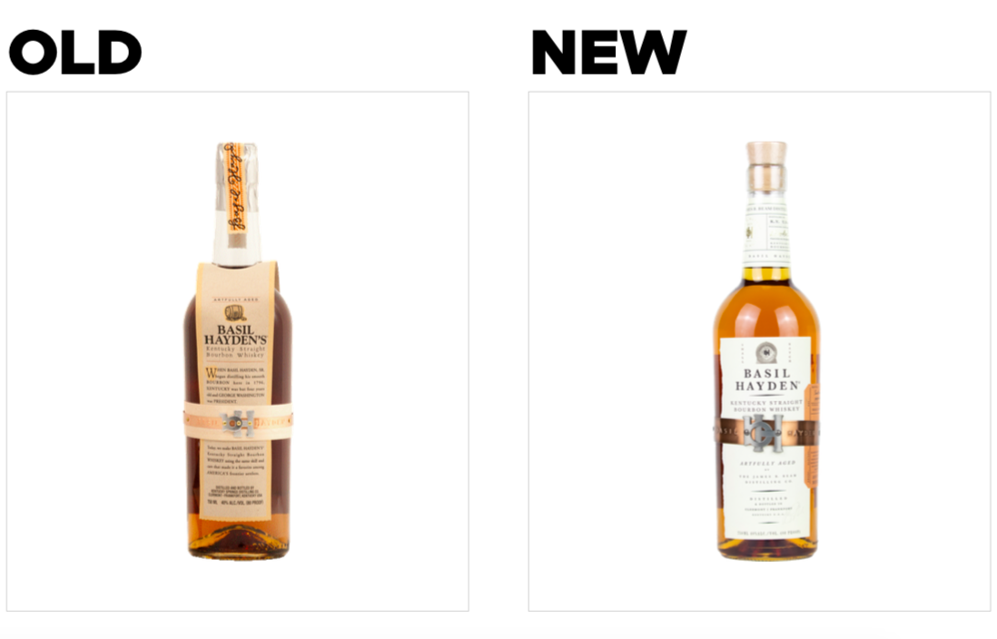
Key creative changes
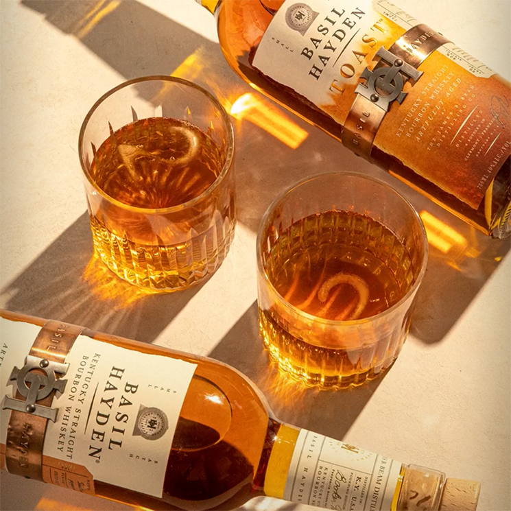
The brand chose to make its most unique design asset—the metal “belt” in the center of the bottle—into its most prominent. The copper-and-silver-toned band was widened and burnished, the size of “BH” buckle and attendant rivets was increased, and the paper band beneath it was removed.
There was also a move away from the protruding paper label, which had extended out from the bottle and included a long description of the brand’s history. Instead, there is a cleaner, streamlined label (white, instead of beige) affixed to the bottle which features simple claims instead of the text-heavy storytelling of its predecessor.
There was also a major change that one could be forgiven for missing at first. The name. The brand removed the apostrophe-s at the end of their name, shifting from “Basil Hayden’s” to simply “Basil Hayden.”
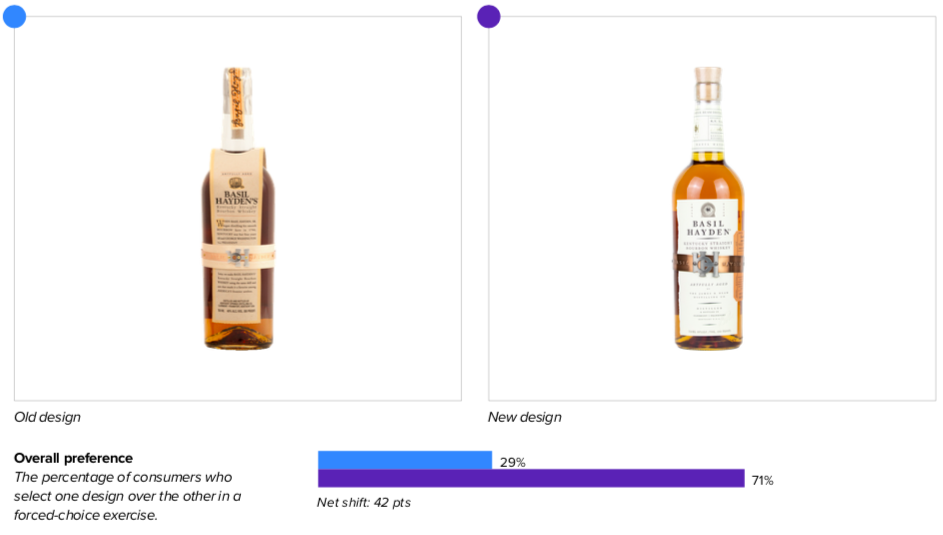
The bottom line
Basil Hayden will no doubt be raising a toast to these numbers. The new design bested the old, 71% to 29%, in purchase preference—which is undeniably something to celebrate.
Wins and opportunities
After a redesign, a brand can initially be harder to find among competitors; after all, consumers get used to a certain look, so they might not recognize the new package right away. By making its logo more legible and creating higher contrast with the lighter-colored label, Basil Hayden actually made it easier to recognize its branding.
The brand also expanded the size of its most distinctive feature—the metal band—which likely helped consumers identify the bottle. It paid off: Consumers found the new package a full 2 seconds faster (7 seconds for the old design versus 4.9 seconds for the new).
The decision to invest in a more prominent metal band seems to portend dividends in other ways as well. Consumers liked the band on the old design (on measures of resonance, it was the second most-liked element on the package), but they really liked the enhanced version on the new design. It was the most-liked element on the package, and garnered twice as many “likes” as the prior version. Interestingly, the band evoked different associations for consumers; one said it gave the bottle a “western feel,” while others said it was “classy,” “cool,” and “modern.” Yet one thread ran through most of the comments: The band is distinctive.
A change in the paper color also seems to have strengthened the look of Basil Hayden’s label—and potentially broadened its appeal. The previous design’s paper had an old-timey, weathered look, perhaps designed to mesh with the brand history described on it. The new design’s white paper not only increased contrast (thus aiding in findability), but it may have assisted in making the brand more modern and approachable. Younger consumers have been gravitating toward bourbon in recent years, so this may have been a conscious attempt to increase appeal to this segment of the market. Higher scores for “good value,” “good for casual occasions,” and “good for mixing” could reflect success on this front.
The new design also benefited by jettisoning what wasn’t working. While consumers mostly liked the logo on the old design, the paper label upon which it was printed was less beloved. At the top end, the paper jutted out, which struck some respondents as unnecessary. “The ill-fitting label looks cheap,” said one, while another remarked “It makes the product look awkward.” One consumer cited functional downsides: “The paper going all the way to the top… looks more fragile and the paper will crinkle or cause the bottle to fall out.”
The old design took up a majority of that label with the story of Basil Hayden, an approach which did not seem to have the intended effect. Although some consumers seemed to like the story it told, more were put off by it. They used words like “plain,” “wordy,” and “boring” to describe it.
Wins
- Overall, the like-to-dislike ratio (a measure of resonance) for elements of the new design was triple that of the old: 6.6 vs. 2.2.
- Importantly, the brand improved the resonance of virtually all aspects of the design, while elevating the most unique one–the metal band, with the signature BH “buckle”–to be the most liked of all). Basil Hayden seems to have found the star of its design and is giving it the spotlight it deserves.
- As noted above, the new design was also considerably easier to spot for consumers, who found it in an average of 4.9 seconds compared to 7 seconds for the old. Brands that take longer for consumers to find are more vulnerable to substitution, so this is a plus.
- The new design bested the old on positive associations and sentiment as well, with a 47% net positive rating compared to 33%.
Opportunities
- The new design could stand to improve in certain areas of communication. While it greatly outperformed the previous design in the communication of “good value” (+48%), “good for casual occasions” (+42%), and “tastes great” (+15%), it lagged in important areas, including “premium” (-10%) and “specially crafted” (-14%). It’s quite possible this was an acceptable trade-off for the brand; it may have wanted to recalibrate in order to be more approachable and fit for more casual usage occasions (as noted above).
Consumer highlight
“I feel like [the new metal band] is branded… makes it look like they took the time to make it more special and fancy.”
About our data
Our goal behind highlighting impactful redesigns is to help brands understand market reactions to design changes and make intentional design decisions. We create a full report of these insightful case studies for every brand redesign in our cross-category database. These value-add tools are created automatically for our clients who subscribe to syndicated category data. For more information on this redesign report or others, contact us.


