Category: Ice Cream (Pints)
Agency: Unknown
Our Redesign of the Month series spotlights a deserving brand that is harnessing the power of design to make an impact, tell a story, and outshine its previous packaging.
Hundreds of current category consumers evaluate the old and new designs across a wide range of performance areas, including purchase preference, communication, mental availability, and design-element resonance. Notably, Designalytics’ testing outcomes align with actual sales performance more than 90% of the time, which bodes well for this month’s winner: Ben & Jerry’s.
Background
From its humble beginnings selling ice cream out of a converted Vermont gas station, Ben & Jerry’s ice cream has grown to be globally beloved. The brand has 5,000 locations around the world and enjoys virtual ubiquity in grocery stores, making it one of the most recognizable and best-selling ice cream brands in the country.
Package design has certainly been a part of its success. In our most recent category report, Ben & Jerry’s achieved the most distinctions in communication, beating competitors in 7 of 12 top purchase-driving attributes we measured, which is a rare achievement in any category. In fact, the brand had the highest performing design across all metrics amongst its competitors. So why would Ben & Jerry's undertake a redesign when its current look was already a winner?
Like many highly successful CPG brands, Ben & Jerry’s seems to understand that highly strategic changes to a package design—even a top-performing one—can help spur growth. In order to keep and potentially expand its edge over rivals, the brand decided its package needed a refresh.
Key creative changes
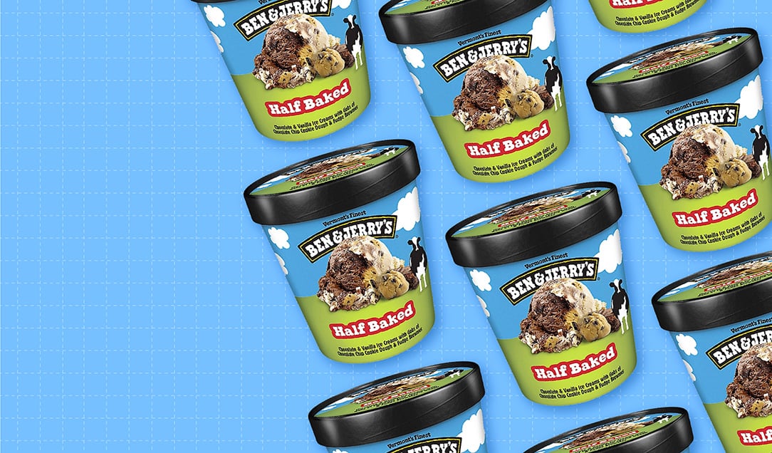
Since 2015, a playfully animated, bucolic Vermont landscape has been a key feature of Ben & Jerry’s package design, complete with a forward-facing cow and a large scoop of ice cream on the side. The new look maintains this aesthetic, with one important shift: It brings the ice cream itself to center stage.
Most of the other changes on the new package are fairly minor. The name of the flavor variety has been moved down (and in the case of Half Baked, the backwards ‘e’ has returned to its traditional positioning). The clouds in the sky are smaller; the green “pastures” take up more space, and the cow has been moved further to the side. The description of the flavor remains at the bottom of the container, though it is smaller, and has changed from white to black font.
Bringing the taste imagery on the packaging—massive mounds of ice cream, with relevant ingredients clearly visible—from the side of the package to the front was clearly the primary intent of this redesign. The brand went big and bold: The scoops of ice cream are so large, and the attendant ingredients so richly textured, everything else on the package now seems to orbit around it.
The bottom line
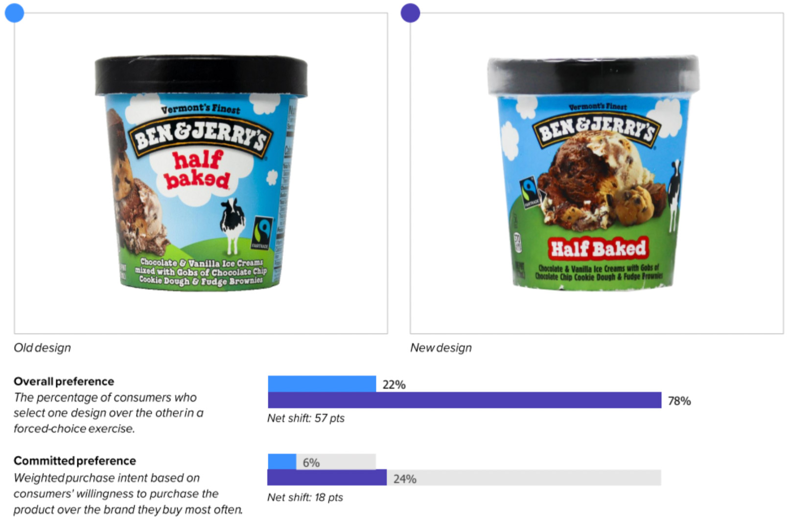
I scream, you scream, we all scream for ice cream, as the saying goes. But Ben & Jerry’s latest redesign may lead to screaming from competitors, and not in a good way. This new look topped its predecessor in consumer purchase preference by an impressive 78% to 22% margin.
Wins and opportunities
In many ways, Ben & Jerry’s has always been focused on simplicity, so it’s perhaps no surprise that this change to their packaging isn’t complicated. The brand just emphasized its most compelling asset: the product itself.
And that seems to be the main reason consumers preferred the new design so overwhelmingly. In many metrics, the difference between the previous design and the updated one were fairly insignificant. Consumers could recognize each design from virtually the same distance (a measure of mental availability). Findability scores were also comparable, if slightly favoring the old look. When asked which words come to mind when viewing each design, 54% of answers for the new design were positive. For the old? 52%.
It was in measures of communication that the gap between them turned into a statistical gorge. The new design outperformed the old in every one of the top 12 most important attributes to consumers, including “premium” (70% for the new vs. 26% for the old*), “good for the whole family” (64% vs. 32%), and “brand I trust” (68% vs. 29%). The largest difference—78% vs. 20%—was in the most important attribute of all, “tastes great.”
This was proven out in the consumer responses for the new design, many of which took special note of the image of the ice cream, such as:
“I like seeing the ice cream right on the front.”
“[I like it better because] there is a larger picture of an ice cream scoop; I can see the ingredients in the ice cream which match the ingredients below.”
Overall, this new design is likely to grow Ben & Jerry’s status as a freezer-aisle phenom.
Wins
- Ben & Jerry’s old design was already the highest performing in its category, which might lead some to stand pat. But the brand took a smart, calculated risk, and was rewarded with even better design performance and a likely increase in sales.
- The new design handily beat its predecessor in communicating every one of the top 12 attributes to consumers, by wide margins. The largest difference between them, as noted above, was in the all-important “tastes great” attribute. This bodes well for Ben & Jerry’s, since saying important things better has an 88% correlation to in-market outcomes.
- Consumers stated over and over again that they appreciated seeing what the actual ice cream looked like, and placing it on the front of the package seems to have helped immensely.
- While not a scientific measurement, consumer responses to the new design included far more effusive, all-caps responses like “MAKES MY MOUTH WATER” and “LOOKS YUMMY AND INDULGENT.” It seems that some of us actually do scream for ice cream 😄.
Opportunities
- It took consumers slightly longer to find the new design when actively searching for it: 3.1 seconds, versus 2.8 seconds for the new. This is likely to improve over time, however, and accuracy remains very impressive and consistent: Consumers only confuse Ben & Jerry’s with other brands 2% of the time, and that’s true across both old and new designs.
- While the image of the ice cream was well-liked, one consumer offered a helpful suggestion: “The ice cream overlaps the branding and crowds the cow. A tad smaller image would be good to try.” Other consumers expressed opinions along these lines as well, so it could be worth keeping in mind for the future.
Consumer highlights:
“I love that the ice cream is larger, and the texture and chunks of ingredients are easy to distinguish. It makes me hungry.”
“The picture of the ice cream on the front of the package makes it clear what to expect from the product.”
About our data
Our goal behind highlighting impactful redesigns is to help brands understand market reactions to design changes and make intentional design decisions. We create a full report of these insightful case studies for every brand redesign in our cross-category database. These value-add tools are created automatically for our clients who subscribe to syndicated category data. For more information on this redesign report or others, contact us.
*Percentages may not add up to 100% for each attribute because consumers who expressed indifference are not included.


