Category: Coffee (bagged)
Parent company: Death Wish Coffee
Agency: Death Wish Coffee's internal design team
Our Redesign of the Month series spotlights a deserving brand that is harnessing the power of design to make an impact, tell a story, and outshine its previous packaging.
Hundreds of current category consumers evaluate the old and new designs across a wide range of performance areas, including purchase preference, communication, mental availability, and design-element resonance. Notably, Designalytics’ testing outcomes align with actual sales performance more than 90% of the time, which bodes well for this month’s winner: Death Wish Coffee.
Background
Founded by Mike Brown, Death Wish Coffee—the self-described “world’s strongest coffee”—has had a successful and colorful run in its 10+-year existence. In 2016, it was the first small business ever to run a Super Bowl ad after winning Intuit’s “Small Business, Big Game” competition, and it followed that by partnering with NASA Labs to send its coffee to caffeinate astronauts on the International Space Station in 2018.
Its name certainly captures attention, and aligns with the boldness of their beans—the brand is known for an extra kick of caffeine—as well as with a cheeky ethos. The brand's social media posts include gems like, “It’s okay if you don’t like coffee; not everyone has good taste” that are impishly snarky.
This personality, along with a commitment to high-quality coffee and social responsibility, has helped the brand develop a cult following in its first decade. But every brand needs to evolve with the times, so Death Wish embarked on a redesign of its packaging. One key question for the brand was likely: How to improve the design without undercutting the irreverence that had helped to fuel its rise as a contender in the space?
Key creative changes
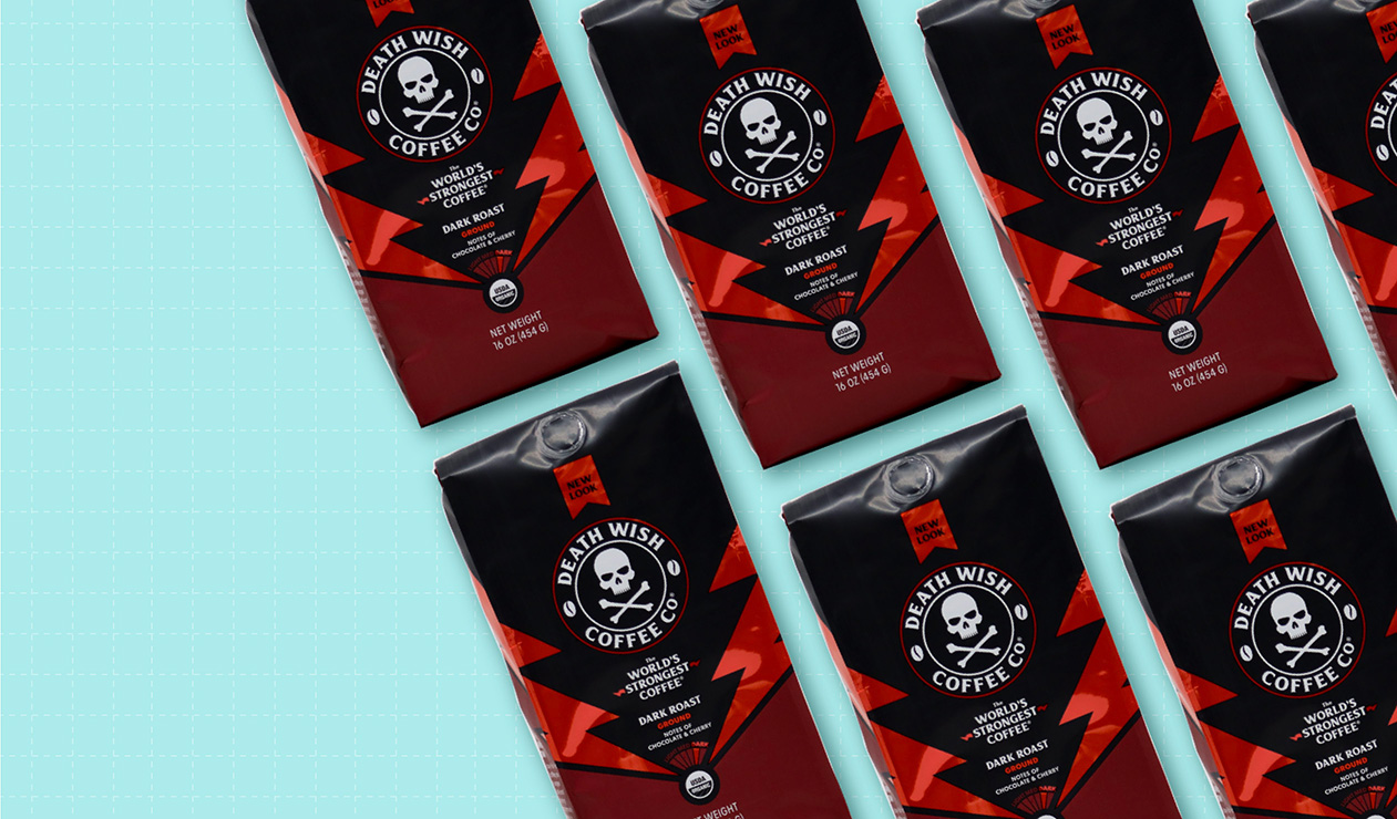
The biggest change can be seen immediately—color. Whereas black completely dominated the previous package, the new look introduces additional colors throughout. Each roast has its own hue, a decision likely made to both increase standout and aid in line navigation.
While the brand retained the skull-and-crossbones logo and its centrality, it is considerably smaller in the new design. Where once it was virtually the only element on an otherwise spartan design, now it shares the stage with lightning-bolt graphics—brightly colored ones on each side.
The “world’s strongest coffee” claim is smaller now, but shares a central location with a description of the coffee’s flavor and helpful meter indicating its roast: light, medium, or dark.
The bottom line
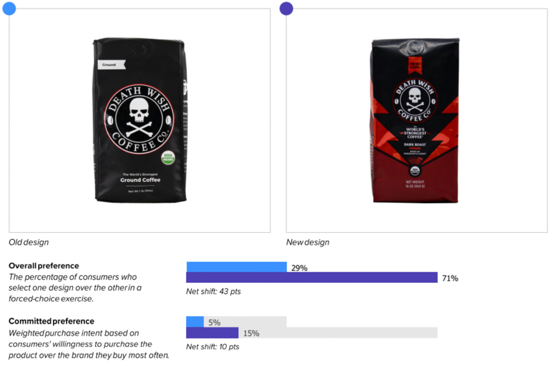
Looks like Death Wish may have found new life with this new design, as consumers preferred it to the previous version, 71% to 29%.
Wins and opportunities
There’s an undeniable truth when it comes to Death Wish Coffee: It’s not going to be for everyone. It is strong and bold, and its marketing is playfully iconoclastic in a way that appeals to a certain segment of consumers.
It’s hard to grow as a brand, though, if you’re not broadening your appeal beyond your die-hard disciples. With this new design, Death Wish seems to have deftly walked a tightrope—maintaining its edge, while providing more reasons for those outside its cult following to try it out.
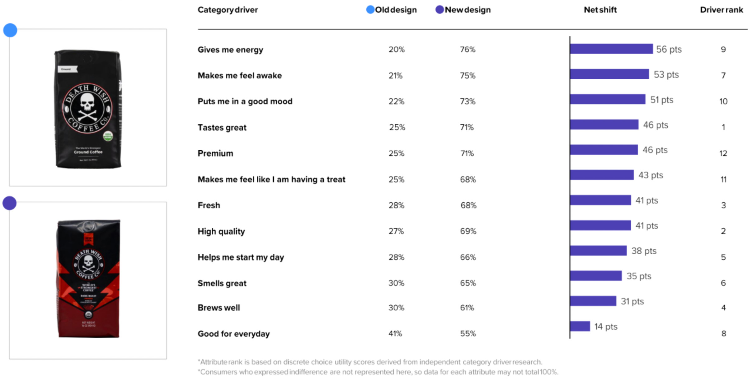
The results will certainly make Death Wish happy, starting with communication performance.
The new design topped the old in communication performance on every one of the top 12 attributes consumers consider when making a purchase. This included dramatic differences in the top three most important: “tastes great” (46% increase in consumer preference for the new), “high quality” (42%), and “fresh” (40%). What’s more, the updated look bested the old in conveying the attributes most closely related to the brand’s key differentiators, “gives me energy” (56% increase) and “makes me feel awake” (54%).
On consumer sentiment measures, Death Wish’s old design was already in a proverbial hole—after all, using symbols that signify poison can be a risk. The score has increased considerably for the new design.
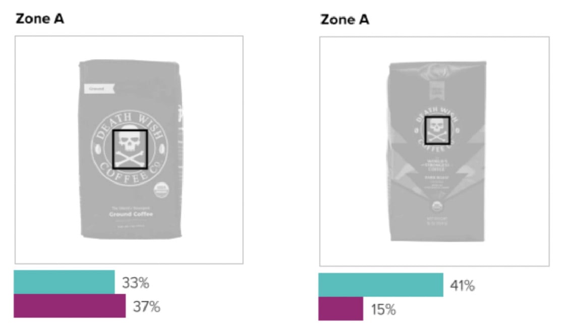
The skull-and-crossbones logo was the most liked and disliked element on both designs, but the ratio skewed heavily in favor of the new design. In fact, more consumers disliked the logo in the previous version than liked it (37% disliked versus 33% liked) and that was dramatically reversed for the new design (41% liked the logo and only 15% disliked it). The logo is still somewhat polarizing, but reducing its prominence seems to have made it much more broadly appealing.
When looking at the top ten responses more likely to be associated overall with the new design versus the old, it was not only more positive—featuring words like “cool,” “unique,” and “powerful”—it was also better aligned with how the brand touts itself. Words like “strong,” “bold,” “edgy,” and “intense” are differentiators, and each was more likely to be mentioned by consumers for the new design.
The new design also tightened the brand’s grip on differentiators compared to competitors. For example, consumers were almost twice as likely to mention “strong” with the new design (+30 compared to category average) than with the old (+16 compared to the same average). The brand was also more likely to prompt words like “cool” and “bold.”
Based on these strong redesign results, some increased sales could be percolating for Death Wish.
Wins
- The new design won on communicating every one of the top 12 attributes to consumers, and by wide margins. Since saying important things better has an 88% correlation to in-market outcomes, this is an auspicious sign for the brand.
- Consumers could recognize the new design from a slightly further distance—6.6 feet vs. 5.9 feet for the old—despite reducing the size of the brand name and highly-distinctive skull and crossbones
- When it comes to design element resonance, the new design outperformed the old one handily, doubling the like-to-dislike ratio (3.1 versus 1.5).
Opportunities
- The choice to have such a polarizing icon (the skull and crossbones) was no doubt a calculated one—the very boldness that draws some consumers to the brand will undoubtedly turn off others. And yet, the new design did increase logo resonance scores from 3.3 to 3.8, which is impressive. If the brand can continue to find incremental improvement in this area without alienating its avid fans, that would only increase its overall appeal.
- Some consumers seemed confused by the flavor claims on the packaging, misinterpreting the “notes of chocolate and cherry” on the package to mean that these flavors were added instead of characteristic of the beans. While only a small segment commented on this, such confusion is worth taking into consideration moving forward.
Consumer highlights:
“I love the color—it really pops.”
“I like the lightning bolt pattern because it makes me think this is a high-energy coffee that will wake me up in the morning.”
About our data
Our goal behind highlighting impactful redesigns is to help brands understand market reactions to design changes and make intentional design decisions. We create a full report of these insightful case studies for every brand redesign in our cross-category database. These value-add tools are created automatically for our clients who subscribe to syndicated category data. For more information on this redesign report or others, contact us.


