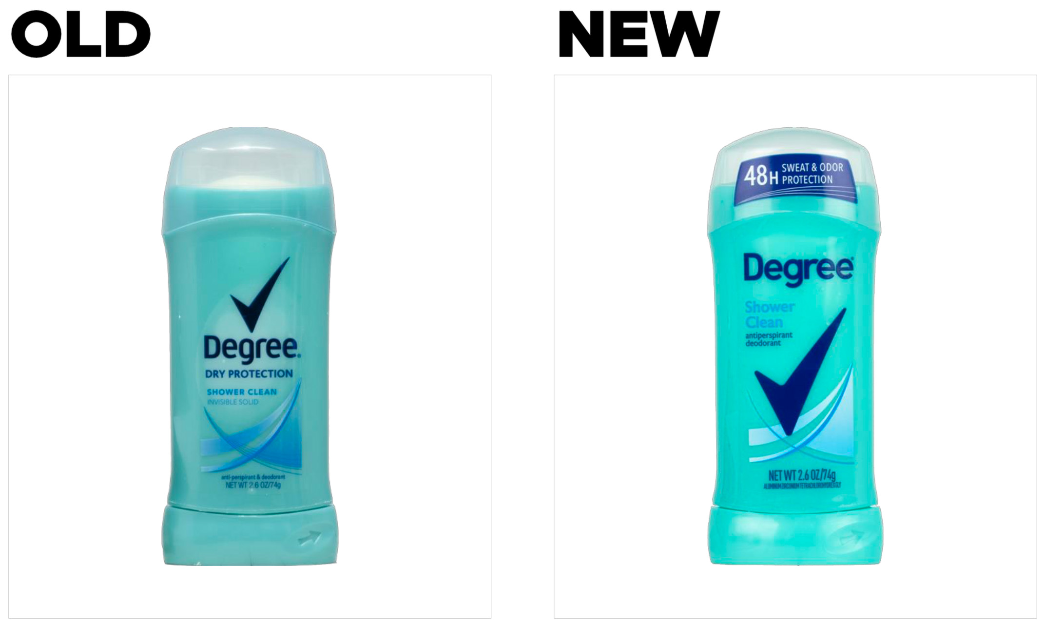
Brand: Degree Dry Protection
Category: Deodorant (Women’s)
Parent brand: Unilever
Agency: Unknown
Our Redesign of the Month series spotlights a deserving brand that is harnessing the power of design to make an impact, tell a story, and outshine its previous packaging.
Hundreds of current category consumers evaluate the old and new designs across a wide range of performance areas, including purchase preference, communication, mental availability, and design-element resonance. Notably, Designalytics’ testing outcomes align with actual sales performance more than 90% of the time, which bodes well for this month’s winner: Degree Dry Protection women’s deodorant.
Background
As a staple of any personal hygiene routine, antiperspirants and deodorants are virtually ubiquitous in homes across the country. For years, there was a fairly predictable line-up of competitors on store shelves—but times have certainly changed.
Many consumers are demanding formulations that are aluminum-free, baking-soda-free, or alcohol-free, while others want specific ingredients included or are partial to organic products. In fact, organic deodorants are projected to grow at a compound annual growth rate of 14%, reaching $158 billion in sales by 2025 according to Grand View Research.
Category leaders like Proctor & Gamble and Unilever have sought to capitalize on the shift towards nontraditional brands with their purchases of Native and Schmidt’s, but the influx of competitors hasn’t let up. Brands like Hume Supernatural, Iyoba, Cleo + Coco and other DTC-disruptors can continue to chip away at the margins—not to mention the unrelenting competitive onslaught from other major brands. It’s not surprising, then, that brands in the space are staying vigilant when it comes to maximizing their design effectiveness. And Degree’s new look is fresh as a daisy, according to consumers.
 Key creative changes
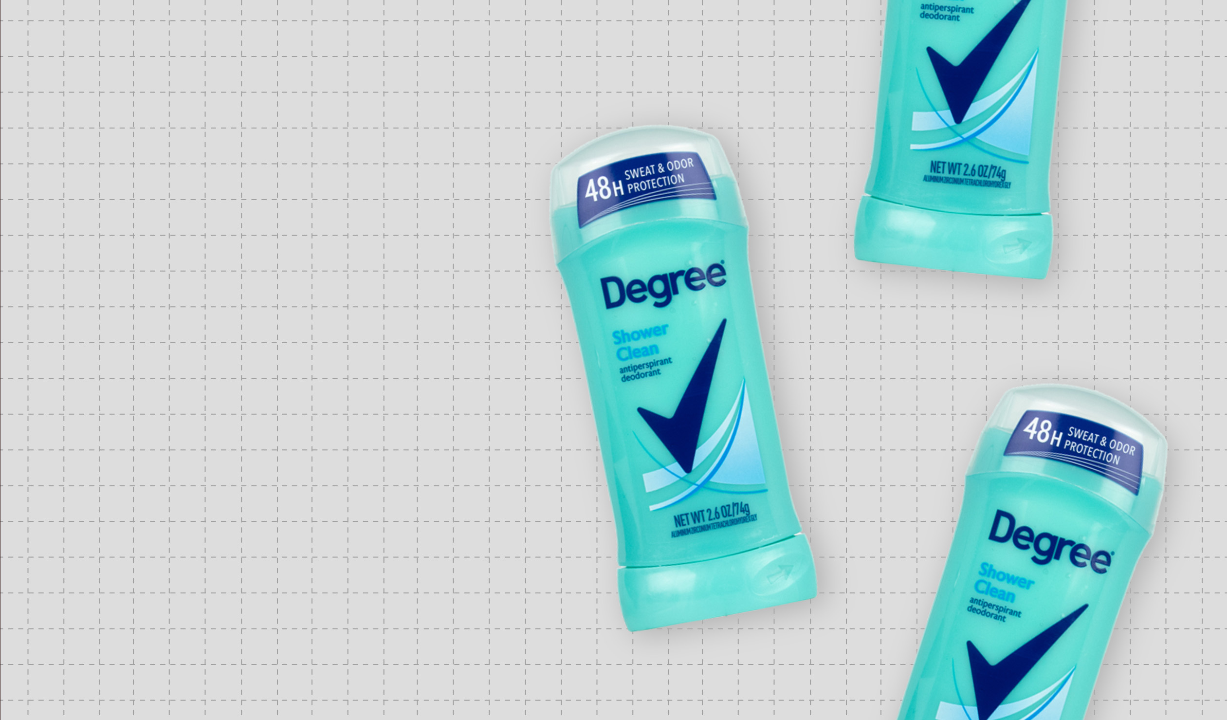
Virtually everything about the new design was bigger and bolder, starting with increasing the size of its signature check mark and changing its location (from above the logo to the center of the design). The check mark, which is the brand’s most distinctive asset, now takes “center stage” on the design. The logo underwent a change as well, with a slightly larger, more-geometric sans-serif font replacing the one the brand had been using for years.
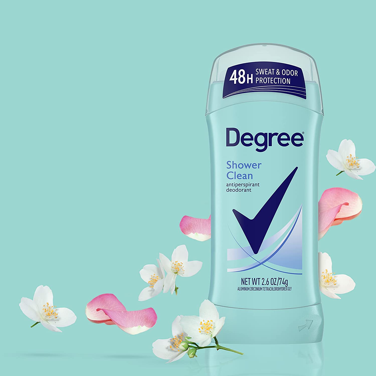
On the cap, a label has been added, saying “48h sweat & odor protection”—the largest claim on the package by far. This represents a major strengthening of the brand’s original “dry protection” claim.
Where once “Shower Fresh” (and the names of other varieties) were tucked unobtrusively under the logo and check mark, now it is placed prominently between them. Gone is the “Dry Protection” descriptor, replaced with a more direct expression of what the product is: “Antiperspirant/deodorant” (which was elevated from the bottom of the design).
The abstract blue graphic, which conveys a sense of movement, has been carried forward to the new design, but is higher-contrast and flatter—following current trends to iron-out textures and other details.
The bottom line
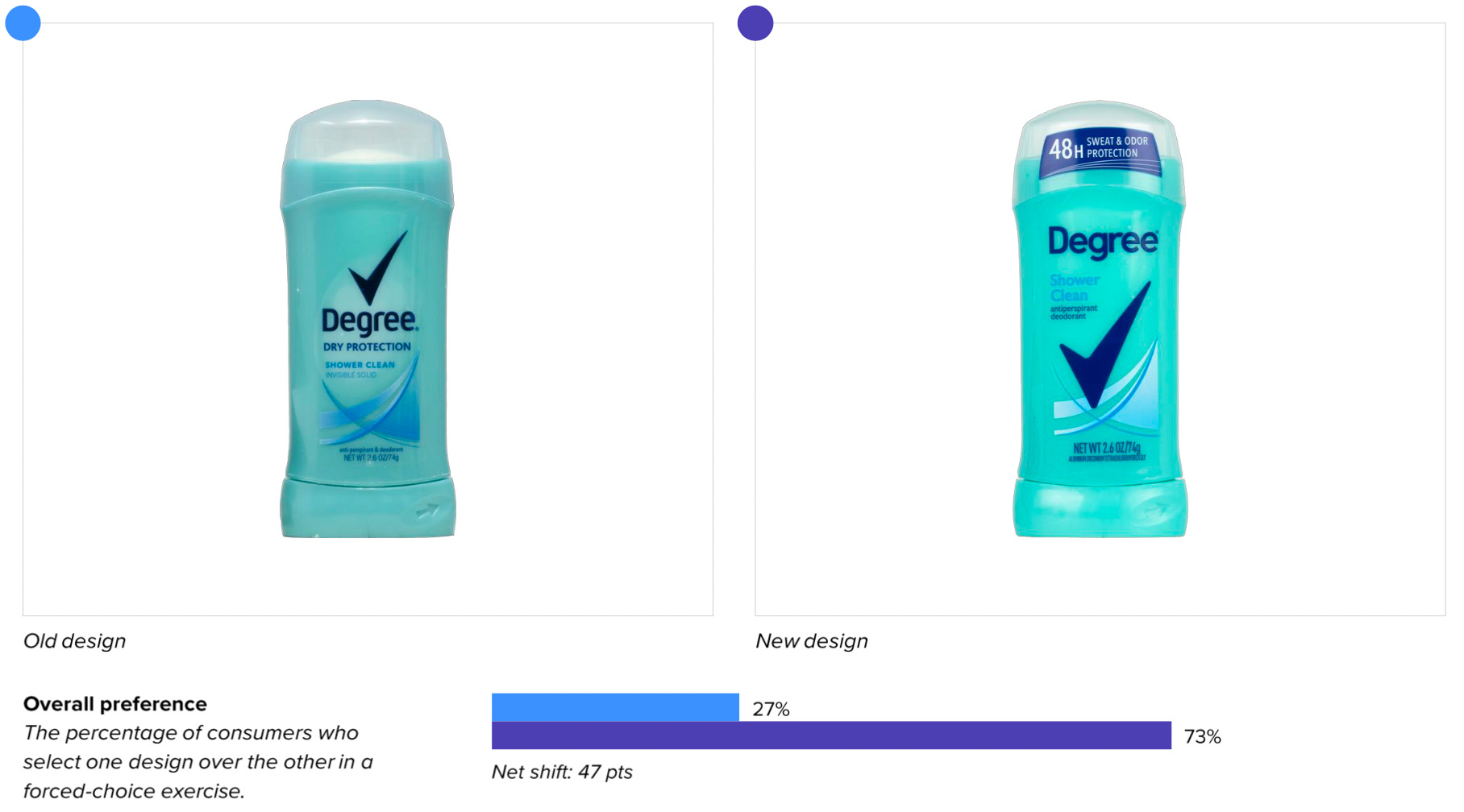
Some major brands might worry about changing a design, but Degree isn’t sweating it. Why? Because the new design beat the old look in consumer purchase preference by a stunning amount—73% to 27%.
Wins and opportunities
Degree’s redesign is a reminder: If you’re going to “modernize” your brand’s package, you might as well also make it more effective as well.
The new design definitely freshens up the brand’s look, with sharper visual assets and a larger logo and brand mark. Consumers took notice—positive associations and measures of positive sentiment rose slightly for the new design.
These are incremental improvements in areas that, while important, aren’t by themselves going to move the needle much for brand growth. There is an area that does, though: Communication of attributes most important to consumers when making purchase decisions.
It was in this area that Degree’s new design really cleaned up. It trounced the old design when it came to communicating every top purchase-driving attribute, including “makes me feel fresh” (81% for the new vs. 17% for the old), “smells great” (80% vs. 18%), and “doesn’t irritate my skin” (66% vs. 25%).1
Undoubtedly the most consequential change to the design, though, is the sticker on the cap stating “48h sweat & odor protection.” It’s no coincidence that this was added; the number one driver of consumer purchase decisions in this category, according to the consumers themselves, is “long-lasting.” The old design made no prominent claims of extended effectiveness, but the new design cleverly utilized previously-unused real estate to hammer home the “48h sweat & odor protection” claim. Not surprisingly, this approach worked: the new design outperformed the old for “long-lasting” by a massive margin (74% vs. 23% in favor of the new design). As one consumer put it: “Sweat and odor protection are the things one seeks in this type of product.”
Consumer sentiment, too, overwhelmingly favored the new design. Respondents were asked which words they would associate with each design, and the words they would associate more with the old design were largely neutral and predictable (e.g., “deodorant,” “dry,” and “women’s”). Conversely, the updated design elicited more varied and positive associations: “fresh,” “clean,” “effective,” and “long-lasting.”
Enlarging the scent name (“Shower clean”) may have contributed to the more sensorial associations; it was the second-most engaging element on the package, and sentiment was highly positive. One consumer wrote, “Shower clean makes me think it won’t smell strongly like a perfume, but a clean, fresh scent.” A few commented on the legibility of the text—an improvement over the old design—saying, “The way it’s displayed makes it easy to read and catches the eye.” One consumer quipped, “Big print for old eyes.”
Wins
- The new design beat the old in every single attribute of communication by considerable margins, including a 51-point differential in the #1 attribute, “long-lasting.” Having an objective understanding of the most important attributes according to consumers is key—and Degree's laser-focus on communicating this benefit paid off.
- Updating the layout to be more navigable and legible, including making the scent easier to read.
- Eliciting more positive and sensorial associations (e.g., "fresh," "clean," etc.).
Opportunities
- The brand’s emphasis on its distinctive assets—such as the upsized check mark and logo—is commendable, but these changes failed to drive significant improvements in mental availability, and led to a slight dip in findability (i.e., consumers took slightly longer to find the new design in a competitive set than the old design). These results aren’t concerning, but they may not measure up to the brand’s hopes, assuming some modifications were meant to drive improvements in these areas.
Consumer highlights:
“48-hour protection from sweat and odor is amazing!”
“48 hours is a good, long time. I would use less product and trust that it would protect me longer between showers.”
About our data
Our goal behind highlighting impactful redesigns is to help brands understand market reactions to design changes and make intentional design decisions. We create a full report of these insightful case studies for every brand redesign in our cross-category database. These value-add tools are created automatically for our clients who subscribe to syndicated category data. For more information on this redesign report or others, contact us.
1Consumers who expressed indifference aren’t represented here, so numbers for each attribute may not total 100%.


