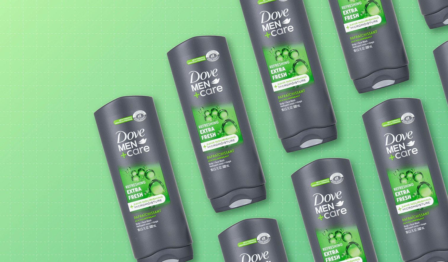
Category: Body Wash (Men’s)
Agency: ForceMAJEURE
Our Redesign of the Month series spotlights a deserving brand that is harnessing the power of design to make an impact, tell a story, and outshine its previous packaging.
Hundreds of current category consumers evaluate the old and new designs across a wide range of performance areas, including purchase preference, communication, mental availability, and design-element resonance. Notably, Designalytics’ testing outcomes align with actual sales performance more than 90% of the time, which bodes well for this month’s winner: Dove Men+Care body wash.
Background
Many brands redesign their packaging, launch it to market…. And then allow design to plummet as a marketing priority for years. Dove Men+Care has taken an entirely different approach: designs are continuously measured and assiduously managed, with an eye toward improving performance and driving brand growth. And the results are impressive.
For example, Dove Men+Care won a Designalytics Effectiveness Award in 2022 with a redesign that drove a sales increase of 17% in the 26 weeks after it was launched (compared to the same period during the prior year). Still, the brand saw opportunities for improvement and decided to embark on another strategic redesign less than two years later. As it turns out, it was an excellent decision.
Key creative changes
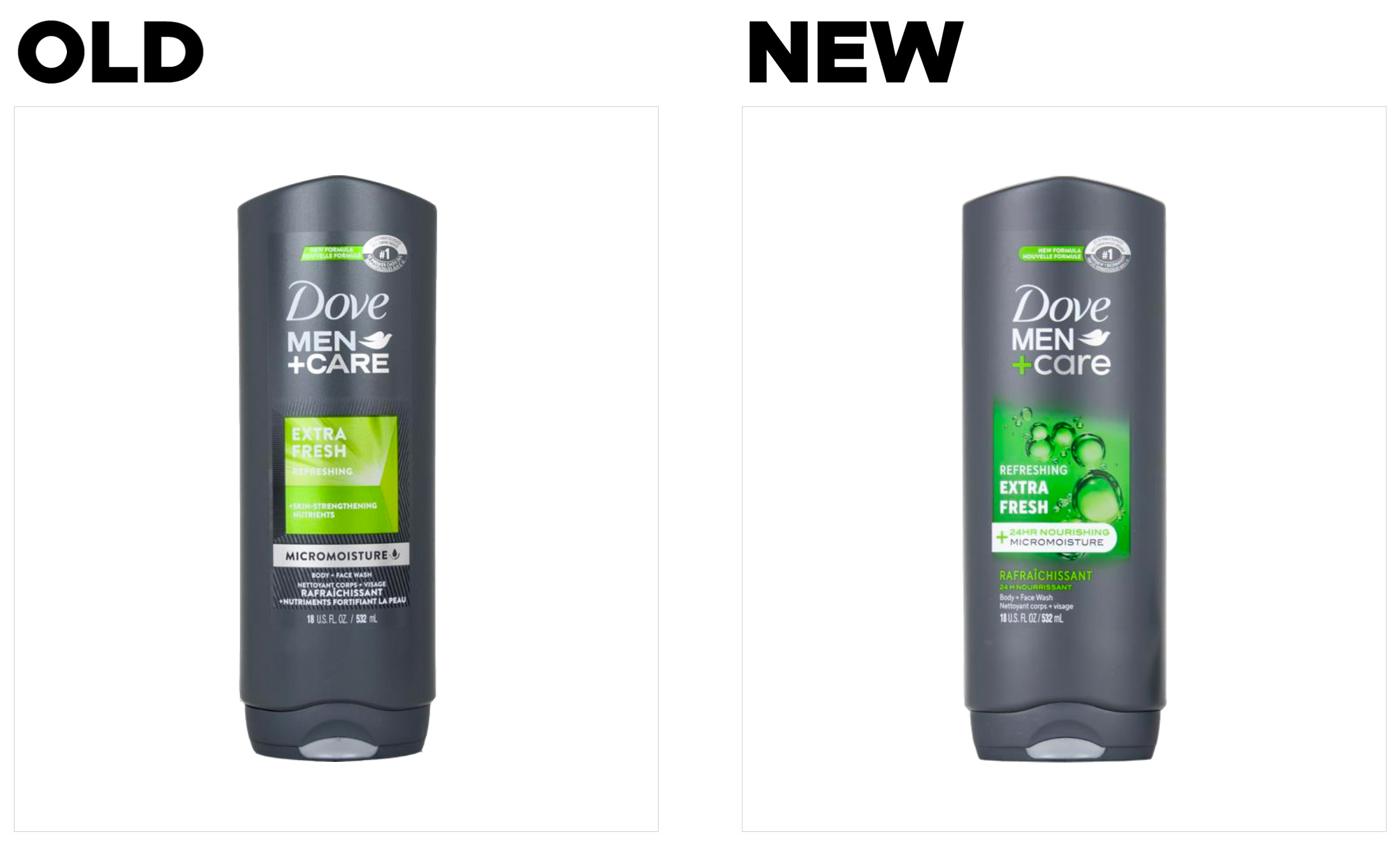
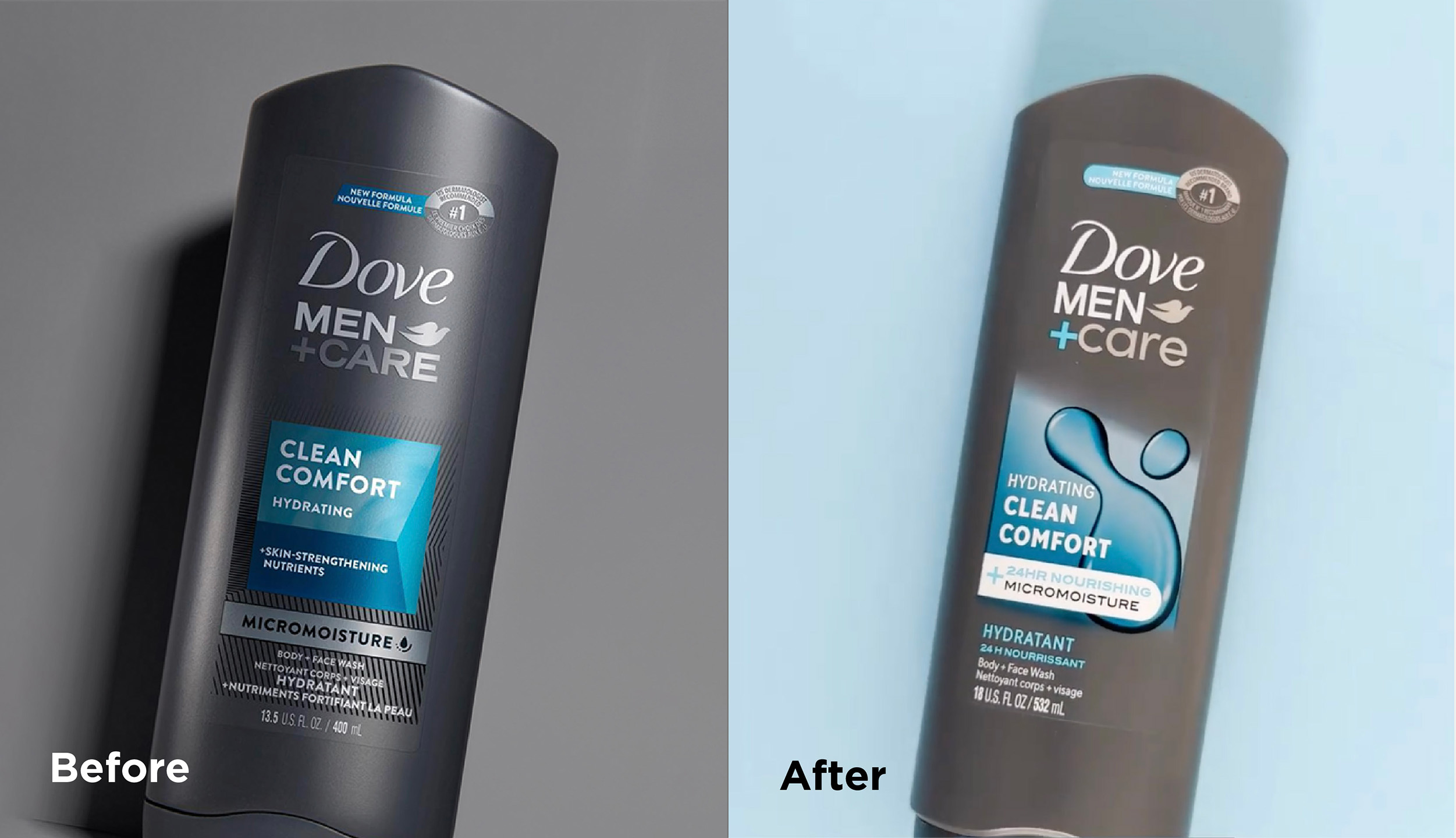
For starters, the brand modified the design’s accent color. In the case of its Extra Fresh body wash, for example, the accent color shifted from the bright, lime-green to a lush, deeper shade of green. And whereas the previous color block had defined borders, the new look’s block is open and the border is less rigid. The accompanying translucent bubbles suggest water and moisture, visually supporting the “refreshing” messaging.
The previous design had a callout within a silver block saying “Micromoisture” with a small water droplet symbol next to it. The updated package continues on this theme, but takes it up a notch: A “24-hour nourishing micromoisture+” call out suggests increased and extended effectiveness that aligns with the visual cues noted above. This claim, set on a white background, also “breaks” the color block, diverging from the previous design’s solid-square aesthetic.
The brand slightly modified the logo as well, by cleverly adding color to the plus-sign to match with each variety’s accent color (green for Extra Fresh, an azure blue for Clean Comfort, etc.), and changing the “care” from all-caps to lowercase letters.
The bottom line
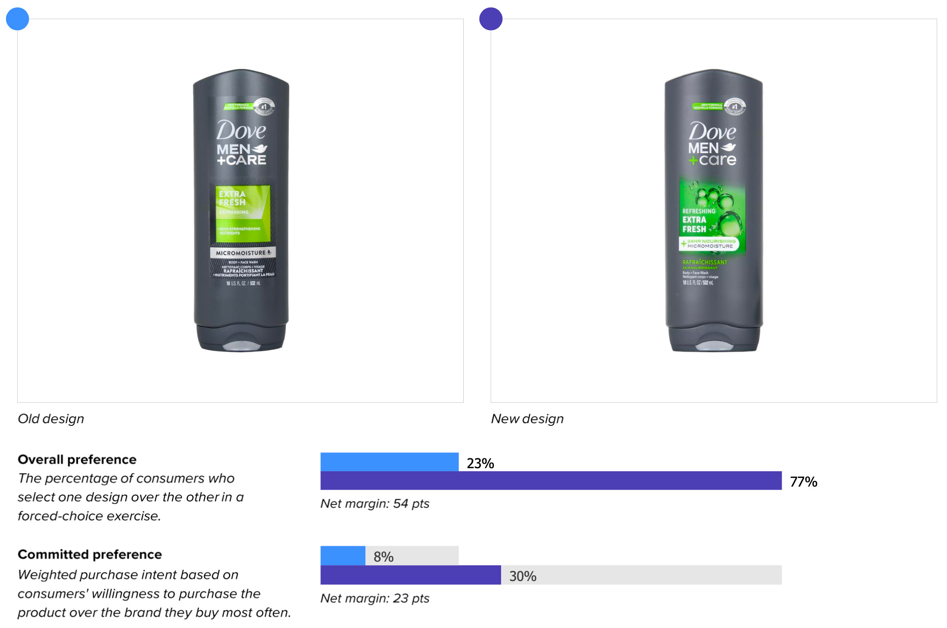
The new look topped the old in consumer purchase preference 77% to 23%, so there’s a good chance the brand will be awash in sales gains thanks to this redesign.
Wins and opportunities
Dove Men+Care’s packaging was already the leader in design effectiveness according to our most recent category report for men’s body washes. So why change what was already working? It seems the brand understood a sentiment epitomized by author John Maxwell’s quote: “Of all the things leaders should fear, complacency heads the list.”
Apart from not wanting to rest on its laurels, Dove Men+Care and its agency, ForceMAJEURE, have figured out the immense value of continuous design management and the power of incremental improvements. Where some might fear “messing up” a successful design, this team saw an opportunity to make it even better.
Take, for example, communication. Saying important things better is basically a cheat-code to better design performance, with an 88% correlation to directional in-market outcomes. The new design cleaned up in this measure, outperforming the previous version in every one of the top 12 purchase drivers by an average of 45 points. In the top three most important attributes—“gets me clean,” “long-lasting clean,” and “helps me feel fresh”—the modified packaging bested its older sibling by 49, 47, and 49 points respectively.
Dove Men+Care was already eclipsing competitors in consumer sentiment scores, but the new packaging takes this to another level. For the old Extra Fresh package, for example, consumers associated positive words like “clean” and “fresh” far more often than they did with competitors in the body wash category. The brand just built on their lead with this new design—the old design’s advantage for “clean” (+16) jumped to a striking +28. For “fresh,” it was a similar story—the old design was +18 versus the rest of the category, and the new was +26. As far as consumers are concerned, Dove Men+Care seems to be the fresh-and-clean brand.
This fresh look excelled even in areas where new designs sometimes lag. For example, the introduction of a new package can sometimes precipitate drop-off in findability and distance recognition (which is a measurement of mental availability). This was not the case here—distance recognition dropped only a negligible amount, and findability scores were identical (and excellent) between the old and new packaging (3.2 seconds to find, with 97% accuracy).
To sum up: Dove Men+Care put on a clinic in how regular, robust design management can take a great design and make it even better.
Wins
- Asset resonance remained steady with the new design, and even saw a slight uptick.
- Consumers loved the introduction of the bubbles—in fact, it was the most liked element of the new design. One consumer commented “I like the bubbles, it looks clean, refreshing, and updated,” while another stated “The bubbles make the design look active and give it some depth.” Another was more succinct: “Bubbles! Bubbles!” This added design element was clearly a big part of the improved performance.
- The choice to add the words “24-hour nourishing” before “micromoisture+” seems to have been smart—since consumers may not necessarily know what “micromoisture+” means, describing the benefits it provides helped the message get across more clearly.
Opportunities
- For both the old and the new design, several consumers commented on the difficulty reading the “#1 dermatologist recommended” claim, and none commented at all on the fact that it was a “new formula.”
Consumer highlights:
“I like the darker green. It makes the words pop more on the bottle.”
“24-hour nourishing micromoisture is a strong statement that breeds confidence.”
“The bubbles add to the overall appeal of the product.”
About our data
Our goal behind highlighting impactful redesigns is to help brands understand market reactions to design changes and make intentional design decisions. We create a full report of these insightful case studies for every brand redesign in our cross-category database. These value-add tools are created automatically for our clients who subscribe to syndicated category data. For more information on this redesign report or others, contact us.


