Brand: Durex
Category: Condoms
Agency: Design Bridge
Our Redesign of the Month series spotlights a deserving brand that is harnessing the power of design to make an impact, tell a story, and outshine its previous packaging.
Hundreds of current category consumers evaluate the old and new designs across a wide range of performance areas, including purchase preference, communication, mental availability, and design-element resonance. Notably, Designalytics’ testing outcomes align with actual sales performance more than 90% of the time, which bodes well for this month’s winner: Durex.
Background
Not many nonagenarians are obsessed with sex, but the condom brand Durex certainly is. Originally registered in 1929 by the London Rubber Company, the brand has been a pioneering force in prophylactics for decades. That has helped make them the world’s leading condom brand, but all winners know that reinvention is a requisite for continued success.
Americans' attitudes about sex have undergone a revolution in the last 50 years, so condom companies have had to regularly adapt to this rapidly-changing cultural environment. More recently, a once-in-a-hundred-years pandemic wreaked havoc on an industry—sales dipped 40% in 2020 as social distancing meant celibacy for some. The combination of changing perspectives and slumping sales meant a change was needed.
Key creative changes
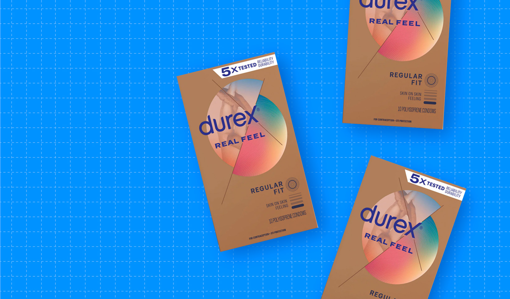
It’s rare that a category leader makes such dramatic changes to their design, let alone one with the history of Durex. Yet this updated package makes it clear that the brand was looking to embrace its reason for being: sex. Bright colors, subtle-yet-suggestive photography, and a boldly reimagined logo demonstrated that this brand was ready to show some skin.
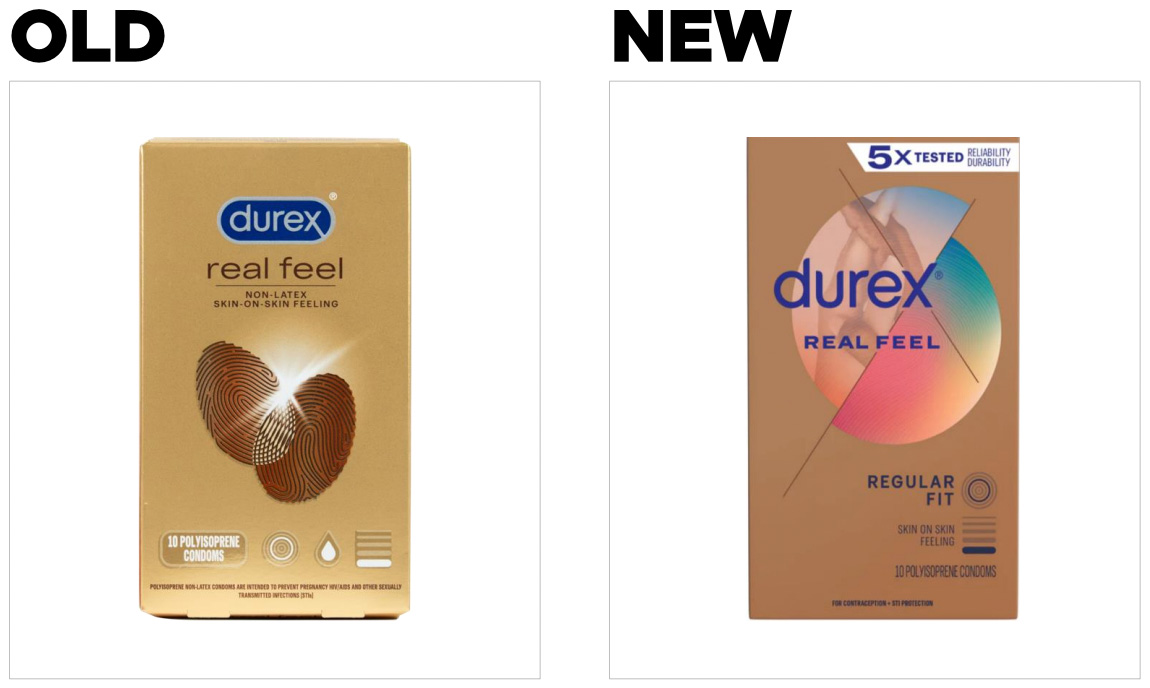
Literally, in fact. While the prior packaging showcased two intersecting fingerprints, a sexy photo of intertwined fingers now appears front-and-center in the latest iteration. This is part of the new centerpiece of the design: a circle, split in half and set askew, now serves as the visual anchor of the design.
While maintaining the general look of the brand’s wordmark, the new version both enlarges the font and allows it to break the barriers that constrained its predecessor, implying severance from past sexual strictures. The “x” marks the spot, in this case, as the extension of the lines of this letter creates the axes around which the design revolves. That “x” draws the consumers’ eyes, a signifier of intersection and connection as well as the most provocative letter shared by “sex” and “Durex.”
Several other aesthetic adjustments were made, including using a slightly darker tone of brown for the box, adding a prismatic splash of color to the underside of the circle, and incorporating a subtle nod to an erstwhile design asset—the fingerprint. (Note: this description is for the “Real Feel” product; each condom variety has a different color treatment and photo, ostensibly to aid in line navigation.)
While these shifts represent an exciting new trajectory for the brand, the most consequential changes are in the communication of key attributes. The top three most important ones for condoms, according to consumers, are (in order): “I trust it will work,” “reliable,” and “safe.” It’s no surprise, then, that Durex chose prime package real estate—the top of the package—to add the claim “5x tested for durability [and] reliability.” This was clearly designed to underscore the diligence with which the brand controls quality.
This purveyor-of-protection also sought to clarify what was already on the package. The old design used icons to indicate the size and thickness of the condom, as well as one meant to indicate whether each variety included lubricant—but added no description of the meaning of these icons. In the updated design, size and thickness remained, but with written definitions alongside the icons.
The bottom line
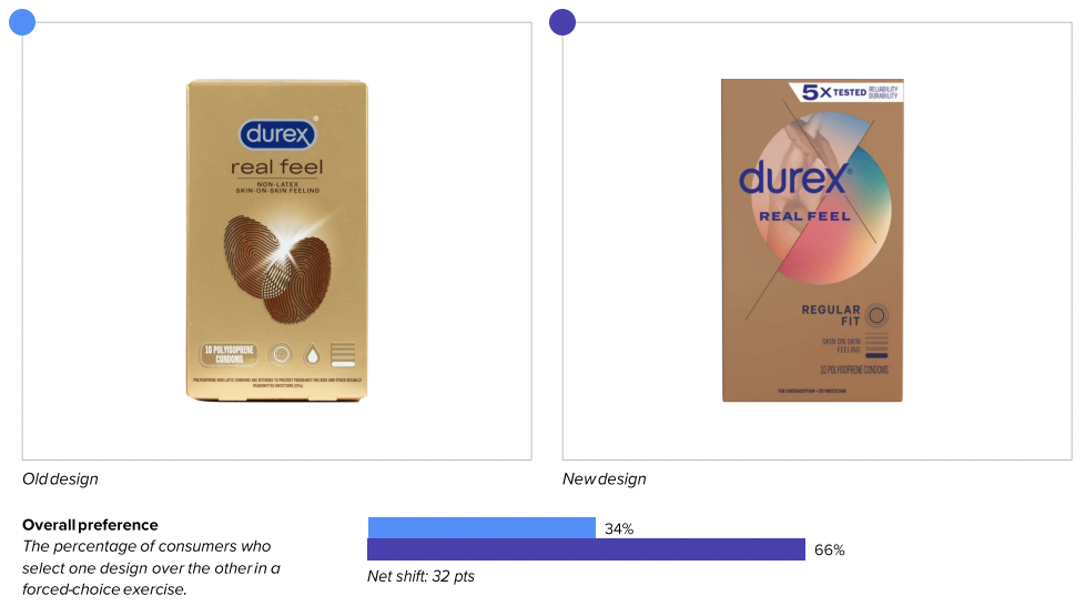
Looks like Durex has rolled out a winner: Consumers preferred it to its predecessor, 66% to 34%.
Wins and opportunities
For starters, Durex’s updated package improved distance recognition (a measure of both mental availability and brand legibility). Consumers could recognize it from further away—from 7.2 feet, in fact, which is above average for the category and a significant jump from the old design’s (somewhat limp) 4.1 feet.
The redesign’s performance stood out in one other way: communication. The new package bested the old in every important attribute by an average of 23 points, including impressive jumps in the top attributes and those directly addressed by the changes (“fits correctly” went up 23 points and “doesn’t feel like I’m wearing a condom” increased 16 points). It’s also worth pointing out that the largest increases were in “high quality” (+41 points) and “premium” (+31) attributes, which align with and support the second-most important attribute, “reliable” (which also increased 31 points).
The “5X tested for durability and reliability” seems to have been especially effective in boosting the new design’s communication performance. Although this claim took up a small portion of the box, it ranked number two in consumer engagement among all package elements. This amounts to a big win for the brand, because communication is where the rubber meets the road: saying important things better has an 88% correlation to in-market outcomes, according to Designalytics’ data.
The contrasting choices in imagery are worth noting, as well. While consumers looking at the old design generally understood that the central image was of intersecting fingerprints, some seemed confused as to what it had to do with condoms (for example, one responded: “I don’t understand why there are fingerprints on the box”). The new design’s imagery connects more directly to consumers’ emotions and the product’s purpose (“The hand touching is sexy,” commented one, while another said it “looks intimate”).
Perhaps unsurprisingly (given such a radical departure from the brand’s previous package design), not all consumers were entirely enamored with the new look. The color of the box, for example, struck many consumers as dull and unattractive. More consumers disliked this aspect of the design than liked it. While there is no clear correlation between consumers’ “liking” a design and the product’s sales—and Durex likely knew such a brash new approach would rub some the wrong way—the brand would do well to keep a close eye on the design’s middling performance in resonance measures.
Wins
- Consumers could recognize the new design from a further distance: 7.2 feet vs. 4.1 feet for the old.
- The additional claims and updated imagery helped make an enormous difference in communication, as the new design bested its predecessor in conveying all 12 key attributes for consumers, including “I trust it will work” (+23 point shift), “reliable” (+31 point shift), “feels good” (+20 point shift).
- The number-one word consumers most commonly associated with one design versus the other were “fingerprints” (old) and “sex” (new). Such measures of association and sentiment are not decisive, but they can be instructive: In this case, consumers associated the new design with the very (enjoyable) reason they were purchasing the product in the first place, versus an abstract image they struggled to connect to the product’s purpose.
Opportunities
- The old design actually outperformed the new one in resonance. Overall, consumers liked more individual elements of the previous iteration. While not determinative of design success, there is clear room for improvement on the execution of some elements.
- The new design helped to improve both distance recognition and accuracy, but the latter is still a relative weakness compared to other leading brands in the category.
- Despite strong performance overall, consumers expressed dislike for certain elements of the new design, especially the color of the box (“ugly,” “makes me think it’s cheaper,” “boring and bland”). Given that each variety of condom has a different color (and not all were tested by Designalytics), this isn’t necessarily a broader issue for Durex, but it could be helpful to consider.
Consumer highlights:
“Seeing that the condoms have been tested 5 times made me believe what the package is advertising.”
“The ‘skin on skin feeling’ claim tells me it won’t feel like I’m wearing the condom even when I am.”
About our data
Our goal behind highlighting impactful redesigns is to help brands understand market reactions to design changes and make intentional design decisions. We create a full report of these insightful case studies for every brand redesign in our cross-category database. These value-add tools are created automatically for our clients who subscribe to syndicated category data. For more information on this redesign report or others, contact us.


