Brand: Froot Loops
Category: Cereal (Kids)
Parent brand: Kellogg’s
Agency: Unknown
Our Redesign of the Month series spotlights a deserving brand that is harnessing the power of design to make an impact, tell a story, and outshine its previous packaging.
Hundreds of current category consumers evaluate the old and new designs across a wide range of performance areas, including purchase preference, communication, mental availability, and design-element resonance. Notably, Designalytics’ testing outcomes align with actual sales performance more than 90% of the time, which bodes well for this month’s winner: Froot Loops.
Background
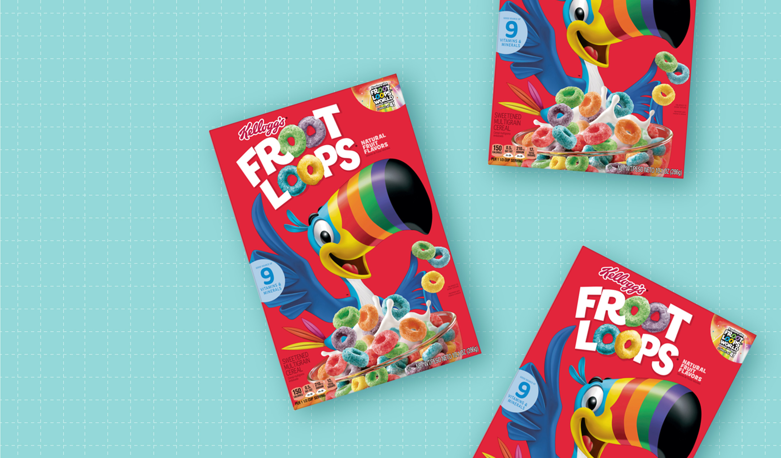
Say the name “Toucan Sam” and most people in the United States will know exactly who you mean. The iconic character has graced the package of Froot Loops cereal since 1963, and his “Follow your nose” mantra has filled many a living room on Saturday mornings. The anthropomorphic avian even ranked number five on an admittedly unscientific Buzzfeed list of best cereal mascots.
Froot Loops is also the least expensive of America’s top-ten most popular ready-to-eat cereals (according to Kiplinger’s), and contributes mightily to Kellogg’s annual revenues. That, along with Toucan Sam’s status as a beloved breakfast companion, makes any change to the Froot Loops package design a delicate undertaking.
And it makes it all the more impressive that the brand seems to have nailed it.
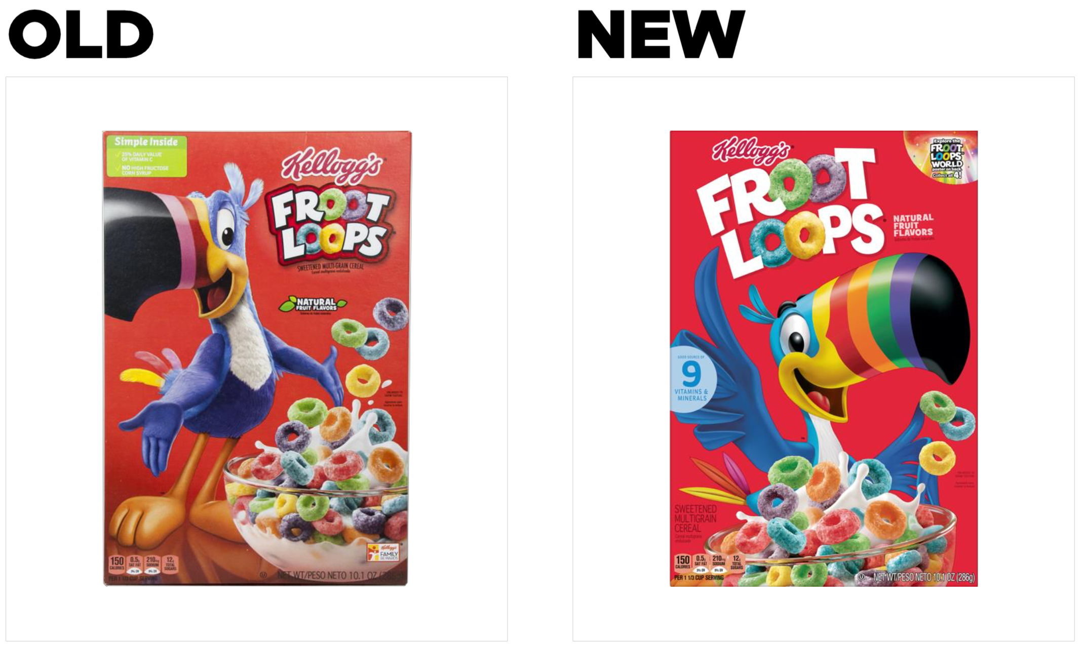
Key creative changes
Toucan Sam has undergone something of a makeover with this redesign. First and most noticeable, two bands of color have been added to his beak (and a previously pink band has been replaced with an orange one). Where once he had arms and hands, the mascot’s upper appendages on the new design more closely resemble wings (though more expressive and human-like than your average tropical bird).
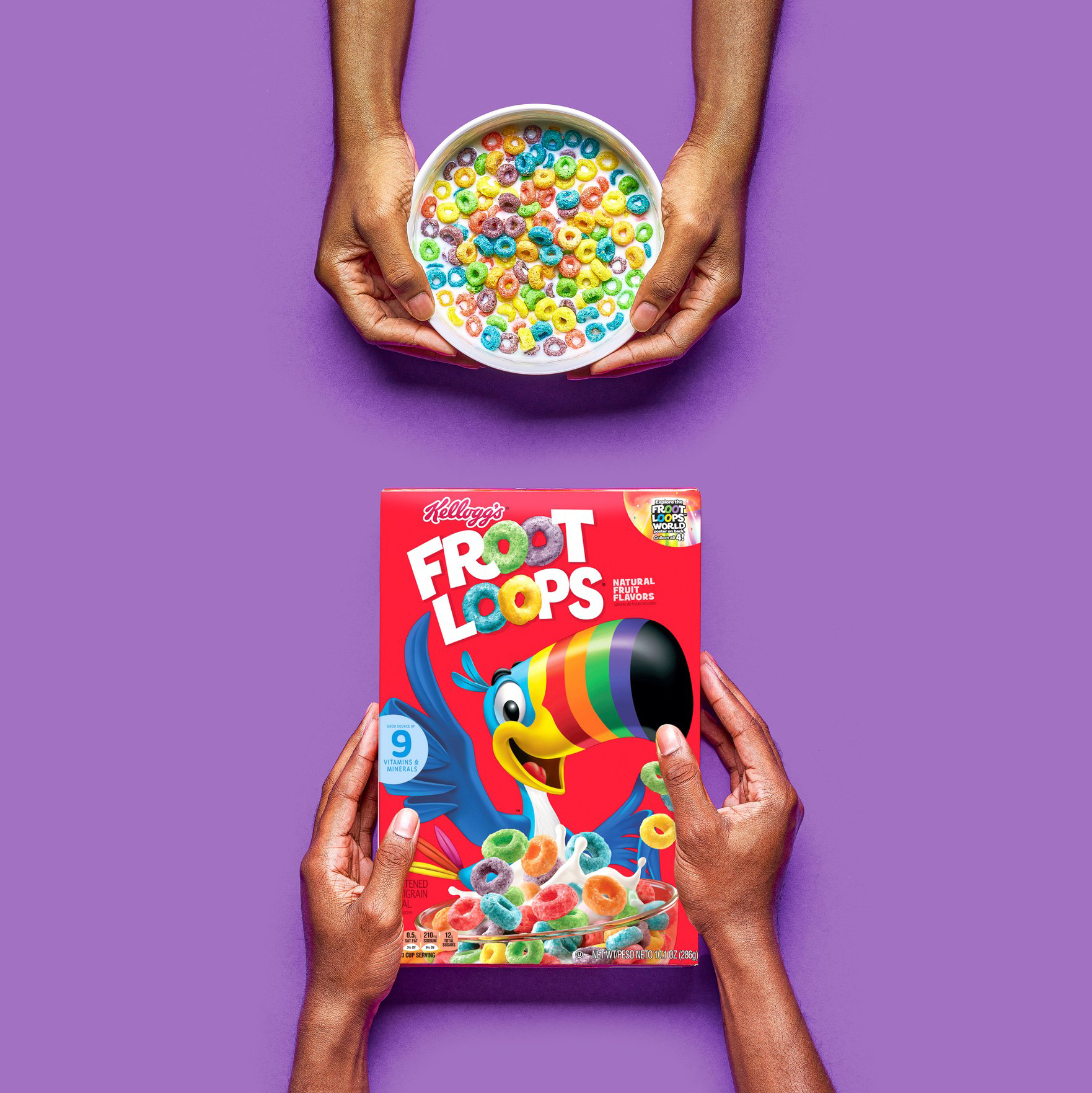
While the mascot is certainly central to the new design, other elements have been elevated in importance. The Froot Loops logo is much larger than in the previous iteration—while ”Kellogg’s” is slightly smaller—and the image of the cereal bowl (and the loops leaping out of it) is brought into the foreground more, allowing a closer look at the cereal itself.
The brand also decided to remove the green box highlighting Vitamin C content and the lack of high-fructose corn syrup, as well as simplifying and moving the “natural fruit flavors” call out. It also added a claim to the center-left of the package touting the “9 vitamins and minerals” in the cereal.
The bottom line
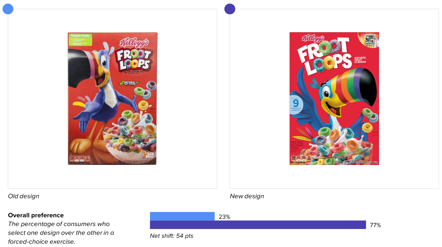
The new design didn’t just beat the old design by a nose; it ran rings around it. Consumers preferred the new design 77% to 23%.
Wins and opportunities
Toucan Sam is an icon, so any redesign that touches the beloved beak-bearer needs to tread carefully. He remains far and away the brand’s most distinctive asset, and the new design bolsters his status despite the change—but it also highlights other key features.
Resonance measurements bear this out in an interesting way. Toucan Sam was the most-liked element on both designs (which makes sense), but the second most-liked element of the new design (18% of all likes) was the “9 vitamins and minerals” claim… which wasn’t even on the old design. The brand had communicated something new and consumers responded very positively. In fact, this claim relates directly to the new design’s modest improvement on the third most important purchase driver in the category: “Healthy.”
And that wasn’t all—the new design actually bested the old design in communicating all 12 of the most important purchase decision drivers for consumers. What’s more, the largest differential between the two designs (50 points) was in the single most important one: “Tastes great.”
It seems the brand increased the size of the logo and brought the image of the cereal to the foreground because each communicated something Toucan Sam never could: taste. The dual “o” in each word of “Froot Loops” is made up of the loops themselves—the cereal is part of the logo. Up-sizing the logo contributed to taste appeal; consumers could get a better look at the product. Ditto for the bowl of the cereal in the foreground: The loops are closer, larger, and brighter, driving home the tastiness of Froot Loops.
Even in the areas where some good redesigns falter, this new iteration of Froot Loops’ package shined. Consumers could find the new design faster and could recognize the brand from slightly further away than its predecessor. Overall, it seems Froot Loops has “followed its nose” to a drastically more effective package design.
Wins
- Consumers could find the new design faster (2.6 seconds vs. 3.9 seconds) than the old design.
- They could recognize the new design from further away (23.7 feet) than the old design (22.6) feet and with greater accuracy (100% for new vs. 91% for old), suggesting an increase in mental availability.
- The new design beat the old in communicating all 12 most important attributes in the category, and the biggest shift (+50 points) was in the number one attribute: “Tastes great.”
- Adding a fresh claim—“9 vitamins and minerals”—to the new design led to a modest improvement in communicating another key decision driver: “Healthy.”
- Consumers were by far more likely to use the word “fun” to describe the new design compared to other leading brands in the category: 26% vs. an 8% category average.
Opportunities
- This redesign was a resounding success, and there wasn’t much to take issue with.
- Though it didn’t attract much attention from consumers overall, the “Froot Loops World” call-out in the upper right corner received about as many “dislikes” as “likes.” Some consumers said it was “too small to read” and “not useful information.” This is likely a temporary element to the design, so it’s probably not of major concern.
Consumer highlights:
“I like knowing that even if it is a sweet cereal, it at least has some nutritional value.”
“This cereal does taste great, and the product shown communicates that.”
About our data
Our goal behind highlighting impactful redesigns is to help brands understand market reactions to design changes and make intentional design decisions. We create a full report of these insightful case studies for every brand redesign in our cross-category database. These value-add tools are created automatically for our clients who subscribe to syndicated category data. For more information on this redesign report or others, contact us.
1Consumers who expressed indifference aren’t represented here, so numbers for each attribute may not total 100%.


