Brand: Kashi Waffles
Category: Frozen Breakfast (Starches)
Parent brand: Kellogg’s
Agency: Unknown
Our Redesign of the Month series spotlights a deserving brand that is harnessing the power of design to make an impact, tell a story, and outshine its previous packaging.
Hundreds of current category consumers evaluate the old and new designs across a wide range of performance areas, including purchase preference, communication, mental availability, and design-element resonance. Notably, Designalytics’ testing outcomes align with actual sales performance more than 90% of the time, which bodes well for this month’s winner: Kashi Waffles.
Background
Waffles—a classic American breakfast staple beloved by children and adults alike—are a hot commodity in the freezer aisle. In fact, Americans consume more than 100 million frozen waffles per year, according to Statista. Competition among brands is steep; category giants like Eggo dominate the market, with brightly colored boxes and tantalizing food photography.
While Kashi was originally marketed as a natural-food brand catering to health-conscious consumers, it’s now become a mainstream player as the sector of nutritious and healthy foods has surged in popularity in recent years. Because this segment has grown, Kashi needed to adapt to the competition–which likely fueled Kashi’s latest comprehensive brand refresh.
Key creative changes
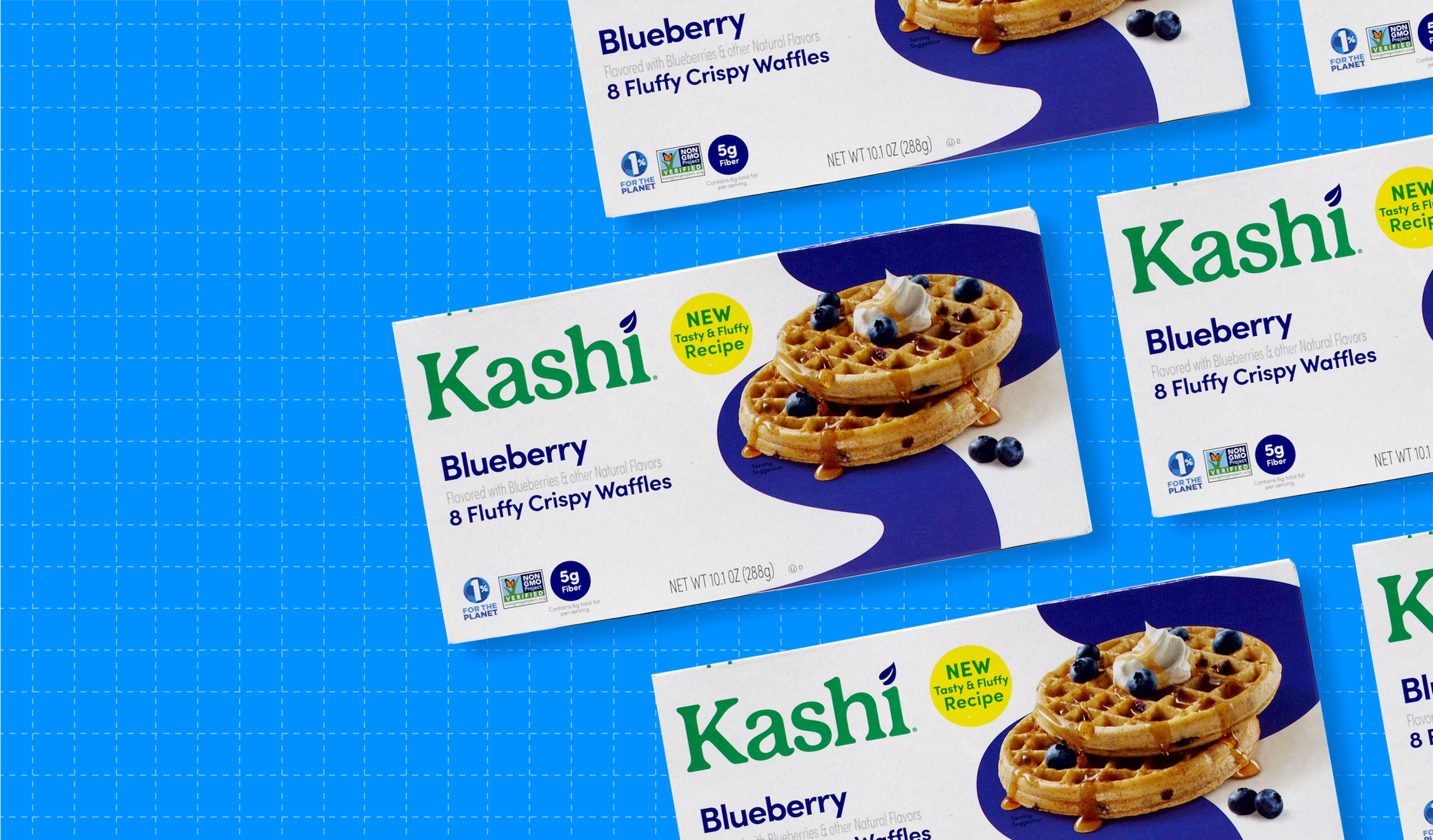
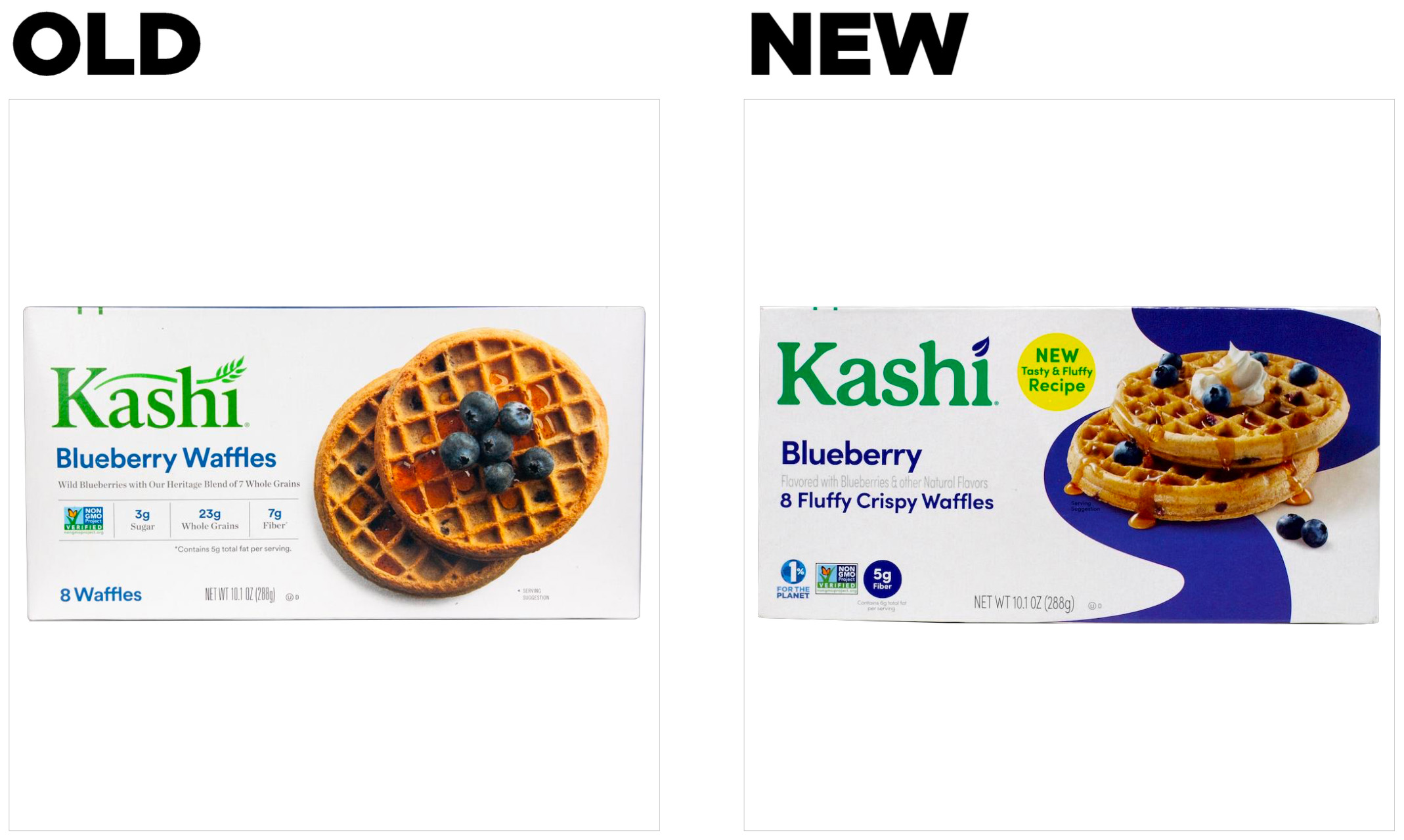
The brand modified nearly every element of the design, from the subtly tweaked and more modern logo to the mouthwatering food photography. It upgraded the waffle imagery–the most-liked element on both packages–with more enticing toppings, including drizzled syrup and a dollop of whipped cream. A bold splash of color runs across the box, aiding in line navigation (e.g., blue for blueberry) across its multiple products, while infusing a dynamic, eye-grabbing element into the design.
The new design utilizes a slightly modified hierarchy of communication, with a larger logo and flavor name as well as sharper color contrast. It left behind some of its previous nutritional claims (though it kept the fiber call-out), and instead emphasized communication of taste appeal with the statement “8 fluffy crispy waffles.” The revised packaging also features a bright yellow “NEW” badge to inform consumers of the redesign and uses this real estate to include even more appealing descriptors like, “tasty” and “fluffy.”
The bottom line
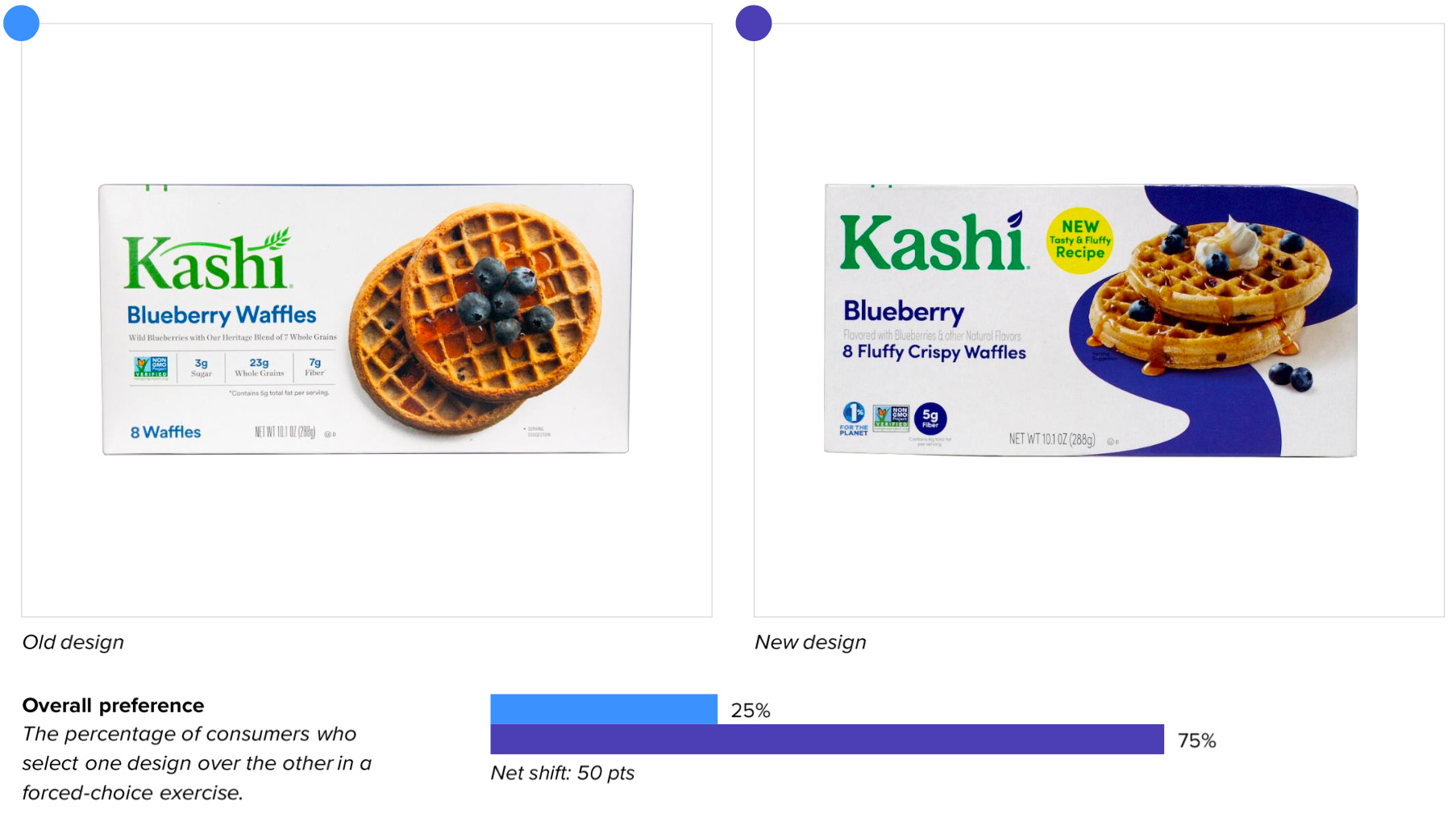
Kashi’s redesign was a delicious victory. The new design won over the old on measures of consumer purchase preference, 75% to 25%.
Wins and opportunities
Kashi’s redesign is a great example of a brand that was already performing well, but chose to aim higher–and scored big. The old design’s resonance (i.e., likability) score already ranked above average for the category, and yet the new design significantly increased scores on this metric, which is an outstanding achievement for any brand.
Taste is the most important product attribute in nearly every food category, and waffles are no exception. The targeted approach to revitalizing flavor cues and ramping up taste appeal paid off in a major way, boosting the communication of the most important decision-driving attribute: “tastes great.” When asked to indicate which design better communicates “tastes great,” 75% of consumers chose the new design, while only 21% chose the old.* In fact, the redesign significantly improved on 10 of the 12 top purchase-driving attributes in the category, including “whole family likes it” (71% vs. 24%), “filling” (70% vs. 27%), and “makes the morning routine easier” (66% vs. 29%).
When asked to share words or phrases that came to mind when first viewing the updated design, consumers responded positively with associations such as “blueberry,” “tasty,” “fluffy,” “delicious,” and “yummy.” In contrast, the previous design had more generic responses such as “breakfast” and “waffles.”
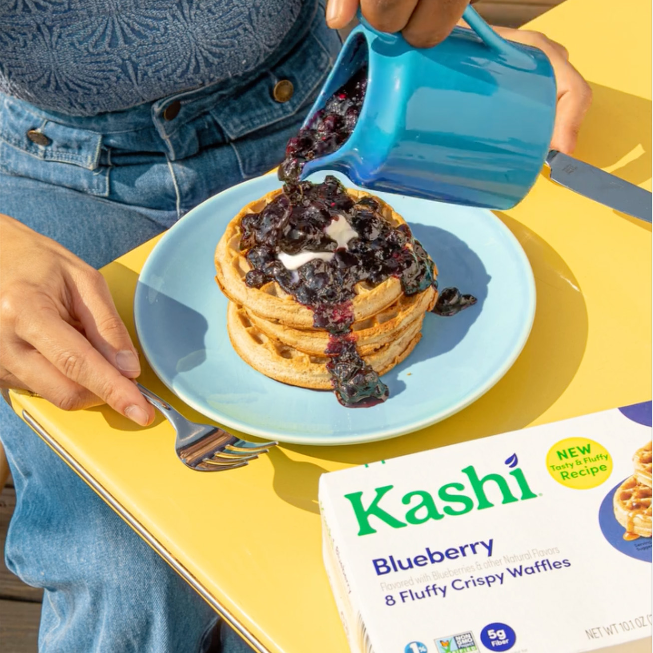
The redesign effectively appeals to the senses, combining both subtle and not-so-subtle indications of flavor and texture through imagery, color, and tantalizing descriptors. Consumers reacted as expected, touting the new design’s waffles as “enticingly good” and “indulgent.”
The brand wasn’t afraid to use words to drive the message home, either. The bold “8 fluffy crispy waffles” and “tasty and fluffy recipe” call-outs were clearly meant to buttress the flavor cues of the imagery, and they seemed to have succeeded.
Wins
- The new design significantly surpassed the old in 10 of the 12 top purchasing-driving attributes, with the largest increase for “tastes great” (the #1 attribute in the category).
- Consumers were able to spot the redesign in only 3.2 seconds—a modest decrease from 3.7 seconds for the old.
- Associations and sentiments for the updated design were largely positive, exceeding the score for the previous design and the category average considerably.
Opportunities
- The brand lost ground on distance recognition (a measure of mental availability), which may be a consequence of adding more engaging elements that pull attention away from the logo. Kashi is an established brand, though, so this is of limited concern.
- The new design made its previous health claims less prominent and included more indulgent food imagery, which likely contributed to the 8 point drop in communicating one of the top purchase-driving attributes, “healthy.” This may have been an intentional trade-off to boost taste appeal and attract a greater number of waffle consumers. However, considering the degree to which the new design improved upon many other key attributes and only moderately decreased for “healthy,” it seems that the brand was able to successfully strike the right balance between nutritious and appetizing.
Consumer highlights:
“The picture of the waffles with blueberries, butter, and syrup looks very appetizing.”
“The waffles look absolutely delicious.”
About our data
Our goal behind highlighting impactful redesigns is to help brands understand market reactions to design changes and make intentional design decisions. We create a full report of these insightful case studies for every brand redesign in our cross-category database. These value-add tools are created automatically for our clients who subscribe to syndicated category data. For more information on this redesign report or others, contact us.
*Percentages assessing communication may not total 100% because consumers who equivocated are not counted.


