Brand: Magnum Ice Cream
Category: ice cream (pints)
Parent brand: Unilever
Agency: Sunhouse Creative
Welcome to our Redesign of the Month series—where we spotlight one deserving brand harnessing the power of design to make an impact, tell a story, and outshine its previous packaging.
Hundreds of current category consumers evaluate the old and new designs across a wide range of performance areas, including purchase preference, communication, mental availability, and design-element resonance. Notably, Designalytics’ testing outcomes align with actual sales performance more than 90% of the time, which bodes well for this month’s winner: Magnum Ice Cream.
Background
Since its launch in 1989, Magnum ice cream has been enormously successful, and now sells more than a billion units every year. In order to keep its edge on competitors, Magnum embarked on a brand refresh in 2021 that would reflect its commitment to “fearlessness, confidence, and sensorial indulgence.”
Back in 2011, the brand started working with Sunhouse Creative, an agency based in the UK. It was Sunhouse who created the “M-stamp” that has become synonymous with Magnum, so the agency was tasked with revamping the design for a third time in its ongoing relationship with the brand.
While there are many who espouse a “fresh eyes” approach to redesigns, Magnum realized the value of creative continuity. “Just like us, they care about the details,” Ben Curtis, global brand director for Magnum, said of Sunhouse. “Which is why Magnum continues to feel fresh and culturally on-the-pulse.”
Key creative changes
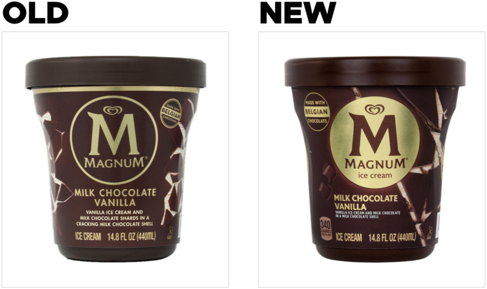
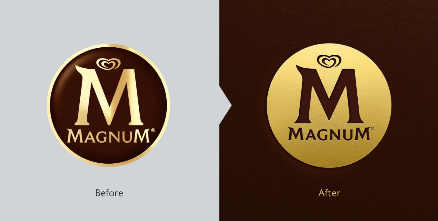
At the heart of this evolutionary change was a simple inversion and modification of the logo coloring. The previous design showcased the “M” in gold enfolded in chocolate-brown, while the redesign features a golden disc within which the chocolate-brown “M” sits. The “gold stamp” aesthetic—which highlights the premiumness of the Magnum brand—was toned down just a tiny bit; there was more gold, but it was less shiny.
There was a subtlety to this change that went beyond just flipping the colors. While gold was a key part of the brand, Magnum wanted to make it more accessible and less elite—which is why it is now a matte gold. The approach embraced indulgence while eschewing the more elite connotations of its glossy predecessor.
"It wasn’t about inventing something new,” James Giles, creative director at Sunhouse, told Transform magazine. “It was about unlocking what was always there and always true. In this way, we were able to find alignment with what consumers intrinsically love about Magnum and then evolve it for relevance and impact.“
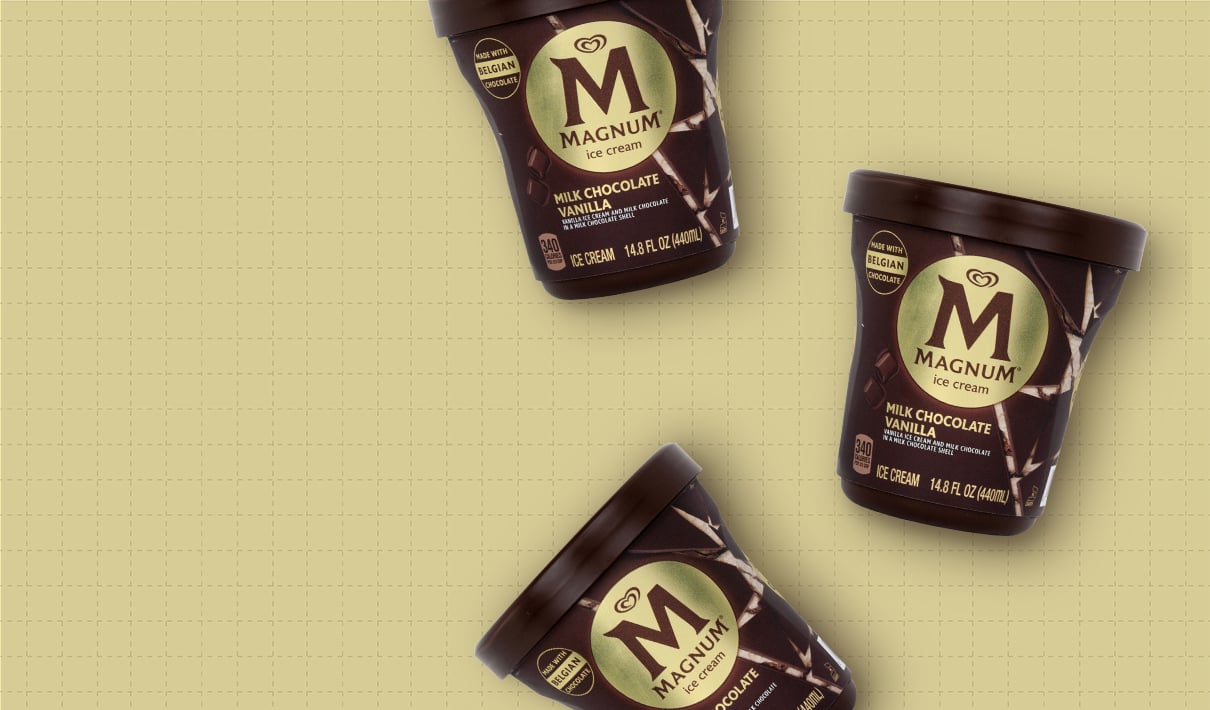
Here’s an example of a strategic-yet-subtle change: There is a diagonal line across each of the packages in the product line. On the pint packages, it’s the “crack and cream” image that connects these products to the rest of the product line while also offering a unique and tantalizing sensory cue. This could be the brand’s way of adding yet another distinctive asset to their already-esteemed package palette.
The bottom line
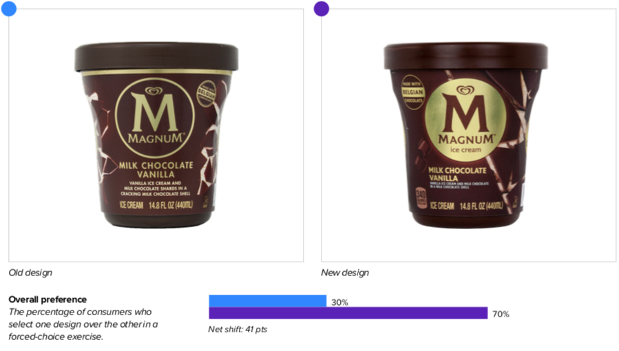
Magnum’s new design was a stone-cold winner. When choosing between the two, category buyers preferred the redesigned package over its predecessor by a whopping 70% to 30%.
Redesign wins and opportunities
As the top ice cream brand in the world, Magnum was already in a strong position—a situation that can make many brands hesitate to embark on a redesign at all. Yet, understanding that the flip-side of such hesitation is a dangerous complacency, the brand decided to make clever, evolutionary modifications that would both reflect the changes in the marketplace and help freeze out any copycat competitors.
Repositioning as a “liberated force of pleasure,” Magnum maintained a similar look with subtle-yet-effective changes designed to preserve its premium standing while conveying a sense of accessibility. This new look starts with the packaging, but it isn’t designed to end there. For example: Remember the “crack and cream” imaging from above? The brand takes it to the next level in their social media posts (see image below), which pushes the concept of “liberated pleasure” even further. The message is clear: Magnum offers consumers an indulgent escape in the freezer aisle.

The inversion of the logo colors made a considerable difference, in part because the gold stamp drew attention to it while also reinforcing (and enhancing) the Magnum’s status as a premium brand. “I love the gold Magnum logo. It looks so fancy,” said one consumer of the new design, while another noted “Gold background looks rich.” One referred to the iconic “M” as an “emblem,” an undeniable step up from “logo.”
The good news kept coming for the new design. As part of our design-testing process, we ask category consumers to tell us which product attributes are most important to them when deciding which product to buy, and then test designs based on this ranked, objective list of attributes. Magnum’s refreshed design bested the previous one in every attribute, including a 27-point increase in the number one attribute: “tastes great.” This suggests that the new design dramatically increases sensory appeal as well as boosting perception of its premiumness, which went up a whopping 33 points over its predecessor. And all while maintaining Magnum’s reputation as an indulgent treat.
When a brand starts with strong design assets (as Magnum did), it’s important to take a targeted approach to avoid undermining what’s already working for the brand. Magnum’s redesign accomplished this, improving distance recognition—a measure of mental availability—while increasing the recognition of its famed “M”. Consumers noted that the brand was “easily recognizable” and that it “indicates the brand from a distance.” In a comment that must’ve been a treat for the marketing team, another respondent said “Everyone knows the M is Magnum!”
The new design also drove increased engagement with the “Made with Belgian chocolate” claim. Though both designs called this out, the wordmark on the new version attracted more attention (inviting comments like “Sounds like a good product if it has higher quality chocolate” and “The Belgian chocolate is the real seller for me” ). It’s a reminder that incremental changes—simply enlarging the claim and modifying the angle of the text, in this case—can increase the impact of a claim. In other words, you may already be saying something on your package, but that doesn't mean you can’t say it better… especially when you arm your creative team with the right data.
Wins
- According to Designalytics’ empirical validation model, the 70% to 30% (new vs. old) victory in purchase preference suggests that this new design will sweeten Magnum’s sales numbers.
- The new design bettered its predecessor on every one of the top decision-driving attributes in the ice cream category in a head-to-head competition, including some major boosts in the top two, “tastes great” (+27 pts) and “high quality” (+38 pts).
- The fresh look was also more likely to evoke initial reactions along the lines of "premium," "delicious," and "indulgent."
- Another major boon for the redesign was in measures of resonance—where consumers were asked which design elements they most liked and disliked. The new design walloped the old, with a like-to-dislike ratio of 4.6-to-1 vs. just 2.9-to-1.
Opportunities
- The changes made in the cracked-chocolate aesthetic seem to have made a minor difference, but perhaps not as much as the brand had hoped given the brand’s focus on liberated indulgence. There seems to be an opportunity to add some “punch” to this element if the execution is refined.
Consumer highlight
“I like the gold foil look—it makes this look like a premium product.”
About our data
Our goal behind highlighting impactful redesigns is to help brands understand market reactions to design changes and make intentional design decisions. We create a full report of these insightful case studies for every brand redesign in our cross-category database. These value-add tools are created automatically for our clients who subscribe to syndicated category data. For more information on this redesign report or others, contact us.


