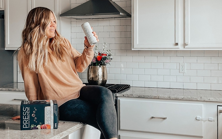
Brand: PRESS
Category: hard seltzer
Parent brand: XYZ Beverage
Agency: Unknown
Welcome to our Redesign of the Month series—where we spotlight one deserving brand harnessing the power of design to make an impact, tell a story, and outshine its previous packaging. Hundreds of current category consumers evaluate the old and new designs across a wide range of performance areas, including purchase preference, communication, mental availability, and design-element resonance. Notably, Designalytics’ testing outcomes align with actual sales performance more than 90% of the time.
Congratulations to this month’s redesign winner: PRESS Hard Seltzer.
Background
Over the past few years, the hard seltzer category has positively exploded. In August 2020, hard seltzer sales had more than tripled over the previous 12 months, according to Nielsen. Though growth has been fizzling out this fall, year-over-year sales in August 2021 were still up 33%—and the competition remains fierce, as new entrants continue to flood the scene. Launched in 2015, PRESS differentiated itself as a premium product with “unique flavor combinations, culinary flavor profiles and understated, sophisticated branding,” and remains one of the top-selling hard seltzer brands in the United States. However, its packaging performed poorly relative to competitors—ranking last of 12—in Designalytics’ 2020 Category Report for the hard seltzer category. Perhaps it’s not so surprising then that PRESS debuted a new look earlier this year.
Key creative changes
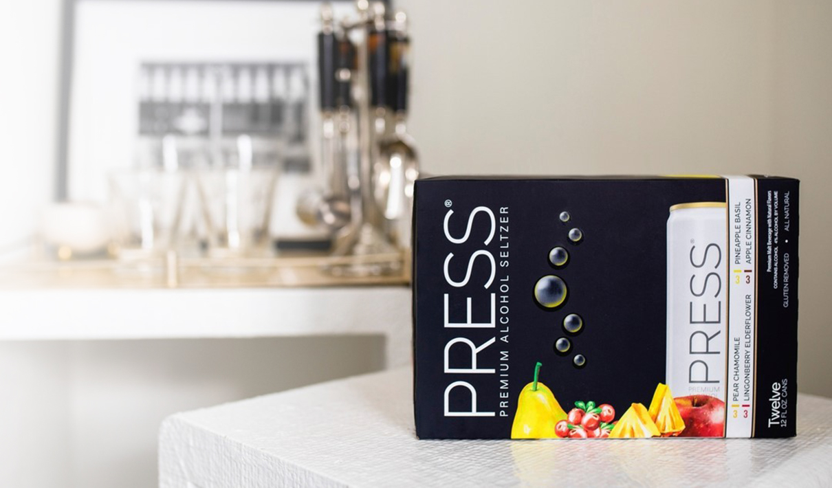
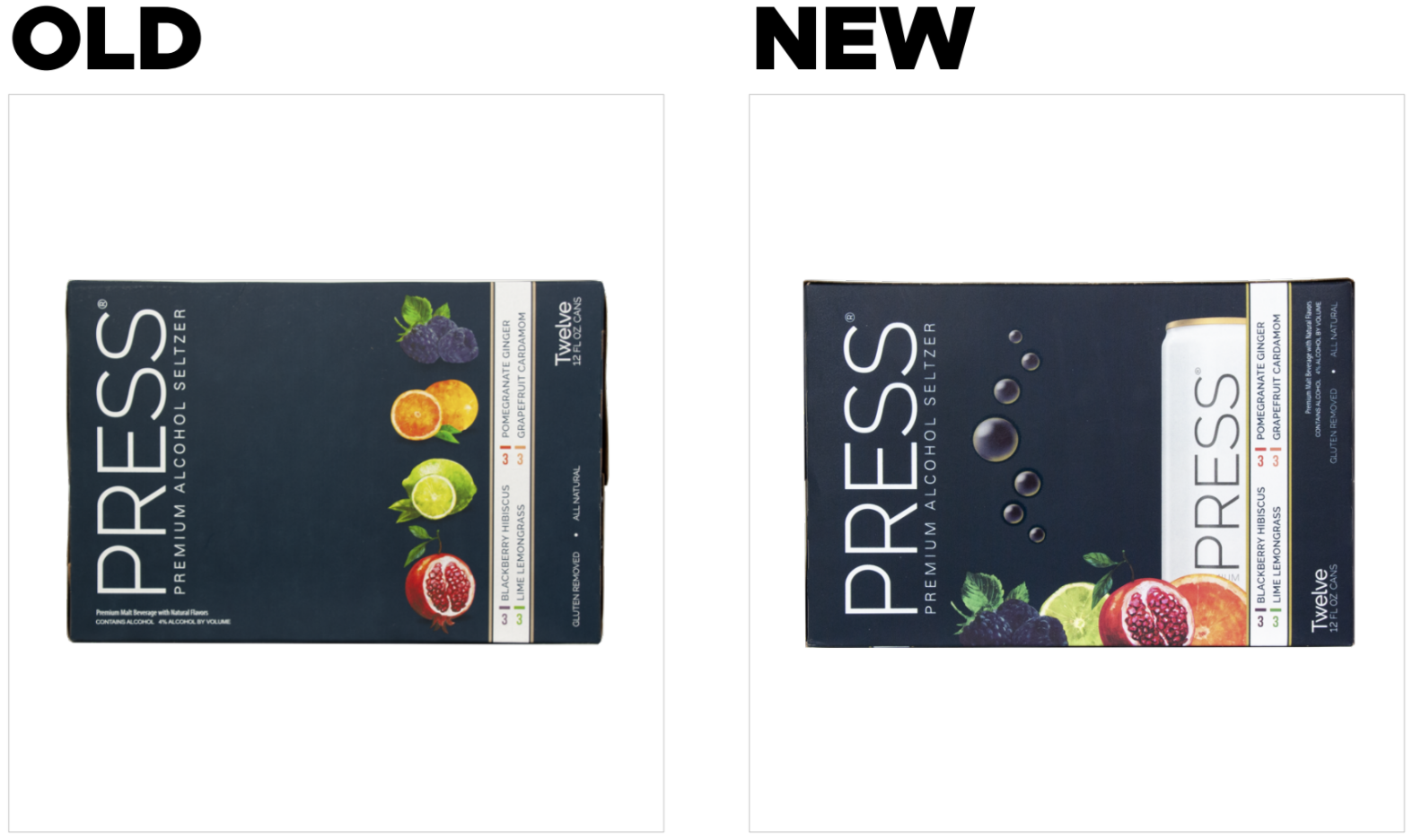
At first glance, PRESS’ design change doesn’t seem dramatic; the dark background color, clean logo, and fruit illustrations remain. However, the new design places the fruit in a cluster at the bottom of the package, partially occluding a newly-added image of the can within. This creates a nice layering effect and enhances the overall impression of contrast. The most impactful change, though, is the addition of bubbles. It’s easy to write them off as a space-filler—which they are, of course—but they’re also communicating something vital.
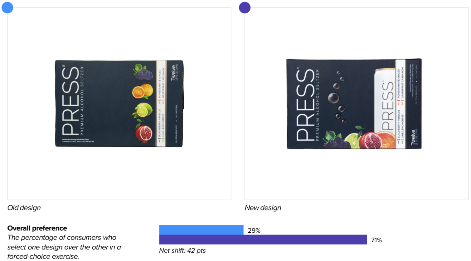
The bottom line
Consumer preference for PRESS’ new design is bubbling over; more than two-thirds of category buyers would purchase the updated version over its predecessor.
Redesign wins and opportunities
While it’s not surprising that hard seltzer consumers enjoy a little effervescence, the power of bubbles here is greater than one might expect. The new design excels at communicating the top attributes that consumers prioritize when choosing which brand to purchase, including “refreshing,” “tastes great,” and “quenches thirst”—all of which are supported by the fizzy imagery. In fact, when asked which version better communicates “refreshing,” three in four consumers chose the bubble-boasting design; many provided commentary such as “bubbles make me think it’s light and refreshing” and “the bubbles communicate ‘liquid’—I’d reach for this because it seems like a tasty, refreshing beverage.” The visual has the added benefit of filling open space—which some consumers cited as “odd” or “bland” in the old design—without crowding the package.
The rearrangement of the fruit seems to have had little effect on consumers, though the presence of the fruit generally is key. When consumers were asked which visual elements they found most likable, the fruit received the most engagement across both designs—and was equally likable in both. This is a pattern Designalytics has observed across beverage categories: Tasty, realistic fruit imagery consistently wins with consumers.
Interestingly, only a small portion of consumers reacted to the can imagery at all, though some noted that it clarifies the box’s contents, while others simply liked its clean, white aesthetic. Interestingly, when asked which design best conveys “enjoyed by both men and women,” nearly two-thirds of consumers chose the new design—a perception potentially bolstered by the minimalistic can design. (Gender-neutral packaging is a growing trend—and hard seltzer, in particular, is a category that has tended to cater equally to men and women.)
Despite consumers’ limited attention to the can, this element provides navigational benefits: The repetition of the logo contributes to modestly improved scores on measures of findability (i.e., consumers can locate the new design amongst a competitive set slightly faster than the old design). That said, both designs lag far behind the category average for findability, which may be partially driven by the brand’s sideways logo.
Wins
- Enhancing communication of all key purchase-driving attributes in the category (e.g., tastes great, refreshing, high-quality, right amount of sweetness, contains fewer artificial ingredients, quenches thirst, natural, etc.).
- Adding a new element (bubbles) that communicates important messages to consumers.
- Eliciting more associations that are core to the brand’s value proposition: fruity, flavorful, refreshing, and premium.
- Modest gains on findability, driven by a slightly enlarged logo and the repetition of this element (via the can imagery)
Opportunities
- Improving legibility of text on the package; beyond the logo, all other key information (flavors, number of cans, claims, etc.) is sideways. While a vertical wordmark may be distinctive to the brand—and should therefore be handled with caution when considering changes—these other elements are not.
- Pushing the fruit imagery even further. This element is a fan favorite and vital to taste perceptions. There may be a way to make these visuals work even harder.
Consumer highlight
“There’s something refreshing about those darn bubbles.”
About our data
Our goal behind highlighting impactful redesigns is to help brands understand market reactions to design changes and make intentional design decisions. We create a full report of these insightful case studies for every brand redesign in our cross-category database. These value-add tools are created automatically for our clients who subscribe to syndicated category data. For more information on this redesign report or others, contact us.


