Category: Snack Bars (Nutritional)
Agency: Beardwood&Co.
Our Redesign of the Month series spotlights a deserving brand that is harnessing the power of design to make an impact, tell a story, and outshine its previous packaging.
Hundreds of current category consumers evaluate the old and new designs across a wide range of performance areas, including purchase preference, communication, mental availability, and design-element resonance. Notably, Designalytics’ testing outcomes align with actual sales performance more than 90% of the time, which bodes well for this month’s winner: Pure Protein.
Background
Back in the 1990s, Pure Protein was among the first contenders in the protein-bar space. In the years since, the brand has become increasingly successful in the category by offering a quick, tasty, and affordable option for a protein boost. That could be why the brand’s package design had remained largely the same—after all, why change what’s working? The answer is often the same: because competitors make it necessary. In Pure Protein’s case, competition has ballooned in recent years, including from popular players like Quest and One. In an ever evolving space, the brand was clearly going to need a new design.
Pure Protein faced a common conundrum in this undertaking: How could it stay true to its brand identity (and status as a market leader), while reinvigorating the brand and connecting with a changing consumer base? Its agency, Beardwood&Co (a two-time Designalytics Effectiveness Award winner), was given a clear mandate in accomplishing this, according to CEO Juila Beardwood. "Pure Protein came to us with the challenge of redesigning the Pure Protein brand to emotionally connect with and attract a broader base of users while reinforcing loyalty among existing customers," she recently told Dieline. "The redesign had to reflect and exemplify its brand positioning to go beyond the gym as a great-tasting, fast-growing lifestyle brand."
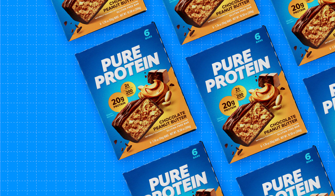
Key creative changes
To start with, Pure Protein decided to part with its long-standing logo. The brand removed the blue shading and angular lettering on their logo, opting for a bold, white sans-serif typeface that takes up a considerably larger portion of the package’s real estate.
There was also shift in the placement and presentation of key nutritional information; whereas the old design offered a white box in the center of the package with protein content, grams of sugar, and calories listed horizontally, the new design placed the protein claim in a “bubble” atop a visual of the product itself, with sugar and calorie content in a slightly smaller bubble to the right.
The brand also put a strong stake in the ground with the choice of color—a deep blue color now dominates every package, creating an eye-grabbing brand block on store shelves. Additionally, a complementary color adorns each box in the lower right corner and in the nutritional information mentioned above. These accent colors not only visually convey the flavor—peanut butter or chocolate mint cookie, for example—they also aid consumers in finding the variety they are looking for.
And flavor is where the brand really flexed its muscles; Appetite imagery has been truly maximized in the new design. Photos of the bar are larger and stylized with a compelling sense of depth, and at the center of the package, rather than tucked in the lower left corner, as with the old design. Plus, the ingredient imagery is much more prominent, giving consumers another visual cue to crave.
The bottom line
Pure Protein really pumped up its performance with this new design, as consumers preferred it to the previous version, 68% to 32%.

Wins and opportunities
Protein content is key for the brand, but it is still subject to the same immutable law that all other food and beverage products are: If it doesn’t taste good, consumers won’t buy it.
So Pure Protein amplified the yum factor with its new look. The product photography and ingredient imagery are not only central to the design, they communicate a sense of activity—flecks of chocolate float away from the bar, as if it has just been chomped. It seems like a frame from a 3D movie, practically jumping off the box.
It worked. The new design topped the old in communication performance on all but one of the top 12 attributes consumers prioritize when shopping for protein bars. This includes an eye-popping leap of 51 points (74% vs. 23% for the new design) in “tastes great,” which is—surprise, surprise—the number-one most important attribute in this category.
Consumer responses included a veritable flood of flavor-focused plaudits. The words “appealing,” “appetizing,” and “tasty” feature repeatedly. Respondents also seemed to appreciate seeing the texture of the bar, which can be seen with greater clarity in the new design.

When looking at consumer associations, the picture becomes even clearer. Of the words consumers would be more likely to associate with the new design versus the old, four had to do with flavor—”tasty,” “appetizing,” “yum,” and “peanut butter.” In fact, the new design was a striking 12 points more likely (15% vs. 3%) to convey “peanut butter,” which suggests that it not only tempts consumers with taste imagery, but also better conveys which flavor the consumers are seeing.
There are less-impressive areas that may warrant Pure Protein’s attention. The new logo doesn’t appear to have hurt the brand considerably, but nearly as many disliked it (7%) as liked it (8%). Consumers used “plain,” “boring,” and “bland” to describe it. That said, the rest of the design is so engaging that a flattened logo may be saving it from becoming too busy.
Wins
- The new design could be seen from a further distance (7.8 feet) than its predecessor (5.8 feet), suggesting improved legibility and mental availability.
- The fresh look also outpaced the old in findability, with consumers finding the former in 3.5 seconds compared to 4.2 seconds for the latter.
- The new design was also better at communicating all but one of the top 12 attributes to consumers. (It improved on “high quality” but lost ground on “good value”—an expected and acceptable trade-off.)
- The brand’s choice to emphasize taste imagery seemed to pay particularly big dividends. The new design vastly outperformed the old (by 51 points!) in conveying “tastes great,” which is the number-one most important attribute according to consumers.
- The brand wanted the taste of the bar to take center stage, yet communicating protein content was still of utmost importance. In the end, the brand got the best of both worlds: While it greatly increased appetite appeal (see above), the number one most-liked element of the design was the call-out of the protein content. “I like that the protein content is prominently displayed on the package,” said one consumer of the new design.
Opportunities
The number of average distinctive assets has dipped from 1.1 for the old design to 0.6 for the new. (Both of these values are low.) That said, the new design contains a few ownable assets that may become more recognizable in time: the deep blue brand color, the diagonal color blocks, and the distinctive photographic styling, to name a few.Neither logo was especially strong in testing with consumers, but the new logo performed slightly worse. As one consumer put it: “The logo is just plain, and everything else on the package is exciting.”
Consumer highlights:
“I really like seeing the texture of the bar. It makes it look appetizing.”
“This brand has other flavors, and I can see where to look to find the flavor I am looking for.”
About our data
Our goal behind highlighting impactful redesigns is to help brands understand market reactions to design changes and make intentional design decisions. We create a full report of these insightful case studies for every brand redesign in our cross-category database. These value-add tools are created automatically for our clients who subscribe to syndicated category data. For more information on this redesign report or others, contact us.


