Brand: Pure Silk
Category: Women’s razors
Parent brand: Perio
Agency: Unknown
Welcome to our Redesign of the Month series—where we spotlight one deserving brand harnessing the power of design to make an impact, tell a story, and outshine its previous packaging. Hundreds of current category consumers evaluate the old and new designs across a wide range of performance areas, including purchase preference, communication, mental availability, and design element resonance. Notably, Designalytics’ testing outcomes align with actual sales performance more than 90% of the time.
Congratulations to this month’s redesign winner: Pure Silk Contour 6 women’s razors.
Background
For a long time, a vast majority of women’s razor brands were under the umbrella of legacy men’s razor companies like Gillette (which owns Venus and Joy), Bic (Soleil), and Schick (Skintimate). In recent years, the success of direct-to-consumer men’s brands (turned retail-store regulars) like Harry’s and Dollar Shave Club have inspired similarly-disruptive women’s razor upstarts like Billie and Athena Club. In short, the woman’s razor market is changing rapidly and brands are scrambling to adapt.
As a sister brand of Barbasol—a men’s shaving product company with a 100-plus-year history—Pure Silk has been a part of the old-school contingent of competitors. To maintain strong market share, the brand has continued to improve its product, with features like a double-flex head, open-flow blades, moisturizing strips with aloe, and a no-slip grip, among other enhancements. The problem, it would appear, is that many consumers weren’t aware of these features.
In our most recent category report for women’s razors, Pure Silk performed above average in standout and findability. But the brand also earned below-average scores in mental availability and middling scores in communication—the latter is of particular concern, since excellent communication is one of the top predictors of sales success. So the stage was set for a redesign… but how would Pure Silk approach it?
Key creative changes
For starters, the brand took a noticeably different tack in color, moving from magenta to a purplish plum. One potential reason for this shift: An increasing awareness of the so-called “pink tax,” which is the price premium placed on women’s razors for a product that is otherwise indistinguishable from men’s razors. The color could send a negative signal to some consumers, so both the packaging and the razors themselves have taken on a different, darker hue.
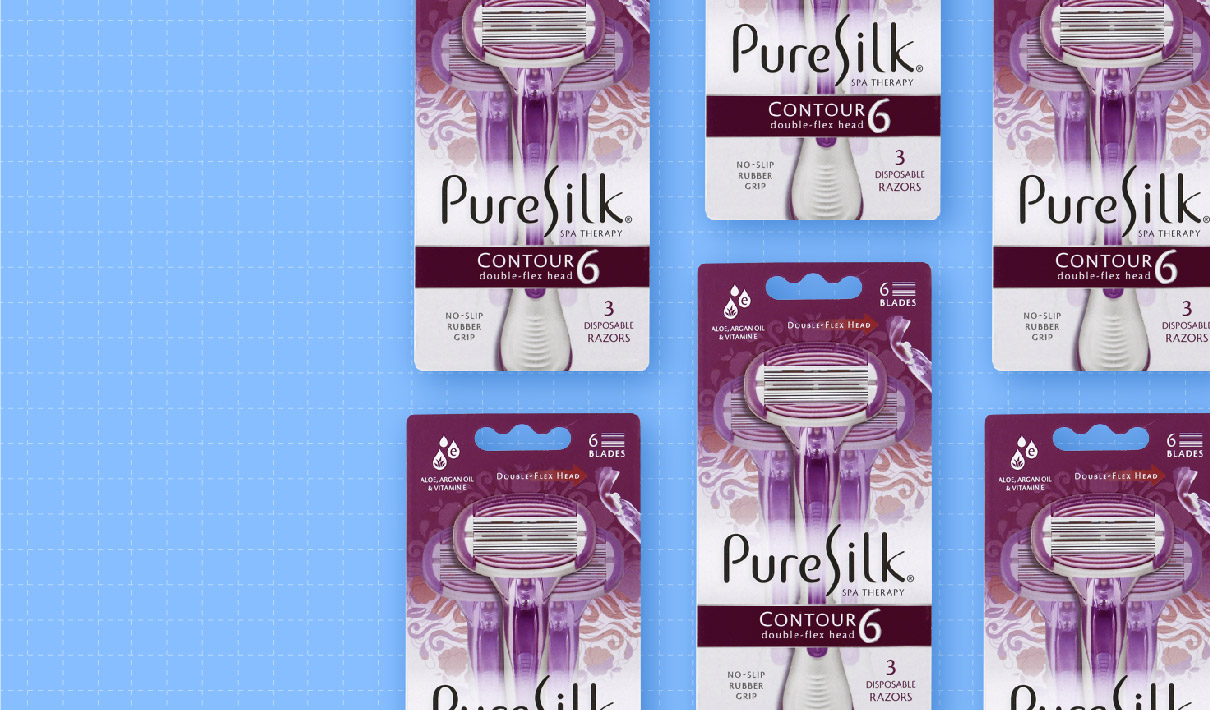
The “Pure Silk” logo increased in size and scope considerably, moving from a small box to stretching across the entire width of the design. The razors themselves were repositioned in the package as well. The previous version showed the actual razors behind the plastic in alternating up-down-up placement, while the new look used stylized, close-up images of the three razors contained within.
The new design dramatically increased the number of claims as well. The brand removed the “Pure Silk Promise” claim from the upper right of the package, but added a series of other call-outs, including “Aloe Arcan Oil & Vitamin E,” “6 blades,” and “No-slip rubber grip.” It also doubled-up on the claim “Double-flex head”—putting it below the name of the product and on the top right. For good measure, they added an image showing the head flexing.
It’s clear that Pure Silk prioritized both telling and showing what the Contour 6 offered. As it turned out, it made a big difference to consumers.
The bottom line
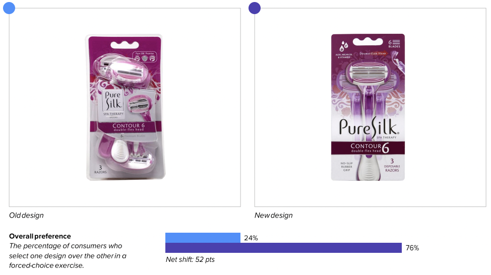
Pure Silk’s new design was undeniably smooth, besting its predecessor in consumer purchase preference by an impressive 52 points, 76% vs. 24%.
Redesign wins and opportunities
Pure Silk may be looking to shave some competitors’ market share with this redesign, and they appear to have created a design that can do just that.
One of the areas of opportunity for the brand at the outset was in communication. The old design had relatively few claims, and one of which—”The Pure Silk Promise,” in the upper right of the package—offered little information about what the implied pledge was. The brand removed this, and filled the design with other claims that offered concrete product benefits that aligned with what was important to consumers.
For example, the “Aloe, Argan Oil & Vitamin E” call-out in the upper left of the new design appealed to consumers, with several commenting about how they appreciated that the razor would help “keep my skin smooth” and was likely to “prevent irritation.” This seems to have directly impacted communication. Scores for the number one attribute, “does not irritate my skin,” were 43 points higher with the new design compared to the old, and for “leaves my skin feeling smooth” (the number two attribute), the difference was 42 points.
This played out elsewhere on the package as well. The “double-flex head” claim (and corresponding photo) on the updated design helped consumers feel that the product would help achieve a better shave. “This seems like it would stay close to your body through all the edges and curves,” said one, while another noted “The flex blade will make for a closer shave.” Sure enough, the new design outperformed the old on communicating the attribute “closer shave” by 51 points (73% to 22%).
Overall, the brand saw an immense boost in communication across the board, with the new design besting the old by an average of 45 points across every one of the top 12 attributes important to consumers.
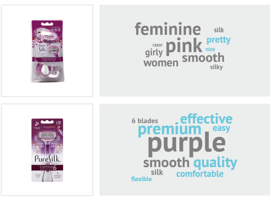
This approach also appears to have impacted consumers’ associations and sentiment related to the designs. We measure this by asking consumers which words come to mind when they view each package, and then noting whether the words they use are positive, negative, or neutral. We then subtract the negative from the positive to arrive at a net-positive consumer sentiment measurement.
In this case, the old design scored slightly less than the category average on measures of positive sentiment, while the new design achieved nearly double the category average.
When asked for the first words they thought of when viewing the old design, consumers gave mostly anodyne answers— “pink,” “girly,” “ladies,” and “silk,” for example. The only answers that denoted a positive sentiment were “pretty” and “nice,” which were notably unrelated to the product’s effectiveness.
The new design, however, elicited a flood of positive sentiments related to the product’s practical benefits: “quality,” “premium,” “easy,” and “effective,” for example. The increased communication clearly contributed to a more positive overall impression of the product. Consumers seemed to appreciate the focus on product efficacy.
Wins
- The new design increased communication performance on every one of the top 12 attributes most important to consumers by an average of 45 points.
- There was a reduction in findability time from 5.2 seconds for the old design to 4 seconds for the new—undoubtedly aided by the larger logo
- Consumers were also able to spot the new, fresh look from 9.4 feet away versus 5.5 feet for its predecessor. (Greater distances equate to greater mental availability and better legibility.)
- Consumers clearly had more positive feelings about the new design; the updated version elicited more positive associations, doubling the old design’s net-positive sentiment score.
Opportunities
- Distinctive asset measurements remained flat, suggesting an opportunity for the brand to develop and reinforce more visual elements that are unique to the brand and meaningful to consumers.
Consumer highlights
“I like that you can really see a close-up of the blades.”
“It's a nice luxury to have aloe, argan oil, and vitamin E included in the razor.”
About our data
Our goal behind highlighting impactful redesigns is to help brands understand market reactions to design changes and make intentional design decisions. We create a full report of these insightful case studies for every brand redesign in our cross-category database. These value-add tools are created automatically for our clients who subscribe to syndicated category data. For more information on this redesign report or others, contact us.


