Category: Flavored Malt Beverages
Agency: Design Bridge & Partners
Our Redesign of the Month series spotlights a deserving brand that is harnessing the power of design to make an impact, tell a story, and outshine its previous packaging.
Hundreds of current category consumers evaluate the old and new designs across a wide range of performance areas, including purchase preference, communication, mental availability, and design-element resonance. Notably, Designalytics’ testing outcomes align with actual sales performance more than 90% of the time, which bodes well for this month’s winner: Smirnoff ICE.
Background
Before there was Mike’s Hard Lemonade, Twisted Tea, or other major entrants in the (increasingly crowded) flavored malt beverage space, there was Smirnoff ICE. Launched in 1999, the brand is the self-described “OG” of a category that has evolved quite a bit since the millennium.
The brand garnered impressive sales very early, but began to lag in the early-mid 2000s. Late in that decade, an unexpected savior arrived: “icing,” a viral prank in which a hidden Smirnoff ICE, when discovered, must be finished by the finder while on one knee. The practice became a part of the zeitgeist of college campuses starting in 2010 before waning in popularity after a few years (note: the brand itself had nothing to do with the icing phenomenon).
Throughout its ups and downs, Smirnoff ICE has remained a popular choice for consumers, in part due to the Smirnoff name. As the maker of the best-selling vodka in the world—with a storied history dating back to the mid-19th century—the brand enjoys practically universal awareness among consumers.
The market, however, never stays static for long. Just in the last several years, this corner of the beverage and alcohol space has fragmented thanks to the introduction of hard seltzers and ready-to-drink cocktails. With more competition than ever, Smirnoff ICE knew it was time for a change to its package design.
Key creative changes
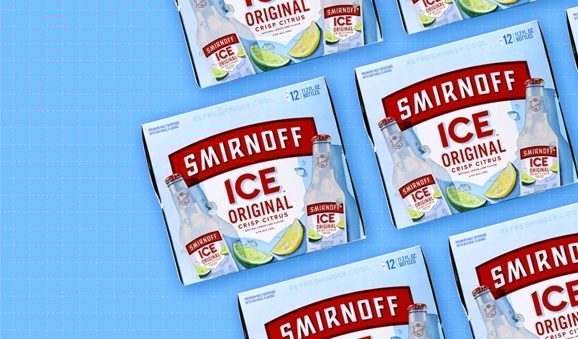
To start with, the brand brightened the overall design considerably, shifting from a largely gray background—a motif meant to suggest ice and separate it from some of its more colorful competitors, perhaps—to a baby-blue one that evokes a clear sky or a swimming pool. Supporting this interpretation: There are shadows beneath the bottles, suggesting they are being enjoyed outside in the sun.
The previous package showed one bottle standing in the background, behind a rocks glass that held the effervescent beverage along with a lemon twist. The new iteration took a different approach: two bottles in the foreground, angled as though being held, with colorful wedges of lemon and lime between them and small chunks of ice strewn around. This collection of design elements creates a U-shaped (or, perhaps, smile-shaped?) frame for another new element: a white shield enclosing the product name. While the former design suggested sophistication, the updated look evinces fun.
Gone are the minus and degree symbols that bracketed the “I” in “ICE” on the old design, which was ostensibly an attempt to underscore the sub-zero vibe of the product. In the new version, the logo is moved down a bit to make room for the phrase “Refreshingly cool” at the top, which is printed in a relatively large but very light font.
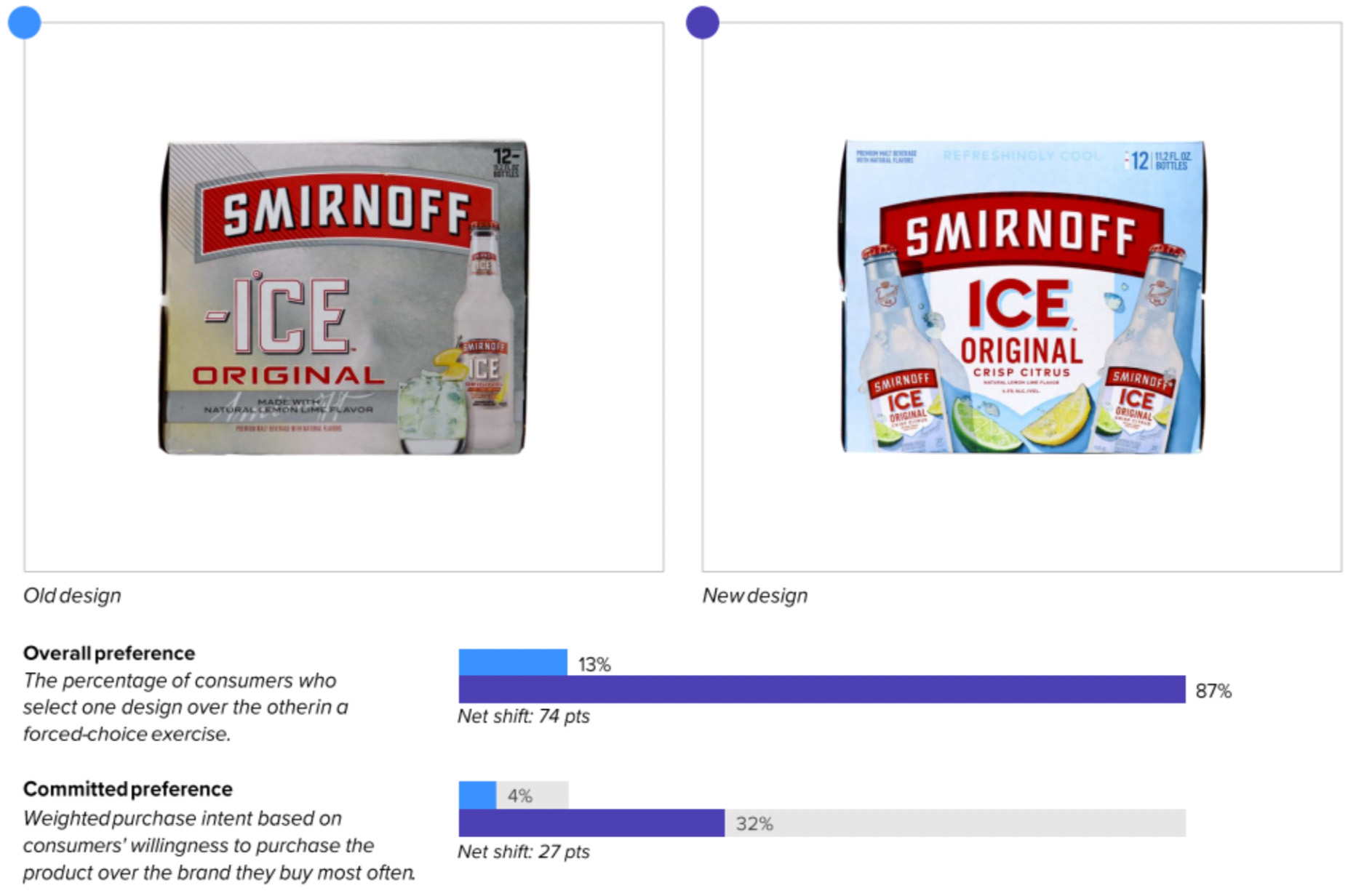
The bottom line
These results may very well send a chill down the spines of Smirnoff ICE’s competitors: The new design absolutely walloped the old in consumer purchase preference, 87% to 13%.
Wins and opportunities
This redesign was an outlier—very few redesigns in our database, especially from established brands, have shown such dramatic improvement over their predecessors. On some measures, the results practically jumped off the screen.
For example, this revamped look was so tantalizing to consumers that it topped the previous design in communicating every one of the top 12 most important attributes by a head-turning average of 54 points. To wit: The new design obliterated its forebear in communicating the top three most important attributes to consumers (in order of importance): “tastes great” (+58 points versus the old design), “high quality” (+44 points), and “refreshing” (+63 points). We very rarely see a redesign win in communication by such wide margins.
In another deft move, the brand tweaked the name of the product itself, from simply “Original” (with a small reference to lemon-lime flavoring below it) to “Original Crisp Citrus.” This likely contributed heavily to the strong scores in communication. “The word ‘crisp’ makes me think of a refreshing drink,” stated one consumer, and another remarked “The words ‘crisp’ and ‘citrus’ just scream thirst-quencher to me.”
The baby-blue backdrop seemed to strike a positive chord with respondents as well. “The box is bright and cheerful-looking,” wrote one individual. Conversely, some consumers noted that the old design was “bland and boring” and that it included “too much gray. Even gray-on-gray in some places.”
The remarkable performance of Smirnoff ICE’s new design could suggest that it was long overdue, and a reflection of the old design’s deficiencies as much as anything else. But there is no question that this stalwart malt beverage has made big improvements that are worth a toast. Cheers!
Wins
- When asked which words come to mind when viewing each design, consumers responded with positive words (like “tasty” and “crisp”) far more often for the new design than the old (57% vs. 38%).
- In that same exercise, the most common positive response was the same: “refreshing.” However, it was only mentioned 13% of the time for the old design, and a whopping 44% of the time for the new.
- The fresh design beat the prior one in communicating all 12 most important attributes in the category, and by margins rarely seen in our database. The biggest shift (+64 points) was for “Good for guests,” and a 58-point margin in “tastes great” (the number one attribute) was eye-popping.
- The most resonant element of the old design was, understandably, the respected and well-established Smirnoff logo—but that was only the second most resonant element of the new design. The first? The lemon and lime wedges. This likely contributed to such vast improvements in communication of “tastes great” and “refreshing.” Consumers respect branding, but they generally buy what looks tasty.
Opportunities
- Though asset resonance (i.e., likability) increased from 4.3 to 4.4 with the new design, it is still below average (4.5) for the category.
- The old design could be recognized from slightly further away, 17.4 feet to 16.4 feet. (Distance recognition is a measure of mental availability.) The higher contrast and the stark departure from the original design could be contributing to this, however, and it will likely improve over time.
- Some consumers took issue with the font choice for “Refreshingly cool” at the top of the package, commenting that the letters were too light and it was hard to read. It’s worth noting, however, that by far the most common spontaneous association was “refreshing,” so this design element seems to have delivered exactly what was intended.

Consumer highlights:
“I like the two bottles. It makes me think this is something that can and should be shared with others.”
“Crisp Citrus sounds refreshing.”
“With the lime and the lemon, this looks so good. I want one right now.”
About our data
Our goal behind highlighting impactful redesigns is to help brands understand market reactions to design changes and make intentional design decisions. We create a full report of these insightful case studies for every brand redesign in our cross-category database. These value-add tools are created automatically for our clients who subscribe to syndicated category data. For more information on this redesign report or others, contact us.


