Category: Coffee creamers
Agency: Unknown
Our Redesign of the Month series spotlights a deserving brand that is harnessing the power of design to make an impact, tell a story, and outshine its previous packaging.
Hundreds of current category consumers evaluate the old and new designs across a wide range of performance areas, including purchase preference, communication, mental availability, and design-element resonance. Notably, Designalytics’ testing outcomes align with actual sales performance more than 90% of the time, which bodes well for this month’s winner: So Delicious coconut milk coffee creamer.
Background
Now more than ever, food and beverage brands are appealing not only to consumers’ taste buds, but to their distinctive dietary needs as well as their affinity for social responsibility. So Delicious was created with this in mind, offering a variety of products that align with a dairy-free, organic lifestyle—and it hasn’t stopped there. The brand also boasts a B Corp certification, which recognizes companies that meet or exceed a range of social and environmental standards.
So Delicious has been successful in its 30-year history, but so has the category as a whole–which has prompted even more competitors to enter the fray. Simple, organic ingredients (a staple of So Delicious’s value proposition) are much more common these days, and competing with established brands like Silk, Califia Farms, Vita Coco and others clearly required So Delicious to embark on a package design to keep pace.
Key creative changes
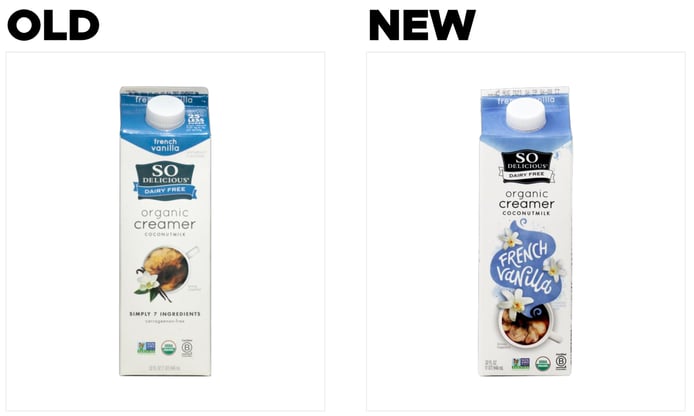
It is evident that the previous design was meant to convey simplicity—white space was prominent, the product name and claims (such as “Simply 7 ingredients” and “carrageenan-free”) featured soft-gray type, and visual flavor cues were clean and subtle. For example, for the French Vanilla flavor, an image of a single vanilla flower perched on a coffee cup with creamer swirling amidst the coffee within. In addition, the name of the variety was featured in small type on the top of the carton and just below the spout.
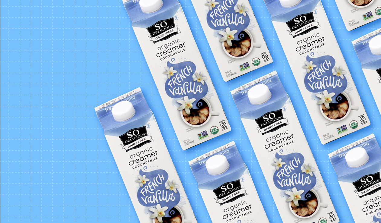
The new look is highly flavor-forward. It eschews the claims related to ingredients and reduced fat, as well as making some slight adjustments to the primary color for each variety (and changing the logo to black-and-white). By far the most dramatic change, however, emphatically communicates flavor. Rising from the cup—and mimicking steam wafting upward from a warm coffee—is a winding swath of color that features the name of the flavor variety as well as more visual elements that highlight appetite appeal (in the case of French Vanilla, for example, three vanilla flowers now adorn the package instead of just one). It’s likely that clearly conveying this information was a primary motivation for the redesign; at a glance, consumers can now navigate to their chosen variety much more easily.
The bottom line
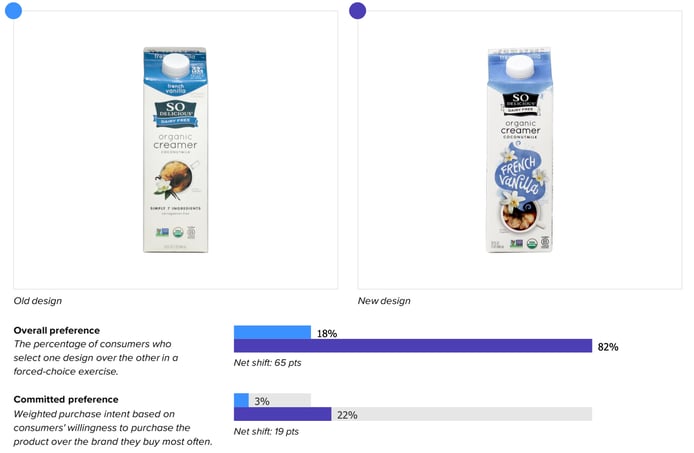
This redesign could be considered the cream of the crop. The new look topped the old in consumer purchase preference 81% to 19%, a remarkable and dominant performance that strongly indicates an increase in sales is on the horizon.
Wins and opportunities
This redesign was an overwhelming success with consumers, and it all started with communication. The new packaging outperformed its older sibling in conveying all 12 of the most important product attributes and by an eye-popping average of 54 points.
What’s more, the best performances for the new design were in some of the most vital attributes (as defined by consumers), including “tastes great” (#1 most important, +69 points over the old design) and “full-flavored” (the #4 most important, +70 points). Through our analysis of thousands of redesigns, we’ve discovered that successfully conveying key decision drivers and important product attributes to consumers has an 88% correlation with in-market sales performance—so this bodes well for the brand (in addition to the purchase preference win noted above).
In addition, an interesting insight was revealed in the measurement of design asset resonance between the two designs. For the old design, the top three most liked elements were the coffee cup (31% liked), the “organic creamer” call-out (28% liked), and the ingredient claims at the bottom (also 28%). In other words, consumers as a whole didn’t gravitate to one design element, and nothing clearly stood out.
With the new design however, the “French Vanilla” flourish was the far-and-away favorite of consumers, with 72% liking it—more than double what the top design element of the old version achieved. Some consumers noted the ease with which they could identify what they wanted (“clearly communicates the flavor” was a common refrain in open-ended responses), others appreciated the artistic flair ( “whimsical,” “pretty,” and “attractive” were used to describe it), and still others the praised the palate-tempting visuals (“looks tasty, you can almost smell it,” said one). So Delicious clearly understood that it was important to show it was delicious, and that resonated with consumers.

Wins
- The changes made to the design were relatively minimal, but had an enormous impact—especially the fun, flavor-focused swirl of color at the center of the package. So Delicious was able to dramatically increase design performance while remaining recognizable to those who already know the brand.
- A minority of the redesigns we evaluate have such marked increases in communication performance, and an elite few see such impressive boosts in purchase preference over their predecessors.
- Consumer sentiment scores for some key design elements increased.
Opportunities
- It took consumers more time to find the new package (7.1 seconds) than the old (4.9 seconds). They were also more accurate in finding the old design, correctly identifying it 96% of the time versus 80% for the new look. While this is worth consideration, it’s also worth noting that this may have been a deliberate trade-off for the brand—after all, while it may initially be harder for a consumer to find the brand, there’s little question they can find their chosen flavor of So Delicious much easier. A drop in findability is also not unusual with new designs.
- Some consumers found the switch to the smaller, black-and-white logo “bland” and “boring,” with one saying “Is it really SO delicious?” The feedback wasn’t overwhelming, but it warrants consideration, especially for a brand that isn’t universally recognized.
Consumer highlights:
“The way the text plays in the stylized steam caught my eye immediately.”
“I like the vanilla flowers as another way to communicate the flavor.”
About our data
Our goal behind highlighting impactful redesigns is to help brands understand market reactions to design changes and make intentional design decisions. We create a full report of these insightful case studies for every brand redesign in our cross-category database. These value-add tools are created automatically for our clients who subscribe to syndicated category data. For more information on this redesign report or others, contact us.


