Brand: Starbucks
Category: coffee (pods)
Parent brand: Nestlé Coffee Partners
Agency: Chase Design Group and Starbucks Studio
Welcome to our Redesign of the Month series—where we spotlight one deserving brand harnessing the power of design to make an impact, tell a story, and outshine its previous packaging. Hundreds of current category consumers evaluate the old and new designs across a wide range of performance areas, including purchase preference, communication, mental availability, and design element resonance. Notably, Designalytics’ testing outcomes align with actual sales performance more than 90% of the time.
Congratulations to this month’s redesign winner: Starbucks Coffee.
Background
While some product categories suffered during the Covid-19 crisis, it’s easy to see why at-home coffee was not one of them. As any dedicated java junkie can tell you, going without just isn’t an option—so many cafe regulars turned to home-brew or ready-to-drink options instead. In May 2021, IRI reported that single-cup coffee had grown 7% compared to the prior year, and valued this segment of the category at close to $5 billion in the United States.1,3 Nearly one year later, the National Coffee Association reported that overall coffee consumption remains above pre-pandemic levels, with 66% of Americans jonesing for a cup of joe on a daily basis.2
From a design perspective, this category has proven rife with redesigns (such as Gevalia, Death Wish, McCafe, Intelligentsia—and yes, even Starbucks in 2020), new product innovations, and private-label players. To keep its packaging fresh and navigable, Starbucks recently redesigned its coffee pods and bagged coffee. (We’ll focus on coffee pods here, for simplicity’s sake.)
Key creative changes
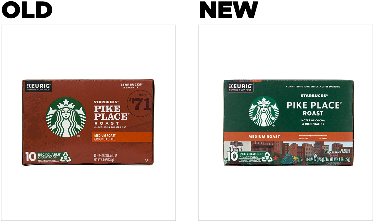
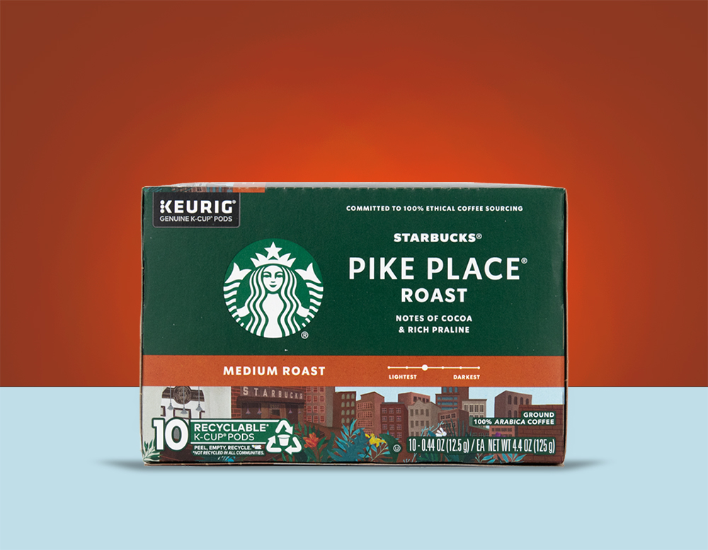
Perhaps the most striking revision to the package lies in its new coloring. The brand replaced its burnt-umber background with a forest green that feels familiar to Starbucks devotees—and pretty much everyone else, too.
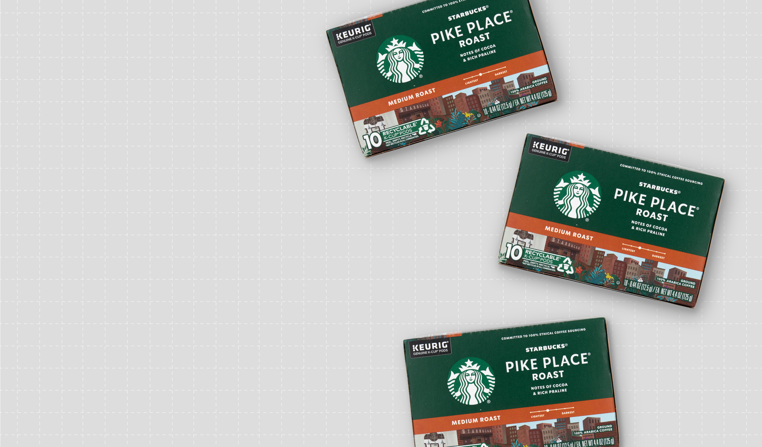
Starbucks must have felt sufficiently secure in its recognizability to downsize the iconic mermaid logo and place it on a lower-contrast background. This created space to add a cityscape illustration on the bottom-third of the box. (Fun fact: the first Starbucks location—the one pictured in the illustration—is located in Seattle’s Pike Place Market, from which this flagship coffee variety derives its name.)
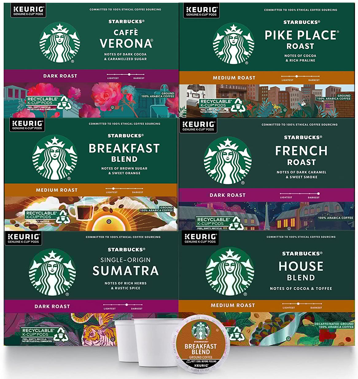
The illustration varies for other roasts in the Starbucks line: a bright sun and steaming mug for Breakfast Blend, a tiger within a tropical rainforest for Sumatra, and so on. Our deep-dive will focus on the imagery for Pike Place, the brand's top-selling variety in coffee pods.
The other notable changes relate to the “volume” at which certain pre-existing elements speak. While the brand placed less emphasis on its logo, it improved readability of copy that helps consumers shop the Starbucks line—and the coffee category generally—with more ease. Instead of the chunky, serif typeface previously used for “Pike Place,” the new design adopted a cleaner, geometric font with wider tracking. “Medium roast” was magnified, and a slider was added to indicate visually where this brew falls on the light-to-dark roast scale.
Starbucks made minor copy modifications to punch up its taste appeal, changing the flavor description from “chocolate and toasted nut” to a more specific and evocative “notes of cocoa and rich praline.”
The bottom line
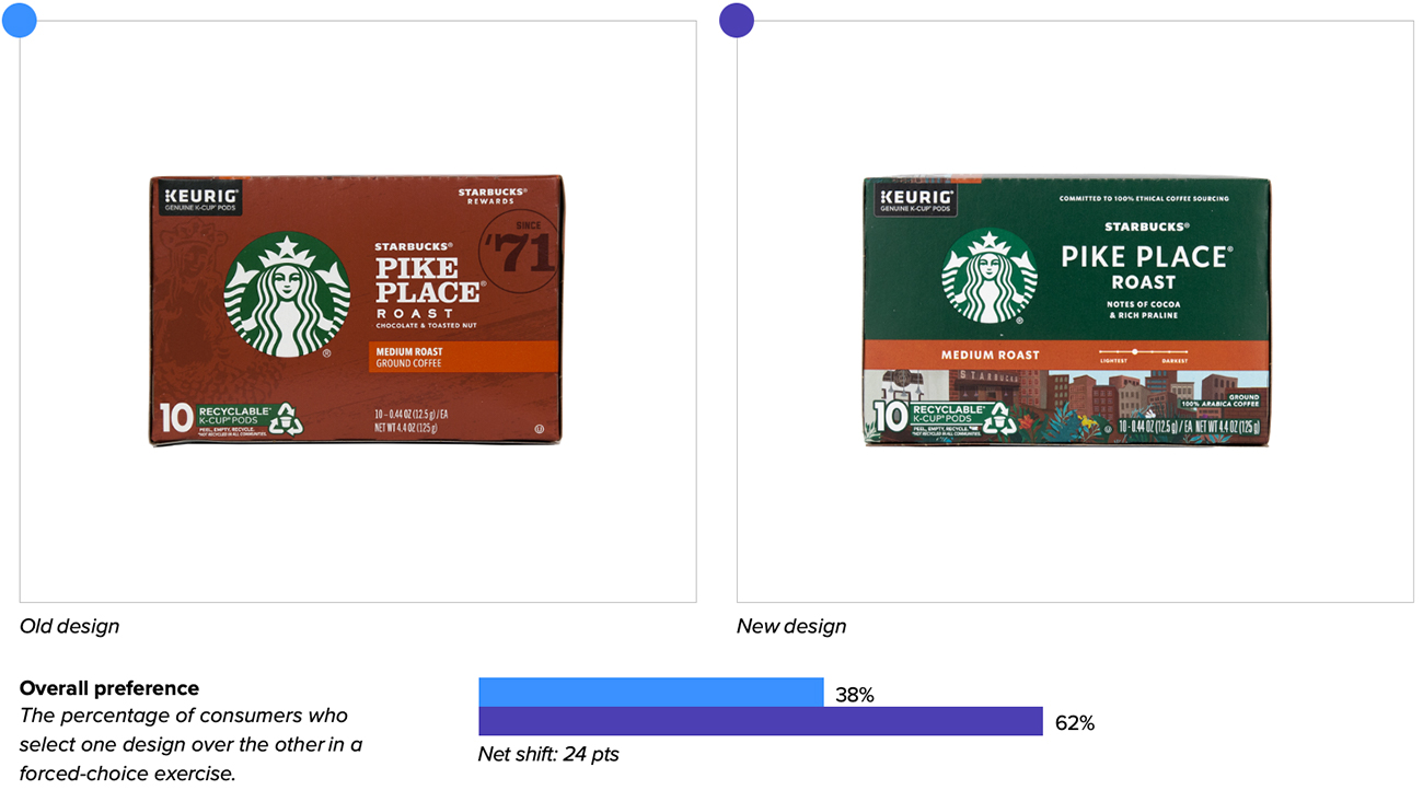
Starbucks’ new design is hot stuff—with 62% of category buyers preferring it for purchase over the prior design.4
Redesign wins and opportunities
The updated design enhanced communication of key purchase-driving attributes in the category, improving significantly on “helps me start my day” and more modestly on “makes me feel energized”—undoubtedly thanks to the addition of a bustling urban scene. One consumer wrote, “The landscape picture makes me think [the product] is modern and for active people.” Another coffee connoisseur connected the imagery to the charms of the café experience, saying “The cityscape reminds me that very special coffee shop experiences happen in urban settings.”
Overall, the new design garnered more positive and varied reactions from consumers. Upon first seeing the designs, they were more likely to associate “coffee” and “Starbucks” with the old design, whereas the new design elicited slightly more associations like “tasty,” “quality,” and “premium.”
To the extent that Starbucks was attempting to differentiate between varieties and clarify key descriptive information, the new design made significant strides. The coffee roast (“Pike Place”) and flavor description (“notes of cocoa and rich praline”) were the most engaging elements of the new package—which was not the case for the older design. Consumers appreciated that they “describe exactly the aroma and the flavor of the coffee” and “tell me what to expect in terms of taste and smell.” The addition of a visual slider for light vs. dark roast was also a hit: “It tells me the roast, which is important to me,” wrote one consumer.
Consumers clearly appreciated the “Recyclable k-cup pods” claim on both designs equally—with approximately 15% of consumers explicitly calling out this element on each design. “Recycling is important to me, as is corporate responsibility. It makes me think they care about the environment,” wrote one consumer.
Despite reducing the logo size, consumers were able to find the new Starbucks package more quickly when actively searching for it within a competitive landscape, reducing the find time from 4.5 to 3.9 seconds on average. This result was likely aided by the use of Starbucks’ signature green as the background color.
Nevertheless, consumers had more difficulty recognizing the brand from a distance (a measure of mental availability), such as when approaching a store aisle. They had to be nearly three feet closer to recognize the new design as Starbucks’ compared to the old design. For a brand as widely distributed as Starbucks, this consequence of the design change likely matters little—consumers expect to find it on the shelf even when it’s not the first package they see, and the brand has cultivated strong distinctive assets (e.g., logo, green, and “Pike Place”).
Wins
- Relying more heavily on a distinctive asset (green color) other than the logo, which freed up space to incorporate more evocative imagery. The former aided findability, while the latter supported communication of “energizing” attributes and increased positive sentiment.
- Ditching assets that aren’t meaningful to consumers: namely, the “Since ‘71’” stamp. It was the least engaging element of the old package, claiming only 3% of consumers’ clicks when they were asked to “like” and “dislike” specific elements of that design. As one consumer commented: “‘Since 71’ doesn’t do much for me.”
- Improving legibility and clarity of important product descriptors (e.g., roast name, roast strength, flavor notes, etc.).
- Enhancing communication of all key purchase-driving attributes in the category, particularly “helps me start my day.” The new design also drove more modest gains on “makes me feel energized,” “high quality,” “makes me feel awake,” and “brews well.”
- Eliciting more positive and diverse associations from consumers.
Opportunities
- Even better communication of the top purchase-driving attributes in the category (e.g., tastes great, high-quality, fresh). In our annual category report for coffee pods, Dunkin’ owned the “tastes great” attribute by a wide margin, and demonstrated a modest lead on nearly all the others.
- While the cityscape illustration garnered interest and positive feedback from consumers, one wonders if it could perform even better with a different execution, especially now that we’ve confirmed it plays a key role in communicating important messages. It may be worth conducting broader creative exploration of this element (and iterative, lightweight consumer testing to learn and affirm which execution resonates most with consumers).
Consumer highlights
“The city scene is evocative of a good time.”
“I had to cut back drastically on k-cups because they weren’t eco-friendly, but I can buy more again if they’re recyclable. Yeaaah!”
About the data
Our goal behind highlighting impactful redesigns is to help brands understand market reactions to design changes and make intentional design decisions. We create a full report of these insightful case studies for every brand redesign in our cross-category database. These value-add tools are created automatically for our clients who subscribe to syndicated category data. For more information on this redesign report or others, contact us.
1,3Beverage Industry, “2021 State of the Beverage Industry: RTD cold brew leads coffee category growth,” July 2021.
2National Coffee Association, “Coffee consumption hits two-decade high,” March 2022.
4In addition to measuring overall purchase preference, Designalytics also evaluates “committed preference”—consumers’ willingness to purchase the brand in question over the brand they currently purchase most often. This measure has proven to be highly predictive of in-market sales outcomes (95%+ accuracy), with increases in 4% or more (from the old design to the new) signifying that the new design will likely drive sales gains. In the case of Starbucks coffee pods, committed preference for the old design was 11%, and 17% for the new design. Since this difference of 6% surpasses the 4% threshold observed by Designalytics for sales predictability, Starbucks is very likely to see an uptick in sales over the next few months.


