Brand: Stella Artois
Category: Beer (Imported)
Parent brand: Anheuser-Busch InBev
Agency: Unknown
Welcome to our Redesign of the Month series—where we spotlight one deserving brand harnessing the power of design to make an impact, tell a story, and outshine its previous packaging. Hundreds of current category consumers evaluate the old and new designs across a wide range of performance areas, including purchase preference, communication, mental availability, and design element resonance. Notably, Designalytics’ testing outcomes align with actual sales performance more than 90% of the time.
Congratulations to this month’s redesign winner: Stella Artois.
Background
For years, Stella Artois was among the best-selling imported beers in the United States. The Belgian pilsner offered beer drinkers a high-quality brew with a prestigious name and history, in a style that aligned with the tastes of American consumers. (Budweiser and Miller Lite, the two top-selling beers in the U.S., are both pilsners as well.) Over the last couple of decades, however, Mexican beers like Modelo and Corona have come to dominate the imported beer market.
In 2021, things changed. AB-InBev (which owns Stella Artois) announced that it was moving production of the storied beer to the United States. The move was designed to stimulate the American economy and reduce the company’s carbon footprint, but it had another effect: here in the States, Stella could no longer call itself an imported beer.
While market conditions may have been ripe for a redesign anyway, Stella’s new status as a domestic beer of higher pedigree made the change a practical necessity. But how could a brand built on its Belgian heritage maintain that cachet while also leaning into its next chapter?
Stella’s design has always been imbued with the rich history of the brand. The curved horn is a nod to Den Hoorn, the original brewery that dates back to 1366 (recognized in the “Anno 1366” featured on the package). The red star recalls erstwhile-owner Sebastian Artois’s creation of the beer as a holiday gift to the people of Leuven, Belgium in the 1700s. (“Stella” means “star” in Latin.)
The challenge was clear: Leverage the brand’s strong heritage while also making it fresh and exciting. Stella’s redesign was a clinic in how to do just that.
Key creative changes
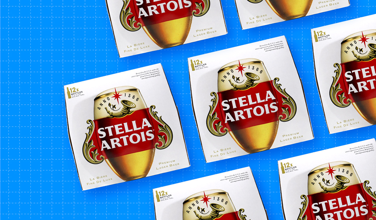
The previous design was intentionally austere in a way intended to suggest refinement. Much of the box was white space; the red-and-white logo was the only other feature that catches the eye. Even the star and horn–two design assets that had been established features on the package design for years–were subtle and understated.
The new design seemed to operate on a straightforward and starkly different directive: bigger, brighter, and bolder. Everything on the new design is larger: the wordmark, the flourish that frames it (now gold instead of black), the red star, and “Anno 1366” (which now practically jump off the package).
But it wasn’t just a matter of making current assets more prominent. The brand also incorporated the distinctive, tulip-shaped Stella chalice as a backdrop, with the golden-colored beer showing underneath the logo and an appealing white foam atop the logo. The chalice was introduced in the 1970s and has since become a recognizable symbol of the brand.
Given the change in its brewing location, “Belgium” was removed from the new design. Instead, a description was added to the upper right of the box, indicating that it’s now brewed in the U.S. with Belgian brewmasters acting as supervisors.
The brand also added call-outs to the bottom left (La Biere Fine de Luxe) and the bottom right (“Premium lager beer,” which is ostensibly an English translation of the former, but doesn’t appear to be a direct one).
The bottom line
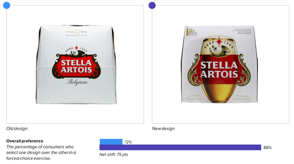
Stella can certainly raise a toast to this new design: It outperformed the previous version in consumer purchase preference by an eye-popping margin of 88% vs. 12%.
Redesign wins and opportunities
It seems as though Stella Artois’s new design was meant to bring a more American personality to this European mainstay, blending its distinguished Belgian heritage with a more assertive aesthetic.
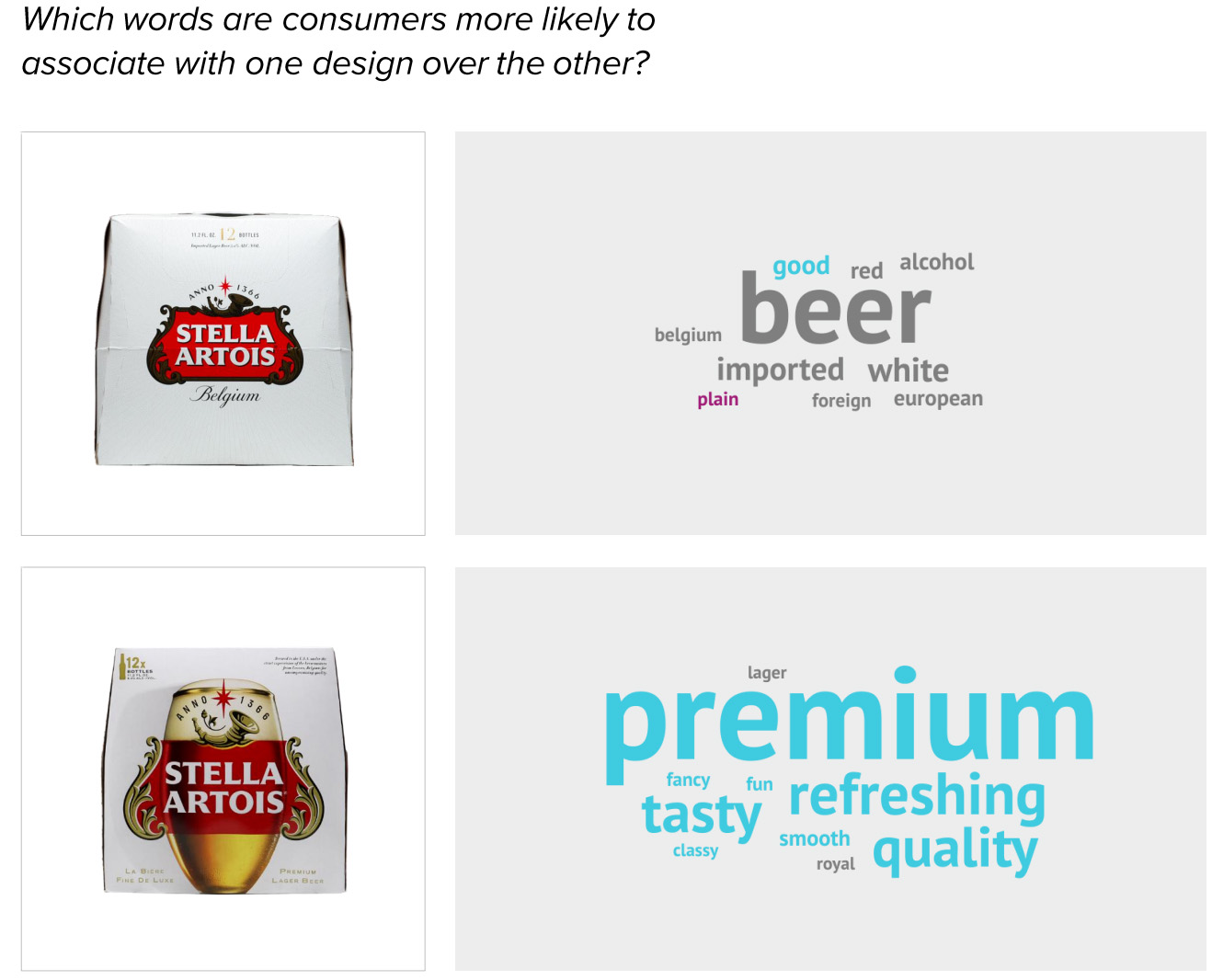
Consumers’ reaction to the new design was essentially: “Where has this design been all my life?” First, the very attribute ascribed to the brand’s success in the United States–premiumness–was conveyed more clearly and convincingly by the new design. When consumers were asked which words came to mind when viewing each design, the word “premium” was used most for the new design (“beer” was the most common answer for the old).
In fact, the new design communicated every one of the 12 most important product attributes better than its counterpart—and by remarkable margins. As an example, the updated look bested the old in communicating the number one attribute (“tastes great”) by 84 points, and the second and third most important (“quality ingredients” and “refreshing”) by 72 and 80 points respectively. We’ve analyzed hundreds of redesigns, and we’ve rarely seen such wide winning margins in communications across the board.
The glimpse of the golden-colored beer below the wordmark no doubt boosted the brand’s taste appeal. In the open-ended responses, consumers remarked that it looked “yummy,” “delicious,” and “thirst-quenching.” By far the most commonly used word, though, was “refreshing,” which (as noted above) happens to be the third-most important purchasing-driving attribute according to category buyers.
The expansive white space on the old design was presumably meant to provide an air of sophisticated simplicity, but consumers didn’t seem to like it. Several indicated it was “too plain” and one put it quite succinctly: “There is a lot of blank space on the package that could have been used to provide more information.”
The new design was able to maintain the brand’s distinguished look and feel while making the package more eye-catching and offering an appetizing glimpse at the product itself. And the result was a thing of brew-ty.
Wins
- Stella’s new design improved on distance recognition (a measure of mental availability). It can be spotted by consumers from further away (21.2 feet vs. 18.1 feet).
- The new look not only beat its predecessor in communication of all 12 most important attributes for consumers, it absolutely annihilated it—by an average of more than 70 points.
- The clever utilization of the Stella chalice—itself a recognizable symbol of the brand—allowed the brand to amp up the taste appeal. The new design outperformed the old in communicating “tastes great” (the #1 most important purchase-driving attribute) by 84 points, which is a staggering margin rarely seen in Designalytics’ database of hundreds of redesigns.
- The addition of the chalice appears to be a masterstroke by the brand. It was the second-most liked element of the design (after the logo) and has immediately become distinctive in the eyes of consumers. Plus, it had the highest average resonance of all of the distinctive assets.
- The fact that the beer is now brewed in the United States didn’t seem to attract much attention, but those consumers who did comment on it saw it as a positive.
Opportunities
- For a brand with a number of strong distinctive assets to carry forward from the old design (the horn, “Anno 1366,” the star, the logo), Stella’s overall number of distinctive assets was slightly below average.
- In addition, some consumers seemed to be puzzled by the use of the horn. “Not sure what the horn represents” said one, while another didn’t “understand the need for a cornucopia.” Others liked it, but seemed unaware it was an established element of the design. “The horn is something I’ve never seen on a Stella package before,” a consumer commented. It may be worth researching why this element is sometimes met with consumer confusion, or finding a way to educate consumers about its significance.
- The use of the French language seems to put off some consumers, particularly the “La Biere Fine de Luxe” statement in the lower left of the new design. “It’s made in the U.S., not Belgium, so skip the French,” commented one consumer. Several others said they didn’t understand what it meant, with one requesting that the brand “stop trying to confuse me with a foreign language.”
Consumer highlights
“It looks refreshing and I can see the type of beer it is: a lager vs. something darker.”
“Got to love that it’s brewed in the USA.”
“This displays the golden color of the beer really well - it looks chilled and tasty.”
About our data
Our goal behind highlighting impactful redesigns is to help brands understand market reactions to design changes and make intentional design decisions. We create a full report of these insightful case studies for every brand redesign in our cross-category database. These value-add tools are created automatically for our clients who subscribe to syndicated category data. For more information on this redesign report or others, contact us.


