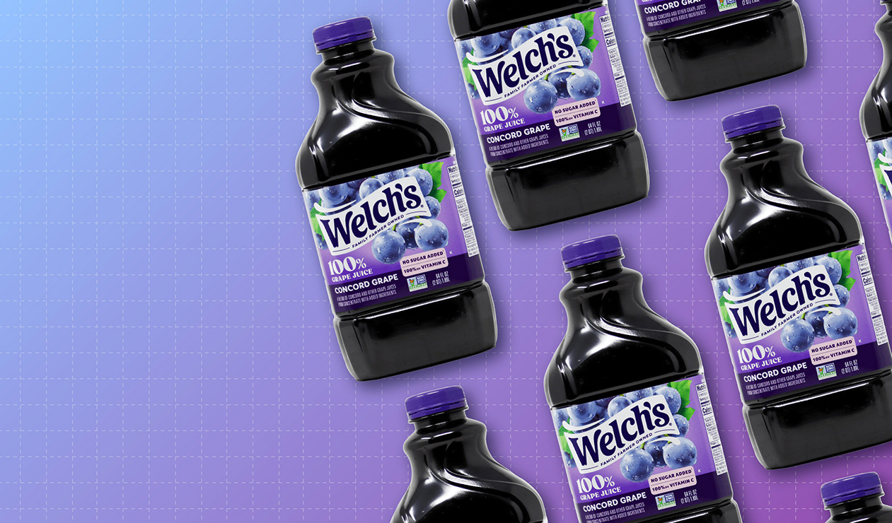
Brand: Welch’s
Category: Juice
Parent brand: National Grape Cooperative Association
Agency: Sterling Brands
Welcome to our Redesign of the Month series—where we spotlight one deserving brand harnessing the power of design to make an impact, tell a story, and outshine its previous packaging. Hundreds of current category consumers evaluate the old and new designs across a wide range of performance areas, including purchase preference, communication, mental availability, and design element resonance. Notably, Designalytics’ testing outcomes align with actual sales performance more than 90% of the time.
Congratulations to this month’s redesign winner: Welch’s grape juice.
Background
In the United States, Welch’s is practically synonymous with grape juice, and for good reason. The company was founded by a Massachusetts dentist, Thomas Bramwell Welch, and his son Charies in the mid-19th century. The pair were Methodist teetotalers and, to ensure there was no alcohol in the wine served at church services, pasteurized juice from grapes in order to prevent fermentation.
Welch and his son took the idea from Concord, Massachusetts to Vineland, New Jersey, which was a “temperance town” populated by fellow abstainers. Their “Welch’s Unfermented Wine” soon became known as grape juice, and the brand enjoyed immense growth as the temperance movement grew in popularity (and eventually helped spur Prohibition).
While the 21st amendment ended this period of history, grape juice gained a foothold in the American household and has remained there since. Welch’s is threaded into the tapestry of abiding American brands, which makes the right approach redesign all the more important. The challenge was clear: Carry on the brand’s strong legacy while also better communicating its most important attributes and boosting taste appeal.
Key creative changes
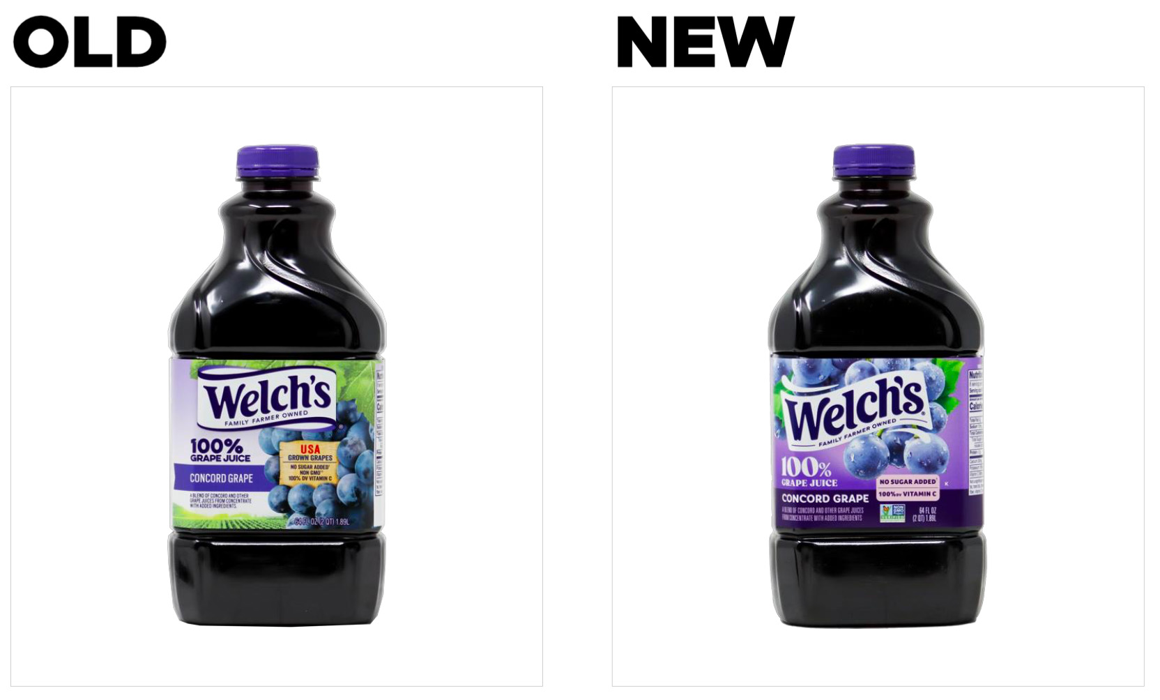
Back in the 1950s, the company was sold to the National Grape Cooperative Association—in other words, actual grape farmers have owned Welch’s for nearly 70 years. This might explain why the previous design featured an image of a verdant vineyard, and prominent “USA grown grapes” and “Non-GMO” claims. The new design drops these claims and highlights the “No Sugar Added” and “100% [daily value] of Vitamin C” attributes of the product.
The color purple is certainly a category standard, and this new design leans into this convention even harder. The green leaves amid the grapes are still there, but take up much less space, and have become brighter and less photorealistic. Gone is the vineyard, replaced by varying shades of purple.
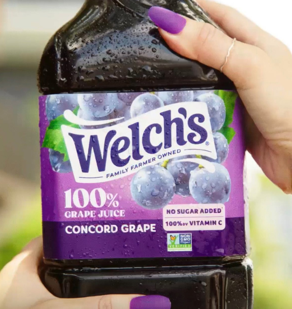
Clearly, marquee billing has been reserved for the grapes themselves. The new design features fruit that is nearly double the size of the previous version, adding texture, water droplets, and more uniform coloring. This fresh look is idealized but insistent—the grapes may look slightly less photo-realistic but, along with the logo, they are unquestionably the most prominent features of the updated version.
The bottom line
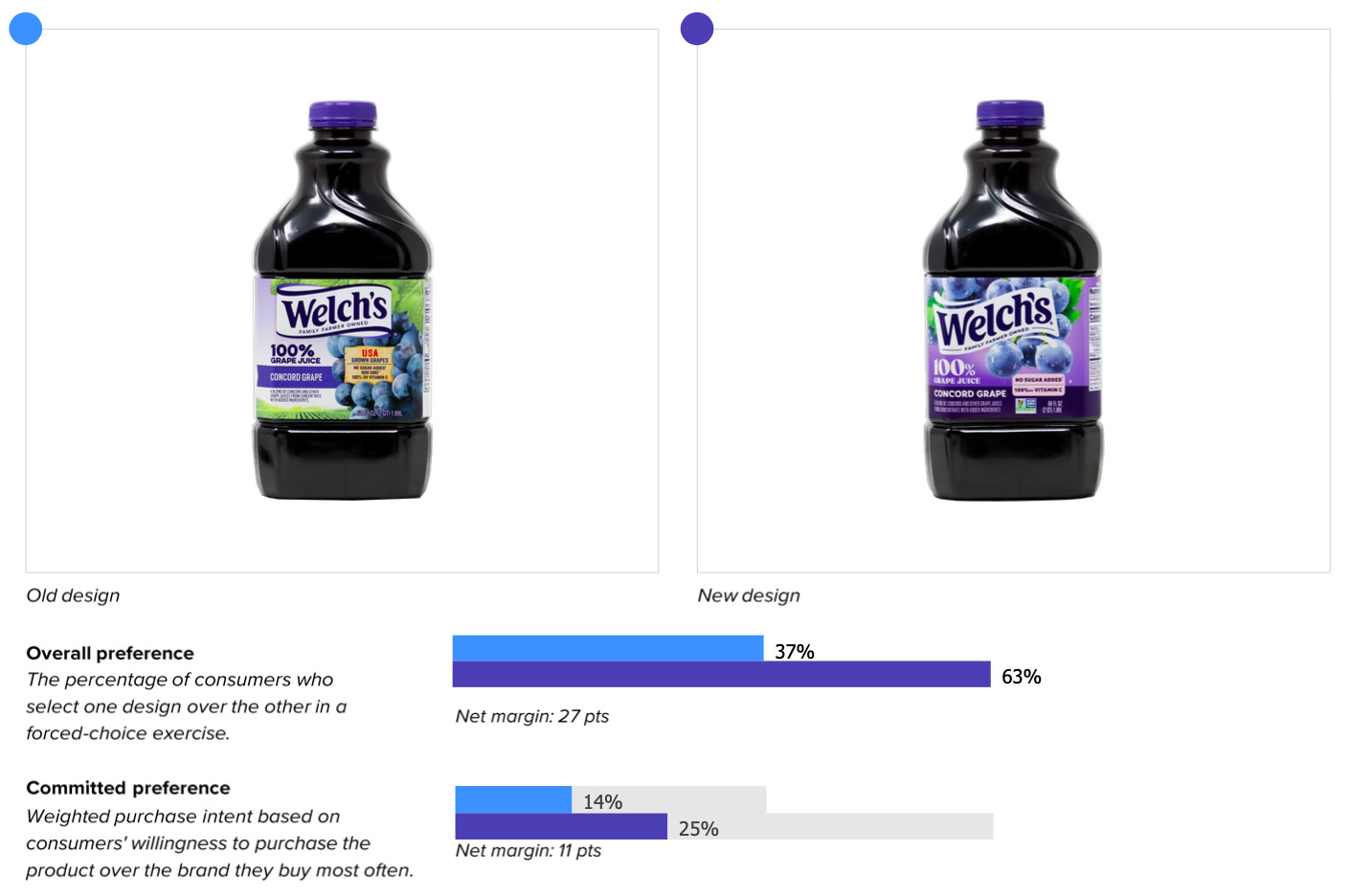
Already a market leader, Welch’s was able to squeeze even more out of its new design: it outperformed the previous version in consumer purchase preference by an impressive margin of 63% vs. 37%.
Redesign wins and opportunities
Taste is paramount in virtually all food and beverage categories, and Welch’s clearly understood this. The brand leaned heavily into flavor cues (increasing the size and sharpening the color of the grapes), while scaling back signals of the fruits’ provenance (i.e., the image of the vineyard and the “USA Grown Grapes'' claim).
This is reflected in communication performance. The new design bettered the old in communication effectiveness for all 12 of the most important attributes, and the greatest increases were related to flavor: “Tastes great” (the #2 purchase driver, +34 points compared to the previous design) and “Fresh tasting” (#6, +27 points). Performance for the number one consumer purchase driver (“Made with real ingredients”) was relatively moderate in comparison—+7 points compared to the old version—as was the number three attribute, “Healthy” (also +7).
When looking closer, this redesign underscores how vital it is to focus on what’s objectively important to consumers. As an example, “no sugar added” and “100% [daily value] of Vitamin C” were claimed on both designs; on the updated version, though, they were easier to read because they were larger and not beneath the “USA” claim.
After reviewing the old design, only a few consumers made note of the no-sugar added and Vitamin C callouts. On the new design, however, an abundance of consumers noted how they liked the no-sugar and Vitamin C claims. They responded with enthusiasm, writing things like “no sugar added and contains vitamin C. Wonderful qualities in a drink I would give my kids” and “It’s clear there is no sugar and it is high in Vitamin C.” Same claims, but the increased prominence and legibility ensured that it landed with consumers.
In the previous design, the “USA grown grapes” claim was deemed to be worthy of high placement in the hierarchy of communication. The problem was that it wasn’t of high importance to consumers—some clearly appreciated it, but it wasn’t driving the choice for them. When this was removed, claims that were more important were elevated, and it paid dividends for the brand.
This redesign was clearly a win, but the brand should keep in mind that the approach they’ve taken here may not be successful across their entire portfolio of products. What works for one product may not work for others.
Wins
- The previous design’s consumer sentiment scores were good—a net positive of 30 points (the category average is 26 points). Yet the new design took it to another level with a net positive of 42 points.
- The updated look evoked considerably more positive associations as well. For example, consumers were more likely to associate the words “tasty,” “fresh,” “no sugar” and “premium” with the updated packaging compared to its predecessor.
- Welch’s previous design ranked among the top 10% of our entire database in findability measures, and the new design only enhanced this strength: it beat out its older sibling by a nose, with an average find time of 2.3 seconds (versus 2.4 seconds for the old design). This is impressive, considering many established brands experience a slight dip in findability after a redesign as consumers acclimate to the new look.
Opportunities
- Consumers could recognize the old design from further away than its counterpart, 16.0 feet versus 14.5 feet. (Greater distances equate to greater mental availability and better legibility.) This is worth noting, but not a dire situation for a brand with such strong consumer awareness.
Consumer highlights
“I like that it is 100% grape juice versus made with artificial ingredients.”
“The images of the grapes look really juicy and refreshing.”
About our data
Our goal behind highlighting impactful redesigns is to help brands understand market reactions to design changes and make intentional design decisions. We create a full report of these insightful case studies for every brand redesign in our cross-category database. These value-add tools are created automatically for our clients who subscribe to syndicated category data. For more information on this redesign report or others, contact us.


