Brand: Yasso
Category: frozen novelties (cream)
Agency: Stone Strategy + Design and Selina Morse
Welcome to our Redesign of the Month series—where we spotlight one deserving brand harnessing the power of design to make an impact, tell a story, and outshine its previous packaging. Hundreds of current category consumers evaluate the old and new designs across a wide range of performance areas, including purchase preference, communication, mental availability, and design element resonance. Notably, Designalytics’ testing outcomes align with actual sales performance more than 90% of the time.
Congratulations to this month’s redesign winner: Yasso.
Background
While some consumer-packaged-goods (CPG) categories flourished and others languished during the pandemic, frozen novelties unquestionably falls into the former category. Year-over-year sales for dessert bars grew 22% from 2020 to 2021.1 And, of course, with greater demand comes greater competition.
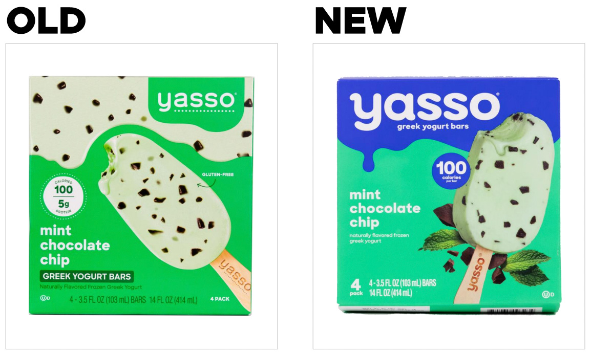
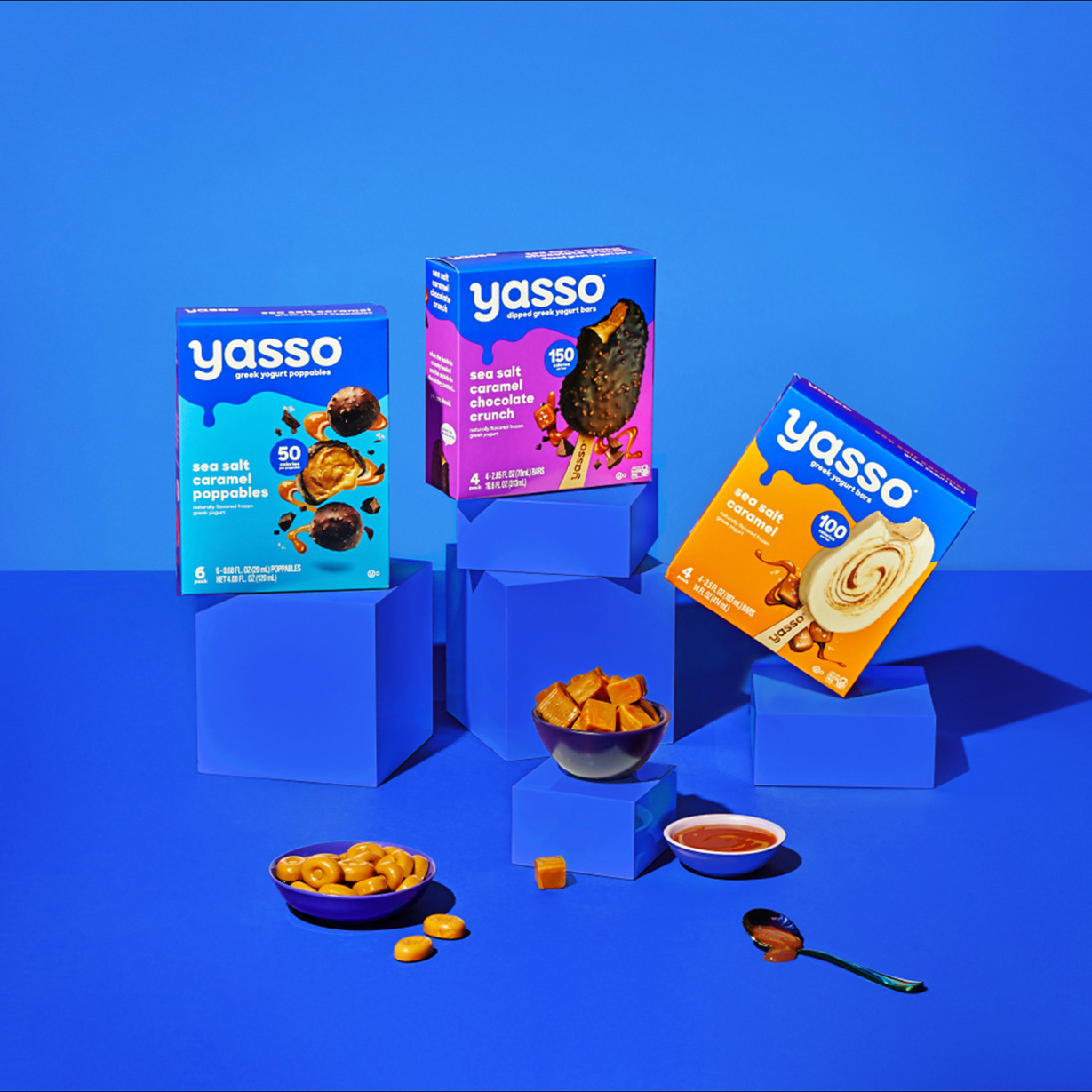
Yasso was the first to bring frozen Greek yogurt bars to market in the United States. The brand first debuted its products in 2011, and sales quickly skyrocketed. Over the past decade, Yasso’s portfolio has expanded to include dipped bars, Greek yogurt sandwiches, mochi, and more. As often happens when product portfolios become more complex, Yasso needed a more cohesive design system to unify its core bar business and its new product innovations, and to make the brand more immediately recognizable at the shelf.
Key creative changes
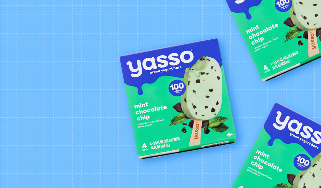
Yasso’s new design adopts a rich, royal blue as its unifying brand color; the “dripping” colorblock appears on every package, regardless of the flavor or product type. There are tactical benefits to this change: It contrasts nicely with the white Yasso logo, making the brand name pop; it complements the coloring used to indicate specific variants; and it creates an eye-grabbing brand block on store shelves.
The revamped design also features a dramatically up-sized logo—another nod toward the brand’s goal of boosting awareness and recognition.
Following in the footsteps of many food and beverage brands recently, Yasso upgraded its taste imagery—a savvy move. The new, punched-up photography has more depth and realism, plus supplementary visuals to signal flavor/ingredients (e.g., mint leaves, strawberries, vanilla flowers, etc.).
The new design streamlines the claims displayed on the prior design, removing copy related to protein content and the “gluten-free” call-out. In exchange, the low-calorie count—a major benefit for consumers seeking better-for-you frozen treats—is now more prominent.
The redesign also includes a modified logo with a slightly chunkier typeface and small details to add more personality (e.g., an additional curve at the top of the “y,” etc.).
The bottom line
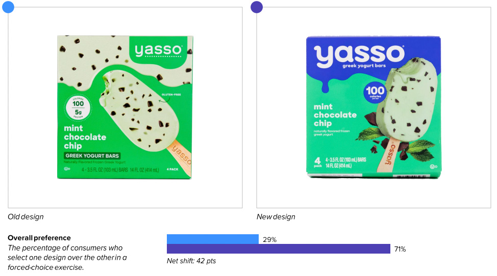
Yasso’s new design freezes out the prior version, claiming a win on purchase preference from 71% of category buyers.
Redesign wins and opportunities
Boost brand recognition? Check.
While “make the logo bigger” may be a tired request for designers, it’s difficult to deny that there are some benefits. For example, consumers are able to locate the new Yasso design within a competitive set faster than the old one (3.6 versus 5.6 seconds, respectively) and with greater accuracy. Relatedly, consumers can recognize the new design more easily from afar: 11.5 feet for the new design, compared to 6.3 feet for the old design. (Strong performance on distance recognition is aided by both mental availability and large, legible branding.)
The revamped design better communicates the top 12 purchase-driving attributes in the category by a significant margin. This includes all-important attributes related to appetite appeal—“tastes great,” “satisfies a sweet craving,” and “authentic taste”—undoubtedly improved by the new product photography. As one consumer wrote, “The product is front and center. It looks real and appetizing.” Other consumers appreciated seeing exactly what they’d be purchasing: “The angle of the bar gives it a sense of thickness and shows approximately the amount of ice cream you'll be getting without having to guess based on numbers.” (After all, most of us have opened up a low-calorie treat, only to feel disappointed that it’s decidedly smaller than we had expected.)
The newly-added, secondary food imagery (e.g., mint leaves, coffee beans, strawberries, etc.) fulfills an important role in communication as well: signaling the flavor variety. When consumers were asked which words came to mind upon first seeing the designs for Yasso’s mint chocolate chip bars, 32% said “mint” for the new design versus just 21% for the old design. As an added benefit, showing the flavor/ingredients also bolsters perceptions that the product is made from clean, simple ingredients. In fact, consumers were much more likely to feel that the new design better communicates “made with real ingredients.” One wrote of the mint chocolate chip bars: “Fresh mint leaves suggest that they use real peppermint oil or flavoring.”
Yasso seems to have hit the bullseye with its curation of claims. Consumers didn’t seem to miss the “gluten-free” claim that was dropped in moving from the old design to the new. Somewhat surprisingly, eliminating the protein-content claim didn’t have a detrimental effect on resonance scores either; the circular call-out elicited approximately the same amount of positive and negative sentiment with only the calorie claim present on the new design. (Perhaps the brand reasoned that the presence of macronutrients is less important than the absence of calories in an indulgent category—even a “better-for-you” indulgent category.) Interestingly, this relatively tiny bit of real estate on the packaging is the second-most engaging element on both the old and new designs. Increasing the calorie claim’s prominence with larger copy and a high-contrast background is an astute move that suggests Yasso understands what’s important to its consumers.
The tweaks to Yasso’s logo seem to have rendered it more distinctive and more appealing, though it still scores below the category average on measures of consumer sentiment. Most consumers who commented on the logo praised the striking blue background and large, legible lettering.
Wins
- Boosting brand awareness (via findability and distance recognition) with a larger logo and unifying brand color.
- Dramatically improving taste appeal with more delicious and realistic photography that gives consumers a better sense of what they’re actually purchasing.
- Enhancing communication of all key purchase-driving attributes in the category, including those related to taste (e.g., “tastes great,” “authentic taste,” etc.) and quality (e.g., “high quality,” “premium,” “made with real ingredients,” etc.).
- Streamlining claims to remove those that aren’t very meaningful to consumers, such as the “gluten free” and protein-content call-outs, and amplifying the claims that are (i.e., calorie content).
Opportunities
- Establishing more distinctive assets beyond the brand’s wordmark. (The royal blue coloring and “dripping” colorblocks seem like solid steps in this direction, and will likely pay off in time.)
- Improving consumer sentiments regarding the wordmark; even the updated version performs below the category average on measures of resonance.
Consumer highlights
“The image makes the product look fresh and flavorful.”
“It looks authentic and like what you'll really be buying—not like a cartoon.”
“Calories per serving—almost dead center. Love this, so I don't need to hunt around on the box.”
About our data
Our goal behind highlighting impactful redesigns is to help brands understand market reactions to design changes and make intentional design decisions. We create a full report of these insightful case studies for every brand redesign in our cross-category database. These value-add tools are created automatically for our clients who subscribe to syndicated category data. For more information on this redesign report or others, contact us.
1Nielsen, xAOC, latest 52 weeks ending 2/20/21.


