Imagine you’re looking at a map, trying to plot out your route to a specific destination.
What’s the first place you look? It’s likely one of two places: Where you are going or where you are right now. You need to know both, or you’ll never get anywhere.
It’s the same with a package redesign. Most brands will eventually develop an idea of where they want to go with a design, but a surprising number fail to properly assess their current design both qualitatively and quantitatively before they begin. We’ve found it’s one of the most common—and preventable—reasons a redesign can go off-track.
Start at the beginning
Brands initiate redesigns for a wide variety of reasons: changes to the competitive landscape, evolutions in consumer perceptions/shopping behavior, pressure from retailers, and internal mandates, to name a few. While some of these reasons are more likely to justify a redesign than others, there’s really no reason not to start by evaluating current design’s strengths and weaknesses.
Ask yourself some basic questions: How is your design performing relative to competitors? Are there assets you should protect, and others you can discard? Which aspects of the design are working, and which aren’t?
There is always something you can learn prior to embarking on a redesign that will save you time, money, and headaches later. Not only can it prevent unnecessary (and potentially ill-advised) changes, it can also help you focus your efforts where they’re needed for the most effective design possible.
The case of Volley
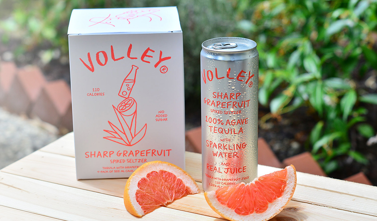
In an effort to illuminate just how important this stage of the process is, we’ll share a specific example: a baseline assessment of the package design for Volley, a challenger brand in the spiked seltzer category.
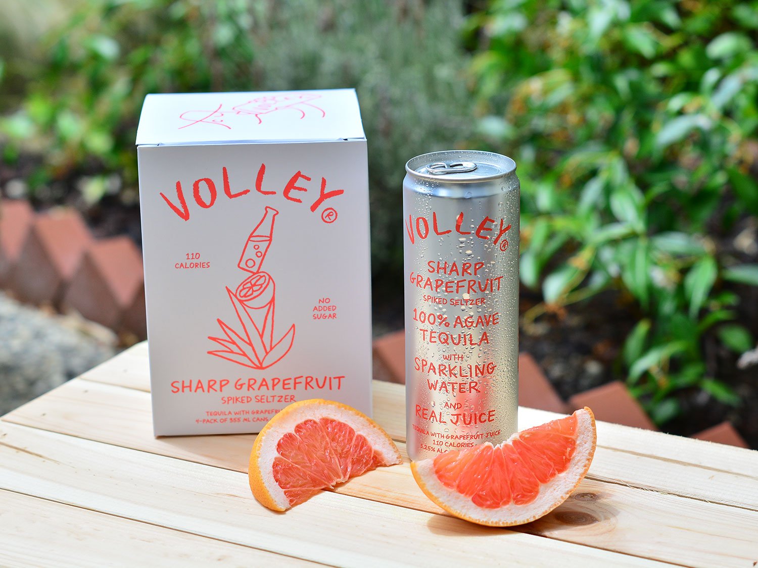
Volley’s existing design was intentionally playful and uncomplicated, and was meant to focus on the high quality of the spirit (100% agave tequila). This included prominent imagery of an agave plant, while attempting to underscore the product’s premiumness and superior ingredients. They wanted to convey all of this simply and with a bright, breezy personality, which they did with minimalistic, monochromatic text and drawings.
Here are just a few key takeaways from a baseline assessment of the brand’s current design, based on feedback from 600 category consumers.
One person’s “simple” is another’s “simplistic”
One of the first insights from the baseline assessment was this: The hand-drawn aesthetic was clearly meant to support the simple-and-breezy brand personality, but it wasn’t having the impact Volley intended. For example, while the design did effectively evoke “simple” associations as hoped, it also struck some consumers as “plain,” “bland,” “cheap,” “boring,” and “childish.”
By digging into an element-level analysis of the design, it was clear that these perceptions were partially driven by the hand-drawn flavor/ingredient imagery and wordmark. This creative execution was polarizing, and was potentially compromising “premium” and “high-quality” perceptions, even while it reinforced the brand’s intended “simple” and “breezy” qualities.
Not capturing attention
Consumers can’t purchase what they don’t notice, so capturing consumers’ attention is vital. Volley’s design performed at an average level on attention-getting power in a competitive environment. While this might be acceptable for a big-name brand, only 20% of hard seltzer consumers were familiar with Volley, making strong standout performance a priority.
Underperformance on competitive differentiators
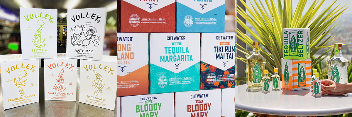
One of Volley’s design goals was to convey that the product was made with high-quality tequila. In spite of it being a top communication priority for the brand, the key descriptor “made with tequila” wasn’t registering with consumers. In fact, Cutwater owned this attribute by a wide margin, with the bold “Tequila Margarita” taking prominent space on their design.
Volley wasn’t even in the top three brands for this attribute. If the brand wanted to compete on that message, it was clear that the tequila-focused copy would need to be dialed-up considerably in the hierarchy of communication.
Not focusing on what is most important to consumers
As it turned out, ingredients weren’t the top priority for consumers—they were most interested in whether the beverage was refreshing and tasted good.
This tracks with our cross-category database. In food and beverage categories, "tastes great" consistently tops the list for attributes that drive purchase in a given category.
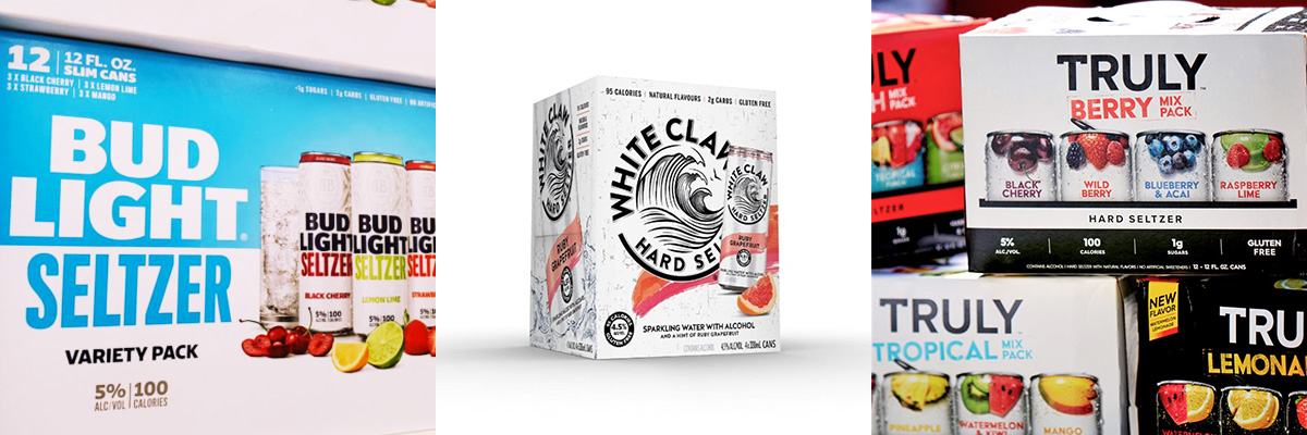
Volley’s design performed poorly on perceptions of “tastes great,” which put them at a distinct disadvantage. Top-performing competitors, such as Truly, White Claw, and Bud Light Seltzer, feature photo-realistic flavor imagery, suggesting that there may be merit to utilizing more evocative and flavor-focused graphics.
Burying the lead
Interestingly, baseline testing revealed another surprising finding. Consumer reactions coalesced not around the ingredients it included, but one it lacked: sugar. Through our spontaneous association exercise—where consumers are presented with an image of the package and prompted to share the first thoughts that come to mind—one claim particularly resonated: zero added sugar.
“I watch my sugar intake,” said one person. “The less sugar the better,” said another, while a third liked that it was “not too sweet.” One more interesting association came up related to health: “No added sugar works for me since I’m diabetic.”
The package mentioned “No added sugars,” but in tiny type. Consumers had prioritized it more than the brand had.
What Volley learned (and what other brands can as well)
The writer Johann Wolfgang von Goethe once said “There is nothing so terrible as activity without insight.” While he was probably not talking about package design (given the dearth of supermarkets in 18th-century Europe), he might as well have been. When it comes to redesigns, acting without insight is the proverbial shot in the dark.
Armed with robust quantitative assessment of their current design, a brand can modify its strategy to maximize the effectiveness of its design. It can notice miscalculations, spot areas of opportunity, and gain insight into its consumers’ mindsets. Without this assessment, the brand can easily make decisions in line with its team’s subjective views, to the detriment of its design and, potentially, its bottom line.


