 Over the past several years, many human food categories have been impacted profoundly by the “clean-label” craze—a desire for simpler, more natural ingredients. Not surprisingly, it wasn’t long before conscientious pet parents began to wonder, “Shouldn’t my pet be eating as well as I do?”
Cue the launch of new pet foods whose packaging touted high-quality ingredients and uber-natural positioning. Suddenly, retail shelves were paneled with images of wolves with piercing blue eyes, dramatic woodland panoramas straight from a National Geographic magazine, and five-star charcuterie boards sprinkled with leafy carrots and choice cuts of meat. “There were a lot of fads gaining popularity in pet food categories with positioning like, ‘Your cat is a tiger, so you should feed it what a tiger eats,’” explained Luca Torregiani, Senior Global Design Manager at Colgate-Palmolive.
Hill’s Science Diet has spent decades proving that the optimal nutrition for domestic pets isn’t the same as for humans or wild animals. However, despite using premium ingredients and conducting painstaking amounts of R&D to ensure the ideal balance of nutrients, the brand was perceived as a stuffy old-timer amongst new brands with a breezier, all-natural bent. “We were standing to the side, giving good advice but not connecting emotionally with the consumer,” said Jen Giannotti-Genes, Global Brand Design Director at Colgate-Palmolive.
That was the crux of the problem—too much emphasis on science and too little on emotion—the Hill’s Science Diet team discovered when they talked to consumers. “Even current Hill’s buyers didn't like the packaging. Typically, they were buying it because their vet had told them to, but it didn't look like food that was going to make their pets happy. It just looked like science—a product with a white coat on it,” said Julia Beardwood, CEO and Founder of Beardwood&Co., a New-York-based branding agency that the Hill’s Science Diet team engaged to lead the redesign.
"It didn't look like food that was going to make their pets happy. It just looked like science—a product with a white coat on it."
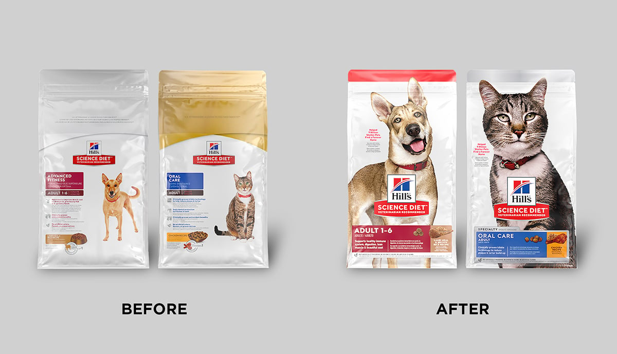
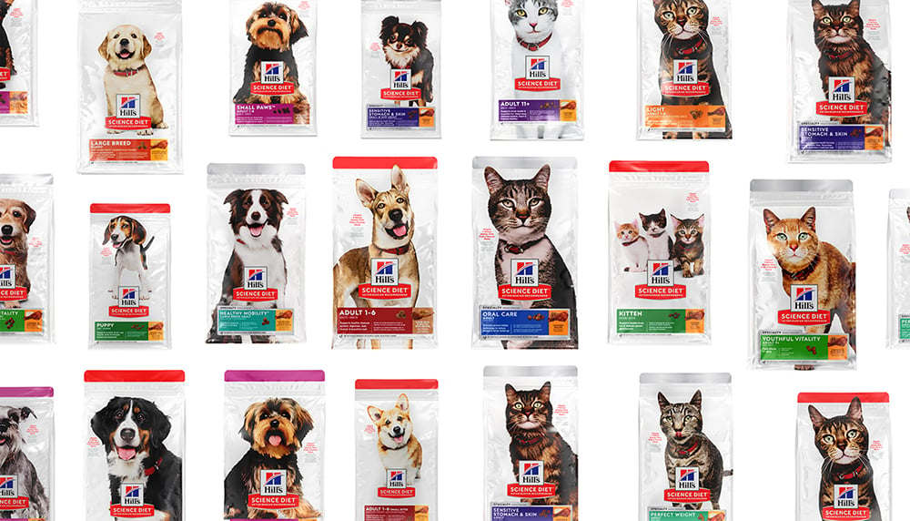
Prior to beginning the design process, the brand team conducted extensive brand and design research to understand the strengths and weaknesses of the brand’s positioning and current packaging. They discovered that, beyond the brand’s lack of emotional appeal, there were other practical drawbacks to the current design. The white bag—a powerful distinctive asset for the brand—was recessive in retail contexts, particularly on e-commerce websites where packages are typically displayed on a white background.
Additionally, the bag was too cluttered with copy, and it lacked a clear hierarchy of communication. “Everything was basically the same size—the logo, the pet image, the key information. Everything was speaking at the same volume. It felt like an opportunity to create some drama and prioritize what was going to connect with people and help them navigate the packaging,” said Sarah Williams, Chief Creative Officer at Beardwood&Co.
Given the complexity of the challenge—solving for multiple problems across a massive product portfolio—Beardwood&Co. took a somewhat unconventional approach to developing the initial design concepts. “Rather than trying to create full package designs right away, we broke the design apart into different components. What does the pet photography look like? How do we portray the food itself? How do we crack the science piece?” said Beardwood.
The agency used a visual creative brief exercise to tackle these different questions with the Hill’s Science Diet team, and followed-up by collecting consumer feedback. “Typically, we would be going right into creating some packaging design routes and territories and wanting to get feedback on that. Building in that additional consumer insight upfront was an extra step, but it allowed us to go faster and further once we had that learning,” explained Williams.
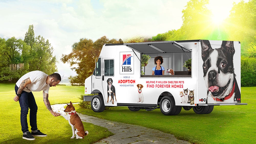
The team learned that the notion of “distinctive pet character” was the most effective way to connect with pet parents, which meant that the animal photography would need to hit just the right note. Serendipitously, the Hill’s Science Diet team came across a photographer named Michael Faye at a natural foods expo in Los Angeles. He had created his own line of kombucha with less sugar than many existing products, and was using his own pet photography on the bottles to advertise shelter dogs in need of adoption—a mission that aligned with Hill’s Science Diet’s own history of donating to animal shelters. “We really fell in love with his spirit and his style,” said Torregiani.
After considering several other photographers, the team commissioned Faye for the project. “The pets created a relatable cast of characters, and the detail in the photography contributed to that—one would have a funny eyebrow quirk, or a little ear perked up, or a sidelong glance, or a sweet smile,” said Williams. In testing, consumers even began to relate people in their lives to the pets’ personalities. “They’d say, ‘Oh, that looks like my uncle Joe or my Aunt Sally. It was really comical,’” recalled Giannotti-Genes.
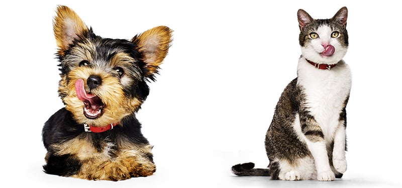
The photography enabled consumers to forge a strong emotional connection with the animals, but it went even further than that. “It was interesting to find that a happy, healthy-looking pet conveys good taste—that taste appeal doesn't just come from food,” said Beardwood. Designalytics’ consumer evaluation supports this observation; when asked whether the old or new packaging better conveys “my pet likes it”—a top-ranked choice driver in the category—more than two-thirds of consumers chose the new design.1
The pets created a relatable cast of characters... one would have a funny eyebrow quirk, or a little ear perked up, or a sidelong glance, or a sweet smile.
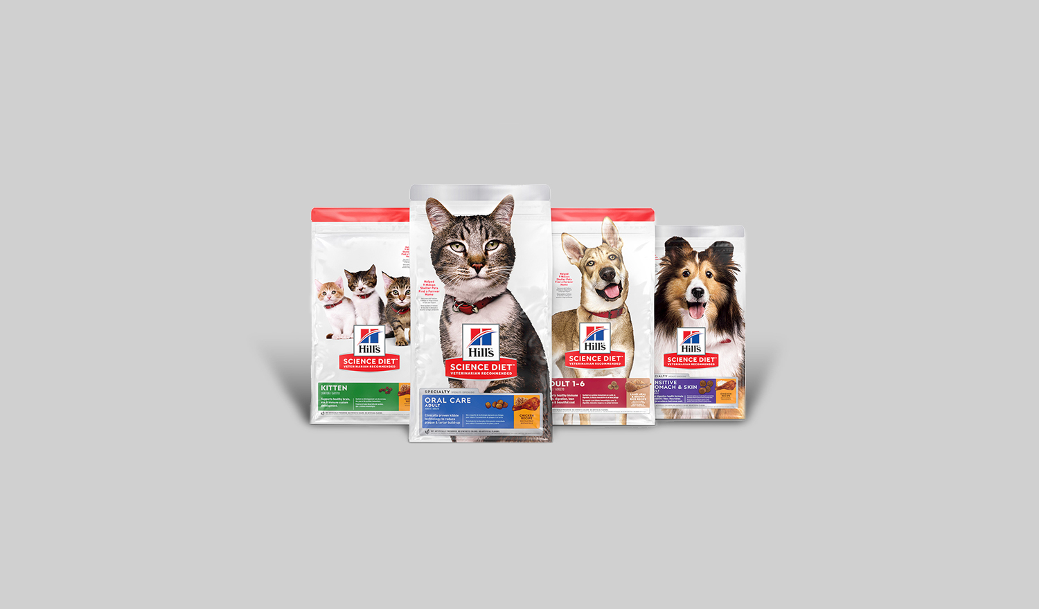
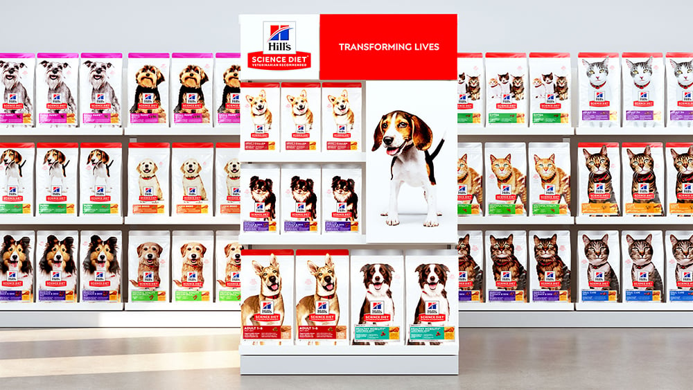
Practically speaking, the distinctive white bag served as the perfect canvas for this outsize cast of characters, transforming the old design’s greatest weakness into its greatest strength; the large photographs spoke to consumers on an emotional level and ensured that the packaging would stand out in both physical and digital retail environments. The addition of a colored bar at the top of the packaging added even more pop, while also making the product line easier for consumers to navigate. “Initially, there were three or four different elements that were colored, and all about equally scaled. We took an edit-and-amplify approach so that consumers could associate specific sub-lines, pet age ranges, and so on, in a more meaningful way,” explained Williams.
The team also simplified the ingredient-driven claims and benefits on the package, and gave priority positioning to its philanthropic claim: “Helped 9 million shelter pets find a forever home.” Previously, this copy had lived a humble existence on the back of the packaging, but the design research that the team conducted suggested that good works make a positive impression on consumers.
“Pet parents are spending hundreds, if not thousands, of dollars on pet food during the course of a year. If they can be giving that money to a company that’s doing good things with it—boy, it really does matter,” said Beardwood.
To boost the brand’s presence on the package, Beardwood&Co. increased the size of the Hill’s parent brand logo on top of the Science Diet logo, and moved it down to the center of the pack. “We placed the Hill’s logo in that central spot, which is kind of unusual. But we found that it helped to make the Hill’s part of the logo bigger to build up a little more master brand recognition. It also really created this connection between the brand and the care that you're giving your pet because they're nested right there together,” said Williams.
In March 2019, Hill’s Science Diet launched its new packaging—and, suddenly, its dog days were over. During the six months following the redesign, the brand grew 17% compared to the six months prior, representing an annualized increase of approximately $100 million.2 Designalytics’ consumer evaluation further affirms the role of design in driving sales; more than two-thirds of consumers indicated that they would prefer the new design for purchase over the old design.3
During the six months following the redesign, the brand grew 17% compared to the six months prior, representing an annualized increase of approximately $100 million.
“I feel like we broke a glass ceiling for our department and the global design team. There’s no denying the successful business outcomes and sales growth that we saw. Design was really driving the bottom line,” said Giannotti-Genes.
The success of Hill’s Science Diet’s redesign is transforming how the larger Colgate-Palmolive organization approaches design, and the value it places on it. For example, while many large manufacturers rely on validation tests as a “final check” before launching a new design, Colgate- Palmolive has begun front-loading its research process on other major initiatives—placing more emphasis on understanding their current brand and design performance to help focus the creative process early in the game.
Colgate-Palmolive has begun front-loading its research process on other major initiatives—placing more emphasis on understanding their current brand and design performance to help focus the creative process early in the game.
“Doing pre-design research was something new, and something that’s now embraced more broadly at Colgate. The stakeholders understand why it's important. We actually just followed the same process for a redesign of a global personal care brand—and, because of the Hill's project, we were able to say, ‘If you want us to do this and move quickly, then here’s how we have to do it from the start,'” said Giannotti-Genes.
Transforming declining sales into double-digit growth is no easy feat for the smallest of brands, much less a multi-billion-dollar category leader in a highly competitive category. Hill’s Science Diet’s story suggests that, by combining masterful creative talent, evidence-based design deci- sions, and senior leadership that recognizes the immense power of design, any dog can have its day.
Download the report with interviews from all the Designalytics Effectiveness Award winners.
1,3 Designalytics Redesign Response Report for Hill's Science Diet, May 2020 (n=400).
2 Retail sales data for the six months preceding and the six months following the launch of the new design: pet specialty stores (via Nielsen Nitro) and eCommerce (via Rakuten); includes all relaunched Hill’s Science Diet products.


