 Can there ever be too many kinds of chocolate? Consumers don’t seem to think so—and, over the past several years, manufacturers have responded with alacrity to their cries for more confections. In particular, sweet-toothed shoppers have gravitated increasingly towards premium chocolate offerings. During 2017, this segment grew 10% compared to the year before—four times more than the total chocolate category—due to increased demand and a deluge of new product launches.1 By 2018, many established brands were struggling to defend their market share. This includes Theo Chocolate, the first organic, fair-trade, bean-to-bar manufacturer in North America. After more than a decade in the marketplace, sales had grown sluggish.
“Our growth had slowed. It’s a cluttered and competitive landscape—there are often 30 or 40 other brands on the shelf. Moreover, chocolate is an impulse-driven item, heavily influenced by price promotions. We make chocolate from scratch with high-quality, fair-trade ingredients, so we don’t compete to have the lowest price,” said Jason Harty, Chief Marketing Officer at Theo Chocolate.
The chocolate category isn’t just a crush of competing brands—it’s crammed with competing narratives, too. In fact, compared to other food categories, chocolate has an incredibly diverse range of messaging points. “There are narratives about saving animals, ethical labor practices, and saving the rainforest. There are narratives about love and about treating yourself. There are a lot of competing messages, and we saw an opportunity to express our brand positioning more clearly through new packaging,” explained Harty.
Theo Chocolate had multiple virtues to communicate, including its ethical sourcing practices, the care with which it crafts its chocolate, and its superior taste. “We really aim to invite people to discover a better world through chocolate—where everyone in the bean-to-bar process can thrive,” said Harty.
Initially, Theo Chocolate had focused on targeting “purists”—consumers who routinely read labels and seek out chocolate in its purest form—but the team recognized that it needed to appeal to a broader range of need states. “Consumers have varying degrees of engagement with the category. Sometimes they choose a brand as a badge for something they believe in. Other times, they just want to satisfy a craving. So we had a lot of issues to iron out at the beginning,” explained Harty.
In late 2018, the Theo Chocolate team engaged clarkmcdowall, a progressive branding agency based in New York City, to lead its rebranding initiative. Before creating a new visual identity and packaging design for the brand, the team needed to understand how the category had evolved over time. Starting with the consumer, they conducted a segmentation study paired with qualitative research to understand the target buyer, the role that chocolate played in their lives, and the existing equities Theo had to leverage. “We’re still a young, scrappy brand. We’re not a startup, but we don't have the resources of a large CPG company. Investing in the right places—including doing the research upfront and having strong creative talent—ultimately made a big difference for us,” reflected Harty, who has worked on several redesigns in his career.
"We’re not a startup, but we don't have the resources of a large CPG company. Investing in the right places—including doing the research upfront and having strong creative talent—ultimately made a big difference for us."
The foundational brand strategy work also included category mapping, an audit of codes and cues in the competitive landscape, as well as identifying Theo Chocolate’s core equities—or “precious elements,” as clarkmcdowall refers to them.
“Which were the elements that we could leave behind? Which did we want to evolve and double-down on? In particular, we learned a lot about how much the brand mark helped to tell Theo’s story; the natural irregularities in the letterforms communicated a sense of whimsy and joy that we wanted to retain,” said Adrienne Muken, Creative Director at clarkmcdowall.
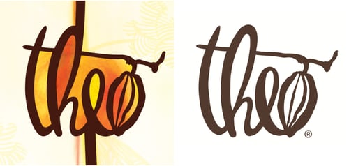
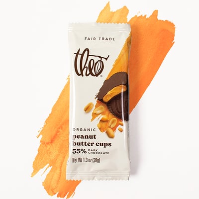
The agency left the brand mark unchanged, with the exception of removing the coloring within and around the letters. This made the mark more flexible—not competing or clashing with other colors that serve a purpose on packaging, such as differentiating flavor varieties.
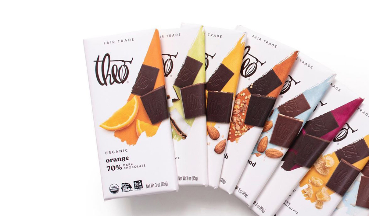
The brand’s predominantly white packaging also proved to be a distinctive asset that helped it to stand out on shelf—a beacon in a sea of little brown bars. “That off-white brand block is unique in the category. It’s a really great device by which we can draw consumers’ eyes and get them to step a little closer to what we have to offer,” explained Harty.
In considering what should evolve about the packaging design, the Theo Chocolate team and clarkmcdowall prioritized taste appeal. “It’s got to look delicious; that’s job one. We needed clear and apparent flavor indications and immediate taste appeal, and we needed to do that in a really thoughtful and deliberate way,” said Harty.
“With these types of projects, there’s sometimes a danger of wanting to change too much—of removing or evolving elements too far that consumers find ‘precious.’ Working closely with the Theo team gave us a deep appreciation for their existing visual equities. There really were no egos in the process—just pure collaboration—and I think that was key for success," said Catherine Clark, Founding Partner at clarkmcdowall.
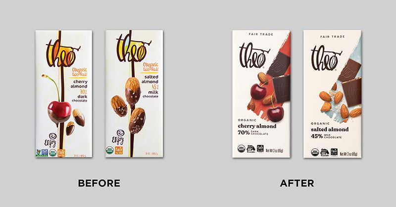
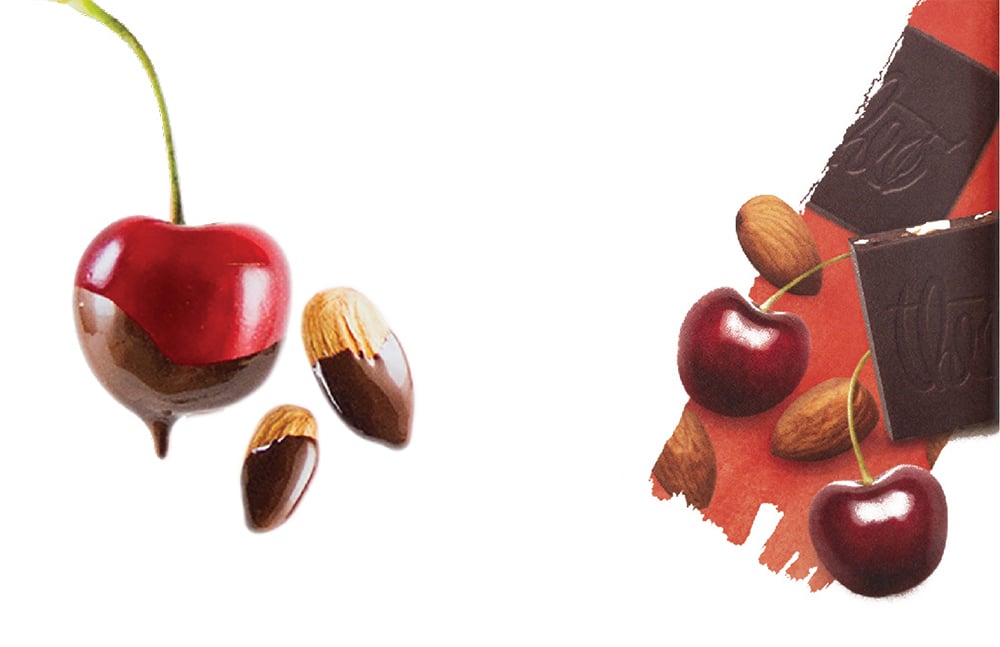
The food photography on the original packaging indicated the flavor—such as a chocolate-dipped cherry—but sometimes shied away from showing the actual product. The new photography incorporated chocolate squares, showcasing the texture and giving consumers a preview of what they could expect upon unwrapping the bar.
The revised photography also toned down the picture-perfect quality of the food. “The original photos were almost so perfect that they lost some of their realness. We wanted the new imagery to be a real representation of good ingredients, not just a stereotypical candy version where the ingredients only represent flavors,” said Muken.
Over the past six months, Theo Chocolate’s sales have increased by 11% in the grocery channel compared to the same period during the prior year.
Based on Designalytics’ consumer evaluation and the brand’s sales performance, it’s clear that shoppers are sweet on the new design. Over the past six months, Theo Chocolate’s sales have increased by 11% in the grocery channel compared to the same period during the prior year. The brand has outpaced and contributed to category growth during the COVID-19 crisis. Moreover, base velocities over the past six months have increased by more than 20% in both grocery and natural channels compared to the same period in 2019.3 It’s hard to imagine anything more satisfying than those results—well, except maybe one of Theo Chocolate’s new peanut butter and jelly cups.Download the report with interviews from all the Designalytics Effectiveness Award winners.
1 New Hope Network, “Premium chocolate is growing 4x more than total chocolate,” February 2018.
2 Designalytics Redesign Response Report for Theo Chocolate, May 2020 (n=400).
3 IRI and Nielsen, SPINS data, latest 26 weeks ending 7/12/2020.


