Brands are everywhere—and some are more recognizable than others. Why? One reason lies in the number and strength of their distinctive visual assets. These assets, such as a logo, color, or brand character, are unique design elements that link consumer memory to a specific brand. As building blocks of mental availability—the propensity for a brand to be thought of or noticed in buying situations—distinctive assets are most effective when they're well-liked and leveraged consistently across a brand’s various communications.
Developing a distinctive logo is no easy feat—but creating additional visual elements that are recognizable and truly unique to a particular brand is a momentous accomplishment. At Designalytics, we measure the strength of a brand’s distinctive assets in the most direct method possible—we question hundreds to thousands of brand-familiar consumers. We ask them which visual elements they consider genuinely unique to the brand in question, and how positively or negatively they regard those elements.
We’ve collected the top-ranked designs for distinctive assets from our cross-category database. Brands are ranked by the number of distinctive assets they possess in consumers’ eyes, with additional context related to consumer sentiment (1 = extremely negative, 5 = extremely positive).
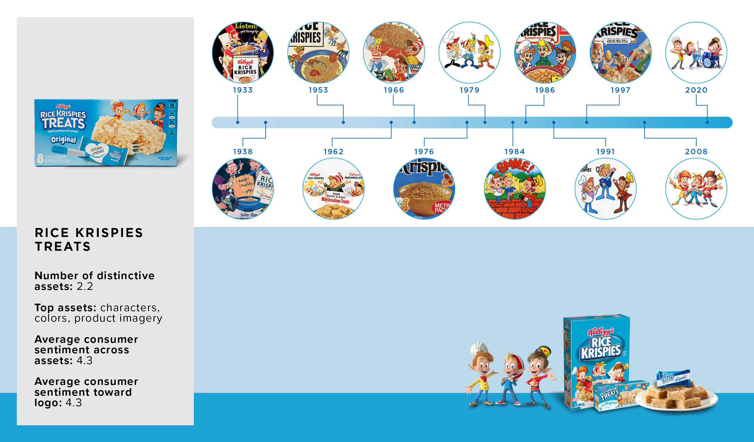
1. Rice Krispies Treats
Category: snack bars (breakfast + treats)
Well, snap–or, rather, Snap, Crackle, and Pop. The iconic elves of the Rice Krispies brand first appeared in the 1930s, and their staying power is clear. Although the elves’ appearance has evolved over the last 90 years, Kellogg’s has continued to display its brand mascots prominently—a wise choice, according to consumers. A whopping 95% of consumers gravitate toward the friendly fellas, with many fondly taking a trip down Memory Lane to their early years. To these consumers, the characters are synonymous with the brand, sparking one resounding declaration: “You can’t have a Kellogg’s snack without Snap, Crackle, and Pop.”
Its affable mascots aren’t the only distinctive asset inducing nostalgia; the “gooey and sweet” product imagery and highly recognizable blue of the package appeal to consumers’ sense of sweet-toothed sentimentality. Additionally, the Rice Krispies Treats logo falls within the top 8% of our cross-category database for positive sentiment among consumers.
![]()
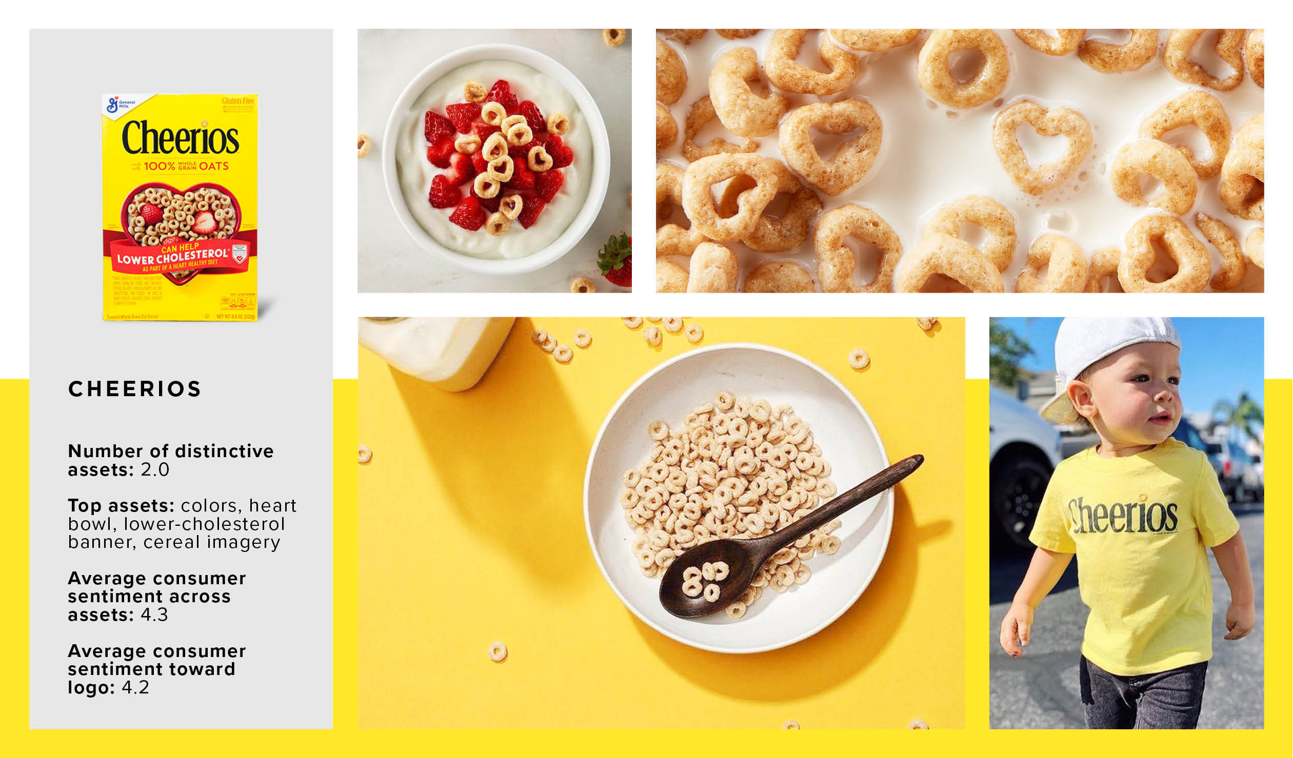
2. Cheerios
Category: cereal (everyday)
The epitome of “classic,” Cheerio’s school-bus yellow box has brandished pantries for over eight decades. Strengthened by years of exposing consumers to the same design elements, Cheerios possesses multiple distinctive assets.
The memorable trio of Cheerio’s heart-shaped bowl, product imagery, and red “low-cholesterol” banner perform double-duty, acting as focal points while reinforcing the heart-healthy brand message. Furthermore, these informative assets bolster consumer sentiment and brand credibility; as one consumer reports, “I’m trying to feed my family the healthiest foods I can find. This makes me feel good about my purchase.”
Impressively, Cheerio’s logo ranks in the top 5% of our database for consumer resonance.
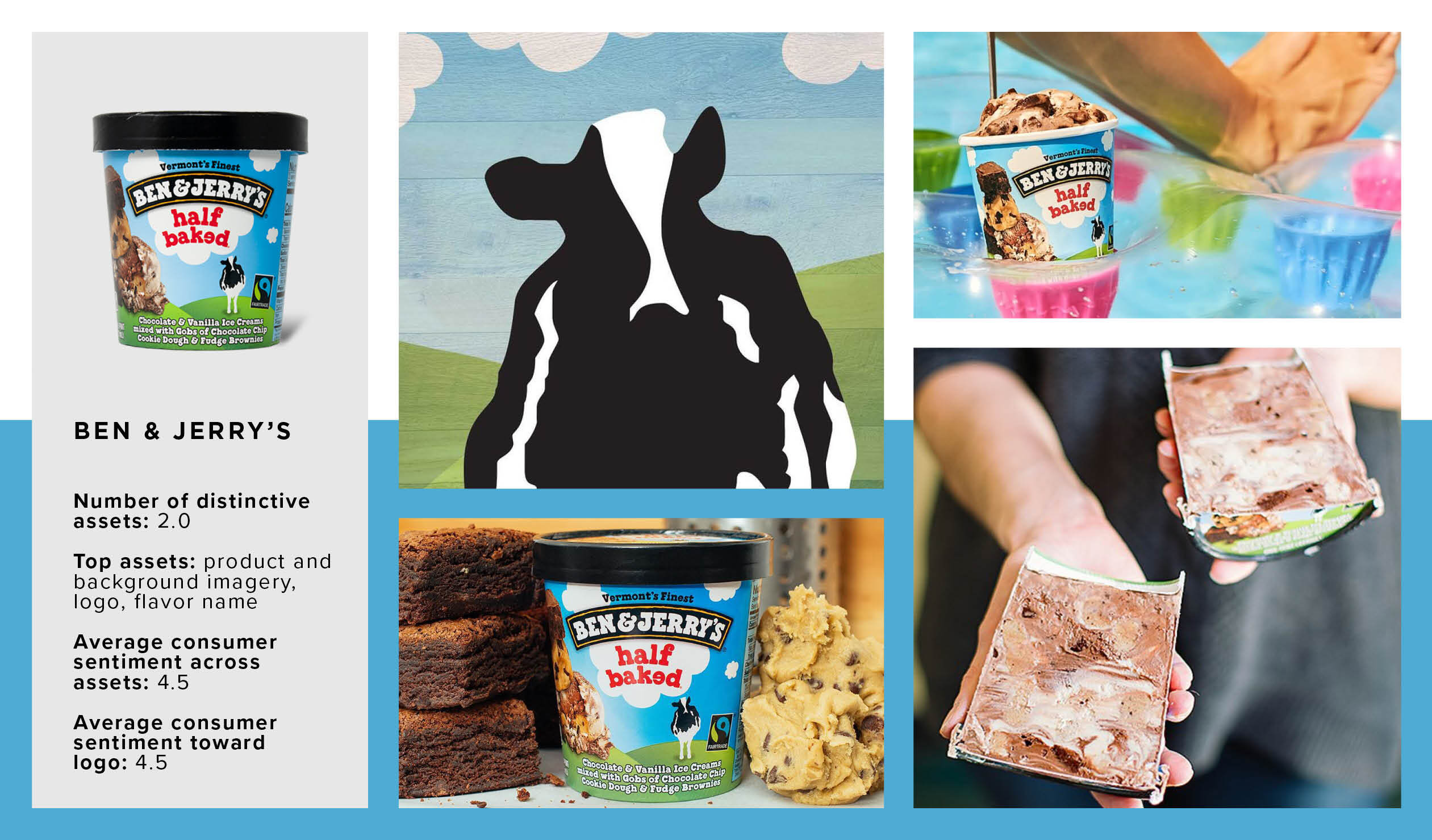
3. Ben & Jerry's
Category: ice cream (pints)
There’s nothing half-baked about Ben & Jerry’s packaging design. The mouth-watering product imagery combined with a whimsical pastoral scene lead the ice cream category for distinctive assets. The majority of consumers positively respond to the product visual, pleased to know what to expect from their pint-sized package. Additionally, the brand’s recognizable grazing cow evokes a sense of creamy quality.
The ice cream category is packed with brands possessing powerful distinctive assets, setting a high bar. Notwithstanding, Ben & Jerry’s licks the competition in both quality and quantity of distinctive assets—sitting within the top 5% of our database for number of distinctive assets, as well as for logo sentiment. According to consumers, the friendly logo of the brand’s namesakes is beyond recognizable—it’s a “legend in the ice cream game.” The sprinkles on top of this highly distinctive design? The flavor names. Quirky, clever, and full of quips, the brand’s wordplay keeps consumers smiling.
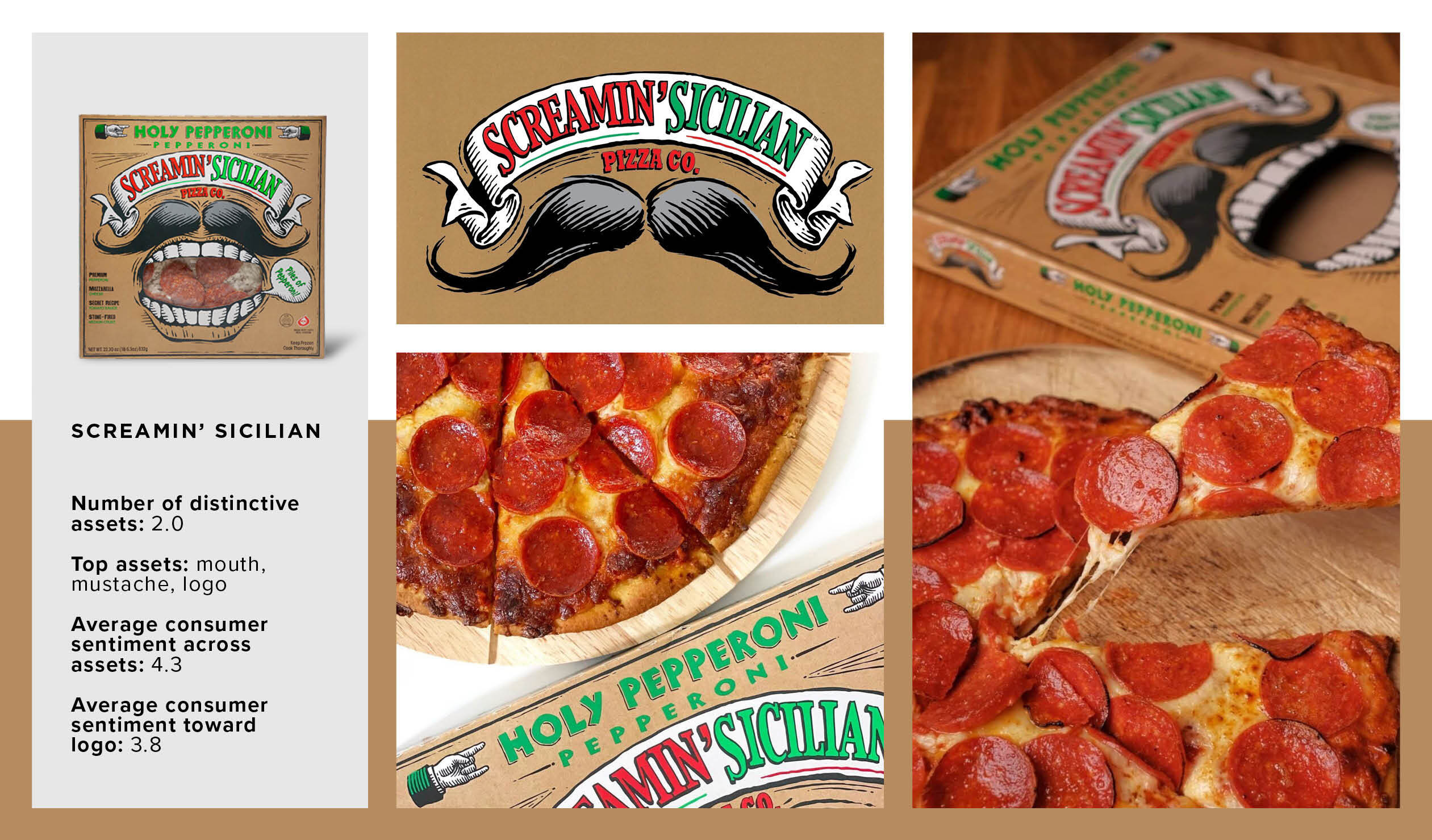
4. Screamin' Sicilian
Category: pizza (frozen, multi-serve)
Screamin Sicilian sets the bar for number of distinctive assets in the frozen pizza category (63% higher than category norms). When this family-owned Wisconsin pizza company entered the scene, it ignored the standard, fresh-out-of-the-oven imagery. Instead, it leveraged its founder’s heritage—and likeness—with a mustache-clad, gaping mouth smack in the middle of the box. Nearly 70% of consumers find amusement, and even hilarity, in the massive open mouth. However, this sneakily clever asset provides more than eye-catching hilarity—it creates a window to view the product, a point of distinction for the brand, as most competitors opt for product photography instead.
Another nod to the brand’s heritage, the brand's name and logo evoke credibility. Leveraging the red, green, and white of the Italian flag, the logo provides an air of authenticity. One consumer said it best: “It screams Italian.” Now I mustache you, are you hungry?
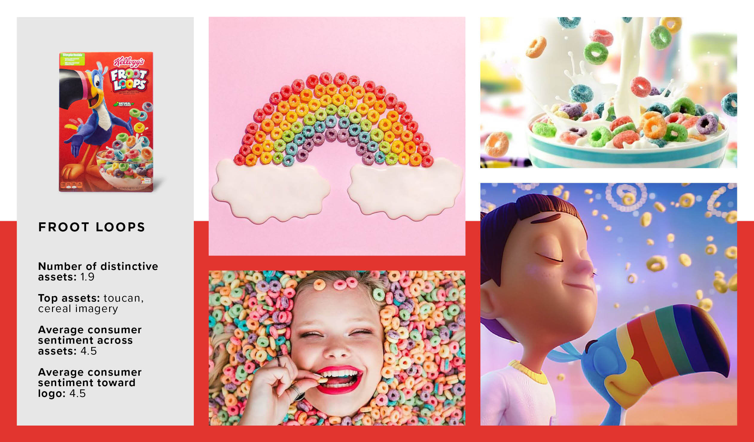
5. Froot Loops
Category: cereal (kids)
Few brand mascots can lay claim to the notoriety of Froot Loops’ Toucan Sam. The gregarious bird has been following his nose to fruity flavor since 1963, creating a wave of nostalgia in his wake. According to 85% of consumers, the iconic toucan is symbolic of their childhood breakfast memories.
In conjunction with Toucan Sam’s popularity, Froot Loops’ cereal-laced logo and vibrant product imagery rank in the top 5% of our cross-category database for consumer sentiment.
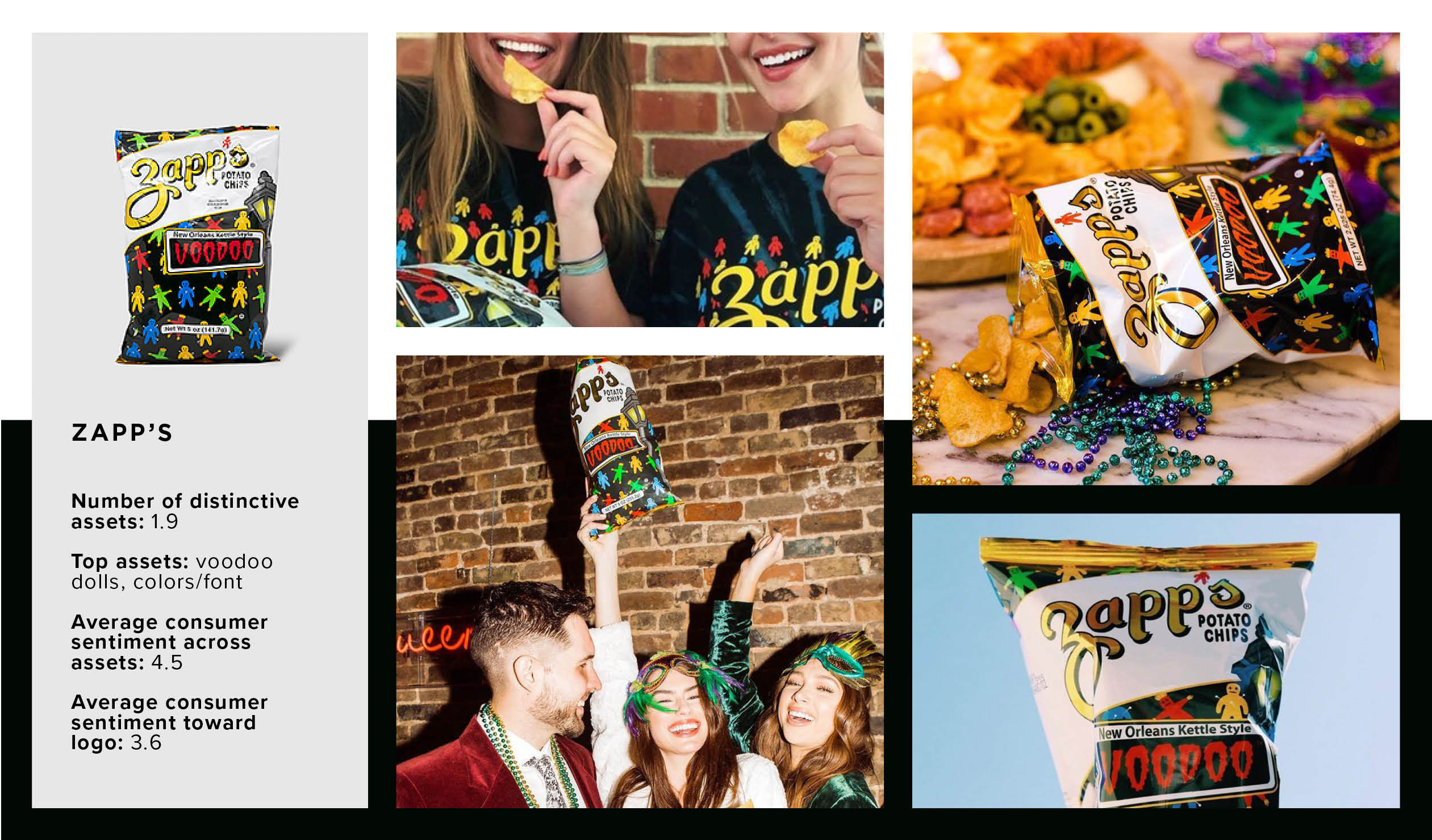
6. Zapp's
Category: chips (kettle)
Zapp’s provides a perfect example of distinctive assets that are both polarizing and powerful. More than half of brand-familiar consumers cite the multi-colored dolls wrapping the package as distinctive, yet the likability of the artwork is variable.
One thing consumers can agree on is the brand’s authentic dedication to its cajun heritage. The bold and slightly sinister typography used to indicate flavor (e.g., “Voodoo”) match with the macabre doll illustrations and transport consumers to the streets of New Orleans.
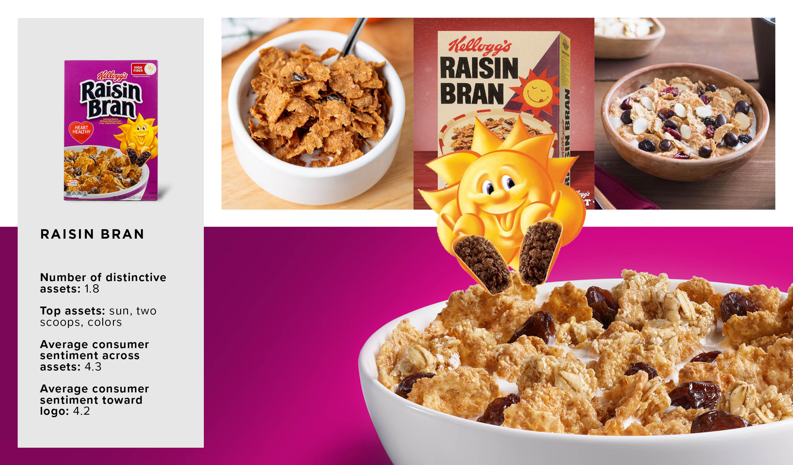
7. Raisin Bran
Category: cereal (everyday)
Unlike other Kellogg’s brands, Raisin Bran’s assets evoke more welcoming vibes than nostalgic ones. The brand’s beaming sun invites consumers to the breakfast table with two iconic heaping scoops of raisins—both of which add to the likability of the sun character. Consumers may not recall his name (it’s Sunny), but 58% recognize his appearance and associate it positively with the brand. In fact, multiple Raisin Bran lovers express gratitude for the shining character: “He makes me want to wake up and enjoy the day.”
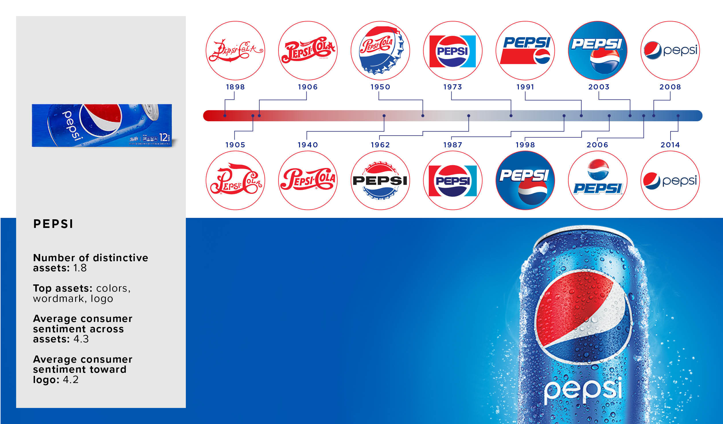
8. Pepsi
Category: carbonated soft drinks (dark, regular)
The carbonated soft drinks category is packed with legacy brands that enjoy near-universal brand familiarity and strong mental availability. That said, distinctive assets for this category are surprisingly low; Pepsi breaks the mold with its signature blue, vintage logo, and unique, clean font.
Pepsi’s globe logo, first introduced in late World War II, is a fantastic example of modernizing a classic asset without taking things too far. Although the style of the Pepsi globe has evolved through the years, Pepsi wisely threaded the well-known shape and colors of the logo into each update. The red, white, and blue of the Pepsi globe conjured U.S. pride in the 1940s and still rings true, evoking patriotism with today’s American consumers.
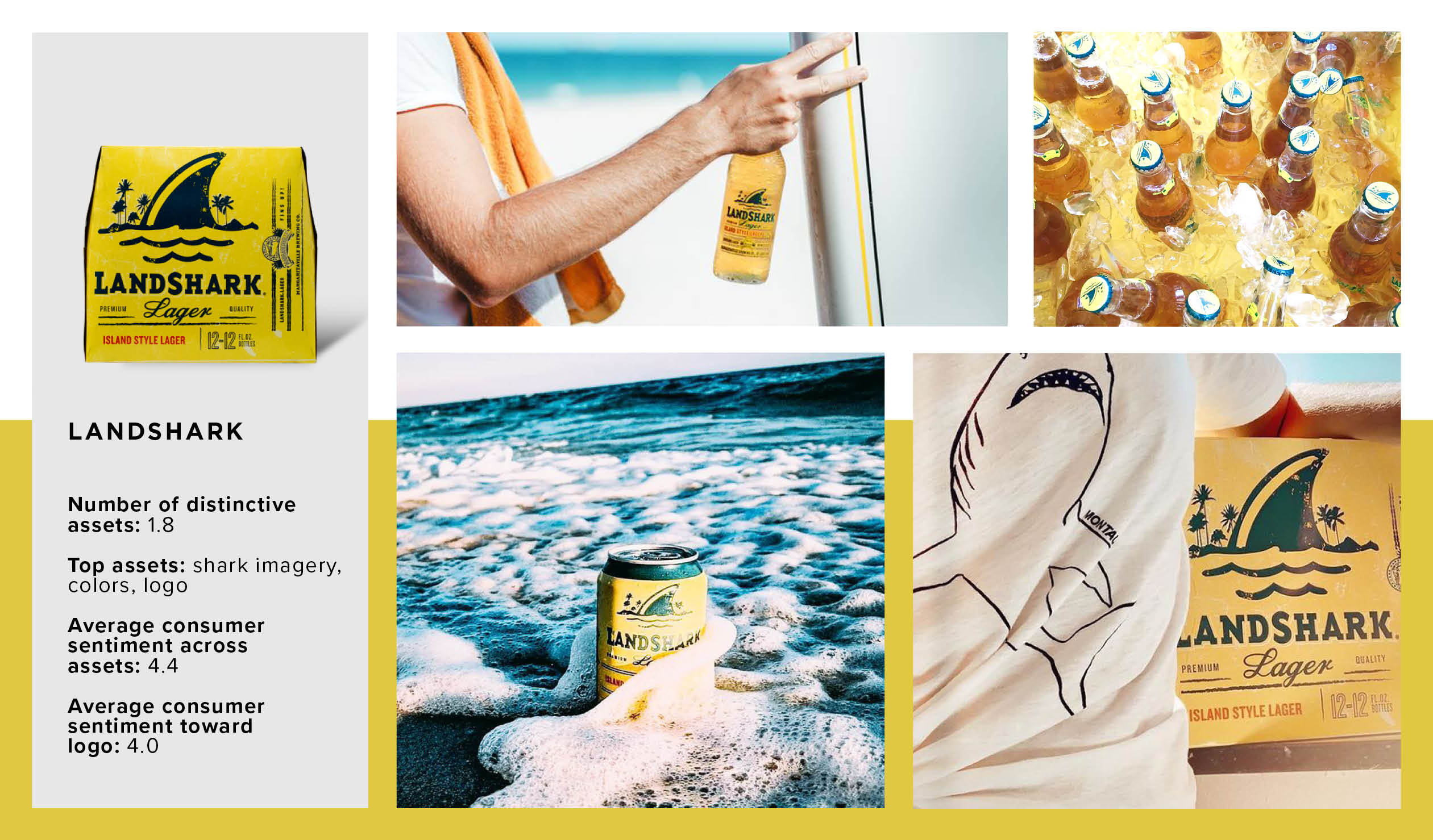
9. Landshark
Category: beer (domestic lager)
Fins up! Landshark makes waves in the domestic lager category for its luminous color choice and prominent shark fin. Nearly 100% of consumers react positively to the beachy depiction, which mentally transports consumers from the store aisle to the tropics. The distinctive fin amidst palm trees instills a sense of relaxation and “playful summer days.”
In addition to its artwork, consumers appreciate the brand’s color selection, as it diverges from category norms and aids them in locating the brand within a competitive set. Furthermore, consumers approve of Landshark’s bold logo mixed with its contemporary imagery: ”You immediately know what the brand associated with the logo is… it perfectly describes the brand.”
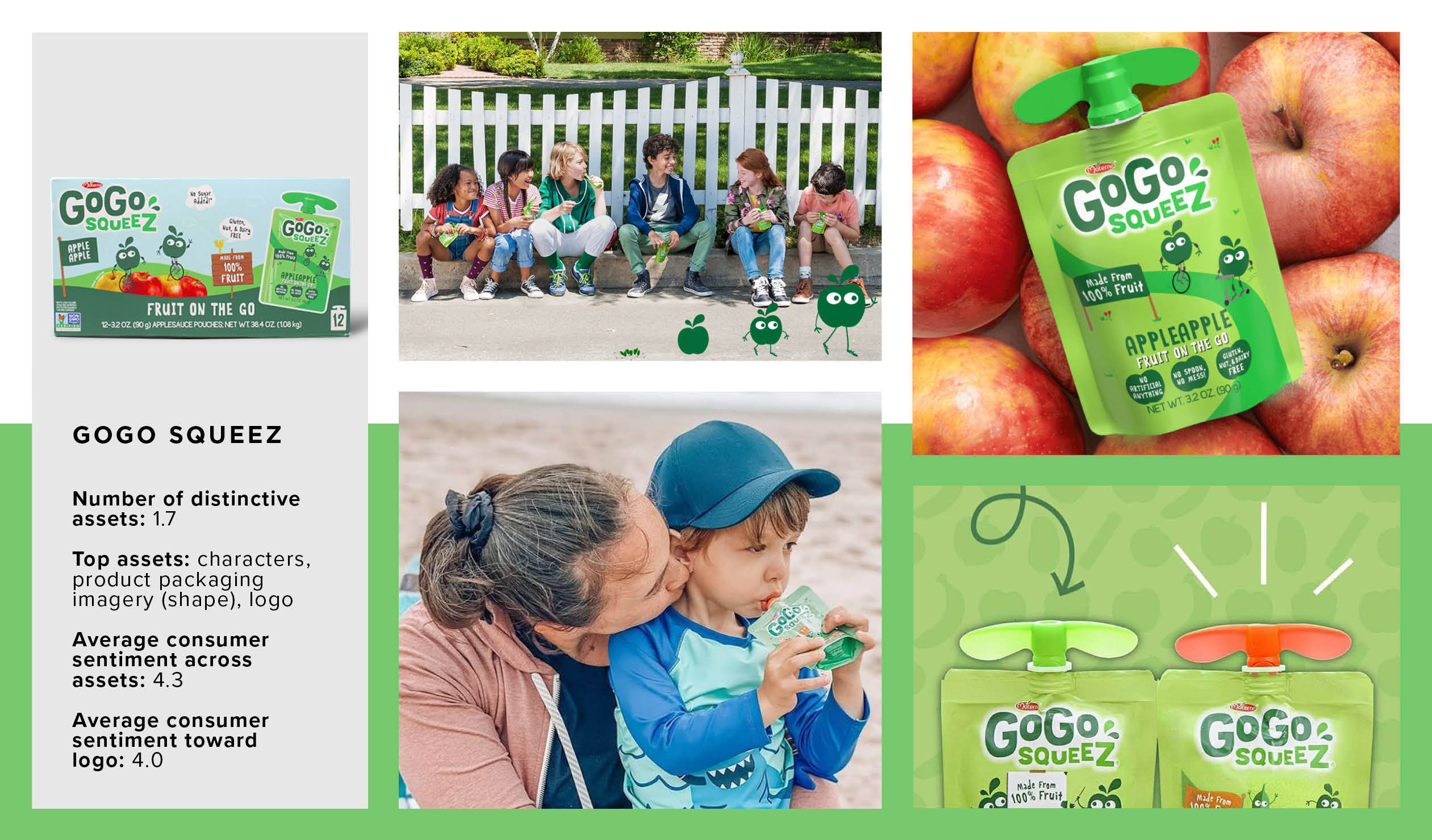
10. GoGo SqueeZ
Category: applesauce
GoGo SqueeZ’s applesauce launch revolutionized the to-go snack industry to the sound of rejoicing parents everywhere. With a focus on shepherding applesauce to a child’s stomach instead of the floor (or overalls), the pouch design is praised by consumers for its convenience and kid-friendly user experience. When GoGo SqueeZ redesigned the outer carton of its 12-pack, leveraging the famed pouch as a distinctive asset was a no-brainer.
In addition to the unique package format, consumers respond positively to two other design elements: the brand logo and apple mascots. With a straightforward name like “GoGo,” it’s no wonder consumers positively associate the logo with convenience. The spritely mascots take a slightly more subtle approach to movement, cruising over real apples on illustrated unicycles. Evoking positive sentiments from consumers of all ages, each asset achieves favor for echoing the brand’s on-the-go potential.
As a provider of syndicated design data, we proactively measure the top-selling designs across hundreds of CPG categories. If you’re interested to see how your brand (or a competitor) performs on mental availability measures—or other key metrics—contact a member of our team.


