Every year, as consumers are digging their ugly Christmas sweaters out of storage, brands are busy dressing up the same old products with new and dazzling package designs. A few brands have generated considerable buzz with their holiday packaging—Newsweek recently published a comprehensive Starbucks retrospective chronicling every cup design since 1997, for example—but most brands don't receive nearly so much fanfare. Designing and distributing limited-edition packaging isn't a simple task. So why bother?
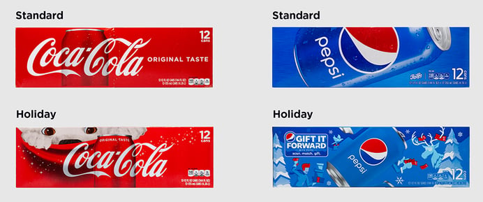
To understand the impact of holiday designs on consumer perceptions and purchasing decisions, Designalytics evaluated the current speciality packaging for two well-known brands—Coke and Pepsi—by conducting in-depth studies with several hundred consumers.
Here's what we learned:
- Holiday packaging has a powerful impact on purchase preference. When asked which design—the standard or holiday version—they'd be most likely to purchase, consumers prefer the holiday packaging by a ratio of approximately two-to-one. This result was consistent for both Coke and Pepsi.
- Messaging related to the occasion, even indirectly, is amplified. For both brands, the holiday packaging better communicates certain key decision drivers for the soft drinks category, such as "treat myself" and "good for the whole family." For most consumers, the winter holidays are a festive, family-centric affair rife with cookies, elaborate home-cooked meals, and other indulgent foods and drinks—and holiday packaging speaks to these traditions.
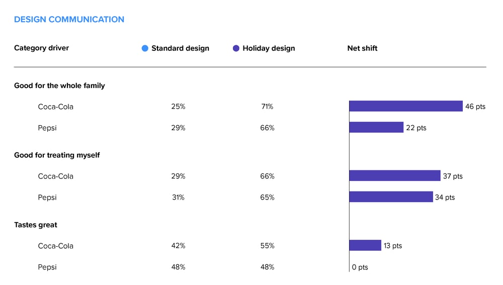
Coca-Cola's holiday packaging also conveys "tastes great," the top-ranked category decision driver, more effectively than its standard design—possibly driven by "cold" cues such as the drifting snow and polar bear. Additionally, throughout Coca-Cola's long history of featuring polar bears in its advertisements, the characters have often cracked open Cokes and guzzled them with relish. This additional association with enjoying the product may also be contributing to a lift in taste perceptions.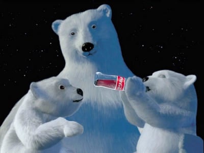
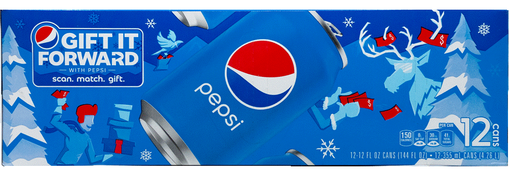
- Novel design elements generate the most engagement. Not surprisingly, logos on standard soft-drink packages are the elements that tend to garner the most engagement from consumers, as they take up considerable real estate and exist at the top of the communication hierarchy in this category. For holiday packaging, novel graphical elements—such as Coca-Cola's polar bear and Pepsi's reindeer—generate the most consumer reactions. For this reason, the content and design execution of new elements should be carefully considered. Anything new to consumers is particularly noteworthy, especially for packaging that's widely recognized.
- Some consumers are sensitive to over-commercialization in seasonal packaging. Pepsi's design resonance scores—based on consumers' "likes" and "dislikes" of individual design elements—is considerably lower for its holiday packaging than Coca-Cola's. (Pepsi received 2.6 likes for every dislike, while Coca-Cola received 3.3 likes for every dislike.) This score is largely driven by the paper money scattered throughout Pepsi's wintry scene, which includes a man carrying a pile of gifts and a fistful of cash. Presumably, Pepsi intended for the money to tie into the notion of giving expressed in its "Gift It Forward" on-pack promotion, but it receives mixed reactions from consumers:
 "I understand the money has to do with 'gift it forward' but, without paying too much attention to the box, my first thought was a 'make it rain' scenario, which communicates excess and showing off."
"The dollar signs make the company look greedy, or reminds me that I'm spending money on unneeded junk food."
"Represents the commercialization of Christmas."
"Reminds me of spending money."

