As the only provider of syndicated package design data, Designalytics evaluates the top-selling and fastest-growing designs across hundreds of consumer-packaged-goods categories. We measure and analyze a wide range of design performance areas, including visibility, communication, mental availability, element-level diagnostics, and more.
In personal care categories, winning on the shelf requires a strategic approach. We’ve spotted several brands that recently freshened up their designs—decluttering labels, clarifying claims, and modernizing aesthetics—and improved consumer preference in the process.
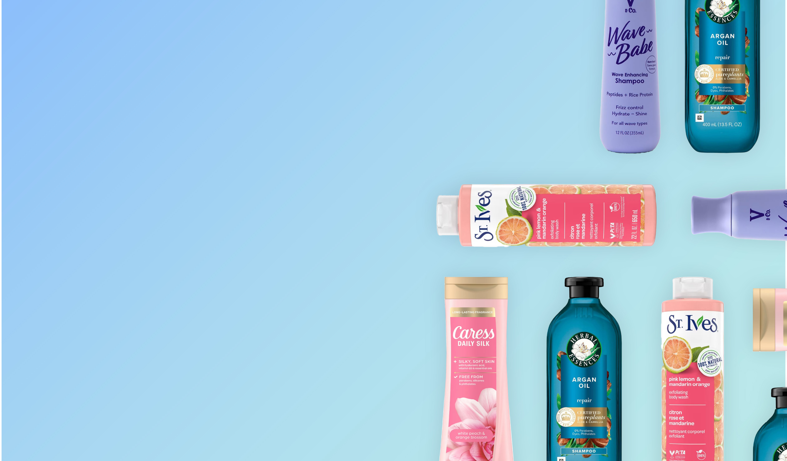
V & Co.
Category: Shampoo
The updated look for this shampoo swaps repetition for clarity. In addition to highlighting the product name with larger typography, the brand created a clearer hierarchy of communication that allowed consumers to glean important information—like key ingredients and benefits—quickly and easily. Consumers responded well to the fresh new look, which prioritized readability without losing character. One consumer noted, “This product seems friendly for people with wavy hair and says what's in the product as well.” Overall, 82% of consumers favored the new look.

Caress
Category: Body Wash
With this redesign, Caress seemed to know what was working…and what to change. The darker, vibrant pink label allows the white text to pop, making "free from" claims and fragrance details immediately legible. Focusing on the benefit (“silky soft skin”) versus the attribute (“moisturizing”) seems to have helped as well. In the end, 65% of consumers preferred the new version over the old. One consumer of the new design: “It was more elegant, bold, and sharper than the other one, making it more appealing to me.”

Herbal Essences
Category: Shampoo
A sleek, monochromatic approach proved effective for Herbal Essences, with 61% of consumers gravitating toward their new design over the prior one. The all-blue bottle conveys a sense of luxury while reducing visual clutter, allowing the brand's logo and essential information to shine. Consumers appreciated the streamlined aesthetic and functional shape, with one observing, “The label looks higher-end because it is less cluttered but still has all the important information.”

St. Ives
Category: Body Wash
With its latest redesign—which was preferred by 63% of category consumers—St. Ives opted for more saturated colors and a structured layout that highlights its ingredients and benefits. The brand created a "holistic vibe" that resonated with consumers looking for natural ingredients. "The label design highlights the ingredients and natural formula," noted a consumer, adding that the new look felt "more informative."


