As the only provider of syndicated package design data, Designalytics evaluates the top-selling and fastest-growing designs across hundreds of consumer-packaged-goods categories. We measure and analyze a wide range of design performance areas, including visibility, communication, mental availability, element-level diagnostics, and more.
We’re highlighting five beverage brands that recently strengthened their design performance with fresh new looks. Each shows how thoughtful updates to packaging can modernize brands, clarify messaging, and boost consumer preference.
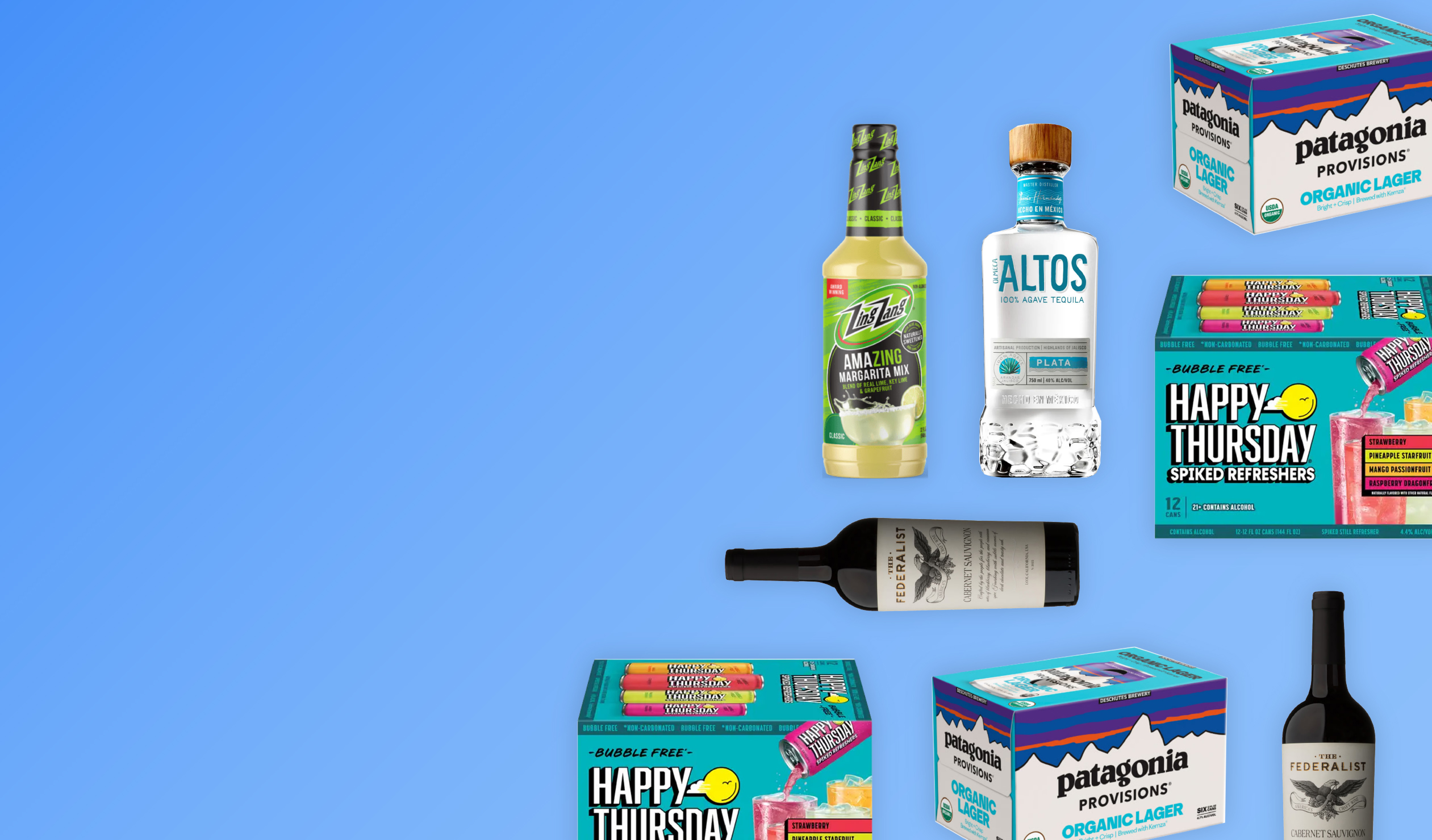
Olmeca Altos
Category: Tequila
Olmeca Altos updated the form and design of their bottle, creating a look that felt elegant and modern and improved legibility. The changes were effective—63% of consumers chose the top-shelf upgrade. In their own words, it “feels more modern, professional, and easy to read.”

The Federalist
Category: Wine (Cabernet Sauvignon)
The bold Federalist redesign earned approval from 61% of consumers. On the new label, an eagle now replaces Ben Franklin, while clear visual hierarchy gives the bottle a polished look. As one consumer put it, “The label is classy and makes the wine look more premium and expensive.”

Zing Zang
Category: Margarita Mix
Consumers praised the new Zing Zang classic margarita packaging, saying, “The picture makes me interested” and “The label looks more premium and the information is easier to read.” With higher contrast to improve legibility and imagery to showcase use and flavor, the brand really shook things up—and won over a whopping 79% of category buyers.

Happy Thursday
Category: Ready-to-Drink Cocktails
Happy Thursday served up sensory imagery on its new packaging, which helped consumers immediately imagine themselves drinking it. As one put it: “I like that you can see the drink in a glass. It looks refreshing.” Overall, 68% of consumers favored the redesign.

Patagonia
Category: Beer (Craft)
Patagonia’s latest beer redesign taps into its storied heritage as an outdoor apparel brand. By pairing its classic colors with a larger logo and organic callout, the package clearly communicates brand identity and product benefits. The effort resonated with 77% of consumers, with one noting that, “The colors fit more with what I expect from the brand…and it’s easier to read.”


