As the only provider of syndicated package design data, Designalytics evaluates the top-selling and fastest-growing designs across hundreds of consumer-packaged-goods categories. We measure and analyze a wide range of design performance areas, including visibility, communication, mental availability, element-level diagnostics, and more.
Cleaning product packaging has to do more than look tidy; it needs to communicate effectiveness, reliability, and clarity in a crowded aisle. These six redesigns—from detergents to sprays—showcase bolder visuals, eye-catching claims, and improved layouts.
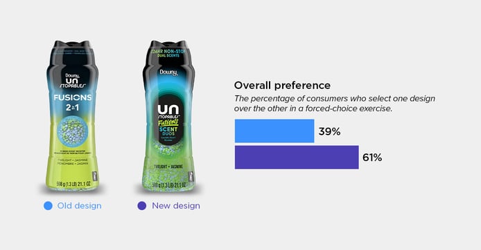
Downy Unstoppables Fusion Laundry Booster
Category: Laundry scent boosters
Downy Unstoppables refreshed packaging caught consumers’ attention, with 61% preferring the new look. The redesign leans into ombre colors and a modern layout, making the “24-hour non-stop scent” claim easy to spot. Consumers said the bolder colors and black center felt more premium. One noted that the packaging looked “softer…like I would expect the product to make my clothes feel and smell,” showing how visual cues can influence expectations.
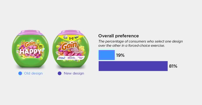
Gain Super Flings Laundry Detergent
Category: Laundry detergent
The updated Gain Super Flings packaging immediately draws attention with its larger logo and more detailed callouts. As a result, 81% of consumers preferred the new design, citing its improved clarity and informative front-of-pack elements. One consumer summed it up by saying, “The information that is important to me is presented in a fun, colorful way that would catch my eye while shopping the shelves.”
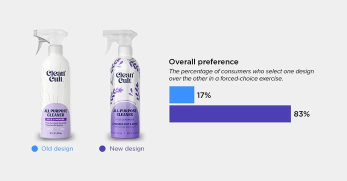
CleanCult All-Purpose Cleaner
Category: Cleaner (all purpose)
This spray packaging pops with saturated colors and floral graphics that clearly convey its scent. Claims like “refillable aluminum bottle” and “conquers dirt and grime” are easy to spot, giving consumers confidence in the product’s effectiveness. One stated that the imagery and more prominent claims gave the spray a “cleaner, eco-friendly feel” and made it “stand out more visually and seem more appealing and trustworthy.” Ultimately, 83% of consumers preferred the new design, showing the update made a significant impact.
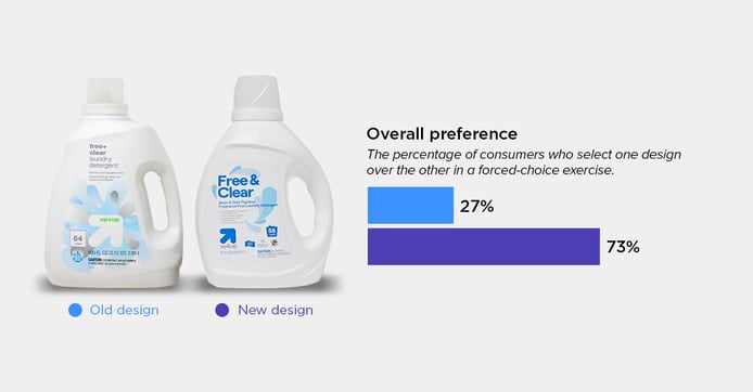
Up&Up Laundry Detergent
Category: Laundry detergent
73% of consumers preferred Up & Up’s new laundry detergent design for its clean, modern look and enhanced readability. Consumers also called out how the design better communicates benefits like stain and odor fighting, while the simplified layout gives the pack a fresher, more premium feel. As one consumer put it, “The font size is much larger and bolder, so you can see it much more visibly—it looks like it would perform much better.”
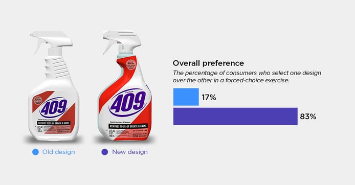
Formula 409 Spray
Category: Cleaner (all purpose)
Formula 409’s new design grabs attention with its modern, vibrant look. Key claims like “kills 99.9% of germs” are prominently displayed, making it easy to see the product’s benefits at a glance. 83% of consumers preferred this new design, highlighting the brighter colors and layout. One consumer shared, “I picked this one because it immediately caught my eye…I liked the placement of the information and the easier-to-read labeling.”
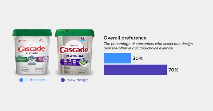
Cascade Platinum Dishwasher Detergent
Category: Dishwasher detergent
Cascade Platinum’s new packaging uses vivid colors and a clearer layout to make key details easier to read, while the bold text and graphics draw the eye. Consumers responded positively, noting that the design communicates a more upscale, contemporary product. One said, “The package looks like platinum, and I would translate that into how my dishes will look if I use this product.” 70% of consumers preferred this new design, citing its color, clarity, and legibility as major factors.