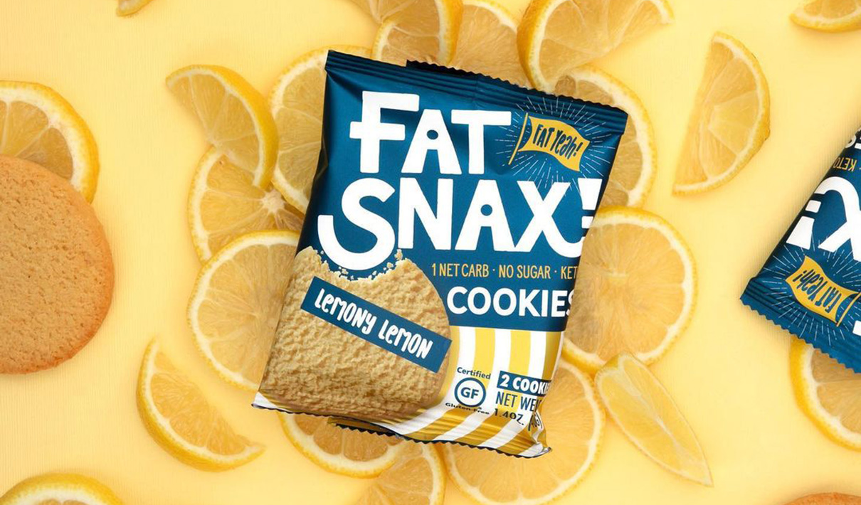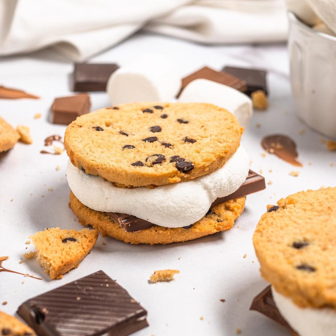
By the early 2000s, the health industry’s long-standing war on fat had begun to wane, replaced by a growing scrutiny of sugar and other refined carbohydrates. More than a decade later, fat is enjoying a veritable heyday, with more consumers than ever chanting, “bring on the butter!” Impressively, the number of U.S. Internet users googling “keto” increased by a factor of 25 times between November 2017 and January 2019.1
One might imagine that traditionally sweet, grain-based snacks present limited opportunities for low-carb product innovation—but, as it happens, bakery sales are booming. The number of new product launches in the bakery category with a keto claim increased 212% globally from 2019 to 2020, according to Mintel’s Global New Products Database. Sweet-toothed shoppers can now purchase a plethora of low-carb confections—from energy bars to peanut brittle to collagen-infused blondies.
Fat Snax, a keto-friendly cookie, launched in 2017—just as the low-carb revolution was reaching new heights. The brand started small, but quickly gained a following through e-commerce retailers. Like many fast-moving challenger brands, Fat Snax adopted a product-first approach, intending to revisit its branding at a later date. “We knew it was a question of when—not if—we would update our branding. We launched at a time when there was a tremendous groundswell of demand for low-carb products, and we wanted to take advantage of that, so we started with a ’minimum viable product’ orientation, which meant less-than-stellar packaging,” explained Brian Hemmert, chief marketing officer at Fat Snax.
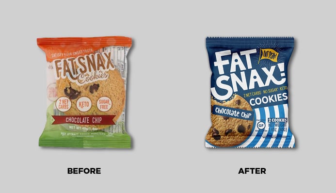
The reckoningcame when Fat Snax began trying to engage brick-and-mortar retail partners, where competition for shelf-space is fierce and the branding benchmarks are higher. “You can sell a lot of things on Amazon but, if you look at grocery shelves now, there aren’t many winners with poor packaging. When we began talking to large retailers like Whole Foods and Sprouts, we thought: ‘Okay, now we need to start thinking seriously about a complete visual overhaul.’ We knew that if we wanted to create a long-term brand, our packaging would need to resonate with consumers immediately from both a taste and a nutrient perspective,” said Hemmert.
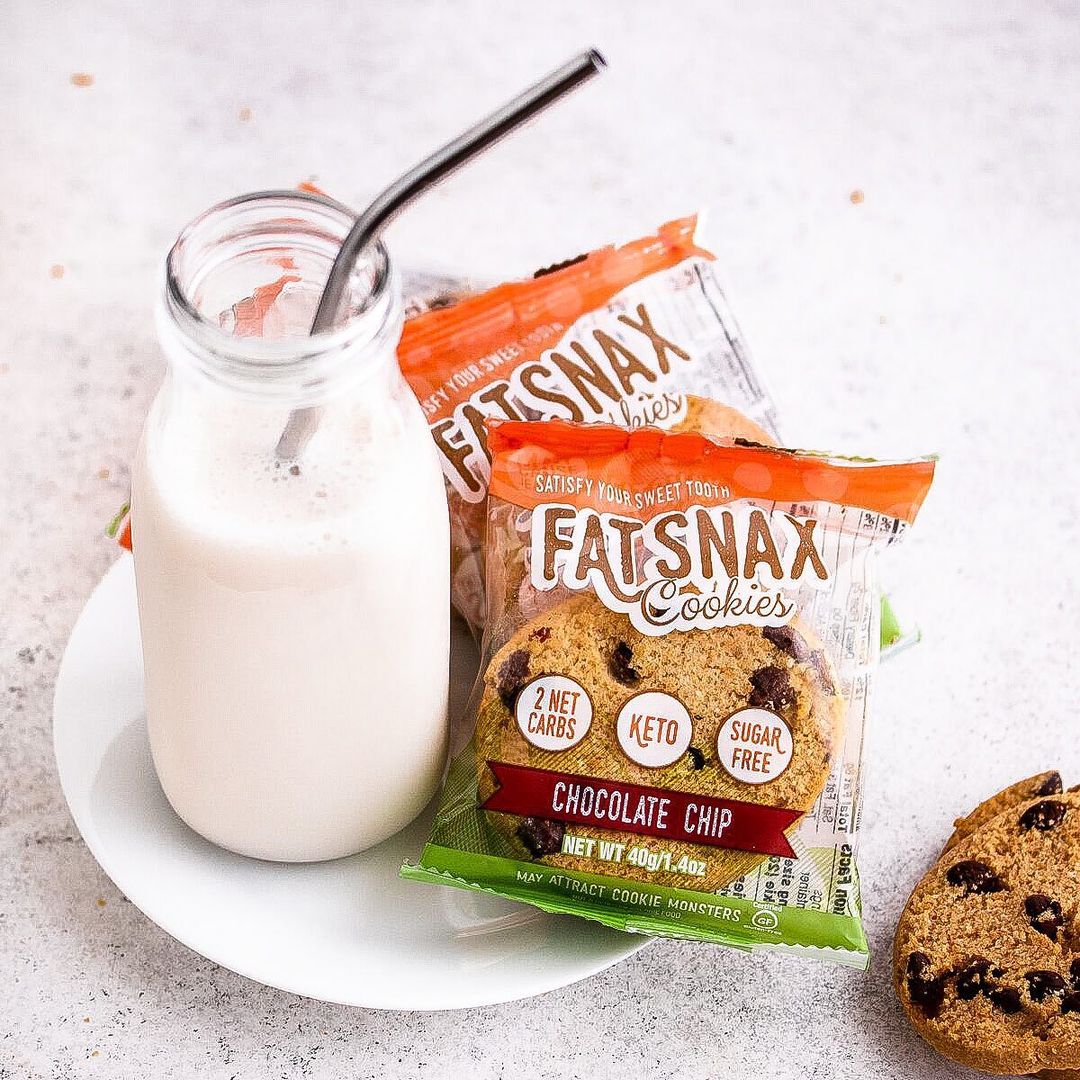
In May 2019, Fat Snax engaged Interact, a Colorado-based branding agency, to lead its redesign initiative. Given that Fat Snax was a young brand without deeply-entrenched brand equities, the opportunities for creative exploration were considerable.
“The brand name was the one piece we weren’t going to change. It stands for something from a nutritional perspective, and it’s fun and polarizing—a conversation piece. Everything else was on the table,” explained Hemmert.
The agency had no qualms with this constraint—”Fat Snax” was distinctive and packed with personality in a competitive space dominated by jargon. “They just ignored the entire playbook and told a different story. They didn’t beat their chests and scream ‘keto!’ like every other player. Their name was Fat Snax in a category filled with brands like Perfect and Paleo Factory and Keto this-and-that—all these SEO buzzwords meant to capitalize on a trend. We didn't have to try to get them to be brave or more bold than they wanted to be at the outset, and that made a big difference,” said Fred Hart, creative director and partner at Interact.
"They just ignored the entire playbook and told a different story. They didn’t beat their chests and scream ‘keto!’ like every other player."
To begin, the team conducted a competitive audit of the space—which included both mainstream cookies and their healthier counterparts. “We have two kinds of competitors: the better-for-you, protein-plus-something kind of diet foods and the satisfying, Netflix-and-chill, mainstream cookie set. Historically, the former has tasted terrible, but some consumers feel they’re worth it because they deliver on certain macronutrients. The second group seemed more exciting; the primary purpose of snacks like Oreos and Famous Amos cookies is to taste great, and we can compete on that. Instead of carbs, we’re all about the fat—and everyone knows fat makes food taste good,” said Hemmert.
Rather than leaning into the specialty diet angle, Fat Snax decided to take the opposite tack: appealing to a broad audience by emphasizing appetite appeal. “We wanted it to be very clear that, first and foremost, this is a cookie. It’s not some substance that’s 50% protein that just happens to be taking the form of a cookie,” quipped Hemmert.
The brand’s decision to downplay its keto chops may seem surprising, but it was strategically savvy—and largely fueled by the brand’s foray into brick-and-mortar retailers. Fat Snax wanted to attract taste-seeking consumers, with its product nestled amongst the ranks of Chips Ahoy, Oreo, Tate’s, and Pepperidge Farm. Better yet, packaging with broader appeal wouldn’t preclude the brand from proclaiming its health credentials; digital and social channels provide plenty of opportunities to deliver more targeted messaging to specific consumer groups. A taste-centric package could still capture these buyers online without alienating mainstream cookie consumers at store shelves.
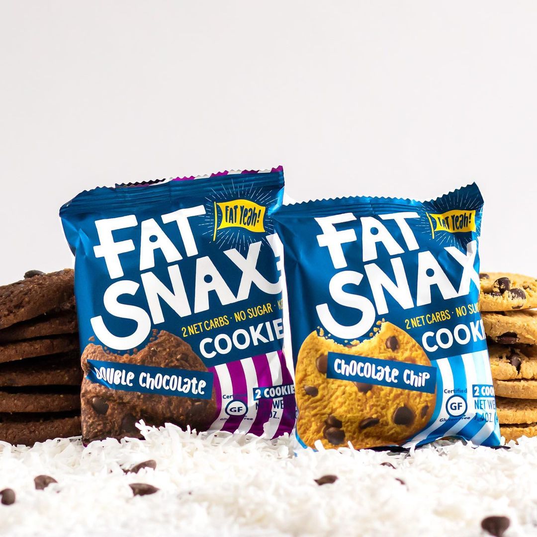
“We wanted to go broad while removing some of the stigma around fats. For the positioning, we landed on: ‘Fat Snax creates unapologetically fat-filled snacks because you can eat fat and be fit.’ Personality-wise, Fat Snax was already unapologetic—we just needed to crystallize it, and convey that the brand is also empowering, sincere, energetic, and cheeky. The question became: how do we translate that into a visual language that separates us from the pack, conveys appetite appeal, handles the hierarchy of communication effectively, and so on?” explained Hart.
Interact completed three rounds of creative exploration, creating dozens of distinct design routes before honing in on the final concept. The broader set included everything from pop art graphics to detailed product photography to bold patterns—to say nothing of the typography, which ranged from modern script lettering to chunky, distressed typefaces. With each round of exploration, the team identified specific elements that spoke to them: a bold, approachable typeface, a bulls-eye pattern, and a peppy flag icon.
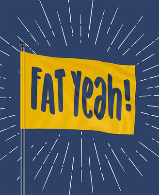
“One of our team members noticed something in the CEO’s email signature. He had this very subtle line at the end that said, ‘Fat yeah!’ It was nothing, just a sign-off. And as we were thinking about being unapologetic and planting our flag in the ground—maybe even waving our freak flag a little bit—that line really inspired us,” recalled Hart. An early design concept included a flag icon with this tagline, which eventually became part of the final design.
“For the logo, we looked at very clean sans-serifs, cursive typefaces, bold and chunky—you name it. We knew we wanted something that was highly legible because the name is a big selling point. Practically speaking, if you put ‘Fat Snax’ on one line, it can only get so large. However, if you choose a typeface that’s more modular, allowing the words to be stacked on top of each other, suddenly the name can get a lot bigger,” explained Hart.
The choice of typeface had other benefits too: Cleverly, the negative space within the “a” reveals an “i”—reinforcing the notion that one can eat fat to be fit.

To drive appetite appeal, the team decided to dispense with the transparent packaging and leverage product photography instead. “Things naturally happen that can affect the look of a product—the cookie can break, or maybe there aren’t enough chocolate chips in the corner that consumers can see on a particular cookie—that kind of thing. Using photography enabled us to reliably control how the product appeared, and freed up more space on the label for other things,” said Hemmert.
The switch to photography was a success: When asked which design better conveys “tastes great,” twice as many consumers selected the new design over the old one, according to Designalytics’ evaluation. The updated packaging showed considerable communication gains on other key attributes too, including “high quality,” “easy to take on the go,” “satisfies a craving,” and “keeps me full.”
In the end, Fat Snax slightly de-emphasized its ingredient and nutrient claims, dialing up “Fat Snax” and “Cookies” even further in the hierarchy of communication. The claim content remained the same, but only after the brand confirmed that it was hitting the right notes. Being a scrappy startup with a limited research budget, the brand leveraged its digital data for this purpose.
“We had a wealth of historical online data from Facebook and Google ads, and we all spent time combing through thousands of reviews—so we had a solid idea of what our consumers were looking for,” explained Hemmert.
In preparation for launch, Interact applied the new brand system to additional packaging, such as shelf caddies and direct-to-consumer boxes. “We just switched everything over and never looked back,” said Hemmert. “When brands change their packaging, there's sometimes a polarization effect where a lot of people say, ‘I don't love this direction. It's too round. It's too square. It’s too something.’ No one—not one person ever—thought that for a second about ours. It just resonated so strongly at this critical inflection point,” he added.
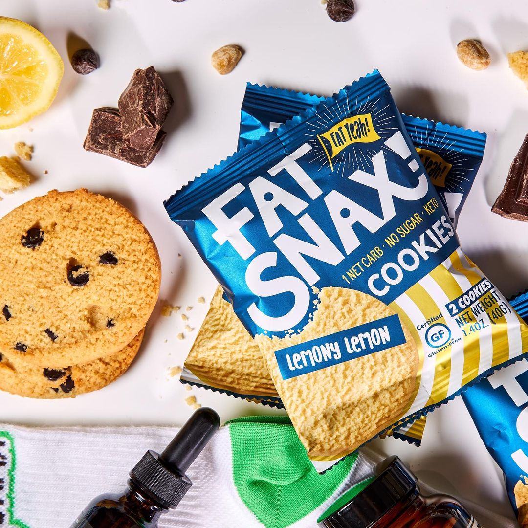
In December 2019, the new design launched, contributing mightily to the brand’s success securing distribution at key brick-and-mortar retailers. “It’s clear the new packaging had a significant impact because, all of a sudden, we became a mainstay on Kroger shelves across the country and continued to win distribution elsewhere. I don’t think we ever would have seen that with the old packaging,” reflected Hemmert.
"All of a sudden, we became a mainstay on Kroger shelves across the country and continued to win distribution elsewhere. I don’t think we ever would have seen that with the old packaging."
“Before, we’d talk to buyers and tell them the sales story, which was strong and they were interested to an extent. But, then we came back with the new packaging and said, ‘Sure, we’ve got the data and everything, but just look at this thing.’ Suddenly, they started to say: ‘Okay, this can
sit on my shelf. This should be next to Simple Mills and Enjoy Life. This should be a core offering in the category,’” he continued.
Not surprisingly, these distribution wins contributed to an increase in sales velocity and volume, boosting retail sales by a whopping 94% after the new packaging hit shelves. However, even discounting distribution effects, the revamped design proved vastly more effective than the old one; for example, at Whole Foods, sales per point of distribution increased by 46%.
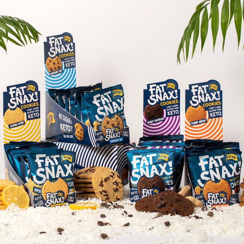
When asked what made this redesign so successful, Hart—who has worked on many successful rebranding initiatives in his career—responded: “If you have a client that's willing to be brave, strong knowledge of retail spaces, and solid working principles such as ‘people don't read, they recognize’ and ‘challenge the category, not the consumer’—the stars will align.”
"If you have a client that's willing to be brave, strong knowledge of retail spaces, and solid working principles such as ‘people don't read, they recognize’ and ‘challenge the category, not the consumer’—the stars will align."
While there’s no cookie-cutter approach to effective design, Hart provides an important reminder that there are principles and processes that, when combined with first-rate creative talent, reliably produce winning designs. Even little brands—maybe especially little brands—should have fat ambitions when it comes to design-driven growth.
Download the report with interviews from all the Designalytics Effectiveness Award winners.
1 Google Trends.

