 Brand: FitJoy
Manufacturer: FitJoy Foods
Agency: Moxie Sozo
FitJoy has come a long way since its founding in 2016. Originally created to manufacture grain-free, vegan protein bars, the Austin-based brand dabbled fruitlessly with other protein-rich products before making a fortuitous observation. “We realized no one had fully challenged the status quo with better-for-you pretzels,” said Chris Pilcher, brand manager at FitJoy. So the brand came out with grain-free pretzels in 2018 to address this gap.
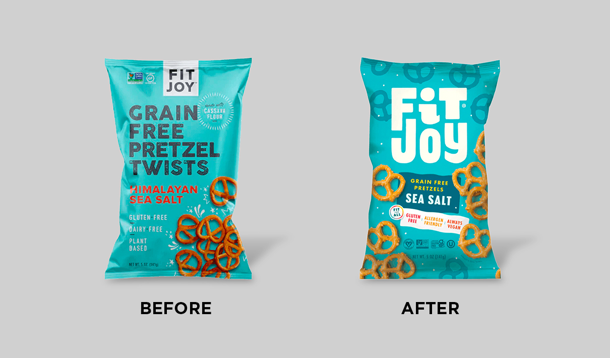
Evolving at a dizzying pace, FitJoy largely transferred its protein-bar branding onto the pretzel bag—expediency trumping exploration as a priority in the packaging process. The packaging was clean and simple, but in Pilcher’s opinion, it had a kind of “medicinal functionality” and didn’t really reflect the brand well. “If you were walking down the aisle and saw our bags, you might have assumed it was a store brand,” he remarked.
In 2020, the brand transitioned fully out of the protein bar business to focus solely on salty snacks. Despite its location in better-for-you aisles of grocery stories, FitJoy didn’t want to pigeonhole itself as only for a niche audience. “The phrase we used at the beginning was ‘no compromises,’” said Mike Bowman, group account director at Moxie Sozo, the design agency that led FitJoy’s redesign. “It is grain-free and vegan, but that shouldn't mean it’s just for consumers with restricted diets. First and foremost, FitJoy is delicious and fun.”
So when the redesign began in March 2021, the brand aimed to appeal not only to consumers with specific nutritional needs, but to anyone who loves a tasty snack. This was going to require a different approach. “Eating a protein bar isn't a joyful occasion,” he noted. “Snacking, on the other hand, is one of life’s simple joys. And using premium ingredients, avoiding things like grain, allows us to amplify that enjoyment because consumers aren’t dealing with the side effects of lower-quality ingredients.”
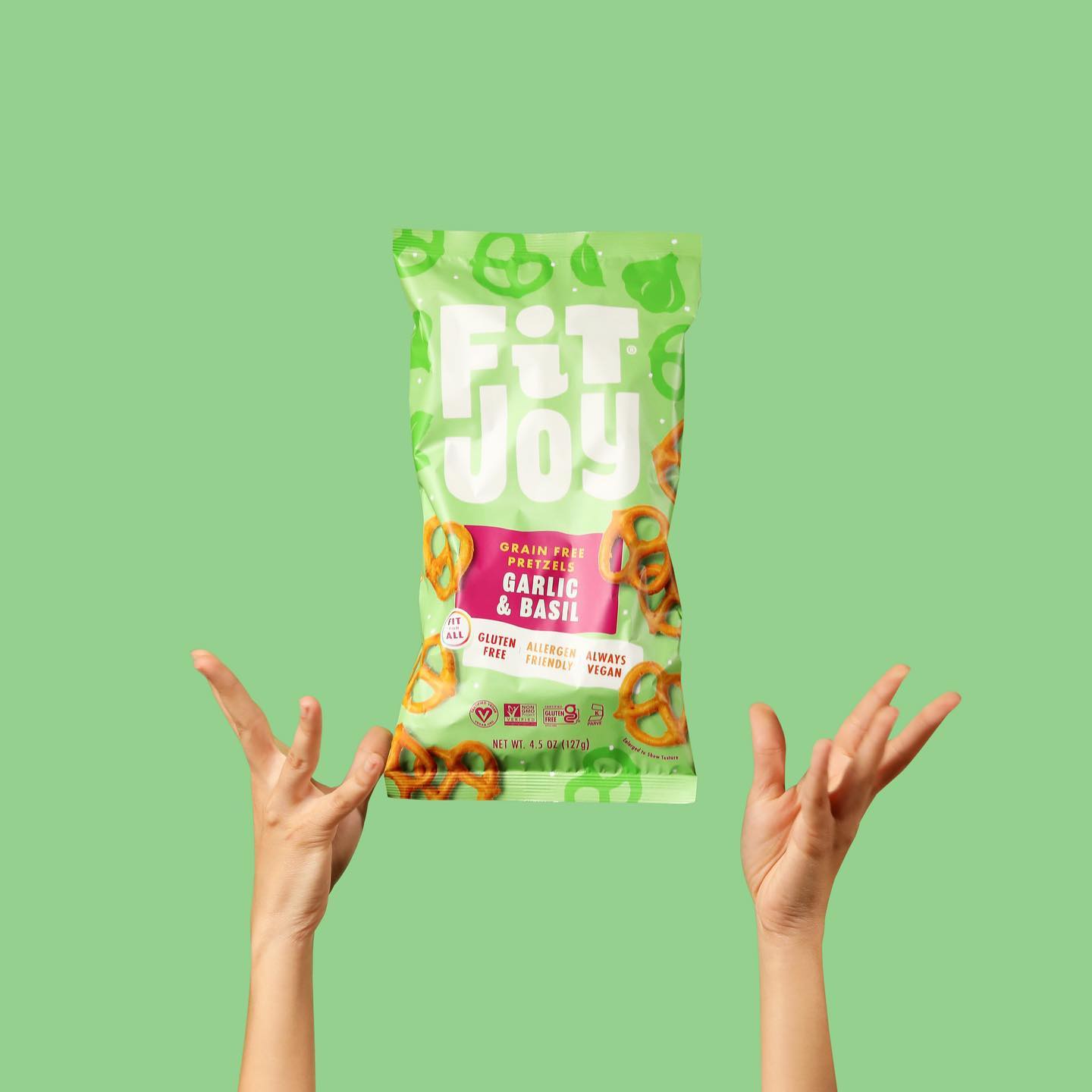
The enjoyment ethos was going to start with the logo, which wasn’t really aligned with the second half of the brand’s name. It was relatively small and framed with a white box at the top of the bag, a remnant of the brand’s origins as a purveyor of more functional foods. The largest text on the old package provided a generic description of the product (“grain free pretzel twists”). For the new design, Moxie Sozo created a large logo with a fun, plump font right in the middle of the package. “We wanted to truly bring out the joy in the brand,” said Cara Berberet, senior designer at Moxie Sozo. “So the logo was really about bringing in the brand’s personality, loudly announcing the joy the brand wanted to convey.”
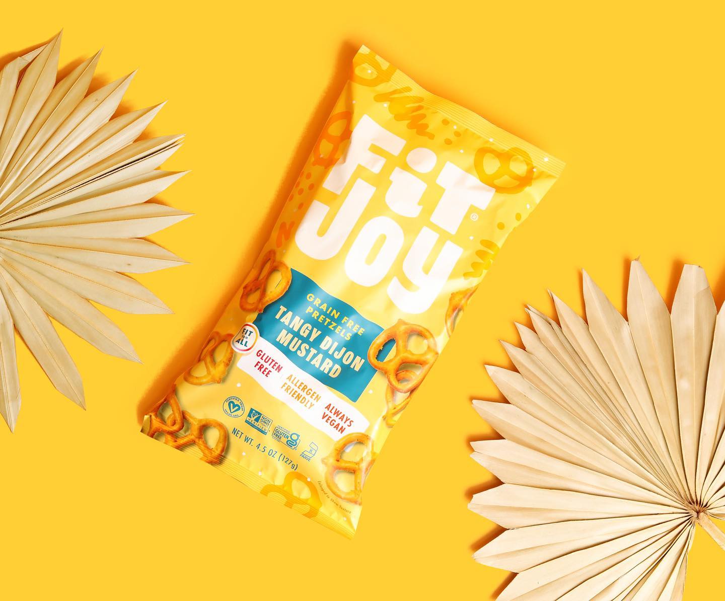
When it came to claims and certifications—which carry high importance for a significant portion of FitJoy’s consumers—the brand created a centralized space to contain them in the lower-middle of the design. This ensures that consumers for whom this information is vital don’t have to search for different bullets or badges; it’s all in the same general location on the pack. “The increased size of the logo certainly shifted the communication hierarchy, but the information is all right there, and easily found,” said Charles Bloom, creative director at Moxie Sozo.
The whole team understood that it was also essential to communicate appetite appeal well, but they didn’t want to overdo it in this case. “We’re not trying to educate people on what pretzels are,” Bloom quipped.
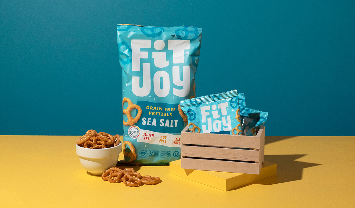
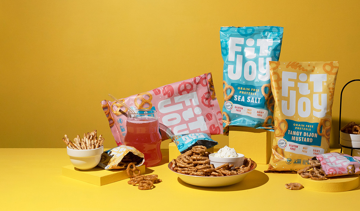
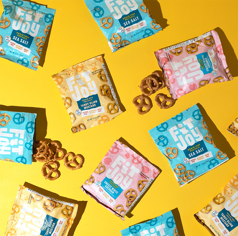
Images continue to do a lot of work to tempt the consumer’s palate, as they had with the previous package. “Photography is just so often the fastest way to appetite appeal,” Berberet remarked. Yet the brand didn’t dramatically change the taste imagery—it simply spread the pretzels on the pack around, ensuring that they could be seen from virtually any angle. The agency also added silhouettes of pretzel twists as a quirky complement to the imagery.
Color was an area where the brand was already ahead of the curve. The teal tone of the previous packaging exuded some of the fun the brand was after, and it was ideal for standing out amidst competitors. “If you’re walking down the grocery aisle and looking at pretzels, all you see is browns and golds—we joked that it was like UPS,” Bloom remarked, referring to the delivery company. “So we retained the bright colors that we knew would stand out on a very brown shelf.” Complementing the primary color on the package were bright red and yellow fonts, as well as a deeper blue block of color, within which nests the “grain free pretzels” description and flavor call-outs.
“If you’re walking down the grocery aisle and looking at pretzels, all you see is browns and golds—we joked that it was like UPS.”
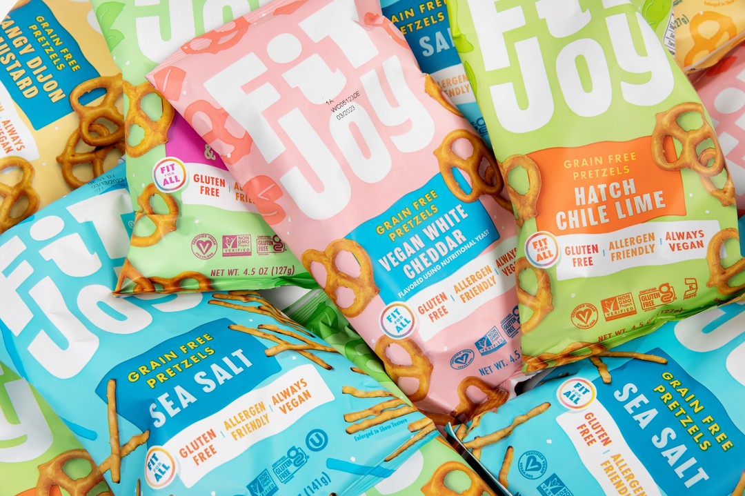
To really hammer home the point that this product appeals to a broad spectrum of consumers, the team even added a small, colorful badge that says: “Fit for all.” This clever callout turns the usual conceit—this product is just for those with dietary restrictions—on its head, implying that these pretzels are for everyone, including those who avoid certain ingredients.
Consumers seem to be eating the new design up. In the six months following the new design's launch, FitJoy’s sales grew 57% compared to the same period in the previous year. And as it turns out, the positive momentum created by the new design has only accelerated since. FitJoy recently came to an agreement to offer its snacks on Delta Airlines flights, which offers superb revenue and marketing opportunities.
In the six months following the new design's launch, FitJoy’s sales grew 57% compared to the same period in the previous year.
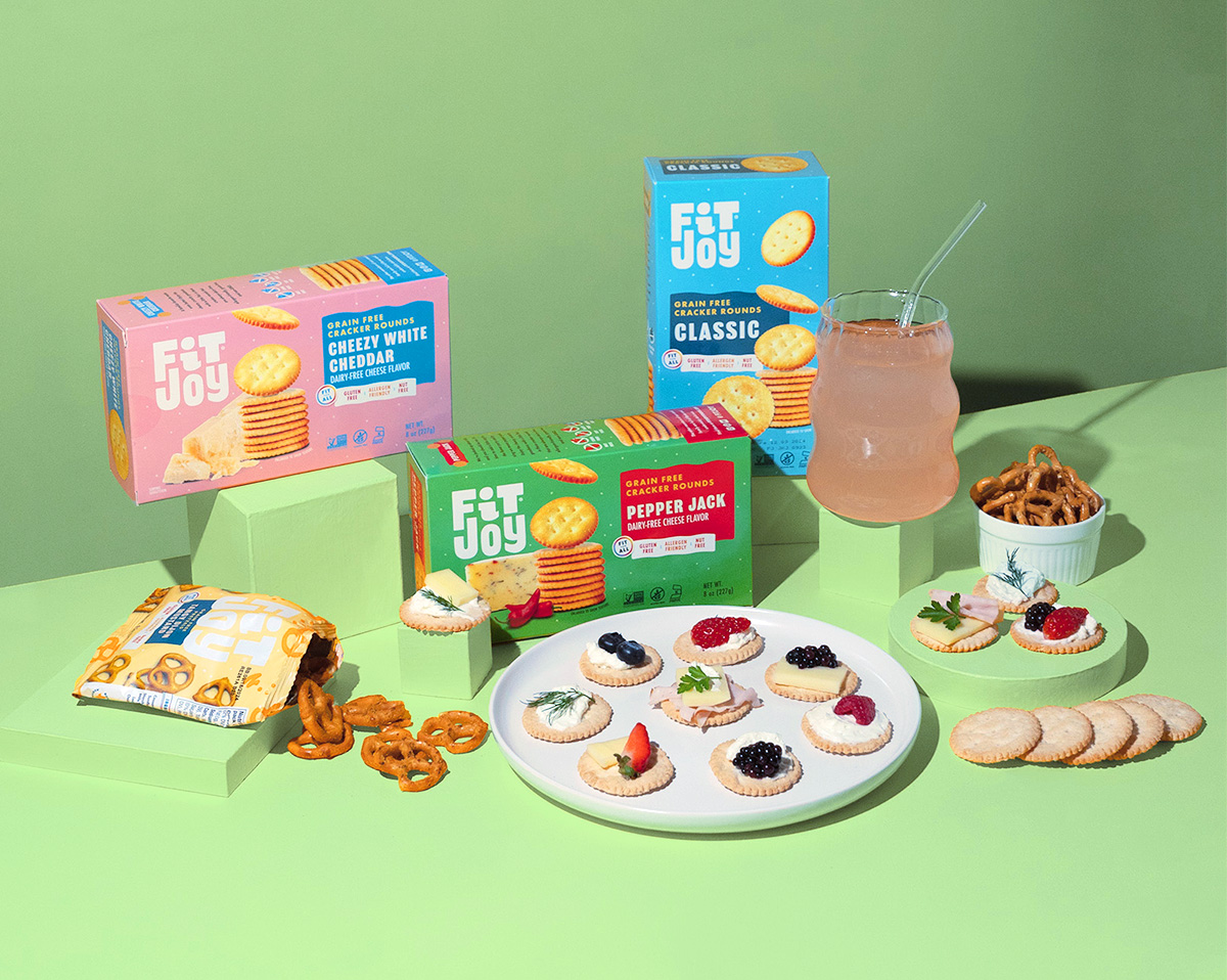
Looking back on the project, Pilcher was particularly pleased with Moxie Sozo’s foresight in creating the new design’s architecture. The original redesign (for the sea salt pretzels) easily transfers to other flavors and products—which is very helpful since FitJoy has recently expanded to offer crackers. “We can just apply the design system they’ve created and adapt it as needed,” he commented. “It’s pretty much plug-and-play.”
Since the redesign launched, Pilcher has received quite a few compliments on the packaging at trade shows and industry events, and he’s very excited about the response he gets from retailers. “We regularly hear ‘I love your packaging, I love your branding.’ And it makes that first conversation with retailers so much easier, because they are drawn to our product before they’ve even tasted it,” he said.