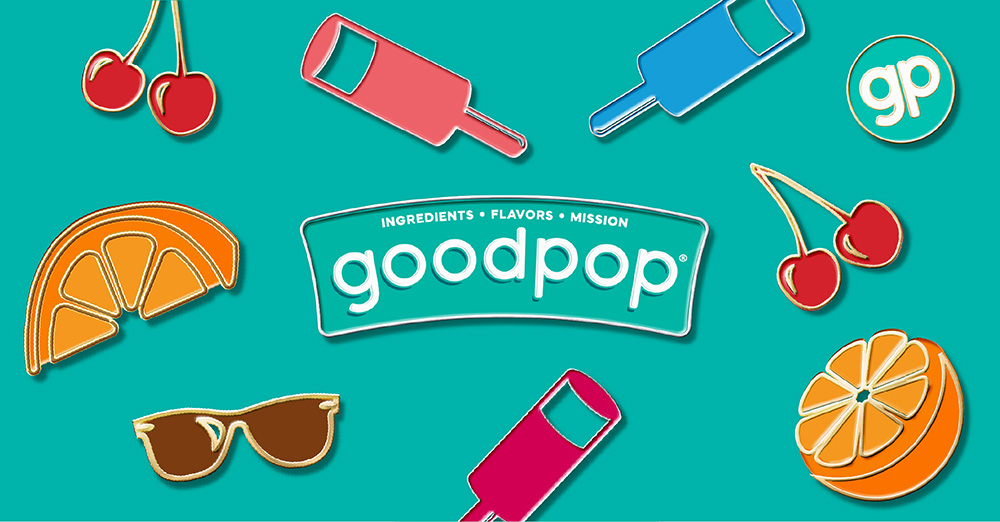
 Brand: GoodPop
Manufacturer: GoodPop
Agency: Interact Brands
Most American adults can remember snarfing down Push-Up Pops, King Cones, Bomb Pops, and crumb-coated Good Humor bars on sweltering summer afternoons. Of course, those were the golden days—before consumers knew to scan nutrition labels for unconscionably-long ingredient lists containing “high fructose corn syrup,” “hydrogenated oils,” and a slew of vaguely scientific, unpronounceable words. Needless to say, times have changed: The past several years have brought about a clean-label revolution, with 69% of consumers claiming that simple, recognizable ingredients influence their purchasing decisions.1
Rather than viewing these desires—nostalgic indulgence and good, clean eating—as two worlds apart, one brand saw an opportunity to blend the best of both. In 2009, Daniel Goetz—an Austin native frustrated by the lack of healthy, refreshing summer treats on offer—founded GoodPop. The young brand launched a line of fruity, frozen novelties positioned as “cleaned-up classics,” using only real, organic, responsibly-sourced ingredients.
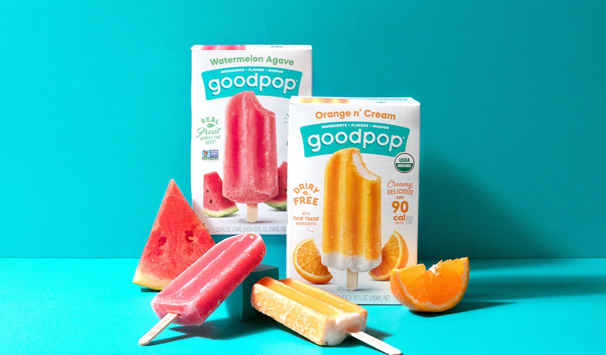
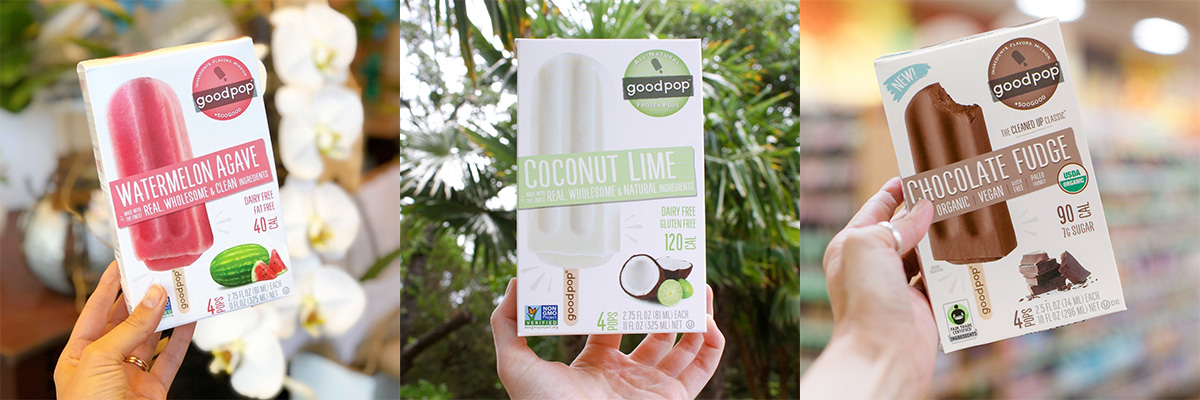
Over the next decade, GoodPop gained traction at natural retailers, including Sprouts Farmers Market and Whole Foods, and its line of products grew. Today, GoodPop offers a wide range of goodies—everything from orange-and-cream bars, to oat-milk-based ice cream sandwiches, to fruit pops in exotic flavors like “hibiscus mint,” “watermelon agave,” and “mango chile.”
In addition to expanding its list of offerings, GoodPop was making its debut in mainstream retail channels like Publix and Costco circa 2019, having already secured its foothold at big-name natural chains. These two causes of growing pains—expanding one’s portfolio and its distribution channels—are common catalysts for revisiting one’s package design.
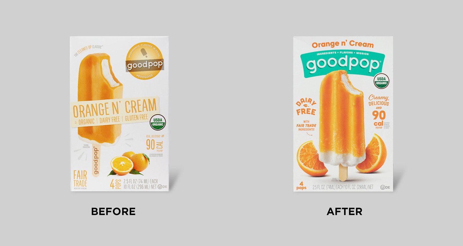
Impressively, GoodPop’s original packaging—a perfectly serviceable design that carried the brand through its first decade—was created by Goetz himself, but it wasn’t built for the big time. “When we began launching new products and lines, we realized we didn’t have a design system that could accommodate that. Our logo was small, and there were some design inconsistencies—we needed consumers to be able to grab one box, and then know the next box was also a GoodPop item,” explained Clara Tomlin, marketing director at GoodPop.
 The logo color on GoodPop's old packaging varied by product variant, impeding brand recognition.
In early 2020, GoodPop engaged Interact, a Colorado-based branding agency with deep expertise in the food and beverage industries—and in helping fast-growing challenger brands look like the sure-footed elites they’ve become.
The agency conducted a thorough audit of the category and GoodPop’s existing equities, determining that the brand’s white box was the only “must-keep” asset. The white coloring presented a challenge and an opportunity, given that GoodPop was being distributed in two retail environments with vastly different competitive sets.
“Colors are hyper-saturated in conventional retail stores, so white was an awesome signal to those consumers that this is a better-for-you brand. The challenge in maintaining the white box then became: How do we make sure it doesn’t make us feel generic in our birthplace—the natural channel—where white is really common?” said Fred Hart, partner and creative director at Interact.
The answer: Pack a lot of personality into the elements that can be changed. Interact’s initial exploration included dozens of design concepts, which experimented with different ways to integrate color (from blocking to monotone doodles), typefaces (from chunky and geometric to handwritten), and food imagery (from upside-down popsicles to fruit slices bursting out of the bars themselves).
The team settled on a vibrant teal color for the holding shape around the wordmark, thus establishing a consistent, recognizable brand color that provided some pop and became an ownable asset across all flavor varieties. Interact added a slight curve to the “GoodPop” lettering within to communicate playfulness. “The logo sticks out on shelves now. It’s a huge banner, and you just can’t miss it. The color is eye-grabbing, but it also feels like a joyful, happy, carefree brand,” said Tomlin.
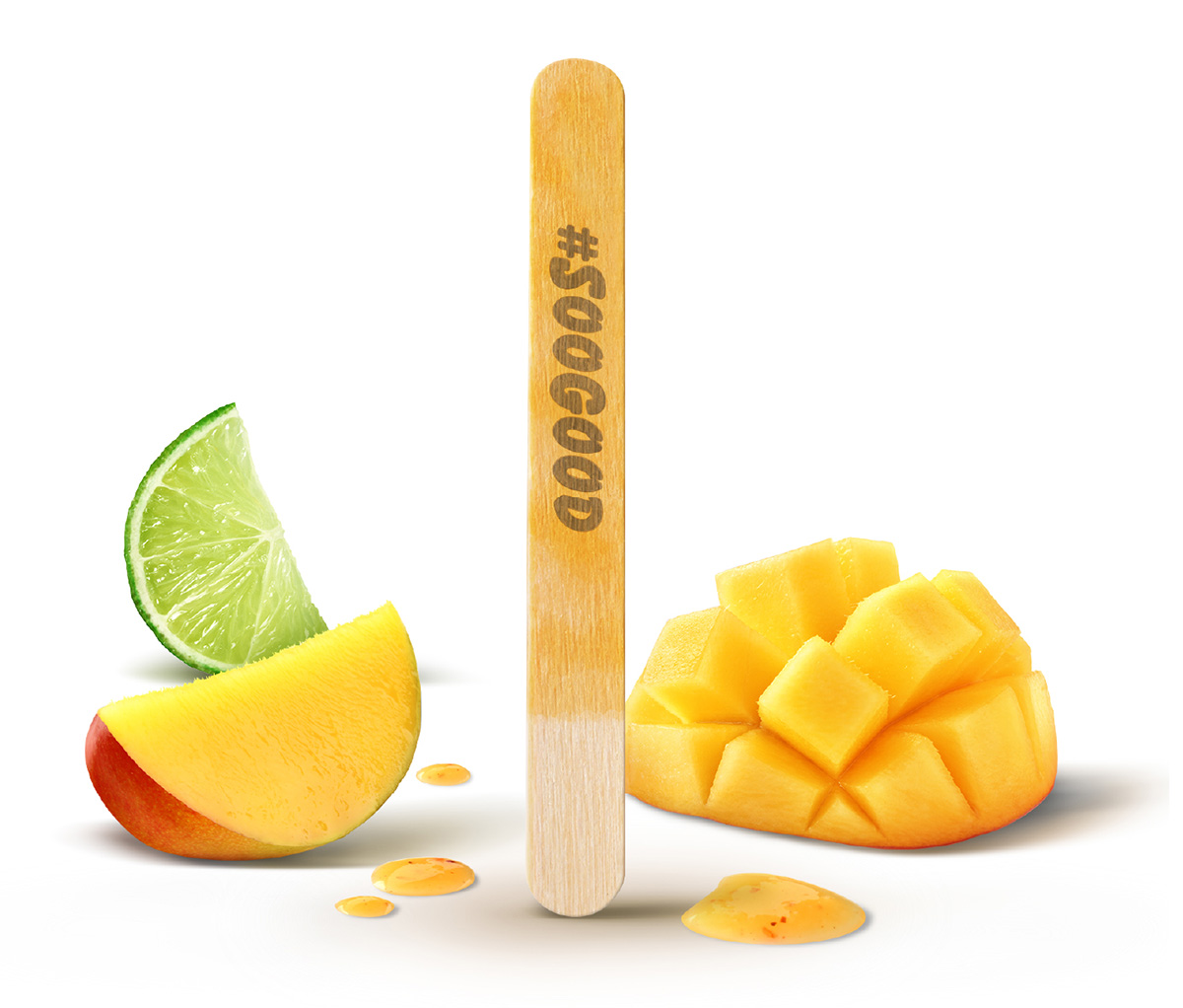
Interact experimented broadly with the popsicle and flavor imagery—another avenue for differentiation. Should the popsicle be standing up or lying flat? Where should it be positioned on the box? How should the fruit slices coexist with the popsicle?
“Previously, the flavor imagery was stock photography, kind of shoved into a corner and not interacting with the popsicle. We made it part of the scene by adding depth and standing the popsicle up, which gives it a little character and personality. The styling of our photography really became our calling card,” said Hart.
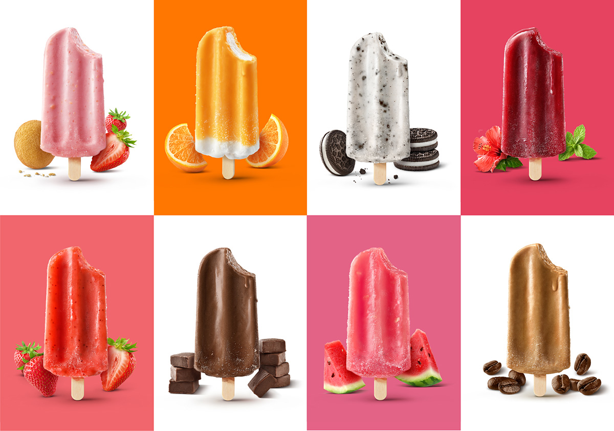
The punched-up photography did more than differentiate the brand—it skyrocketed taste appeal. When asked which design best communicates “tastes great,” category buyers were three times more likely to select the new design over the old, according to an evaluation by Designalytics.
"The styling of our photography really became our calling card."
Interact engaged photographer Mike Wepplo for the painstaking work of capturing frozen novelties at peak deliciousness. “Mike is a Photoshop magician. He’s about 40% photography and 60% post-production, whereas most photographers get about 70-90% of the way to perfect during the shoot, then do light retouching. The flavor imagery, like the fruit slices, were all composited in. That helped us get the ideal look, because trying to shoot everything perfectly would've been an absolute nightmare,” said Hart, scrolling through a lengthy art direction document, complete with examples of optimal lighting, depth, frost, moisture, and how not to style a bite mark (“too shallow,” “not melted enough,” “looks like an animal got to it”).
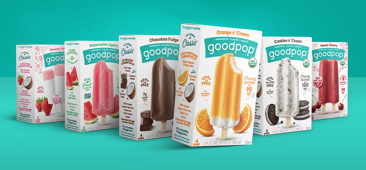
The next challenge was to prioritize claims on the front of the package. GoodPop is in the enviable position of possessing too many virtues to display them all prominently: organic, dairy-free, gluten-free, low calorie, fair trade, fresh ingredients—the list goes on.
Hart likened the importance of prioritizing textual content to playing “catch” with consumers. “If I throw five tennis balls at the consumer, they're going to catch none of them. If I throw one, they'll definitely catch it; two, probably; and every additional tennis ball makes success less likely. A brand who throws everything they’ve got is essentially saying, ‘We don’t know what’s important.’ Choosing only the most critical messages shows confidence, and that attracts people naturally,” he explained.
"A brand who throws everything they’ve got [at the consumer] is essentially saying, ‘We don’t know what’s important.’ Choosing only the most critical messages shows confidence, and that attracts people naturally."
The team decided to prioritize no more than three claims—which vary depending on the product—leveraging the back of the package to discuss any remaining virtues. This includes GoodPop’s status as a B corporation and its mission to do good.
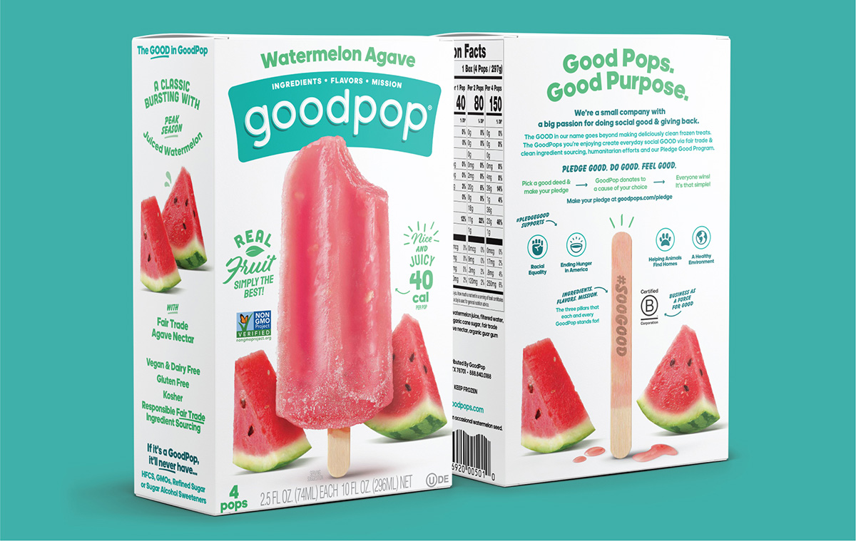
“Consumers’ eyes are drawn to our package for the mouth-watering flavors, but they stay for the mission,” said Tomlin. “There's a page on our site where you can pledge to do a good deed. At the most basic level, this is about spreading kindness, especially during a time when there’s a lot of animosity in the world. With every good deed that's pledged, we'll donate a dollar to a charitable partner that fits with one of our pillars—supporting social equity or ending hunger or cleaning up the environment, for example,” she explained.
The back of the package also sports Hart’s favorite feature: the stick from a completely-consumed popsicle, in the exact same position as on the front of the package. “It’s the kind of thing a designer would notice—a fun little moment,” he said.
In early 2021, GoodPop’s new design launched, proving to be a stone-cold success. In the year following, sales increased by 40% compared to the prior year.2 The results of a consumer evaluation by Designalytics echo this outcome: 75% of category buyers preferred the new design over the old one.
In the year following the redesign, sales increased by 40% compared to the prior year.
The revamped design had far-reaching effects, bolstering the brand’s advertising efforts and boosting recall at the moment of truth. “The packaging is the hero in any advertisement we're putting out there. We want people to take notice of us when we appear in their social channels, and then be able to walk in a store and easily recall the item they saw. The new design certainly did that,” said Tomlin.
When asked what advice Hart would give to challenger brands, he suggested that they be bold and take creative risks—as long as those risks are strategic. “There’s a quote I like: ‘The opposite of bravery isn’t cowardice; it’s conformity.’ Some of our clients are afraid to take the risk, and I tell them: ’Look, you’re a $10 million business now, and you want to be a $50 million business—at which point you’ll want to take even less risk. As an entrepreneur, you’ve already taken massive amounts of risk, so why are you stopping when it comes to creative? Your product is disruptive, and now you need to strategize and find the opportunity to challenge from a design standpoint,’” he said.
"Some of our clients are afraid to take the risk, and I tell them... 'As an entrepreneur, you’ve already taken massive amounts of risk, so why are you stopping when it comes to creative?'"
Hart’s sentiment is one often shared by the masterminds behind effective packaging design, and is worth highlighting in a discipline so often preoccupied with mitigating risks over maximizing opportunities. GoodPop reminds us that timely, carefully-considered redesigns can deliver seriously sweet results.
1ADM Outside Voice research.
2Nielsen xAOC, latest 52 weeks ending 3/19/22 vs. prior year.